value_animation_progress 1.0.0+2  value_animation_progress: ^1.0.0+2 copied to clipboard
Used to display numerical value by circle animation progress
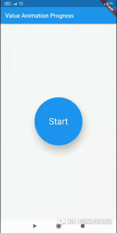
Value Animation Progress #
This library helps explain the amount of user consumption from the value of the Internet package or any value that needs to be clarified by the amount of consumption by Circle Progress Animation
Getting Started #
Parameters #
| Name | Type | Usage |
|---|---|---|
| value | double | value of progress |
| gradientCircularProgressColorOne | Color | Gradient Color One in Progress |
| gradientCircularProgressColorTwo | Color | Gradient Color Two in Progress |
| gradientCircularProgressColorThree | Color | Gradient Color Three in Progress |
| duration | Duration | Duration time to complete animations |
| textSize | double | Text Size for display values |
| textColor | Color | Text color for display values |
| cardHeight | double | Text container Height |
| cardWidth | double | Text container Width |
| progressStrokeWidth | double | Progress Width |
| progressRadius | double | Progress Radius |
| textBackGroundColor | Color | Text container BackGround Color |
Usage #
import
import 'package:value_animation_progress/value_animation_progress.dart';
Example
class MyHomePage extends StatefulWidget {
  MyHomePage({Key key, this.title}) : super(key: key);

  final String title;

  @override
  _MyHomePageState createState() => _MyHomePageState();
}

class _MyHomePageState extends State<MyHomePage> {
  /// range is from 1 to 100
  double value = 90.0;

  @override
  Widget build(BuildContext context) {
    return Scaffold(
      appBar: AppBar(
        title: Text(widget.title),
        backgroundColor: Colors.blue,
      ),
      body: Center(
          child: ValueAnimationProgress(
        value: value,
        textSize: 30,
        duration: Duration(seconds: 3),
        textColor: Colors.white,
        cardHeight: 170,
        cardWidth: 170,
        progressRadius: 120,
        progressStrokeWidth: 20,
        textBackGroundColor: Colors.blue,
        gradientCircularProgressColorOne: Color.fromRGBO(58, 255, 51, 1),
        gradientCircularProgressColorTwo: Color.fromRGBO(255, 85, 51, 1),
        gradientCircularProgressColorThree: Color.fromRGBO(255, 85, 51, 1),
      )),
    );
  }
}
library
ValueAnimationProgress(
        value: value,
        textSize: 30,
        duration: Duration(seconds: 3),
        textColor: Colors.white,
        cardHeight: 170,
        cardWidth: 170,
        progressRadius: 120,
        progressStrokeWidth: 20,
        textBackGroundColor: Colors.blue,
        gradientCircularProgressColorOne: Color.fromRGBO(58, 255, 51, 1),
        gradientCircularProgressColorTwo: Color.fromRGBO(255, 85, 51, 1),
        gradientCircularProgressColorThree: Color.fromRGBO(255, 85, 51, 1),
      )
Metadata
1
likes
25
pub points
0%
popularity
Publisher
unverified uploader
Metadata
Used to display numerical value by circle animation progress
Repository (GitHub)
View/report issues
License
 MIT (LICENSE)
Dependencies
cupertino_icons, flutter, gradient_progress