themed 2.0.1  themed: ^2.0.1 copied to clipboard
 glasberg.dev
The themed package lets you define a theme with const values, and then, by using some dark Dart magic, go and change them dynamically anyway.

themed #
The themed package lets you define a theme with const values, and then, by using some dark Dart magic, go and change them dynamically anyway.
Using const variables is the easiest way to create and use themes:
// Define colors and styles.
static const myColor = ColorRef(Colors.white);
static const myStyle = TextStyleRef(TextStyle(fontSize: 16, color: Colors.red));

// Use them.
Container(
   color: myColor,
   child: const Text('Hello', style: myStyle)))

// Later, change the theme dinamically.
Themed.currentTheme = {
   mycolor: Colors.blue,
   myStyle: TextStyle(fontSize: 20, color: Colors.green));
}
There is no need to use Theme.of(context) anymore:
// So old-fashioned.
Container(
   color: Theme.of(context).primary,
   child: Text('Hello', style: TextStyle(color: Theme.of(context).secondary)))
Also, since Theme.of needs the context and is not constant, you can't use it in constructors.
However, the themed package has no such limitations:
// The const color is the default value of an optional parameter.
MyWidget({
    this.color = myColor,
  });
You can also organize your theme in a class:
// Define a theme class.
class MyTheme {
   static const myColor = ColorRef(Colors.white);
   static const myStyle = TextStyleRef('mainStyle', TextStyle(fontSize: 16, color: Colors.red));
}

// Use it.
Container(
   color: MyTheme.myColor,
   child: const Text('Hello', style: MyTheme.myStyle)))
Setup #
Wrap your widget tree with the Themed widget, above the MaterialApp:
@override
Widget build(BuildContext context) {
   return Themed(
      child: MaterialApp(
        ...
Compatibility #
The themed package is compatible with Flutter's native theme system, which means you can use it
inside a ThemeData widget:
child: MaterialApp(
   theme: ThemeData(
      primaryColor: MyTheme.color2,
      elevatedButtonTheme:
         ElevatedButtonThemeData(
            style: ElevatedButton.styleFrom(primary: MyTheme.color2),
      ),
   ),
How to define a theme map #
Each theme should be a Map<ThemeRef, Object>, where the keys are your ColorRef
and TextStyleRef const values, and the values are the colors and styles you want to use on
that theme. For example:
Map<ThemeRef, Object> theme1 = {
  MyTheme.color1: Colors.yellow,
  MyTheme.color2: Colors.pink,
  MyTheme.color3: Colors.purple,
  MyTheme.mainStyle: const TextStyle(fontSize: 22, fontWeight: FontWeight.w900, color: MyTheme.color1),
};
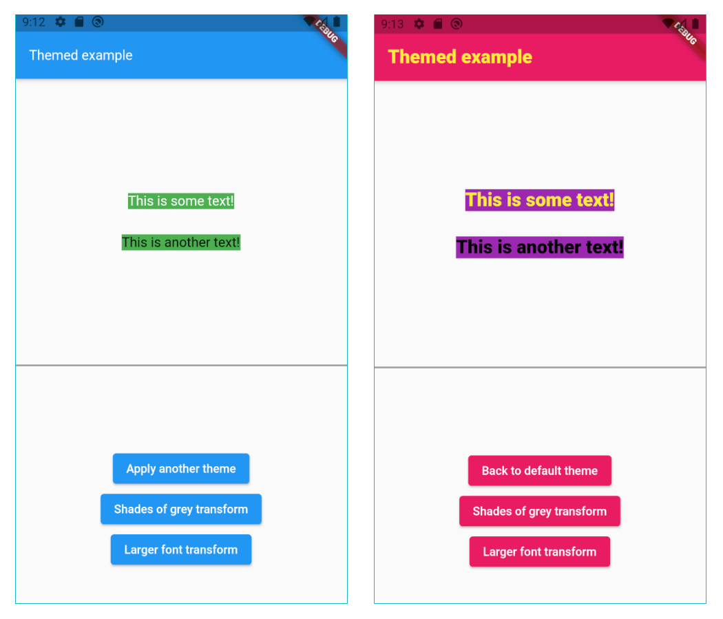
At any point in your app you can just change the current theme by doing:
// Setting a theme:
Themed.currentTheme = theme1;

// Setting another theme:
Themed.currentTheme = theme2;

// Removing the current theme (and falling back to the default theme):
Themed.clearCurrentTheme();

// This would also remove the current theme:
Themed.currentTheme = null;
Color transform #
Instead of changing the current theme you can create a color transformation. For example, this will turn your theme into shades of grey:
static Color shadesOfGreyTransform(Color color) {
  int average = (color.red + color.green + color.blue) ~/ 3;
  return Color.fromARGB(color.alpha, average, average, average);
}
Note you can create your own function to process colors, but shadesOfGreyTransform is already
provided:
// Turn it on:
Themed.transformColor = ColorRef.shadesOfGreyTransform;

// Then, later, turn it off:
Themed.clearTransformColor();
TextStyle transform #
You can also create a style transformation. For example, this will make your fonts larger:
static TextStyle largerText(TextStyle textStyle) =>
      textStyle.copyWith(fontSize: textStyle.fontSize! * 1.5);

// Turn it on:
Themed.transformTextStyle = largerText;

// Then, later, turn it off:
Themed.clearTransformTextStyle();
TextStyle extension #
With the provided extension, you can make your code more clean-code by creating new text styles by
adding colors and other values to a TextStyle. For example:
// Using some style:
Text('Hello', style: MyTheme.mainStyle);

// Making text black:
Text('Hello', style: MyTheme.mainStyle + Colors.black);

// Changing a lot of other stuff:
Text('Hello', style: MyTheme.mainStyle + FontWeight.w900 + FontSize(20.0) + TextHeight(1.2));
Beware not to define the same constant #
Please remember Dart constants point to the same memory space. In this example, colorA, colorB
and colorC represent the same variable:
class MyTheme {
  static const colorA = ColorRef(Colors.white);
  static const colorB = ColorRef(Colors.white);
  static const colorC = colorA;
}
If you later change the color of colorA, you are also automatically changing the color of colorB
and colorB.
If you want to create 3 independent colors, and be able to change them independently, you have to
create different constants. You can provide an id string, just to differentiate them. For example:
class MyTheme {
  static const colorA = ColorRef(Colors.white, id:'A');
  static const colorB = ColorRef(Colors.white, id:'B');
  static const colorB = ColorRef(colorA, id:'C');
}
Avoid circular dependencies #
The following will lead to a StackOverflowError error:
Map<ThemeRef, Object> anotherTheme = {
   MyTheme.color1: MyTheme.color2,
   MyTheme.color2: MyTheme.color1,
};
You can have references which depend on other references, no problem. But both direct and indirect circular references must be avoided.
Other ways to use it #
If you want, you may also define a default theme, and a current theme for your app:
@override
Widget build(BuildContext context) {
   return Themed(
      defaultTheme: { ... },
      currentTheme: { ... },
      child: MaterialApp(
        ...
The defaultTheme and currentTheme are both optional. They are simply theme maps, as explained
below.
When a color/style is used, it will first search it inside the currentTheme.
If it's not found there, it searches inside of defaultTheme.
If it's still not found there, it uses the default color/style which was defined in the constructor.
For example, here the default color is white: ColorRef(Colors.white).
Please note: If you define all your colors in the defaultTheme, then you don't need to provide
default values in the constructor. You can then use the fromId constructor:
class MyTheme {
  static const color1 = ColorRef.fromId('c1');
  static const color2 = ColorRef.fromId('c2');
  static const color3 = ColorRef.fromId('c3');
  static const mainStyle = TextStyleRef.fromId('mainStyle');
}
Copyright #
This package is copyrighted and brought to you by Parkside Technologies, a company which is simplifying global access to US stocks.
This package is published here with permission.
Please, see the license page for more information.
Authored by Marcelo Glasberg
Other Flutter packages I've authored:
Metadata
Publisher
Metadata
The themed package lets you define a theme with const values, and then, by using some dark Dart magic, go and change them dynamically anyway.
Repository (GitHub)
View/report issues
License
 unknown (license)