simple_animations 2.4.0-beta.1  simple_animations: ^2.4.0-beta.1 copied to clipboard
 felix-blaschke.de
Powerful framework to create beautiful custom animations in no time.
🎬 Simple Animations ❷ #

Simple Animations is a powerful framework to create beautiful custom animations in no time.
- 💪 fully tested
- 📝 well documented
- 💼 enterprise-ready
🌞 Highlights #
- Easily create custom animations in stateless widgets
- Animate multiple properties at once
- Create staggered animations within seconds
- Simplified working with AnimationController instances
- Designed with type-safety in mind
⛏️ Getting started #
Add Simple Animations to your project by following the instructions on the install page and start using it:
import 'package:simple_animations/simple_animations.dart';
🛈 If are upgrading from version 1.x.x read the migration guide.
🍱 Features #
Simple Animations contains multiple features. Each one covers a different aspect of making animation very simple.
Overview #
| Feature | Description |
|---|---|
| 🍹 Liquid | Beautiful visual animations that increases the visual quality of your app. |
| 🚀 Stateless Animation | Widgets for super simple creation of custom animations. |
| 🎭 MultiTween | Animate multiple properties at once or create staggered animations. |
| 🎥 Anicoto | Setup managed AnimationControllers instantly. |
🛈 Note: These examples uses supercharged for syntactic sugar.
🍹 Liquid #
Liquid provides ready-to-use, stunning visual animations that can be explored and configured with Liquid Studio.
Read more about it or watch examples.
🚀 Stateless Animation #
Stateless Animation provides your app with a powerful set of Flutter widgets that hide the most complex part of creating animations.
Example: Square with a animated, fading background color.
PlayAnimation<Color>( // <-- specify type of animated variable
  tween: Colors.red.tweenTo(Colors.blue), // <-- define tween of colors
  builder: (context, child, value) { // <-- builder function
    return Container(
        color: value, // <-- use animated value
        width: 100,
        height: 100
    );
});
Read more about it or watch examples.
🎭 MultiTween #
MultiTween gives is mighty tool thats enables you to tween multiple properties in a single Animatable or designing staggered animations.
Example: Custom tween with multiple properties.
enum AniProps { width, height, color } // <-- define properties

class MyWidget extends StatelessWidget {

  final _tween = MultiTween<AniProps>() // <-- design tween
    ..add(AniProps.width, 0.0.tweenTo(400.0), 1000.milliseconds)
    ..add(AniProps.width, 400.0.tweenTo(300.0), 1000.milliseconds)
    ..add(AniProps.height, 500.0.tweenTo(200.0), 2000.milliseconds)
    ..add(AniProps.color, Colors.red.tweenTo(Colors.blue), 2.seconds);

  @override
  Widget build(BuildContext context) {
    return ... // <-- use tween
  }
}
Read more about it or watch examples.
🎥 Anicoto #
Anicoto fully manages your AnimationController instances and handles initialization, configuration and disposing. No more boilerplate code.
Example: Animated stateful widget with full-fledged AnimationController instance.
class _MyAnimatedWidgetState extends State<MyAnimatedWidget>
    with AnimationMixin {  // <-- add AnimationMixin to state class

  Animation<double> size; // <-- declare animation variable

  @override
  void initState() {
    size = 0.0.tweenTo(200.0).animatedBy(controller); // <-- connect tween and controller and apply to animation variable
    controller.play(); // <-- start the animation playback
    super.initState();
  }

  @override
  Widget build(BuildContext context) {
    return Container(
      width: size.value, // <-- use animation variable's value here
      height: size.value, // <-- use animation variable's value here
      color: Colors.red
    );
  }
}
Read more about it or watch examples.
📈 Improve #
Simple Animations will improve in future updates. Help me by reporting bugs, submit new ideas for features or anything else that you want to share.
- Just write an issue on GitHub. ✏️
- And don't forget to hit the like button for this package ✌️
🍹 Liquid Documentation #
Liquid provides beautiful visual animations that increases the visual quality of your Flutter application.
Plasma #
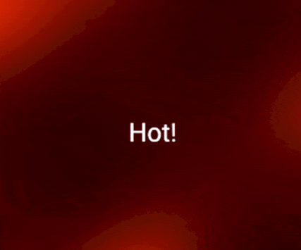
Plasma is a Widget that creates an animation with moving particles that generates a smooth liquid effect. It can be configured in many styles.
You can also use a non-animating variant to generate a fancy background image. Therefor set speed to 0.0 and choose nice position by tuning the offset.
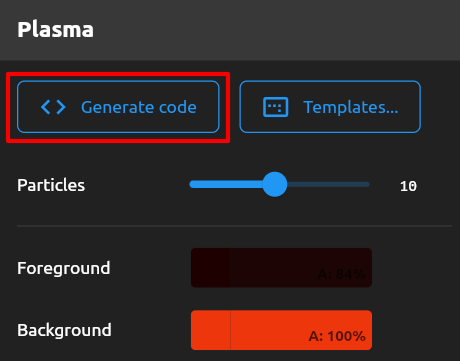
Use the Plasma creator in Liquid Studio to create an animation.
Hit the Generate code button and copy the code into your Flutter app.
🚀 Stateless Animation Documentation #
Stateless Animation enables developers to craft custom animations with simple widgets.
PlayAnimation widget #
Create your animation by adding the PlayAnimation widget to your app. It takes two mandatory parameters tween and builder.
Tween
The tween is the description of your animation. Mostly it will change a value from A to B. Tweens describe what will happen but not how fast it will happen.
// Animate a color from red to blue
Animatable<Color> myTween = Colors.red.tweenTo(Colors.blue);
Builder
The builder is a function that is called for each new rendered frame of your animation. It takes three parameters: context, child and value.
-
contextis your FlutterBuildContext, which should be familiar to you. -
childis a placeholder for any widget that you can additionally pass in aPlayAnimationwidget. It's usage is described further below. -
valueis "current value" of any animated variable. If your tween describes to interpolate from0to100, thevariableis a value somewhere between0and100.
How often your builder function is called, depends on the animation duration and the framerate of the device used.
A simple PlayAnimation
The PlayAnimation<?> widget can be typed with the type of the animated variable. This enables us the code type-safe.
PlayAnimation<Color>( // <-- specify type of animated variable
  tween: Colors.red.tweenTo(Colors.blue), // <-- define tween of colors
  builder: (context, child, value) { // <-- builder function
    return Container(
        color: value, // <-- use animated value
        width: 100,
        height: 100
    );
});
This snippet creates animation of a red square. It's color will fade to blue within one second.
Animation duration
By default the duration of the animation is one second. You set the optional parameter duration to refine that.
PlayAnimation<Color>(
  tween: Colors.red.tweenTo(Colors.blue),
  builder: (context, child, value) {
    return Container(color: value, width: 100, height: 100);
  },
  duration: 5.seconds, // <-- specify duration
);
Now the red square will fade it's color for 5 seconds.
Delay
By default animations will play automatically. You can set the delay parameter to make PlayAnimation wait for a given amount of time.
PlayAnimation<Color>(
  tween: Colors.red.tweenTo(Colors.blue),
  builder: (context, child, value) {
    return Container(color: value, width: 100, height: 100);
  },
  duration: 5.seconds,
  delay: 2.seconds, // <-- add delay
);
The red square will wait for 2 seconds before it starts fading it's color.
Non-linear animation
You can make your animation more interesting by applying a non-linear timing curve to it. By default the tween is animated constantly or linear.
Scenarios where the animation is faster at beginning and slower at the ending are called non-linear animations.
You can enrich your animation with non-linear behavior by supplying a Curve to the curve parameter. Flutter comes with a set of predefined curves inside the Curves class.
PlayAnimation<Color>(
  tween: Colors.red.tweenTo(Colors.blue),
  curve: Curves.easeInOut, // <-- specify curve
  builder: (context, child, value) {
    return Container(color: value, width: 100, height: 100);
  },
);
Working with child widgets
Animations are highly demanding because parts of your apps are recomputed many times per second. It's important to keep these computions as low as possible.
Image the following scenario: There is a Container with a colored background. Inside the Container is a Text. Now we want to animate the background color. There is no need to recompute the Text because the animation only effects the Container color.
In that scenario we have static Text widget. Only the Container need to be update on each frame. We can set the static widget as a child parameter. In our builder function we receive that child widget and can use it inside our animated scene. This way the child widget is only computed once.
PlayAnimation<Color>(
  tween: Colors.red.tweenTo(Colors.blue),
  child: Text("Hello World"), // <-- set child widget
  builder: (context, child, value) { // <-- get child passed into builder function
    return Container(
      child: child, // <-- use child
      color: value,
      width: 100,
      height: 100,
    );
  },
);
Using keys
Flutter tends to recycle used widgets. If your app swaps out a PlayAnimation with another different PlayAnimation in the same second, it may recycle the first one. This may lead to a strange behavior.
All widgets mentioned here support keys to avoid such strange behavior. If you are not familiar with keys then watch this video.
LoopAnimation and MirrorAnimation #
Beside PlayAnimation there are two similar widgets LoopAnimation and MirrorAnimation.
It's configuration is pretty the same as the PlayAnimation.
LoopAnimation
A LoopAnimation repeatly plays the specified tween from the start to the end.
LoopAnimation<Color>(
  tween: Colors.red.tweenTo(Colors.blue), // <-- mandatory
  builder: (context, child, value) { // <-- mandatory
    return Container(child: child, color: value, width: 100, height: 100);
  },
  duration: 5.seconds, // <-- optional
  curve: Curves.easeInOut, // <-- optional
  child: Text("Hello World"), // <-- optional
);
MirrorAnimation
A MirrorAnimation repeatly plays the specified tween from the start to the end, then reverse to the start, then again forward and so on.
MirrorAnimation<Color>(
  tween: Colors.red.tweenTo(Colors.blue), // <-- mandatory
  builder: (context, child, value) { // <-- mandatory
    return Container(child: child, color: value, width: 100, height: 100);
  },
  duration: 5.seconds, // <-- optional
  curve: Curves.easeInOut, // <-- optional
  child: Text("Hello World"), // <-- optional
);
CustomAnimation #
Use CustomAnimation if the animation widgets discussed above aren't sufficient for you use case. Beside all parameters mentioned for PlayAnimation it allows you actively control the animation.
Take over control
The control parameter can be set to the following values:
| CustomAnimationControl.VALUE | Description |
|---|---|
| STOP | Stops the animation at the current position. |
| PLAY | Plays the animation from the current position reverse to the start. |
| PLAY_REVERSE | Plays the animation from the current position reverse to the start. |
| PLAY_FROM_START | Reset the position of the animation to 0.0 and starts playing to the end. |
| PLAY_REVERSE_FROM_END | Reset the position of the animation to 1.0 and starts playing reverse to the start. |
| LOOP | Endlessly plays the animation from the start to the end. |
| MIRROR | Endlessly plays the animation from the start to the end, then it plays reverse to the start, then forward again and so on. |
You can bind the control value to state variable and change it during the animation. The CustomAnimation will adapt to that.
class _PageState extends State<Page> {
  CustomAnimationControl control = CustomAnimationControl.PLAY; // <-- state variable

  @override
  Widget build(BuildContext context) {
    return CustomAnimation<double>(
      control: control, // <-- bind state variable to parameter
      tween: (-100.0).tweenTo(100.0),
      builder: (context, child, value) {
        return Transform.translate( // <-- animation that moves childs from left to right
          offset: Offset(value, 0),
          child: child,
        );
      },
      child: MaterialButton( // <-- there is a button
        color: Colors.yellow,
        child: Text("Swap"),
        onPressed: toggleDirection, // <-- clicking button changes animation direction
      ),
    );
  }

  void toggleDirection() {
    setState(() { // toggle between control instructions
      control = (control == CustomAnimationControl.PLAY)
          ? CustomAnimationControl.PLAY_REVERSE
          : CustomAnimationControl.PLAY;
    });
  }
}
Start position
Each animation has an internal abstract position. This is a value ranging form 0.0 (start) to 1.0 end.
You can modify the initial position by setting the startPosition parameter.
CustomAnimation<Color>(
    control: CustomAnimationControl.PLAY, // <-- play forward
    startPosition: 0.5, // <-- set start position at 50%
    duration: 10.seconds, // <-- full duration is 10 seconds
    tween: Colors.red.tweenTo(Colors.blue),
    builder: (context, child, value) {
      return Container(color: value, width: 100, height: 100);
    });
This animation will start playing right in the middle of the specified animation and only will animate for 5 seconds.
Listen to AnimationStatus
Behind the scenes there is an AnimationController processing the animation. CustomAnimation exposes it's AnimationStatusListener to enable you to react to finished animations.
You can specify your own listener at the animationStatusListener parameter.
CustomAnimation<Color>(
  tween: Colors.red.tweenTo(Colors.blue),
  builder: (context, child, value) {
    return Container(color: value, width: 100, height: 100);
  },
  animationStatusListener: (AnimationStatus status) {
    if (status == AnimationStatus.completed) {
      print("Animation completed!");
    }
  },
);
🎭 MultiTween Documentation #
MultiTween is a powerful Animateable that animates multiple properties at once.
Basic usage pattern #
Create an enum outside your widget class. It contains all properties you want to animate. (For example: width, height or color)
enum AniProps { width, height }
Then you create a MultiTween by instancing it with the enum you created in the first step.
Invoke the add method to arrange your animation.
final _tween = MultiTween<AniProps>()
  ..add(AniProps.width, 0.0.tweenTo(100.0), 1000.milliseconds)
  ..add(AniProps.width, 100.0.tweenTo(200.0), 500.milliseconds)
  ..add(AniProps.height, 0.0.tweenTo(200.0), 2500.milliseconds);
Use the created _tween with your favorite animation technique. Here we use the PlayAnimation widget provided by Simple Animations.
PlayAnimation<MultiTweenValues<AniProps>>(
  tween: _tween, // Pass in tween
  duration: _tween.duration, // Pass in total duration obtained from MultiTween
  builder: (context, child, value) {
    return Container(
      width: value.get(AniProps.width), // Get animated width value
      height: value.get(AniProps.height), // Get animated height value
      color: Colors.yellow,
    );
  },
);
Using the predefined enum for animation properties #
It's always good to create your own enum that contain the precise animation properties the animation uses.
But we developers are sometimes lazy.
If you feel lazy can also use the DefaultAnimationProperties enum that contains a varity of common used animation properties.
final _tween = MultiTween<DefaultAnimationProperties>()
  ..add(DefaultAnimationProperties.width, 0.0.tweenTo(100.0), 1000.milliseconds);
Some notes on using durations #
Duration tracking
The MultiTween tracks the duration for each property you specified when arranging your tween. In the examples above we used this "tracked duration" (_tween.duration) to define the total animation duration.
Use own durations
You also also use your own Duration. MultiTween will automatically lengthen or shorten the tween animation.
PlayAnimation<MultiTweenValues<AniProps>>(
  tween: _tween,
  duration: 3.seconds, // Use own duration
  builder: (context, child, value) {
    return Container(
      width: value.get(AniProps.width),
      height: value.get(AniProps.height),
      color: Colors.yellow,
    );
  },
);
Default duration when adding tweens to MultiTween
Supplying a duration when calling add method is optional as well. It will use Duration(seconds: 1) as the default value.
final _tween = MultiTween<DefaultAnimationProperties>()
  ..add(DefaultAnimationProperties.width, 0.0.tweenTo(100.0)); // no duration supplied

_tween.duration; // Duration(seconds: 1)
Inhomogeneous durations
If properties have different durations MultiTween will extrapolate the last value for each property.
final tween = MultiTween<DefaultAnimationProperties>()
  ..add(DefaultAnimationProperties.width, 0.0.tweenTo(100.0), 1.seconds) // width takes 1 second
  ..add(DefaultAnimationProperties.height, 0.0.tweenTo(1000.0), 2.seconds); // height takes 2 seconds
After a second the width reaches it's target value of 100.0. Meanwhile the height property is halfway at 500.0. From now on width will stay at 100.0 untils height reaches it's target value of 1000.0. The whole tween is completed after 2 seconds.
Non-linear animations #
You can make your animation more interesting by adding non-linear tweens.
When adding your tweens you can use the (optional) fourth parameter to specify a Curve.
Flutter comes with a set of predefined curves inside the Curves class.
final tween = MultiTween<DefaultAnimationProperties>()
  ..add(DefaultAnimationProperties.width, 0.0.tweenTo(100.0), 1000.milliseconds, Curves.easeOut);
🎥 Anicoto Documentation #
Anicoto (AnimationController toolkit) enriches your developing expierience with Flutter's AnimationController.
Basic usage pattern #
Overview
Configuring animation support is three simple steps:
- Add the
AnimationMixinto the state class of your stateful widget - Declare
Animation<?>class variables for each animated property and use them in yourbuild() {...}method - Create an
initState() {...}method and connect tweens with the controller by callingtween.animatedBy(controller). Store that result into yourAnimation<?>variable. Finally start the animation withcontroller.play().
class _MyAnimatedWidgetState extends State<MyAnimatedWidget>
    with AnimationMixin {  // Add AnimationMixin to state class

  Animation<double> size; // Declare animation variable

  @override
  void initState() {
    size = 0.0.tweenTo(200.0).animatedBy(controller); // Connect tween and controller and apply to animation variable
    controller.play(); // Start the animation playback
    super.initState();
  }

  @override
  Widget build(BuildContext context) {
    return Container(
      width: size.value, // Use animation variable's value here
      height: size.value, // Use animation variable's value here
      color: Colors.red
    );
  }
}
💪 Note: The AnimationMixin generates a preconfigured AnimationController as controller. You can just use it. No need to worry about initialization or disposing.
The three steps in more detail
Creating own animations with an AnimationController requires state changing. For that you first create a stateful widget that contains the content you want to animate.
Start by adding with AnimationMixin to your state class.
class _MyAnimatedWidgetState extends State<MyAnimatedWidget>
    with AnimationMixin { // <-- add AnimationMixin to your state class

  @override
  Widget build(BuildContext context) {
    return Container(
      width: 100.0, // <-- value to animate
      height: 100.0, // <-- value to animate
      color: Colors.red
    );
  }
}
This snippet wants to animate a red square. For that we identified width and height to be the animated property "size".
Next we substitute the fixed values for our "size" with a declared Animation<double> class variable.
class _MyAnimatedWidgetState extends State<MyAnimatedWidget>
    with AnimationMixin {

  Animation<double> size; // <-- Animation variable for "size"

  @override
  Widget build(BuildContext context) {
    return Container(
      width: size.value, // <-- use the animated value for "size"
      height: size.value, // <-- use the animated value for "size"
      color: Colors.red
    );
  }
}
The final step is to add an initState() { ... } method. In this method we connect tweens ("the movie script of our animation") with our AnimationController ("the movie director"). Then we can start the animation by calling controller.play().
@override
void initState() {
  size = 0.0.tweenTo(200.0).animatedBy(controller); // <-- connect tween with controller
  controller.play(); // <-- start animation playback
  super.initState();
}
You can find the complete code on top of the example page.
Shortcuts for AnimationController #
Anicoto enriches the AnimationController with four convenience functions:
-
controller.play()plays animation and stops at the end. -
controller.playReverse()plays animation reversed and stops at the start. -
controller.loop()repeatly plays the animation from start to the end. -
controller.mirror()repeatly plays the animation forward, then backwards, then forward and so on.
Each of these methods take an optional duration named parameter to configure your animation action within one line of code.
controller.play(duration: 1500.milliseconds);
controller.playReverse(duration: 1500.milliseconds);
controller.loop(duration: 1500.milliseconds);
controller.mirror(duration: 1500.milliseconds);
You can use these methods nicely along the already existing controller.stop() and controller.reset() methods.
Create multiple AnimationController #
With multiple AnimationController you can have many parallel animations at the same time.
Anicoto's AnimationMixin enhances your state class with a method createController() to create multiple managed* AnimationController. ("Managed" means that you don't need to care about initialization and disposing.)
Create a managed AnimationController
First create a class variable of type AnimationController. Then inside the initState() {...} method call createController(). That's all.
class _MyAnimatedWidgetState extends State<MyAnimatedWidget>
    with AnimationMixin { // <-- use AnimationMixin

  AnimationController sizeController; // <-- declare custom AnimationController
  Animation<double> size;

  @override
  void initState() {
    sizeController = createController(); // <-- create custom AnimationController
    size = 0.0.tweenTo(100.0).animatedBy(sizeController); // <-- animate "size" with custom AnimationController
    sizeController.play(duration: 5.seconds); // <-- start playback on custom AnimationController
    super.initState();
  }

  @override
  Widget build(BuildContext context) {
    return Container(width: size.value, height: size.value, color: Colors.red);
  }
}
Create many managed AnimationController
Anicoto allows you to have as many AnimationController you want. Behind the scenes it keeps track of them.
class _MyAnimatedWidgetState extends State<MyAnimatedWidget>
    with AnimationMixin {
  AnimationController widthController;
  AnimationController heightController;
  AnimationController colorController;

  Animation<double> width;
  Animation<double> height;
  Animation<Color> color;

  @override
  void initState() {
    widthController = createController()..mirror(duration: 5.seconds);
    heightController = createController()..mirror(duration: 3.seconds);
    colorController = createController()..mirror(duration: 1500.milliseconds);

    width = 100.0.tweenTo(200.0).animatedBy(widthController);
    height = 100.0.tweenTo(200.0).animatedBy(heightController);
    color = Colors.red.tweenTo(Colors.blue).animatedBy(colorController);

    super.initState();
  }

  @override
  Widget build(BuildContext context) {
    return Container(
        width: width.value, height: height.value, color: color.value);
  }
}
Isn't it insanely simple? It's Simple Animations!
Metadata
Publisher
Metadata
Powerful framework to create beautiful custom animations in no time.
Homepage
Repository (GitHub)
View/report issues
License
 unknown (license)
Dependencies
flutter, pedantic, sa_v1_migration, supercharged