selection_wave_slider 1.0.1  selection_wave_slider: ^1.0.1 copied to clipboard
A selection_wave_slider in Flutter is a material design widget utilized for choosing a scope of values.
Flutter slider selection with wave effect.
Demo #
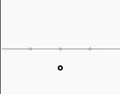
A selection_wave_slider in Flutter is a material design widget utilized for choosing a scope of values. It is an information widget where we can set a range of values by dragging or pushing the ideal position. and also can draggable possition to the bootom. Typically, we utilize the slider widget for changing a value. Along these lines, it is needed to store the value in a variable. This widget has a slider class that requires the onChanged() work. This capacity will be called at whatever point we change the slider position.
Getting Started #
Add dependancy to your pubspec.yaml
dependencies:
  ...
  selection_wave_slider: any
Properties #
| Properties | Required | Description |
|---|---|---|
| optionToChoose | true | list of string (list size must be less than 10) |
| onSelected | true | call back provide selected value |
| sliderHeight | false | Slider Height |
| toolTipBackgroundColor | false | Tool tip background color |
| toolTipBorderColor | false | Tool tip border color |
| toolTipTextStyle | false | Tool tip text style |
| dragButtonColor | false | Draggable object color |
| selected | false | initial selected value |
| dragButton | false | custom drag widget |
| sliderColor | false | Slider color |
| sliderPointColor | false | Color of point present on slider |
| sliderPointBorderColor | false | draggable object border color |
Usage #
         WaveSliderWithDragPoint(
              dragButton: Container(
                color: Colors.blue,
              ),
              sliderHeight: 80,
              sliderPointColor: Colors.blue,
              sliderPointBorderColor: Colors.orange,
              sliderColor: Colors.red,
              toolTipBackgroundColor: Colors.yellow,
              toolTipBorderColor: Colors.green,
              toolTipTextStyle: TextStyle(
                color: Colors.green,
                fontSize: 14,
                fontWeight: FontWeight.w500,
              ),
              onSelected: (value) {
                print(value);
              },
              optionToChoose: [
                "Yes",
                "May Be",
                "No",
              ],
            )
Metadata
13
likes
120
points
14
downloads
Documentation
Publisher
unverified uploader
Weekly Downloads
Metadata
A selection_wave_slider in Flutter is a material design widget utilized for choosing a scope of values.
Repository (GitHub)
View/report issues
License
 unknown (license)