quick_button 1.0.0  quick_button: ^1.0.0 copied to clipboard
 pozadkey.com
A customizable button widget for Flutter applications that allows you to easily create buttons with various attributes and behaviors.
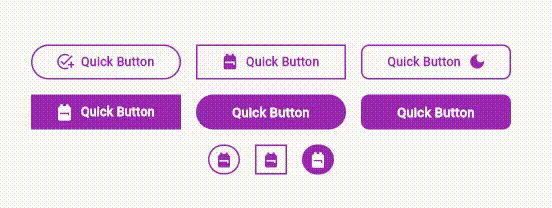
QuickButton #
A customizable button widget for Flutter applications that allows you to easily create buttons with various attributes and behaviors.
Resources #
Installation #
To use this package, add quick_button as a dependency in your pubspec.yaml file:
dependencies:
  flutter:
    sdk: flutter
  quick_button: ^1.0.0 # Use the latest version
Usage #
Import the package in your Dart code:
import 'package:quick_button/quick_button.dart';
You can then use the QuickButton widget to create buttons with different variations:
QuickButton(
  labelText: 'Submit',
  onPressed: () {
    // Action to perform when the button is pressed
  },
)

QuickButton.icon(
  icon: Icons.star,
  onPressed: () {
    // Action to perform when the button is pressed
  },
)

QuickButton.prefixIcon(
  labelText: 'Start',
  prefixIcon: Icons.play_arrow,
  onPressed: () {
    // Action to perform when the button is pressed
  },
)

QuickButton.suffixIcon(
  labelText: 'End',
  suffixIcon: Icons.stop,
  onPressed: () {
    // Action to perform when the button is pressed
  },
)
Attributes #
labelText: The label text displayed on the button.labelColor: The color of the label text.labelSize: The font size of the label text.labelWeight: The font weight of the label text.labelSpacing: The spacing between characters in the label text.icon: The icon placed within the button.prefixIcon: The icon placed before the label text.suffixIcon: The icon placed after the label text.iconSize: The size of all icons. Default value is15.0.buttonWidth: The width of the button. Default value is150.0.buttonHeight: The height of the button.borderRadius: The degree of the roundness for the corners of the button.borderColor: The color of the border surrounding the button.borderSize: The width of the border surrounding the button. Default value is1.0.backgroundColor: The background color of the button.hoverIn: The color of the label text when the mouse moves within the widget.backgroundHoverIn: The background color of button when the mouse moves within the widget.hoverOut: The color of the label text when the mouse moves outside the widget.backgroundHoverOut: The background color of button when the mouse moves outside the widget.onPressed: Callback function to execute when the button is pressed.
Callback #
All variations of the QuickButton widget require an onPressed callback function that gets triggered when the button is pressed.
License #
This package is released under the MIT License.
Contributions #
Contributions are welcome! If you find any issues or want to enhance this package, feel free to submit a pull request here.
Metadata
Publisher
Metadata
A customizable button widget for Flutter applications that allows you to easily create buttons with various attributes and behaviors.
Repository (GitHub)
View/report issues
Documentation
License
 MIT (LICENSE)