material_you_dynamic_theme 0.0.8  material_you_dynamic_theme: ^0.0.8 copied to clipboard
A Flutter package to dynamically change app theme based on phone wallpaper.
material_you_dynamic_theme #
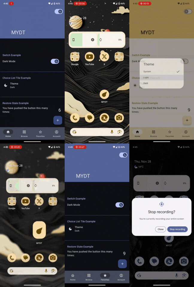
A Flutter package that dynamically changes the app's theme based on the dominant colors extracted from the device's wallpaper. This package leverages Android's Dynamic Colors feature (API level 31 and above) for a seamless and visually appealing user experience.
Note: This package currently focuses on Android.
How to use it? #
1. Add the package to pubspec.yaml dependency:
dependencies:
  material_you_dynamic_theme: ^0.0.8
2. Import package:
import 'package:material_you_dynamic_theme/material_you_dynamic_theme.dart';
3. Initialize and use the package:
void main() {
  WidgetsFlutterBinding.ensureInitialized();
  runAppDynamic(
    home: MyHomePage(),
  );
}

Using the Dynamic Color Scheme #
The material_you_dynamic_theme package generates a theme with a ColorScheme reflecting the dominant colors of the device's wallpaper. This ColorScheme provides a consistent and accessible way to access various colors within your application's UI. To use it, access the Theme.of(context).colorScheme. property within your widgets.
Accessing Color Scheme Properties:
The ColorScheme object offers a variety of properties representing different color roles, ensuring accessibility and consistency. Here are some key properties:
primary: The main color of your application. Used for primary buttons, toolbars, and other prominent UI elements.onPrimary: The color used for text and icons on theprimarybackground. Should provide sufficient contrast.secondary: A secondary color, often used for less prominent UI elements.onSecondary: The color used for text and icons on thesecondarybackground.background: The color used for the main background of your app.onBackground: The color used for text and icons on thebackground.surface: The color for surfaces like cards and dialogs.onSurface: The color for text and icons on surfaces.error: The color used for error messages and indicators.onError: The color for text and icons displayed within error messages.brightness: Indicates whether theColorSchemeis light or dark.
Example Usage:
class test extends StatelessWidget {
  const test({super.key});

  @override
  Widget build(BuildContext context) {
    return Scaffold(

      backgroundColor: Theme.of(context).colorScheme.background,

      body: Column(
        children: [

          ElevatedButton(
            onPressed: () {/* Your button action */},
            style: ElevatedButton.styleFrom(
              backgroundColor: Theme.of(context).colorScheme.primary,
            ),
            child: Text(
              'Primary Button',
              style: TextStyle(color: Theme.of(context).colorScheme.onPrimary),
            ),
          ),


          Text(
            'Background Text',
            style: TextStyle(color: Theme.of(context).colorScheme.onBackground),
          ),


          Container(
            color: Theme.of(context).colorScheme.surface,
            child: Padding(
              padding: const EdgeInsets.all(8.0),
              child: Text(
                'Surface Text',
                style:
                TextStyle(color: Theme.of(context).colorScheme.onSurface),
              ),
            ),
          ),

        ],
      ),
    );
  }
}
This example demonstrates how to use the colorScheme to style an ElevatedButton, a Text widget on the background, and a container showing surface color. Remember to adapt these examples to your specific UI elements and design preferences.
Custom Widget #
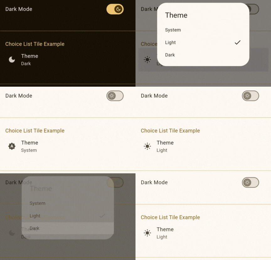
The package provides custom widgets for convenient theme management: A simple switch to toggle between light dark & system themes.
Using ChangeThemeSwitchWidget:

class test extends StatelessWidget {
  const test({super.key});
  @override
  Widget build(BuildContext context) {
    return Scaffold(
      body: Center(
        child: ListTile(
          title: Text('Dark Mode'),
          trailing: ChangeThemeSwitchWidget(),
        ),
      ),
    );
  }
}
Using ChangeThemeChoiceListTileWidget:

class test extends StatelessWidget {
  const test({super.key});
  @override
  Widget build(BuildContext context) {
    return Scaffold(
      body: Center(
        child: ChangeThemeChoiceListTileWidget(),
      ),
    );
  }
}
Important Considerations: #
Contrast: Always ensure sufficient contrast between text and background colors for accessibility.
Theme Data: The generated theme may not always provide perfectly contrasting colors. Consider adding logic to handle edge cases or fallback to default colors if necessary.
Accessibility: Prioritize accessible color combinations, especially for users with visual impairments. Refer to accessibility guidelines for suitable color contrast ratios.
This detailed documentation section clarifies how to leverage the dynamically generated ColorScheme effectively within your application, improving readability and usability for developers integrating your package. Remember to update the example with actual widget usages relevant to your package.
Important Considerations: #
Android API Level: This package requires Android API level 31 or higher to fully utilize the Dynamic Colors API. For older versions, a fallback theme will be used.
Contributing: #
Contributions are welcome! Please open issues for bug reports and feature requests.
Developer #
© All rights reserved.