flutter_widget_from_html_core 0.12.0-alpha.2  flutter_widget_from_html_core: ^0.12.0-alpha.2 copied to clipboard
 daohoangson.com
Flutter package to render html as widgets that focuses on correctness and extensibility.
Flutter Widget from HTML (core) #

Flutter package to render html as widgets that focuses on correctness and extensibility. Supports 70+ most popular tags.
| Live demo | |
|---|---|
 |
 |
Getting Started #
Add this to your app's pubspec.yaml file:
dependencies:
  flutter_widget_from_html_core: ^0.12.0-0
Usage #
Then you have to import the package with:
import 'package:flutter_widget_from_html_core/flutter_widget_from_html_core.dart';
And use HtmlWidget where appropriate:
HtmlWidget(
// the first parameter (`html`) is required
'''
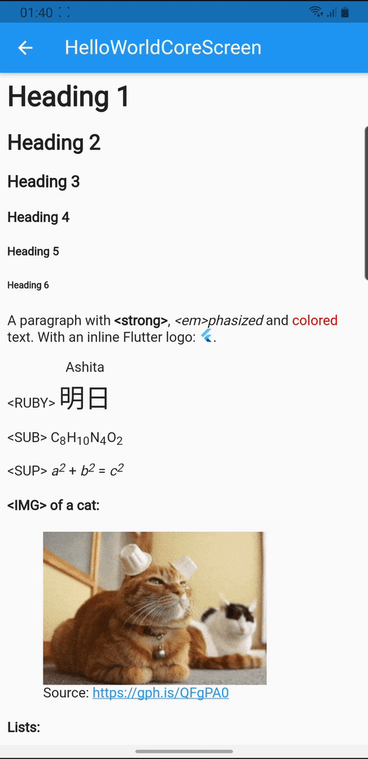
<h1>Heading 1</h1>
<h2>Heading 2</h2>
<h3>Heading 3</h3>
<!-- anything goes here -->
''',
// all other parameters are optional, a few notable params:
// specify custom styling for an element
// see supported inline styling below
customStylesBuilder: (element) {
if (element.classes.contains('foo')) {
return {'color': 'red'};
}
return null;
},
// render a custom widget
customWidgetBuilder: (element) {
if (element.attributes['foo'] == 'bar') {
return FooBarWidget();
}
return null;
},
// these callbacks are called when a complicated element is loading
// or failed to render allowing the app to render progress indicator
// and fallback widget
onErrorBuilder: (context, element, error) => Text('$element error: $error'),
onLoadingBuilder: (context, element, loadingProgress) => CircularProgressIndicator(),
// this callback will be triggered when user taps a link
onTapUrl: (url) => print('tapped $url'),
// select the render mode for HTML body
// by default, a simple `Column` is rendered
// consider using `ListView` or `SliverList` for better performance
renderMode: RenderMode.column,
// set the default styling for text
textStyle: TextStyle(fontSize: 14),
),
Features #
HTML tags #
Below tags are the ones that have special meaning / styling, all other tags will be parsed as text. Compare between Flutter rendering and browser's.
- A: underline, theme accent color with scroll to anchor support
- H1/H2/H3/H4/H5/H6
- IMG with support for asset (
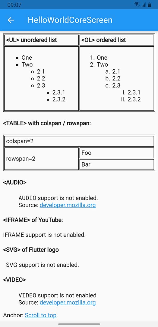
asset://), data uri, local file (file://) and network image - LI/OL/UL with support for:
- Attributes:
type,start,reversed - Inline style
list-style-typevalues:lower-alpha,upper-alpha,lower-latin,upper-latin,circle,decimal,disc,lower-roman,upper-roman,square
- Attributes:
- TABLE/CAPTION/THEAD/TBODY/TFOOT/TR/TD/TH with support for:
- TABLE attributes
border,cellpadding,cellspacing - TD/TH attributes
colspan,rowspan,valign
- TABLE attributes
- ABBR, ACRONYM, ADDRESS, ARTICLE, ASIDE, B, BIG, BLOCKQUOTE, BR, CENTER, CITE, CODE, DD, DEL, DETAILS, DFN, DIV, DL, DT, EM, FIGCAPTION, FIGURE, FONT, FOOTER, HEADER, HR, I, INS, KBD, MAIN, MARK, NAV, NOSCRIPT, P, PRE, Q, RP, RT, RUBY, S, SAMP, SECTION, SMALL, STRIKE, STRONG, STYLE, SUB, SUMMARY, SUP, TT, U, VAR
- Everything with screenshot: https://demo.fwfh.dev/supported/tags.html
- Try with fwfh.dev
These tags requires flutter_widget_from_html:
- AUDIO
- IFRAME
- SVG
- VIDEO
These tags and their contents will be ignored:
- SCRIPT
- STYLE
Attributes #
- align: center/end/justify/left/right/start/-moz-center/-webkit-center
- dir: auto/ltr/rtl
Inline stylings #
- background: 1 value (color)
- background-color
- border: 3 values (width style color), 2 values (width style) or 1 value (width)
- border-top, border-right, border-bottom, border-left
- border-block-start, border-block-end
- border-inline-start, border-inline-end
- border-radius: 4, 3, 2 or 1 values with slash support (e.g.
10px / 20px)- border-top-left-radius: 2 values or 1 value in
em,ptandpx - border-top-right-radius: 2 values or 1 value in
em,ptandpx - border-bottom-right-radius: 2 values or 1 value in
em,ptandpx - border-bottom-left-radius: 2 values or 1 value in
em,ptandpx
- border-top-left-radius: 2 values or 1 value in
- color: hex values,
rgb(),hsl()or named colors - direction (similar to
dirattribute) - font-family
- font-size: absolute (e.g.
xx-large), relative (larger,smaller) or values inem,%,ptandpx - font-style: italic/normal
- font-weight: bold/normal/100..900
- line-height:
normal, number or values inem,%,ptandpx - margin: 4 values, 2 values or 1 value in
em,ptandpx- margin-top, margin-right, margin-bottom, margin-left
- margin-block-start, margin-block-end
- margin-inline-start, margin-inline-end
- padding: 4 values, 2 values or 1 value in
em,ptandpx- padding-top, padding-right, padding-bottom, padding-left
- padding-block-start, padding-block-end
- padding-inline-start, padding-inline-end
- vertical-align: baseline/top/bottom/middle/sub/super
- text-align (similar to
alignattribute) - text-decoration
- text-decoration-color
- text-decoration-line: line-through/none/overline/underline
- text-decoration-style: dotted/dashed/double/solid
- text-decoration-thickness, text-decoration-width: values in
%only
- text-overflow: clip/ellipsis. Note:
text-overflow: ellipsisshould be used in conjuntion withmax-linesor-webkit-line-clampfor better result. - white-space: pre/normal/nowrap
- Sizing:
autoor values inem,%,ptandpx- width, max-width, min-width
- height, max-height, min-height
Extensibility #
This package implements widget building logic with high testing coverage to ensure correctness. It tries to render an optimal tree by using RichText with specific TextStyle, merging text spans together, showing images in sized box, etc. The idea is to build a solid foundation for apps to customize easily. There are two ways to alter the output widget tree.
- Use callbacks like
customStylesBuilderorcustomWidgetBuilderfor small changes - Use a custom
WidgetFactoryfor complete control of the rendering process
The enhanced package (flutter_widget_from_html) uses a custom WidgetFactory with pre-built mixins for easy usage:
- fwfh_cached_network_image for optimized image rendering
- fwfh_chewie for VIDEO support
- fwfh_just_audio for AUDIO support
- fwfh_svg for SVG support
- fwfh_url_launcher to launch URLs
- fwfh_webview for IFRAME support
Callbacks #
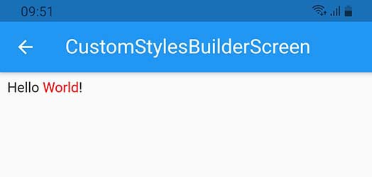
For cosmetic changes like color, italic, etc., use customStylesBuilder to specify inline styles (see supported list above) for each DOM element. Some common conditionals:
- If HTML tag is H1
element.localName == 'h1' - If the element has
fooCSS classelement.classes.contains('foo') - If an attribute has a specific value
element.attributes['x'] == 'y'
This example changes the color for a CSS class:
|
|
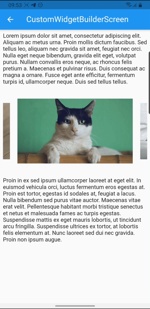
For fairly simple widget, use customWidgetBuilder. You will need to handle the DOM element and its children manually.
This example renders a carousel (live demo, try with fwfh.dev):
Custom WidgetFactory #
The HTML string is parsed into DOM elements and each element is visited once to prepare BuildTrees.
flowchart TD
    _addBitsFromNode[/process DOM element/] --> ifIsText{TEXT?} --->|yes\n\nBuildTree.addText\nBuildTree.addWhitespace| bitOK( )

    ifIsText --->|no| ifCustomWidget{customWidget?} -->|yes\n\nHtmlWidget.\ncustomWidgetBuilder| customWidget[/render custom widget/] --> bitOK

    ifCustomWidget -->|no| _parseEverything[/parse styles/] -->|WidgetFactory.parse\nBuildOp.defaultStyles\nHtmlWidget.customStylesBuilder\nWidgetFactory.parseStyle\nWidgetFactory.parseStyleDisplay| _parseOK( ) ~~~ _addBitsFromNodeOK
    _parseOK -.->|process children\nelements recursively| _addBitsFromNode -.->|BuildOp.onChild| _addBitsFromNodeOK( ) -->|BuildOp.onParsed| ifIsBlock{block\nelement?} -->|no| appendSubTree>ready for\ninline rendering] -->|BuildOp.\nonRenderInline| bitOK

    ifIsBlock -->|yes\n\nBuildOp\n.onRenderBlock| appendBuiltSubTree[/render block/] --> bitOK
Notes:
- Styling can be changed with
HtmlStyleBuilder, register your callback to be called when the build context is ready.- The first parameter is a
HtmlStylewhich is immutable and is calculated from the root down to each element, the callback must return a newHtmlStyleby callingcopyWith. It's recommended to return the same object if no change is needed. - Optionally, pass any object on enqueue and your callback will receive it as the second parameter.
- The first parameter is a
// example 1: simple callback setting accent color from theme
tree.apply(
  (style, _) => style.copyWith(
    textStyle: style.textStyle.copyWith(
      color: style.getDependency<ThemeData>().accentColor,
    ),
  ),
  null,
);

// example 2: callback using second param to set alignment
HtmlStyle callback(HtmlStyle style, TextAlign value) =>
  style.copyWith(textAlign: value)

// example 2 (continue): register with some value
tree.apply(callback, TextAlign.justify);
- Other complicated styling are supported via
BuildOp
tree.register(BuildOp(
  onParsed: (tree) {
    // can be used to change text, inline contents, etc.
    tree.append(...);
  },
  onRenderBlock: (tree, child) {
    // use this to render special widget, wrap it into something else, etc.
    return MyCustomWidget(child: child);
  },
  // depending on the rendering logic, you may need to adjust the execution order to "jump the line"
  priority: 9999,
));
- Each tree may have as many style builder callbacks and build ops as needed.
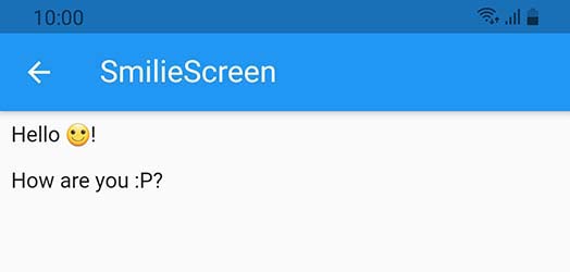
The example below replaces smilie inline image with an emoji:
smilie.dart
const kHtml = """
<p>Hello <img class="smilie smilie-1" alt=":)" src="http://domain.com/sprites.png" />!</p>
<p>How are you <img class="smilie smilie-2" alt=":P" src="http://domain.com/sprites.png" />?
""";

const kSmilies = {':)': '🙂'};

class SmilieScreen extends StatelessWidget {
  @override
  Widget build(BuildContext context) => Scaffold(
        appBar: AppBar(
          title: Text('SmilieScreen'),
        ),
        body: Padding(
          padding: const EdgeInsets.all(8.0),
          child: HtmlWidget(
            kHtml,
            factoryBuilder: () => _SmiliesWidgetFactory(),
          ),
        ),
      );
}

class _SmiliesWidgetFactory extends WidgetFactory {
  final smilieOp = BuildOp(
    onParsed: (tree) {
      final alt = tree.element.attributes['alt'];
      tree.addText(kSmilies[alt] ?? alt);
    },
  );

  @override
  void parse(BuildTree tree) {
    final e = tree.element;
    if (e.localName == 'img' &&
        e.classes.contains('smilie') &&
        e.attributes.containsKey('alt')) {
      tree.register(smilieOp);
      return;
    }

    return super.parse(tree);
  }
}
Metadata
Publisher
Metadata
Flutter package to render html as widgets that focuses on correctness and extensibility.
Homepage
Repository (GitHub)
View/report issues
License
 unknown (LICENSE)
Dependencies
csslib, flutter, fwfh_text_style, html, logging