flutter_typeahead 1.4.1  flutter_typeahead: ^1.4.1 copied to clipboard
A highly customizable typeahead (autocomplete) text input field for Flutter
Flutter TypeAhead #
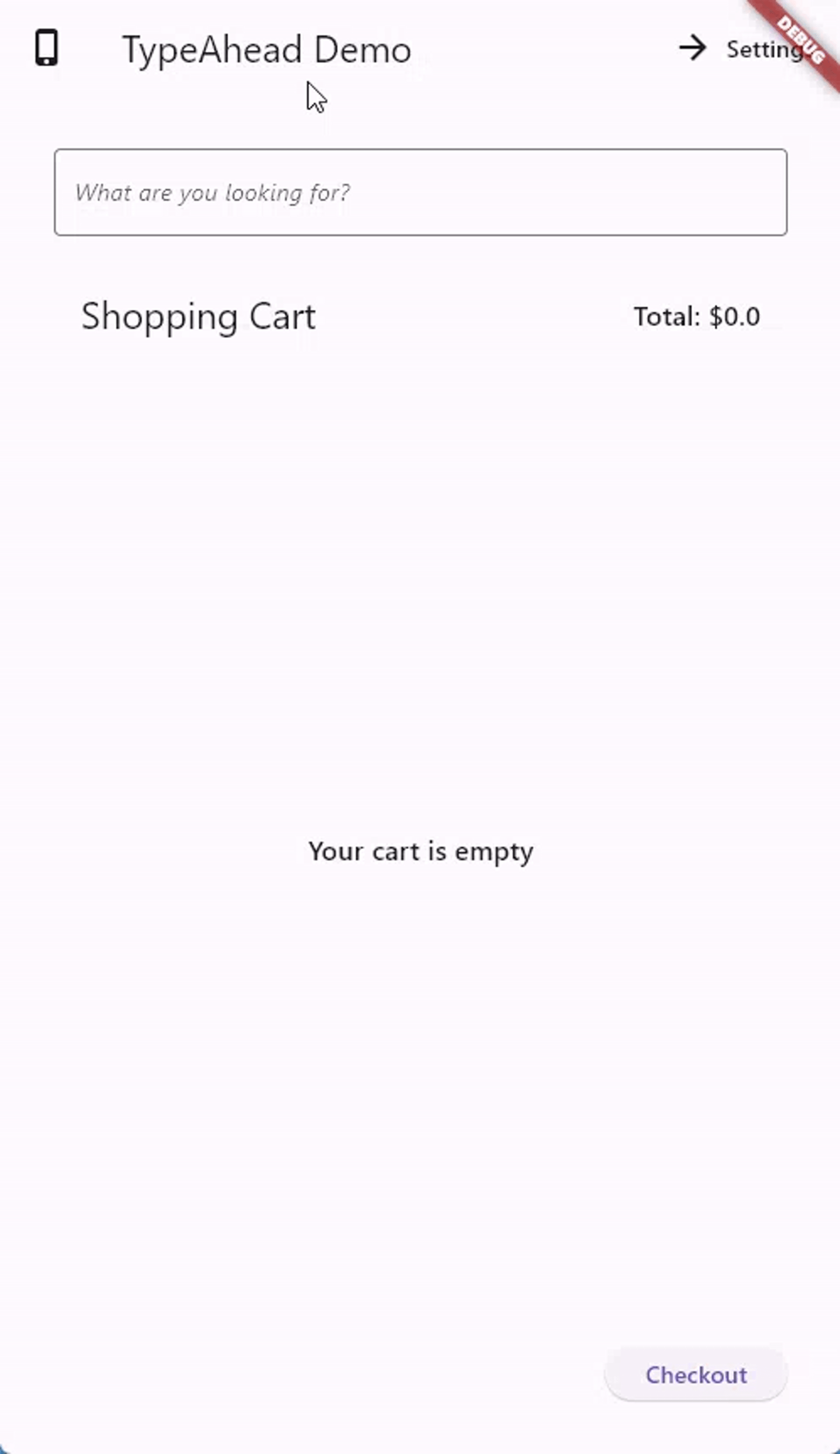
A TypeAhead (autocomplete) widget for Flutter, where you can show suggestions to users as they type
Features #
- Shows suggestions in an overlay that floats on top of other widgets
- Allows you to specify what the suggestions will look like through a builder function
- Allows you to specify what happens when the user taps a suggestion
- Accepts all the parameters that traditional TextFields accept, like decoration, custom TextEditingController, text styling, etc.
- Provides two versions, a normal version and a FormField version that accepts validation, submitting, etc.
- Provides high customizability; you can customize the suggestion box decoration, the loading bar, the animation, the debounce duration, etc.
Installation #
See the installation instructions on pub.
Usage examples #
You can import the package with:
import 'package:flutter_typeahead/flutter_typeahead.dart';
and then use it as follows:
Example 1: #
TypeAheadField(
  textFieldConfiguration: TextFieldConfiguration(
    autofocus: true,
    style: DefaultTextStyle.of(context).style.copyWith(
      fontStyle: FontStyle.italic
    ),
    decoration: InputDecoration(
      border: OutlineInputBorder()
    )
  ),
  suggestionsCallback: (pattern) async {
    return await BackendService.getSuggestions(pattern);
  },
  itemBuilder: (context, suggestion) {
    return ListTile(
      leading: Icon(Icons.shopping_cart),
      title: Text(suggestion['name']),
      subtitle: Text('\$${suggestion['price']}'),
    );
  },
  onSuggestionSelected: (suggestion) {
    Navigator.of(context).push(MaterialPageRoute(
      builder: (context) => ProductPage(product: suggestion)
    ));
  },
)
In the code above, the textFieldConfiguration property allows us to
configure the displayed TextField as we want. In this example, we are
configuring the autofocus, style and decoration properties.
The suggestionsCallback is called with the search string that the user
types, and is expected to return a List of data either synchronously or
asynchronously. In this example, we are calling an asynchronous function
called BackendService.getSuggestions which fetches the list of
suggestions.
The itemBuilder is called to build a widget for each suggestion.
In this example, we build a simple ListTile that shows the name and the
price of the item. Please note that you shouldn't provide an onTap
callback here. The TypeAhead widget takes care of that.
The onSuggestionSelected is a callback called when the user taps a
suggestion. In this example, when the user taps a
suggestion, we navigate to a page that shows us the information of the
tapped product.
Example 2: #
Here's another example, where we use the TypeAheadFormField inside a Form:
final GlobalKey<FormState> _formKey = GlobalKey<FormState>();
final TextEditingController _typeAheadController = TextEditingController();
String _selectedCity;
...
Form(
  key: this._formKey,
  child: Padding(
    padding: EdgeInsets.all(32.0),
    child: Column(
      children: <Widget>[
        Text(
          'What is your favorite city?'
        ),
        TypeAheadFormField(
          textFieldConfiguration: TextFieldConfiguration(
            controller: this._typeAheadController,
            decoration: InputDecoration(
              labelText: 'City'
            )
          ),
          suggestionsCallback: (pattern) {
            return CitiesService.getSuggestions(pattern);
          },
          itemBuilder: (context, suggestion) {
            return ListTile(
              title: Text(suggestion),
            );
          },
          transitionBuilder: (context, suggestionsBox, controller) {
            return suggestionsBox;
          },
          onSuggestionSelected: (suggestion) {
            this._typeAheadController.text = suggestion;
          },
          validator: (value) {
            if (value.isEmpty) {
              return 'Please select a city';
            }
          },
          onSaved: (value) => this._selectedCity = value,
        ),
        SizedBox(height: 10.0,),
        RaisedButton(
          child: Text('Submit'),
          onPressed: () {
            if (this._formKey.currentState.validate()) {
              this._formKey.currentState.save();
              Scaffold.of(context).showSnackBar(SnackBar(
                content: Text('Your Favorite City is ${this._selectedCity}')
              ));
            }
          },
        )
      ],
    ),
  ),
)
Here, we assign to the controller property of the textFieldConfiguration
a TextEditingController that we call _typeAheadController.
We use this controller in the onSuggestionSelected callback to set the
value of the TextField to the selected suggestion.
The validator callback can be used like any FormField.validator
function. In our example, it checks whether a value has been entered,
and displays an error message if not. The onSaved callback is used to
save the value of the field to the _selectedCity member variable.
The transitionBuilder allows us to customize the animation of the
suggestion box. In this example, we are returning the suggestionsBox
immediately, meaning that we don't want any animation.
Customizations #
TypeAhead widgets consist of a TextField and a suggestion box that shows as the user types. Both are highly customizable
Customizing the TextField #
You can customize the text field using the textFieldConfiguration property.
You provide this property with an instance of TextFieldConfiguration,
which allows you to configure all the usual properties of TextField, like
decoration, style, controller, focusNode, autofocus, enabled,
etc.
Customizing the Suggestions Box #
TypeAhead provides default configurations for the suggestions box. You can,
however, override most of them. This is done by passing a SuggestionsBoxDecoration
to the suggestionsBoxDecoration property.
Customizing the loader, the error and the "no items found" message
You can use the loadingBuilder, errorBuilder and noItemsFoundBuilder to
customize their corresponding widgets. For example, to show a custom error
widget:
errorBuilder: (BuildContext context, Object error) =>
  Text(
    '$error',
    style: TextStyle(
      color: Theme.of(context).errorColor
    )
  )
By default, the suggestions box will maintain the old suggestions while new
suggestions are being retrieved. To show a circular progress indicator
during retrieval instead, set keepSuggestionsOnLoading to false.
Hiding the Suggestions Box
There are three scenarios when you can hide the suggestions box.
Set hideOnLoading to true to hide the box while suggestions are being
retrieved. This will also ignore the loadingBuilder. Set hideOnEmpty
to true to hide the box when there are no suggestions. This will also ignore
the noItemsFoundBuilder. Set hideOnError to true to hide the box when there
is an error retrieving suggestions. This will also ignore the errorBuilder.
By default, the suggestions box will automatically hide when the keyboard is hidden.
To change this behavior, set hideSuggestionsOnKeyboardHide to false.
Customizing the animation
You can customize the suggestion box animation through 3 parameters: the
animationDuration, the animationStart, and the transitionBuilder.
The animationDuration specifies how long the animation should take, while the
animationStart specified what point (between 0.0 and 1.0) the animation
should start from. The transitionBuilder accepts the suggestionsBox and
animationController as parameters, and should return a widget that uses
the animationController to animate the display of the suggestionsBox.
For example:
transitionBuilder: (context, suggestionsBox, animationController) =>
  FadeTransition(
    child: suggestionsBox,
    opacity: CurvedAnimation(
      parent: animationController,
      curve: Curves.fastOutSlowIn
    ),
  )
This uses FadeTransition
to fade the suggestionsBox into the view. Note how the
animationController was provided as the parent of the animation.
In order to fully remove the animation, transitionBuilder should simply
return the suggestionsBox. This callback could also be used to wrap the
suggestionsBox with any desired widgets, not necessarily for animation.
Customizing the debounce duration
The suggestions box does not fire for each character the user types. Instead,
we wait until the user is idle for a duration of time, and then call the
suggestionsCallback. The duration defaults to 300 milliseconds, but can be
configured using the debounceDuration parameter.
Customizing the offset of the suggestions box
By default, the suggestions box is displayed 5 pixels below the TextField.
You can change this by changing the suggestionsBoxVerticalOffset property.
Customizing the decoration of the suggestions box
You can also customize the decoration of the suggestions box using the
suggestionsBoxDecoration property. For example, to remove the elevation
of the suggestions box, you can write:
suggestionsBoxDecoration: SuggestionsBoxDecoration(
  elevation: 0.0
)
Customizing the growth direction of the suggestions list
By default, the list grows towards the bottom. However, you can use the direction property to customize the growth direction to be one of AxisDirection.down or AxisDirection.up, the latter of which will cause the list to grow up, where the first suggestion is at the bottom of the list, and the last suggestion is at the top.
Set autoFlipDirection to true to allow the suggestions list to automatically flip direction whenever it detects that there is not enough space for the current direction. This is useful for scenarios where the TypeAheadField is in a scrollable widget or when the developer wants to ensure the list is always viewable despite different user screen sizes.
For more information #
Visit the API Documentation
Team: #
 |
 |
 |
|---|---|---|
| AbdulRahman AlHamali | S McDowall | Kenneth Liang |
Shout out to the contributors! #
This project is the result of the collective effort of contributors who participated effectively by submitting pull requests, reporting issues, and answering questions. Thank you for your proactiveness, and we hope flutter_typeahead made your lifes at least a little easier!
How you can help #
Metadata
Publisher
unverified uploader
Metadata
A highly customizable typeahead (autocomplete) text input field for Flutter
Repository (GitHub)
View/report issues
License
 unknown (license)