flutter_calendar_collection 1.0.2  flutter_calendar_collection: ^1.0.2 copied to clipboard
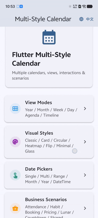
A comprehensive Flutter calendar widget library featuring multiple view modes, visual styles, date pickers, and business scenarios like attendance, booking, and lunar calendar.
flutter_calendar_collection #

A comprehensive Flutter calendar widget library featuring multiple view modes, visual styles, date pickers, and real-world business scenarios -- all in one package.
Features #
Views #
- Year View -- 12-month thumbnail grid for annual planning and heatmaps
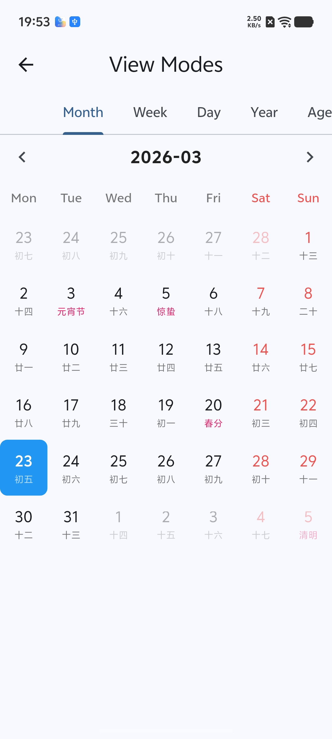
- Month View -- Classic 7x6 date grid with optional lunar calendar display
- Week View -- 7-day columns with a shared hourly time ruler
- Day View -- 24-hour timeline with draggable and resizable event cards
- Agenda View -- Vertical event list grouped by date
- Timeline View -- Horizontal Gantt-style track layout for project management
- Scroll Picker -- Infinite-scroll wheel picker for date selection
Visual Styles #
- Classic grid, card-based, and minimal layouts
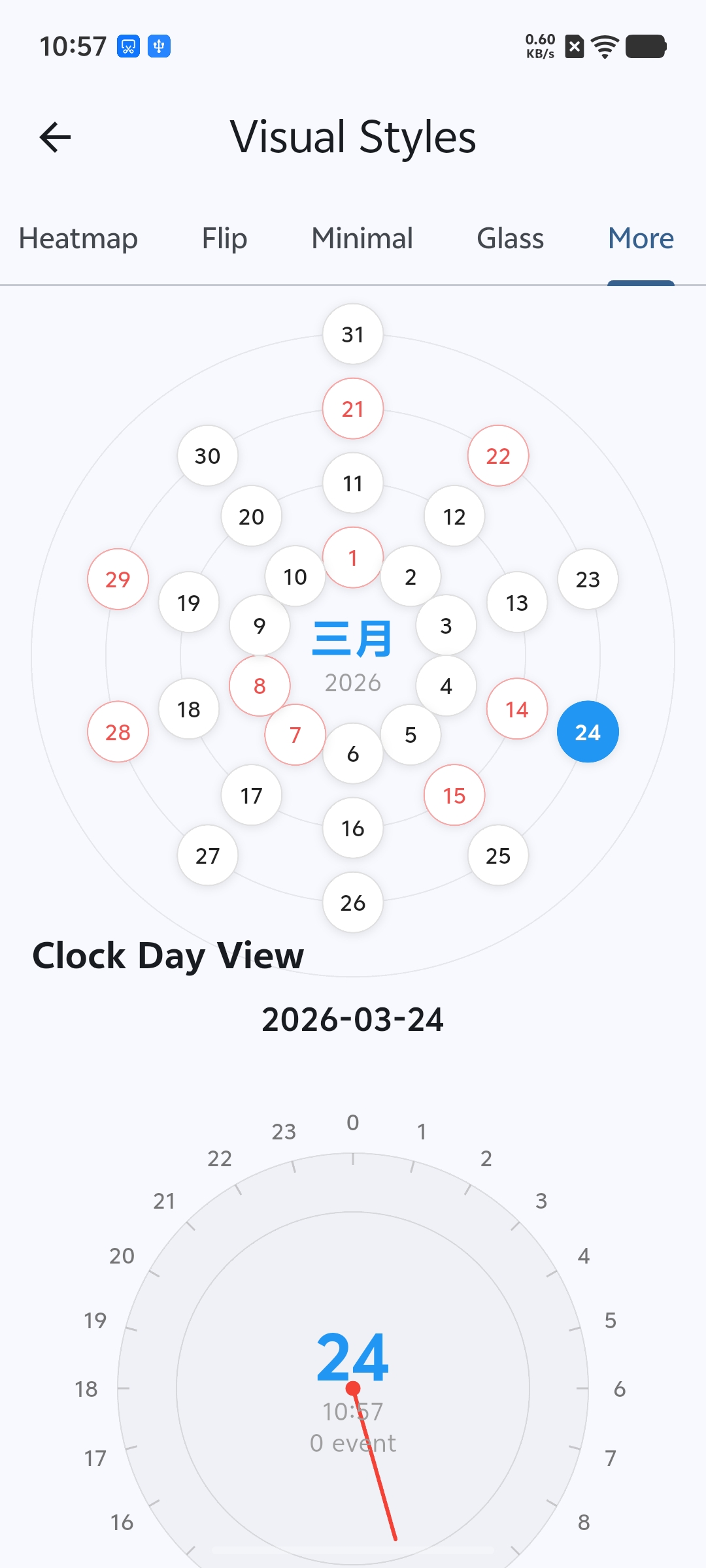
- Circular / ring / clock face designs
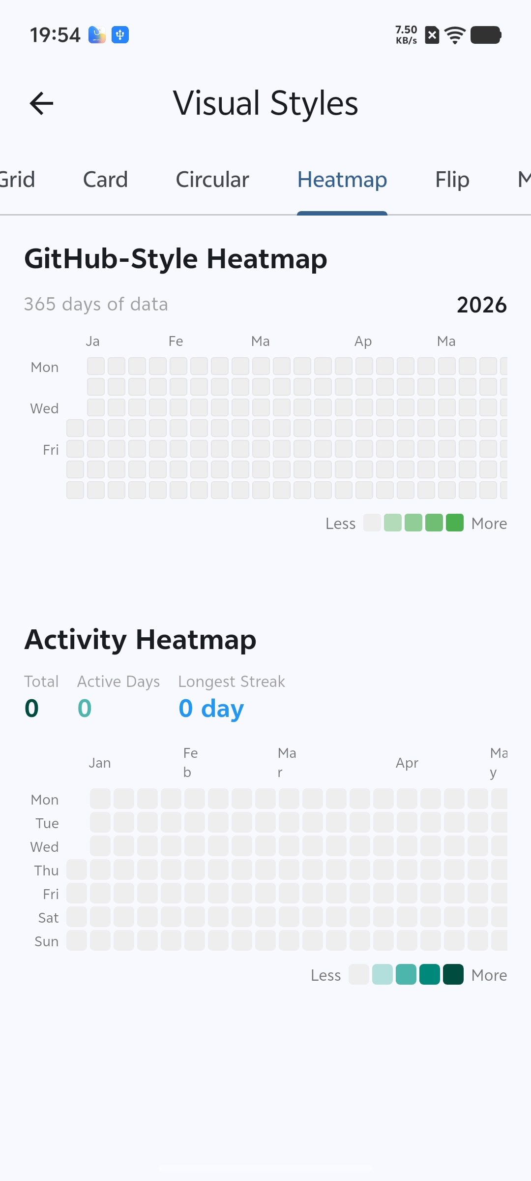
- GitHub-style activity heatmap
- 3D flip calendar with page-turn animation
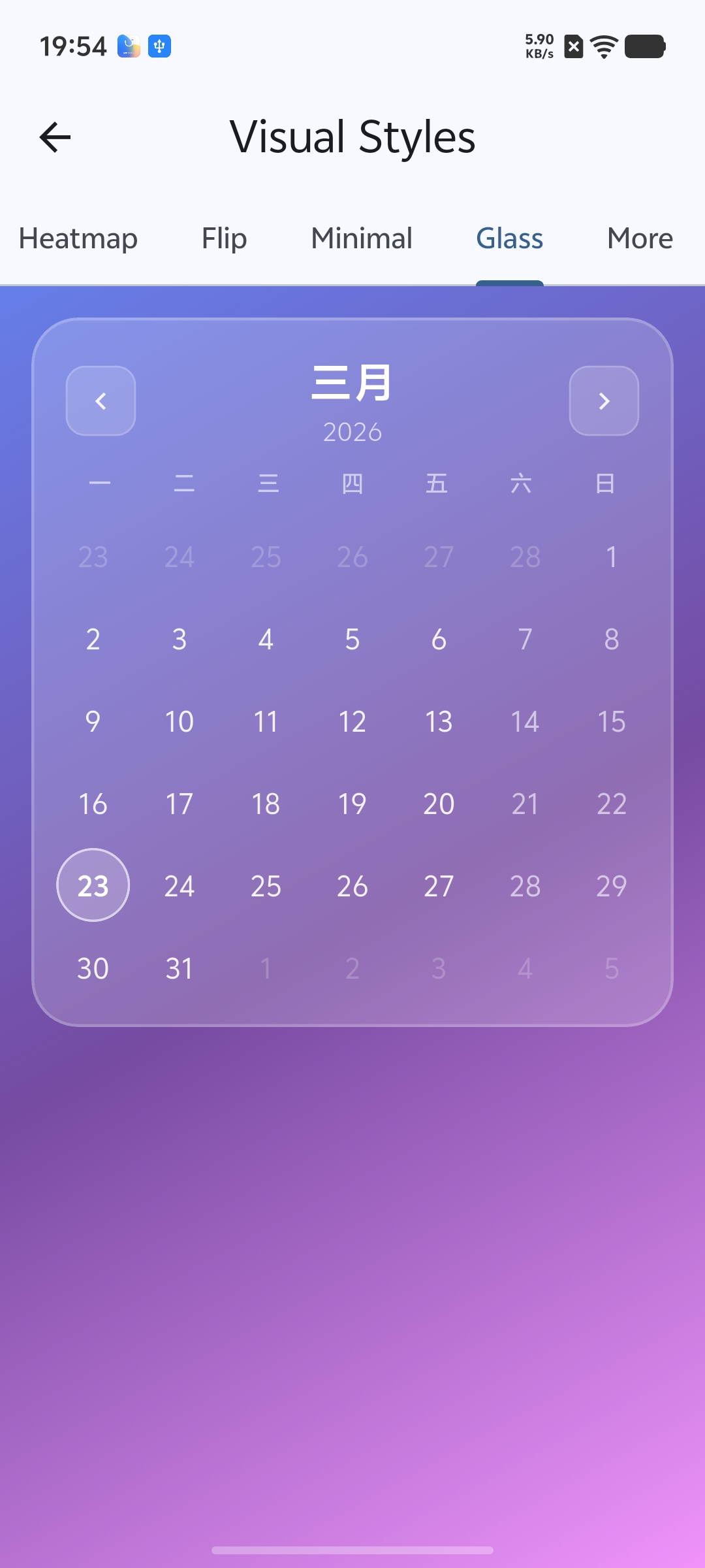
- Glassmorphism (frosted glass) theme
Date Pickers #
- Single date picker
- Multi-date picker
- Date range picker
- Month picker and year picker
- Combined date-time picker
Business Scenarios #
- Attendance Calendar -- check-in/check-out tracking with status icons and statistics
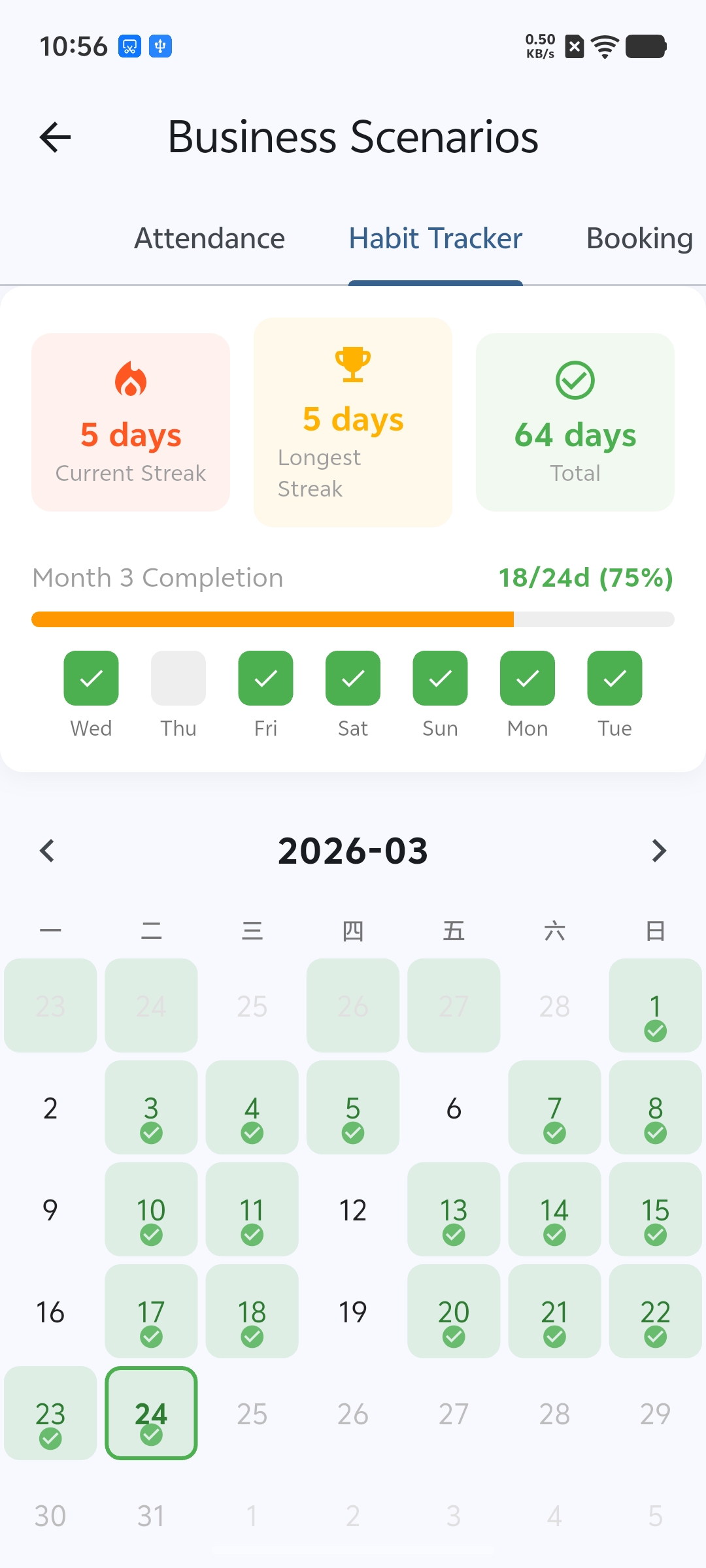
- Habit Tracker -- streak counter and completion heatmap
- Booking Calendar -- time-slot availability grid
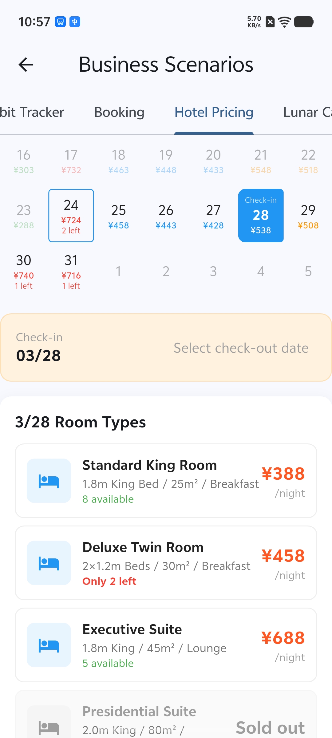
- Hotel Pricing Calendar -- per-night prices with room availability
- Chinese Lunar Calendar -- festivals, solar terms, and daily fortune
- Period Tracker -- cycle prediction and symptom logging
- Countdown Calendar -- milestone tracking
- Shared Calendar -- multi-member colors with conflict detection
Calendar Systems #
- Gregorian (default)
- Chinese Lunar (with zodiac, Gan-Zhi stems, solar terms)
- Islamic (Hijri)
Interactions #
- Single, multi, and range date selection
- Event drag-and-drop (long press)
- Event duration resize
- Swipe to switch months/weeks
Screenshots #
| Month View (Lunar) | Heatmap Styles | Glassmorphism Style |
|---|---|---|
 |
 |
 |
| Habit Tracker | Hotel Pricing | Circular & Clock Styles |
|---|---|---|
 |
 |
 |
| Demo |
|---|
 |
Installation #
Add the package to your pubspec.yaml:
dependencies:
  flutter_calendar_collection: ^1.0.0
Then run:
flutter pub get
Quick Start #
Wrap your app in a ProviderScope (the library uses Riverpod internally):
import 'package:flutter/material.dart';
import 'package:flutter_riverpod/flutter_riverpod.dart';
import 'package:flutter_calendar_collection/flutter_calendar_collection.dart';

void main() {
  runApp(const ProviderScope(child: MyApp()));
}
Display a basic month view:
class BasicCalendarPage extends StatefulWidget {
  const BasicCalendarPage({super.key});

  @override
  State<BasicCalendarPage> createState() => _BasicCalendarPageState();
}

class _BasicCalendarPageState extends State<BasicCalendarPage> {
  DateTime _currentMonth = DateTime(DateTime.now().year, DateTime.now().month);
  DateTime? _selectedDate;

  @override
  Widget build(BuildContext context) {
    return Column(
      children: [
        CalendarHeader(
          currentDate: _currentMonth,
          onPrevious: () => setState(() {
            _currentMonth = DateTime(_currentMonth.year, _currentMonth.month - 1);
          }),
          onNext: () => setState(() {
            _currentMonth = DateTime(_currentMonth.year, _currentMonth.month + 1);
          }),
          onToday: () => setState(() {
            _currentMonth = DateTime(DateTime.now().year, DateTime.now().month);
          }),
        ),
        WeekHeader(firstDayOfWeek: 1), // Monday start
        Expanded(
          child: MonthGrid(
            month: _currentMonth,
            selectedDate: _selectedDate,
            onDateTap: (date) => setState(() => _selectedDate = date),
          ),
        ),
      ],
    );
  }
}
Usage Examples #
Month View with Lunar Calendar #
Enable lunar date display, solar terms, and holiday labels through CalendarConfig:
MonthGrid(
  month: DateTime(2026, 3),
  config: const CalendarConfig(
    showLunar: true,
    showSolarTerms: true,
    showHolidays: true,
  ),
  selectedDate: _selectedDate,
  onDateTap: (date) => setState(() => _selectedDate = date),
)
Each day cell will show the Chinese lunar date beneath the Gregorian date. Solar terms and festivals are highlighted automatically when they fall on a given day.
Date Range Picker #
Open a range picker dialog and receive the selected start and end dates:
final range = await DateRangePicker.show(
  context,
  initialRange: DateRange(DateTime(2026, 3, 10), DateTime(2026, 3, 15)),
  minDate: DateTime(2026, 1, 1),
  maxDate: DateTime(2026, 12, 31),
);

if (range != null) {
  print('Selected: ${range.start} to ${range.end}');
}
For single date selection use SingleDatePicker.show:
final date = await SingleDatePicker.show(
  context,
  initialDate: DateTime.now(),
  minDate: DateTime(2020, 1, 1),
  maxDate: DateTime(2030, 12, 31),
);
Week View #
Display a full week with hourly time slots and events:
WeekView(
  weekStart: DateTime(2026, 3, 23),
  config: const CalendarConfig(
    dayStartHour: 8,
    dayEndHour: 20,
  ),
  events: myEvents,
  onTimeTap: (dateTime) {
    // User tapped an empty time slot
  },
  onEventTap: (event) {
    // User tapped an existing event
  },
)
Attendance Calendar #
Drop in the pre-built attendance tracking widget. It includes monthly statistics, a color-coded calendar grid, a legend, and a detail panel for the selected date:
const AttendanceCalendar()
The widget manages its own state and generates sample data out of the box. In a real application you would supply attendance records through a provider or constructor parameters.
Configuration #
CalendarConfig centralizes all calendar behavior. All fields have sensible defaults so you only need to override what you want to change:
const CalendarConfig(
  // Calendar system
  system: CalendarSystem.gregorian,   // gregorian | lunar | islamic
  firstDayOfWeek: 1,                  // 1 = Monday, 7 = Sunday
  locale: Locale('zh', 'CN'),

  // Current view
  viewType: CalendarViewType.month,   // year | month | week | day | agenda | timeline

  // Display toggles
  showWeekNumber: false,
  showLunar: true,
  showHolidays: true,
  showSolarTerms: true,

  // Day/week view hours
  dayStartHour: 0,
  dayEndHour: 24,
  timeSlotMinutes: 30,

  // Selection behavior
  selectionMode: SelectionMode.single, // none | single | multiple | range

  // Interaction toggles
  enableDrag: false,
  enableResize: false,
  enableCreate: true,

  // Date constraints
  minDate: null,
  maxDate: null,
  disabledDates: null,
)
Use copyWith to derive a new config from an existing one:
final custom = config.copyWith(showLunar: false, selectionMode: SelectionMode.range);
Localization #
The library ships with built-in Chinese (zh) and English (en) locale support. The active locale is determined by the standard Flutter localization mechanism. To enable it, add flutter_localizations to your dependencies and configure your MaterialApp:
MaterialApp(
  localizationsDelegates: const [
    GlobalMaterialLocalizations.delegate,
    GlobalWidgetsLocalizations.delegate,
    GlobalCupertinoLocalizations.delegate,
  ],
  supportedLocales: const [
    Locale('en'),
    Locale('zh'),
  ],
  // ...
)
All calendar labels -- month names, weekday abbreviations, button text, status descriptions -- adapt automatically to the current locale.
Contributing #
Contributions are welcome! To get started:
- Fork the repository.
- Create a feature branch:
git checkout -b feature/my-feature. - Make your changes and ensure they pass
flutter analyzeandflutter test. - Commit with a clear message and open a pull request.
Please follow the existing code style and add tests for new functionality.
License #
This project is licensed under the MIT License. See the LICENSE file for details.
Metadata
Documentation
Publisher
unverified uploader
Weekly Downloads
Metadata
A comprehensive Flutter calendar widget library featuring multiple view modes, visual styles, date pickers, and business scenarios like attendance, booking, and lunar calendar.
Repository (GitHub)
View/report issues
Topics
#calendar #flutter-widget #date-picker #lunar-calendar #scheduling
License
 MIT (license)
Dependencies
collection, equatable, fl_chart, flutter, flutter_animate, flutter_localizations, flutter_riverpod, intl, lunar, uuid