dynamo_calendar 1.0.1  dynamo_calendar: ^1.0.1 copied to clipboard
A Flutter project that Supports flexible and customizable calendar/date-time picker widget for Flutter applications, supporting multiple modes
dynamo_calendar #
A powerful, multi-mode Flutter calendar widget designed for flexibility. Whether you need a simple date picker, a precise time picker, or a full-scale event scheduler, Dynamo Calendar handles the complexity so you can focus on your app's logic.
Optimized for desktop, tablets, and small-screen apps; android, iOS, and web.

🌟 Features #
Four distinct modes:
-
Simple date selection
-
Time selection only
-
Combined date + time selection
-
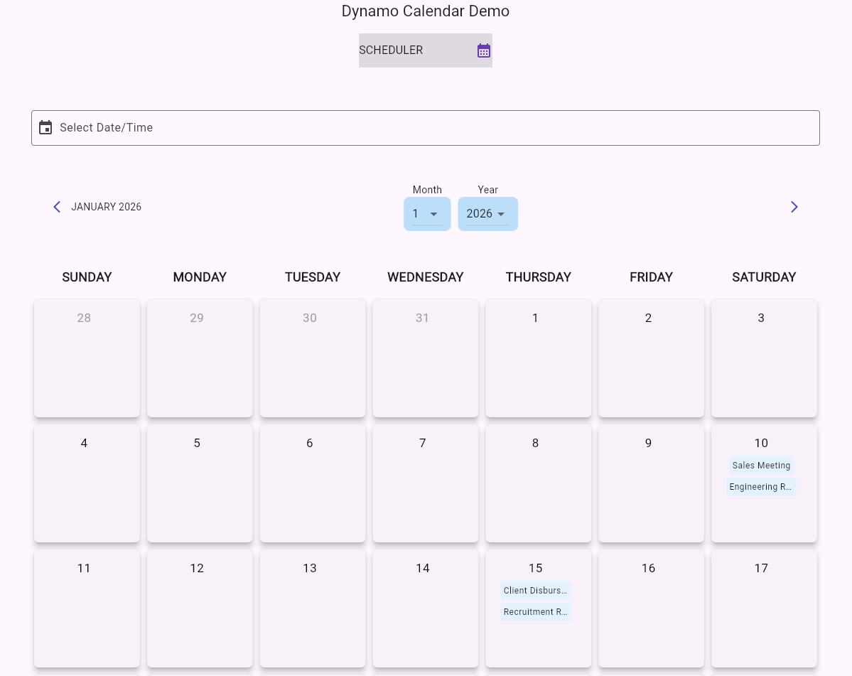
Full scheduler with event visualization & interaction
-
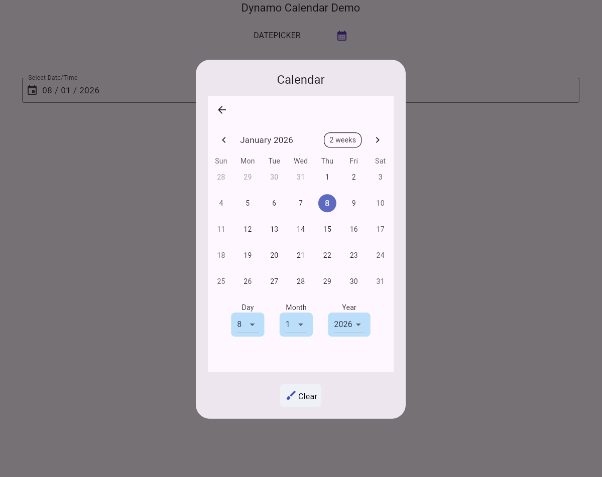
📅 Date Picker: Selection of single dates with a clean, modern UI.
-
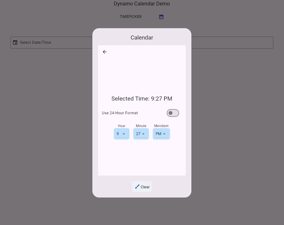
⏰ Time Picker: Precise hour and minute selection.
-
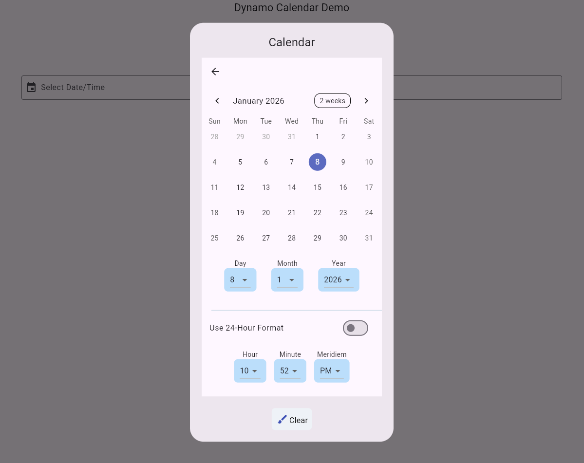
🌓 Date & Time: Combined picker for appointments and deadlines.
-
🗓️ Scheduler Mode: View and interact with a list of events assigned to specific dates.
-
📱 Responsive: Built-in support for both Mobile and Desktop/Web layouts.
📦 Installation #
Add the dependency to your pubspec.yaml:
dependencies:
  dynamo_calendar: ^1.0.0
Or run:
flutter pub add dynamo_calendar
🚀 Usage #
Import the library
import 'package:dynamo_calendar/dynamo_calendar.dart';
Datepicker Example
    showDialog(
      context: context,
      builder: (context) => Material(
        type: MaterialType.transparency,
        child: DynamoCalendar(
          calendarMode: CalendarMode.datePicker,
          selectedDate: selectedDate,
          onDateSelected: (datePicked) {
            selectedDate = datePicked;
            _updateText(selectedDate != null ? DateUtil.getStandardDate(selectedDate) : "");
          },
        ),
      ),
    );
Timepicker Example
    showDialog(
      context: context,
      builder: (context) => Material(
        type: MaterialType.transparency,
        child: DynamoCalendar(
          key: ValueKey(++_counter),
          calendarMode: CalendarMode.timePicker,
          selectedTime: selectedTimeOfDay,
          onTimeSelected: (timePicked) {
            selectedTimeOfDay = timePicked;
            _updateText(selectedTimeOfDay?.format(context) ?? "");
          },
        ),
      ),
    );
Date & Time Picker Example
    showDialog(
      context: context,
      builder: (context) => Material(
        type: MaterialType.transparency,
        child: DynamoCalendar(
          calendarMode: CalendarMode.dateAndTimePicker,
          selectedDate: selectedDate,
          onDateSelected: (datePicked) {
            selectedDate = datePicked;
            _updateText(selectedDate != null ? DateUtil.getStandardDate(selectedDate, verbose: true) : "");
          },
        ),
      ),
    );
Scheduler Example
      DynamoCalendar(
        calendarMode: CalendarMode.scheduler,
        selectedDate: selectedDate,
        calendarEvents: myCalendarEvents,
        onShowDetailsPressed: (events) => _showEventDetails(context, events),
        onDateSelected: (date) {
          // Navigator logic for new event
        },
      ),
Implementation Tips
ReadOnly TextFields: When using a TextField as a trigger, set readOnly: true.
This prevents the system keyboard from overlapping your beautiful calendar.

Event Handling: In scheduler mode, the onShowDetailsPressed returns a list of events.
You can use this to show a detail sheet or a custom popup with event description details.
🧪 Example #
A complete working example is available in /example, showcasing:
- Datepicker
- Timepicker
- Date & Time Picker
- Scheduler
🎥 Demo #
📄 License #
This project is licensed under the Apache 2.0 License - see the LICENSE file for details.
🤝 Contributing #
Contributions, issues, and feature requests are welcome! Feel free to check the issues page.
Metadata
Publisher
unverified uploader
Weekly Downloads
Metadata
A Flutter project that Supports flexible and customizable calendar/date-time picker widget for Flutter applications, supporting multiple modes
Repository (GitHub)
View/report issues
Documentation
License
 Apache-2.0 (license)
Dependencies
cupertino_icons, flutter, intl, logger, table_calendar