clue_ui_component 1.0.8  clue_ui_component: ^1.0.8 copied to clipboard
A UI library file used in the CLUe project, designed to enhance and streamline the development of dynamic and responsive user interfaces.
CLUe UI Component #
Introduction #
The CLUe UI Component was created to ensure the uniformity of Suprema's frontend outputs. It is designed to easily and conveniently implement basic elements that make up the UI, such as various buttons, dropdowns, pop-ups, and more. In addition to the component's style, various functionalities are implemented. For instance, with a customized Dropdown component, some of the items may need to be disabled, multiple items may be clickable, or the default selected item may need to be indicated separately.
Usage #
When GlobalKey is already used in the app #
import 'package:flutter/material.dart';

// import clue component module
import 'package:clue_ui_component/clue_ui_component.dart';

final GlobalKey<NavigatorState> myappKey = GlobalKey<NavigatorState>(debugLabel: 'in-your-app-key');

void main() {
  // CAUTION: You must register your key in the clue module.
  setClueGlobalKey(myappKey);

  runApp(SampleApp());
}

class SampleApp extends StatelessWidget {
  @override
  Widget build(BuildContext context) {
    return MaterialApp(
      navigatorKey: myappKey,
      home: Scaffold(
        body: Center(
          child: ClueDropDownButton(
            itemMap: const {"Key1": "value1", "Key2": "value2"},
            onChanged: (String key) {
              ClueOverlay.showSuccessToast(key);
            },
          ),
        ),
      ),
    );
  }
}
When GlobalKey is not used #
import 'package:flutter/material.dart';

// import clue component module
import 'package:clue_ui_component/clue_ui_component.dart';

void main() {
  runApp(SampleApp());
}

class SampleApp extends StatelessWidget {
  @override
  Widget build(BuildContext context) {
    return MaterialApp(
      navigatorKey: clueNavigatorKey, // << Add this line
      home: Scaffold(
        body: Center(
          child: ClueDropDownButton(
            itemMap: const {"Key1": "value1", "Key2": "value2"},
            onChanged: (String key) {
              ClueOverlay.showSuccessToast(key);
            },
          ),
        ),
      ),
    );
  }
}
Description #
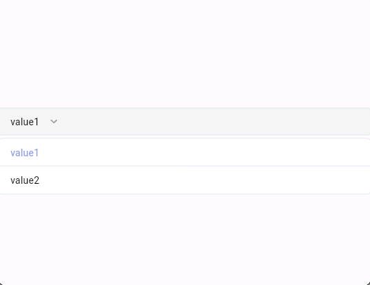
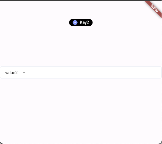
When executed, the DropDown Component is present in the center, and when an item is clicked, the selected item is displayed as a Toast at the top.
Examples #


Visit the HomePage to see the full preview.