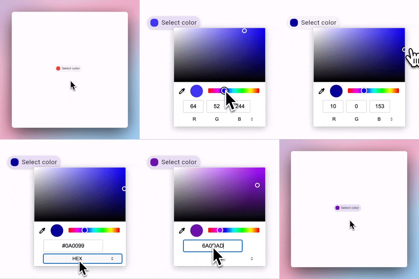
web_color_picker 1.0.1+5  web_color_picker: ^1.0.1+5 copied to clipboard
This package allows you use the native web browser color picker in your Flutter Web app.
A Flutter widget that displays the native web color picker for browsers for use in Flutter Web apps.
Note
This package supports only Flutter web.
Features #
- Default Browser Color Picker: Uses the built-in color picker of web browsers.
- Callbacks for Color Change Events: Notifies you when a color is selected or confirmed.
- Customizable Selector Appearance: Allows you to display a custom widget as the color picker selector.
Usage #
To use the web_color_picker package in your Flutter Web application, follow these steps:
1. Import the Package #
First, make sure to add web_color_picker to your pubspec.yaml dependencies. Then, import it in your Dart code:
import 'package:web_color_picker/web_color_picker.dart';
2. Using The WebColorPicker Widget #
To Display A Custom Color Picker Selector:
Use the WebColorPicker.builder constructor to display a custom color picker selector provided by the builder parameter.
Tapping on the custom color picker will open the browser's color picker.
Here's an example showing how to use an ElevatedButton as the custom color picker selector:

"WebColorPicker.builder(
  initialColor: textColor,
  builder: (context, selectedColor) {
    return ElevatedButton(
      onPressed: () {
        print('ElevatedButton pressed');
      },
      style: ElevatedButton.styleFrom(
        padding: const EdgeInsets.symmetric(
          horizontal: 8,
          vertical: 12,
        ),
      ),
      child: Row(
        mainAxisSize: MainAxisSize.min,
        children: [
          Container(
            width: 20,
            height: 20,
            decoration: BoxDecoration(
              borderRadius: BorderRadius.circular(8),
              color: selectedColor,
            ),
          ),
          const SizedBox(
            width: 8,
          ),
          Text(
            'Select color',
          ),
        ],
      ),
    );
  },
)"
To Display The Default Color Picker Selector:
Use the WebColorPicker constructor to display the browser's default color picker selector.
Here's an example showing how to use the default color picker selector:

WebColorPicker(
  initialColor: Colors.red,
  width: 60.0,
  height: 30.0,
)
3. Handle Color Change Events #
There are two main callbacks you can handle:
- onInput: Triggered whenever a color is selected in the picker.
- onChange: Triggered whenever the picker is dismissed and a color is confirmed.
Each of these callbacks provides the selected Color and the corresponding HTML event:
An example demonstrating the color picker events using the default color picker selector and a custom color picker selector:

WebColorPicker(
  initialColor: textColor,
  onInput: (color, event) {
    setState(() {
      previewTextColor = color;
    });
  },
  onChange: (color, event) {
    setState(() {
      textColor = color;
    });
  },
  // ... other properties
),
See the example directory for a complete example.
Resources #
For more understanding on how the HTML color input (which this package uses) works, check out the following:
-
MDN Documentation:
<input type="color">: An in-depth overview of the HTML color input element. -
Using Color Inputs on MDN: A guide that explains the user interactions and behavior of the color input.
-
Color Inputs: A Deep Dive into Cross-Browser Differences | CSS-Tricks: An article that delves into the cross-browser differences of color inputs.
Apps Using This Library #
- Flutter Gradient Generator - An online tool for creating and customizing gradients for use in Flutter applications. Check it out on GitHub.