spotlight_ant 1.0.1  spotlight_ant: ^1.0.1 copied to clipboard
Spotlight the widget by wrapping it and with highly flexible configuration.
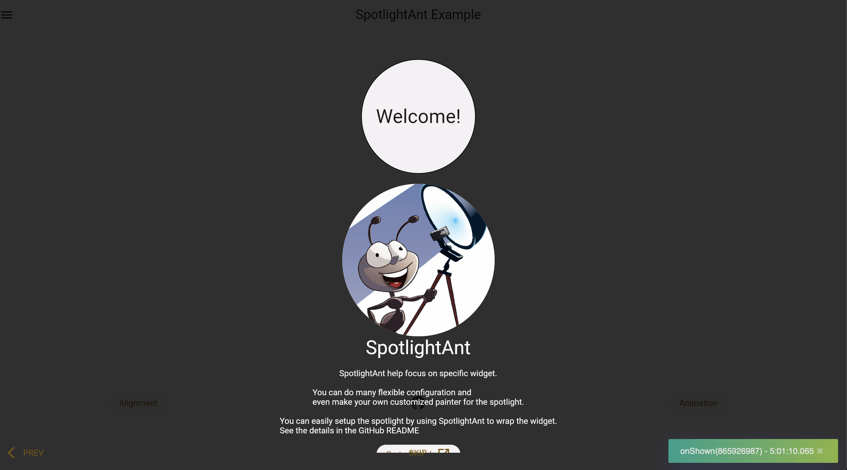
SpotlightAnt helps focus on specific widget with highly flexible configuration.
This package is separated from my project POS-System.
Play it yourself by visiting the online demo page!
See more details in example.
Installation #
flutter pub add spotlight_ant
Usage #
There are two main widget: SpotlightShow and SpotlightAnt.
Each individual SpotlightAnt should with the SpotlightShow widget as a
common ancestor of all of those. Call methods on SpotlightShowState to
show, skip, finish, go next or previous SpotlightAnt that is a descendant
of this SpotlightShow.
To obtain the SpotlightShowState, you may use SpotlightShow.of with a
context whose ancestor is the SpotlightShow, or pass a GlobalKey to the
SpotlightShow constructor and call GlobalKey.currentState.
Widget build(BuildContext context) {
  // Wrap all the SpotlightAnt by SpotlightShow.
  return SpotlightShow(child: Column(children: [
    SpotlightAnt(
      child: MyCircularButton(),
    ),
    SpotlightAnt(
      // Using rectangle spotlight to emphasize it.
      spotlightBuilder: const SpotlightRectBuilder(),
      content: Text('this is my content'),
      child: MyRectButton(),
    ),
  ]);
}
It can also be run by program:
TabBarView(
  controller: _controller,
  children: [
    Container(),
    SpotlightAnt(
      child: Text('child'),
    ),
  ],
);
// ...
final desiredIndex = 1;
_controller.addListener(() {
  if (!_controller.indexIsChanging) {
    if (desiredIndex == _controller.index) {
      // Get the SpotlightShow from descent context.
      SpotlightShow.of(context).start();
    }
  }
});
Configuration #
The configuration of SpotlightAnt:
| Name | Default | Desc. |
|---|---|---|
| enable | true |
Whether show this ant or not. |
| monitorId | null |
Monitor widget's visibility and start the show after it shown. |
| spotlight | SpotlightConfig | Customize spotlight. |
| backdrop | SpotlightBackdropConfig | Customize backdrop. |
| action | SpotlightActionConfig | Customize actions. |
| duration | SpotlightDurationConfig | Customize animation duration. |
| contentLayout | SpotlightContentLayoutConfig | Customize layout of content. |
| bumpRatio | 0.1 |
How big outer area you want in bump animation. |
| content | null |
Content beside spotlight. |
| onShown | null |
Callback before zoom in. |
| onShow | null |
Callback after zoom in. |
| onDismiss | null |
Callback before zoom out. |
| onDismissed | null |
Callback after zoom out. |
| child | required | The spotlight target. |
The configuration of SpotlightShow:
| Name | Default | Desc. |
|---|---|---|
| showAfterInit | true |
If you want to fire it by program, set it to false |
| showWaitFuture | null |
Pass the Future and it will wait until it done and start the show. |
| onSkip | null |
Callback after tapping SpotlightAntAction.skip. |
| onFinish | null |
Callback after finish the show. |
Go to API doc for details.
SpotlightConfig #
Configuration for the spotlight.
| Name | Default | Desc. |
|---|---|---|
| builder | SpotlightCircularBuilder |
Allow any builder that extends from SpotlightBuilder. |
| padding | EdgeInsets.all(8) |
- |
| silent | false |
Disable capturing spotlight's tap event which will start to show next spotlight. |
| usingInkwell | true |
Use GestureDetector instead of Inkwell. |
| splashColor | null |
Inkwell property. |
SpotlightBackdropConfig #
Configuration for the backdrop.
| Name | Default | Desc. |
|---|---|---|
| silent | false |
Disable capturing backdrop's tap event which will start to show next spotlight. |
| usingInkwell | true |
Use GestureDetector instead of Inkwell. |
| splashColor | null |
Inkwell property. |
SpotlightActionConfig #
Configuration for the actions.
| Name | Default | Desc. |
|---|---|---|
| enabled | [SpotlightAntAction.skip] |
Actions showing in bottom, customize it by actionBuilder |
| builder | null |
Build the actions wrapper |
| next | null |
Change SpotlightAntAction.next default widget |
| prev | null |
- |
| skip | null |
- |
SpotlightDurationConfig #
Configuration for the animation duration.
| Name | Default | Desc. |
|---|---|---|
| zoomIn | Duration(milliseconds: 600) |
- |
| zoomOut | Duration(milliseconds: 600) |
- |
| bump | Duration(milliseconds: 500) |
Argument for AnimationController.repeat |
| contentFadeIn | Duration(milliseconds: 300) |
- |
SpotlightContentLayoutConfig #
Configuration for the layout of content.
| Name | Default | Desc. |
|---|---|---|
| alignment | null |
Auto-detect it or specify it. |
| prefer | ContentPreferLayout.vertical |
Prefer content shown in which side. |
Customize #
It can be easy to customize your painter:
class MyCustomSpotlightBuilder extends SpotlightBuilder {
  @override
  SpotlightPainter build(Rect target, double value, bool isBumping) {
    // ...
  }

  @override
  double inkwellRadius(Rect target) => 0;
}

class _Painter extends SpotlightPainter {
  @override
  /// The [size] should be the window's size
  void paint(Canvas canvas, Size size) {
    // ...
  }
}
Actions is also easy too:
SpotlightAnt(
  skipAction: TextButton.icon(
    onPressed: () => SpotlightShow.of(context).skip(),
    label: const Text('MY Skip'),
    icon: const Icon(Icons.arrow_forward_ios_sharp),
  ),
  // ...
);

