speed_chart 1.0.1  speed_chart: ^1.0.1 copied to clipboard
An efficient line chart widget featuring both horizontal and vertical axes, allowing interactive gestures for exploring and visualizing data. Supports seamless functionality across both mobile and des [...]
Features #
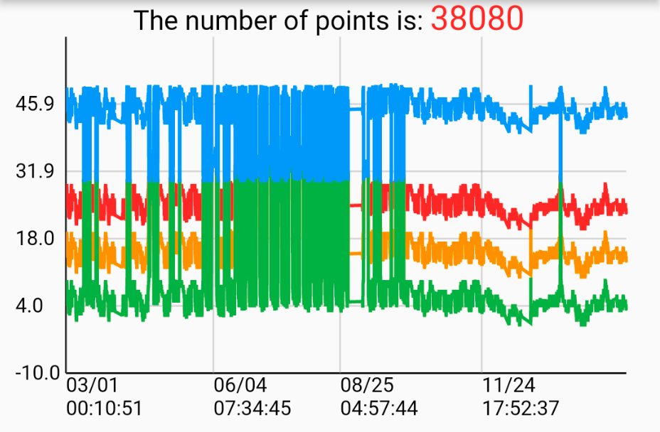
1. Draw more than one group of line series in a line chart.
2. Horizontal scaling (pinch in / pinch out)
3. Horizontal panning
4. Draw a trackball containing a vertical line and corresponding data point on a long press event.
Check my demo video : https://youtu.be/Bh4sUhu9UCM.
Usage #
Prepare data points
LineSeries _getChartData({
    required List data,
    required Color color,
    required String name,
}) {
    List<DateValuePair> dataList = [];
    for (int i = 0; i < data.length; i++) {
        var d = data[i];
        DateTime dateTime = DateTime.parse(d['time'].toString());
        double? value =
            d['value'] == 'null' ? null : double.parse(d['value'].toString());

        dataList.add(DateValuePair(dateTime: dateTime, value: value));
    }

    LineSeries lineSeries = LineSeries(
        name: name,
        dataList: dataList,
        color: color,
    );

    return lineSeries;
}
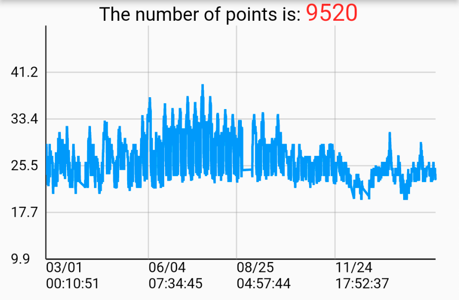
Create a single line chart
List<LineSeries> lineSeriesCollection = [
    _getChartData(
        data: [
            {"time": "2022-09-16 00:41:38", "value": "12.0"},
            {"time": "2022-09-16 00:51:39", "value": "23.0"},
            {"time": "2022-09-16 01:01:38", "value": "65.6"},
        ],
        color: Colors.red,
        name: 'Line0',
        ),
    ]

SpeedLineChart(
    lineSeriesCollection: _lineSeriesCollection0,
    title: _lineSeriesCollection0[0].name,
    showLegend: false,
),
Create a multiple line chart
List<LineSeries> lineSeriesCollection1 = [
    _getChartData(
        data: [
            {"time": "2022-09-16 00:41:38", "value": "12.0"},
            {"time": "2022-09-16 00:51:39", "value": "23.0"},
            {"time": "2022-09-16 01:01:38", "value": "65.6"},
        ],
        color: Colors.red,
        name: 'Line0',
        ),
    _getChartData(
        data: [
            {"time": "2022-09-16 00:41:38", "value": "12.0"},
            {"time": "2022-09-16 00:51:39", "value": "23.0"},
            {"time": "2022-09-16 01:01:38", "value": "65.6"},
        ],
        color: Colors.orange,
        name: 'Line1',
        ),
    ]

SpeedLineChart(
    lineSeriesCollection: _lineSeriesCollection1,
    title: _lineSeriesCollection0[0].name,
    showLegend: false,
),
Knowledge #
整理一些基本知識:
原始資料點(x,y) : (DateTime, Value)
_minDate //最早的日期時間
_maxDate //最晚的日期時間
_minValue //最小值
_maxValue //最大值
_xRange = _maxDate.difference(_minDate).inSeconds.toDouble();
_yRange = _maxValue - _minValue;
- Draw Y-axis labels and horizontal grid lines
固定畫5個刻度在y軸上:yScalePoints = 5
算出y軸的每一個單位的長度:double yStep = size.height / yRange;
算出資料點的取直間隔:double yInterval = yRange / yScalePoints;
用迴圈一個一個畫:
for (int i = 0; i < yScalePoints; i++) {
    double scaleY = size.height - i * yInterval * yStep;

    // Draw horizontal grid line
    canvas.drawLine(Offset(leftOffset, scaleY),
        Offse(size.width - rightOffset + leftOffset, scaleY), _gridPaint);

    // Draw Y-axis scale points
    String label = (i * yInterval + minValue).toStringAsFixed(1);
    _axisLabelPainter.text = TextSpan(
    text: label,
    style: const TextStyle(
        fontSize: 12,
        color: Colors.black,
    ),
    );
    _axisLabelPainter.layout();
    _axisLabelPainter.paint(
        canvas,
        Offset(leftOffset - _axisLabelPainter.width - 4,
            scaleY - _axisLabelPainter.height));
}

/* example
Suppose the canvas’s size.width = 300, size.height = 200 , yRange = 50 , minValue = 10 , maxValue = 60 leftOffset = 10 ,rightOffset = 30
The 5 horizontal grid lines and labels will be:
grid line #0 (10, 200) to (280, 200), label #0 = 10
grid line #1 (10, 160) to (280, 160), label #1 = 20
grid line #2 (10, 120) to (280, 120), label #2 = 30
grid line #3 (10, 80) to (280, 80), label #3 = 40
grid line #4 (10, 40) to (280, 40), label #4 = 50
*/
2. Draw a Y-axis
3. Draw a X-axis
4. Draw X-axis labels and vertical grid lines
使用clipRect框出折線圖中呈現線段的範圍, 這樣子在縮放或平移時, 超出邊界的範圍就會遮住, 不會看起來是畫到邊界外, 但實際上還是有畫只是被遮住
canvas.translate的目的在於定義原點(0,0)位置, 把(leftOffset + offset, 0)的位置定義為(0,0)。
canvas.clipRect(Rect.fromPoints(Offset(leftOffset, 0),
    Offset(size.width + leftOffset - rightOffset + 1, size.height + 40)));
canvas.translate(leftOffset + offset, 0);
算出x軸的每一個單位的長度: double xStep = (size.width * scale - rightOffset) / xRange;
決定要畫幾個刻度在x軸上: int xScalePoints = size.width * scale ~/ 80;
算出資料點的取直間隔: double xInterval = (longestLineSeriesX.dataList.length - 1) / xScalePoints;
使用迴圈畫出所有刻度:
for (int i = 0; i < xScalePoints; i++) {
  double scaleX = (longestLineSeriesX
          .dataList[(i * xInterval).round()].dateTime
          .difference(minDate)
          .inSeconds
          .toDouble() *
      xStep);

  // Draw vertical grid line
  canvas.drawLine(
      Offset(scaleX, 0), Offset(scaleX, size.height), _gridPaint);

  // Draw X-Axis scale points
  DateTime dateTime =
      longestLineSeriesX.dataList[(i * xInterval).round()].dateTime;
  String date = DateFormat('yy-MM-dd').format(dateTime);

  String time = DateFormat('HH:mm:ss').format(dateTime);

  _axisLabelPainter.text = TextSpan(
    text: '$date\n$time',
    style: const TextStyle(
      fontSize: 12,
      color: Colors.black,
    ),
  );
  _axisLabelPainter.layout();
  _axisLabelPainter.paint(canvas, Offset(scaleX, size.height));
}

/* example
Suppose the canvas’s size.width = 390, size.height = 200, xRange = 200, yRange = 50, leftOffset = 10 ,rightOffset = 30
xStep = 400 * 1 / 200 = 2
xScalePoints = 390 * 1 ~/ 80 = 4
xInterval = (200 - 1) / 4 = 49.75
The 5 vertical grid lines and date time labels will be:
grid line #0 (scaleX0, 0) to (scaleX0, 200), label #0 = dataList[0].dateTime
grid line #1 (scaleX1, 0) to (scaleX1, 200), label #1 = dataList[50].dateTime
grid line #2 (scaleX2, 0) to (scaleX2, 200), label #2 = dataList[100].dateTime
grid line #3 (scaleX3, 0) to (scaleX3, 200), label #3 = dataList[149].dateTime
*/
-
畫折現的方式也是一樣
-
如何達到水平平移跟水瓶縮放
可以用GestureDetector的onScaleStart和onScaleUpdate
offset的值是隨著平移圖表時變化的, 帶入canvas.translate來達到平移圖表,類似sliding window在圖表上滑動,決定呈現範圍
計算offset的方法, 假設按下的點為op(已知), 縮放後的點為np(未知), op : 原圖表寬 = np : 新圖表寬(scale * 原圖表寬)
新的offset = op - np
scale的值是用onScaleUpdate提供的值來計算的, 帶入 xStep 來得到縮放單位長度
Additional information #
For more implement detail, refer to my Medium articles:
Create your professional widget in Flutter — Multiple Line Chart (Part.1)
Create your professional widget in Flutter — Multiple Line Chart (Part.2)
Metadata
Publisher
unverified uploader
Weekly Downloads
Metadata
An efficient line chart widget featuring both horizontal and vertical axes, allowing interactive gestures for exploring and visualizing data. Supports seamless functionality across both mobile and desktop platforms.
Repository (GitHub)
View/report issues
License
![]() unknown (license)
unknown (license)