speed_chart 1.0.4  speed_chart: ^1.0.4 copied to clipboard
An efficient line chart widget featuring interactive gestures for visualizing data.
Features #
1. Draw more than one group of line series in a line chart.
2. Horizontal scaling (pinch in / pinch out)
3. Horizontal panning
4. Draw a trackball containing a vertical line and corresponding data point on a long press event.
Check my demo video : https://youtu.be/Bh4sUhu9UCM.
Supported Platforms #
- Android
- iOS
- macOS
- Windows
Usage #
Prepare data points: DateTime format X-Axis
  LineSeries _getChartData({
    required List data,
    required Color color,
    required String name,
    double? maxYAxisValue,
    double? minYAxisValue,
  }) {
    List<ValuePair> dataList = [];
    for (int i = 0; i < data.length; i++) {
      var d = data[i];
      DateTime dateTime = DateTime.parse(d['time'].toString());
      double? value =
          d['value'] == 'null' ? null : double.parse(d['value'].toString());

      dataList.add(ValuePair(x: dateTime, y: value));
    }

    LineSeries lineSeries = LineSeries(
      name: name,
      dataList: dataList,
      color: color,
      maxYAxisValue: maxYAxisValue,
      minYAxisValue: minYAxisValue,
    );

    return lineSeries;
  }
Prepare data points: number format X-Axis
  LineSeries _getGenericTypeChartData({
    required List data,
    required Color color,
    required String name,
    double? maxYAxisValue,
    double? minYAxisValue,
  }) {
    List<ValuePair> dataList = [];
    for (int i = 0; i < data.length; i++) {
      var d = data[i];
      int freq = int.parse(d['freq'].toString());
      double? level =
          d['level'] == 'null' ? null : double.parse(d['level'].toString());

      dataList.add(ValuePair(x: freq, y: level));
    }

    LineSeries lineSeries = LineSeries(
      name: name,
      dataList: dataList,
      color: color,
      maxYAxisValue: maxYAxisValue,
      minYAxisValue: minYAxisValue,
    );

    return lineSeries;
  }
Data structure of the LineSeries
The maxYAxisValue, minYAxisValue are optional, If provided, the y-axis range will be displayed based on the given values. If not provided, the y-axis range will automatically adjust based on the data points."
class LineSeries {
  const LineSeries({
    required this.name,
    required this.dataList,
    required this.color,
    this.maxYAxisValue,
    this.minYAxisValue,
  });

  final String name;
  final List<ValuePair> dataList;
  final Color color;
  final double? maxYAxisValue;
  final double? minYAxisValue;
}
showLegend displays each line series's name and color to identify the corresponding line series in the chart.
showMultipleYAxises displays multiple Y-axes.
showScaleThumbs displays a scale thumb on the chart, used for scaling and panning the line series. It is recommended for use on desktop platforms as an alternative to hand gestures.
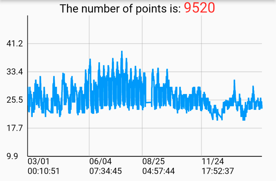
Create a single line chart
List<LineSeries> lineSeriesCollection = [
    _getChartData(
        data: [
            {"time": "2022-09-16 00:41:38", "value": "12.0"},
            {"time": "2022-09-16 00:51:39", "value": "23.0"},
            {"time": "2022-09-16 01:01:38", "value": "65.6"},
        ],
        color: Colors.red,
        name: 'Line0',
        ),
    ]

SpeedLineChart(
    lineSeriesCollection: _lineSeriesCollection0,
    title: _lineSeriesCollection0[0].name,
    showLegend: false,
),
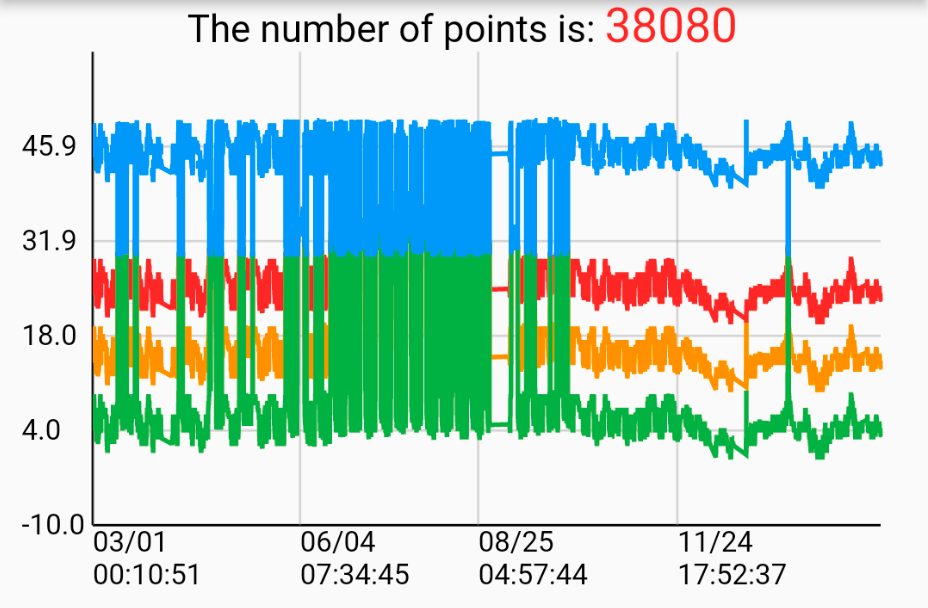
Create a multiple line chart
List<LineSeries> lineSeriesCollection1 = [
    _getChartData(
        data: [
            {"time": "2022-09-16 00:41:38", "value": "12.0"},
            {"time": "2022-09-16 00:51:39", "value": "23.0"},
            {"time": "2022-09-16 01:01:38", "value": "65.6"},
        ],
        color: Colors.red,
        name: 'Line0',
        ),
    _getChartData(
        data: [
            {"time": "2022-09-16 00:41:38", "value": "12.0"},
            {"time": "2022-09-16 00:51:39", "value": "23.0"},
            {"time": "2022-09-16 01:01:38", "value": "65.6"},
        ],
        color: Colors.orange,
        name: 'Line1',
        ),
    ]

SpeedLineChart(
    lineSeriesCollection: _lineSeriesCollection1,
    title: _lineSeriesCollection0[0].name,
    showLegend: false,
),
Additional information #
For more implement detail, refer to my Medium articles:
Create your professional widget in Flutter — Multiple Line Chart (Part.1)
Create your professional widget in Flutter — Multiple Line Chart (Part.2)
Metadata
Publisher
unverified uploader
Weekly Downloads
Metadata
An efficient line chart widget featuring interactive gestures for visualizing data.
Documentation
License
![]() BSD-3-Clause (license)
BSD-3-Clause (license)