shadcn_flutter 0.0.40  shadcn_flutter: ^0.0.40 copied to clipboard
 sunaryathito.space
Beautifully designed components from Shadcn/UI is now available for Flutter
🎨 shadcn_flutter #
Beautifully designed components from shadcn/ui, now available for Flutter


🚀 A comprehensive Flutter UI library inspired by shadcn/ui, providing elegant and customizable components for modern app development.
✨ Features #
- 🎨 70+ Beautiful Components - From basic buttons to complex data tables
- 🌙 Dark/Light Mode - Built-in theme switching with multiple color schemes
- 📱 Responsive Design - Components that work seamlessly across all screen sizes
- 🎯 Type Safe - Full TypeScript-like experience with Dart's strong typing
- 🚀 Performance First - Optimized components for smooth animations and interactions
- 🎨 Customizable - Easy theming and styling to match your brand
- 📦 Tree Shakable - Import only what you need
🧩 Components Library #
🎬 Animation Components
| Component | Description | Preview |
|---|---|---|
| AnimatedValueBuilder | Smooth value transitions with custom curves |  |
| Number Ticker | Animated number counting effects |  |
| RepeatedAnimationBuilder | Looping animations made simple |  |
📂 Disclosure Components
| Component | Description | Preview |
|---|---|---|
| Accordion | Collapsible content sections |  |
| Collapsible | Hide and show content with smooth transitions | 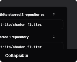 |
📢 Feedback Components
| Component | Description | Preview |
|---|---|---|
| Alert | Display important messages and notifications | 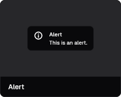 |
| Alert Dialog | Modal dialogs for confirmations and alerts | 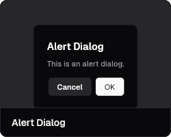 |
| Circular Progress | Loading indicators with smooth animations | 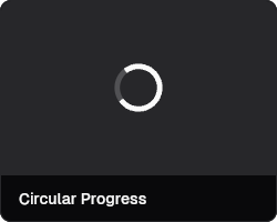 |
| Progress Bar | Linear progress indicators | 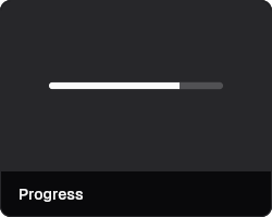 |
| Skeleton | Loading placeholders for content | 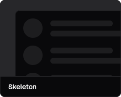 |
| Toast | Non-intrusive notifications | 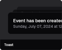 |
📝 Form Components
| Component | Description | Preview |
|---|---|---|
| Button | Customizable buttons with multiple variants | 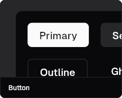 |
| Checkbox | Interactive checkboxes with custom styling | 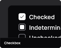 |
| Chip Input | Input field with removable tags | 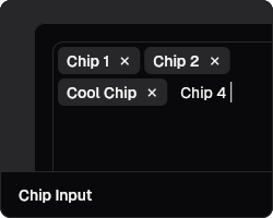 |
| Color Picker | Advanced color selection interface | 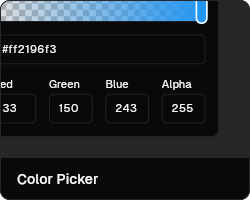 |
| Date Picker | Elegant date selection component | 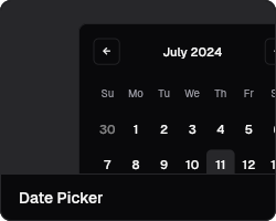 |
| Form | Complete form management system | 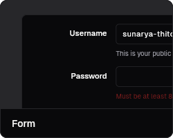 |
| Input | Versatile text input fields | 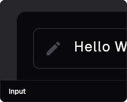 |
| Input OTP | One-time password input component | 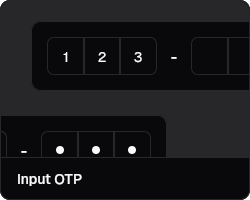 |
| Phone Input | International phone number input | 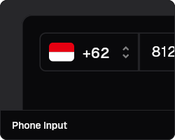 |
| Radio Group | Single selection from multiple options | 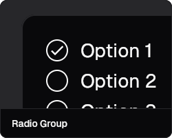 |
| Select | Dropdown selection component | 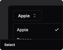 |
| Slider | Range and value selection sliders | 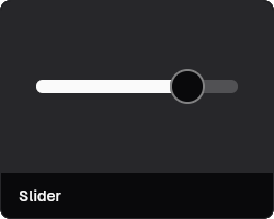 |
| Star Rating | Interactive rating component | 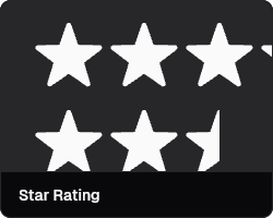 |
| Switch | Toggle switches with smooth animations | 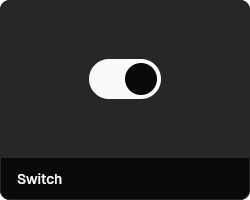 |
| Text Area | Multi-line text input component | 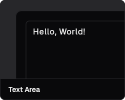 |
| Time Picker | Intuitive time selection interface | 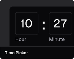 |
| Toggle | Button-style toggle component | 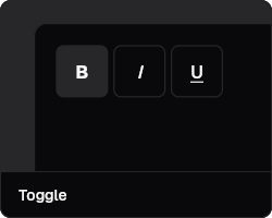 |
📐 Layout Components
| Component | Description | Preview |
|---|---|---|
| Card | Flexible content containers | 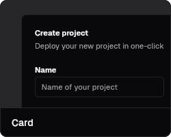 |
| Carousel | Image and content carousels | 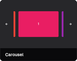 |
| Divider | Visual separation between content | 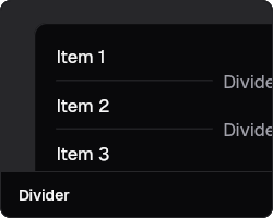 |
| Resizable | User-resizable panels and layouts | 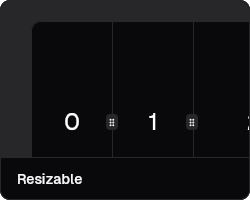 |
| Stepper | Step-by-step process indicators | 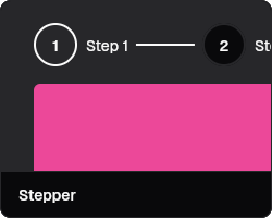 |
| Steps | Progress tracking for multi-step flows | 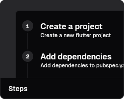 |
| Timeline | Chronological content display | 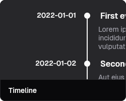 |
🧭 Navigation Components
| Component | Description | Preview |
|---|---|---|
| Breadcrumb | Hierarchical navigation paths | 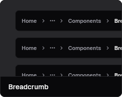 |
| Menubar | Application menu bars | 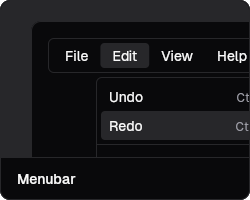 |
| Navigation Menu | Responsive navigation menus | 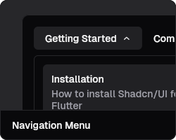 |
| Pagination | Navigate through pages of content | 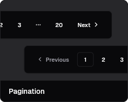 |
| Tabs | Tabbed content organization | 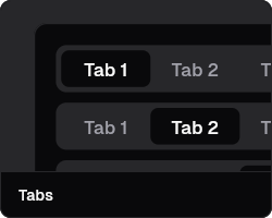 |
| Tab List | Horizontal tab navigation | 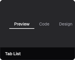 |
| Tree | Hierarchical tree navigation | 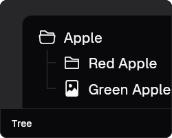 |
🪟 Surface Components
| Component | Description | Preview |
|---|---|---|
| Dialog | Modal dialogs and overlays | 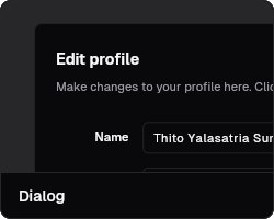 |
| Drawer | Slide-out navigation panels | 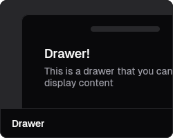 |
| Hover Card | Content previews on hover | 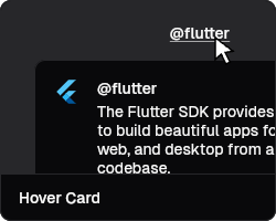 |
| Popover | Contextual popup content | 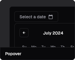 |
| Sheet | Bottom sheets and side panels | 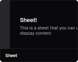 |
| Tooltip | Helpful context information | 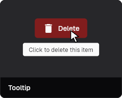 |
📊 Data Display Components
| Component | Description | Preview |
|---|---|---|
| Avatar | User profile pictures and initials |  |
| Avatar Group | Multiple user avatars in groups |  |
| Code Snippet | Syntax-highlighted code blocks |  |
| Tracker | Data visualization and tracking |  |
🔧 Utility Components
| Component | Description | Preview |
|---|---|---|
| Badge | Status indicators and labels | 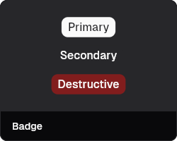 |
| Calendar | Full-featured calendar widget | 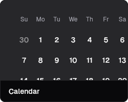 |
| Command | Command palette interface | 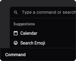 |
| Context Menu | Right-click context menus | 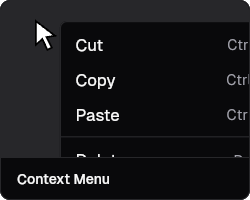 |
| Dropdown Menu | Action menus and dropdowns | 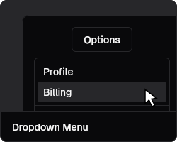 |
🤝 Contributing & Support #
We welcome contributions from the community! Here's how you can help make shadcn_flutter even better:
🌟 Ways to Contribute #
💰 Financial Support
- 💖 GitHub Sponsors - Support ongoing development
- 💰 PayPal - Support ongoing development
- ⭐ Star the repository - Help us reach more developers
- 📢 Share the project - Spread the word in your community
🛠️ Code Contributions
- 🐛 Bug fixes - Help us squash those pesky bugs
- ✨ New features - Add components or enhance existing ones
- 📚 Documentation - Improve guides, examples, and API docs
- 🧪 Testing - Write tests to improve reliability
🗨️ Community Support
- 💬 Join our Discord - Get help and connect with other developers
- 🤝 Help others - Answer questions and share your knowledge
- 📝 Write tutorials - Create blog posts or video tutorials
🏆 Recognition #
This project is funded and maintained by the community. Every contribution, no matter how small, makes a difference and helps ensure the continued development of shadcn_flutter.
Thank you to all our contributors and supporters! 🙏
Built with ❤️ by Thito Yalasatria Sunarya and the community
Made in Indonesia 🇮🇩
Metadata
Publisher
Weekly Downloads
Metadata
Beautifully designed components from Shadcn/UI is now available for Flutter
Repository (GitHub)
View/report issues
Topics
#widget #user-interface #design #components #shadcn-ui
Documentation
License
 unknown (license)
Dependencies
country_flags, cross_file, data_widget, email_validator, expressions, flutter, gap, image, phonecodes, skeletonizer, syntax_highlight, web