selector_wheel 1.0.3  selector_wheel: ^1.0.3 copied to clipboard
A Flutter package for creating a customizable value selector wheel.
Selector Wheel #
A Flutter package for creating customizable selector wheel widgets.
Table of Contents #
Features #
- Customizable selector wheel widget
- Supports variable wheel size, item width, item height, and more
- Built with Flutter's best practices for optimal performance
- Supports haptic feedback, fade-out effect, and more
- Can be used with any data type


Getting started #
Add selector_wheel to your pubspec.yaml by running the following command:
flutter pub add selector_wheel
Usage #
Import the package:
import 'package:selector_wheel/selector_wheel.dart';
Basic usage #
Use the SelectorWheel widget in your app:
SizedBox(
  width: 200,
  height: 200,
  child: SelectorWheel(
    childCount: 10,
    // convertIndexToValue is a function that converts the index of the
    // child to a value that is displayed on the selector wheel. In this
    // case, we are converting the index to a string. I.e we'll have
    // 0, 1, 2, 3, 4, 5, 6, 7, 8, 9 on the selector wheel.
    convertIndexToValue: (int index) {
      return SelectorWheelValue(
        label: index.toString(),
        value: index,
        index: index,
      );
    },
    onValueChanged: (SelectorWheelValue<int> value) {
      // print the value that was selected
      print(value);
    },
  ),
)
Customizing the selector wheel #
Keep in mind, that the convertIndexToValue function can be used to convert the index to any value.
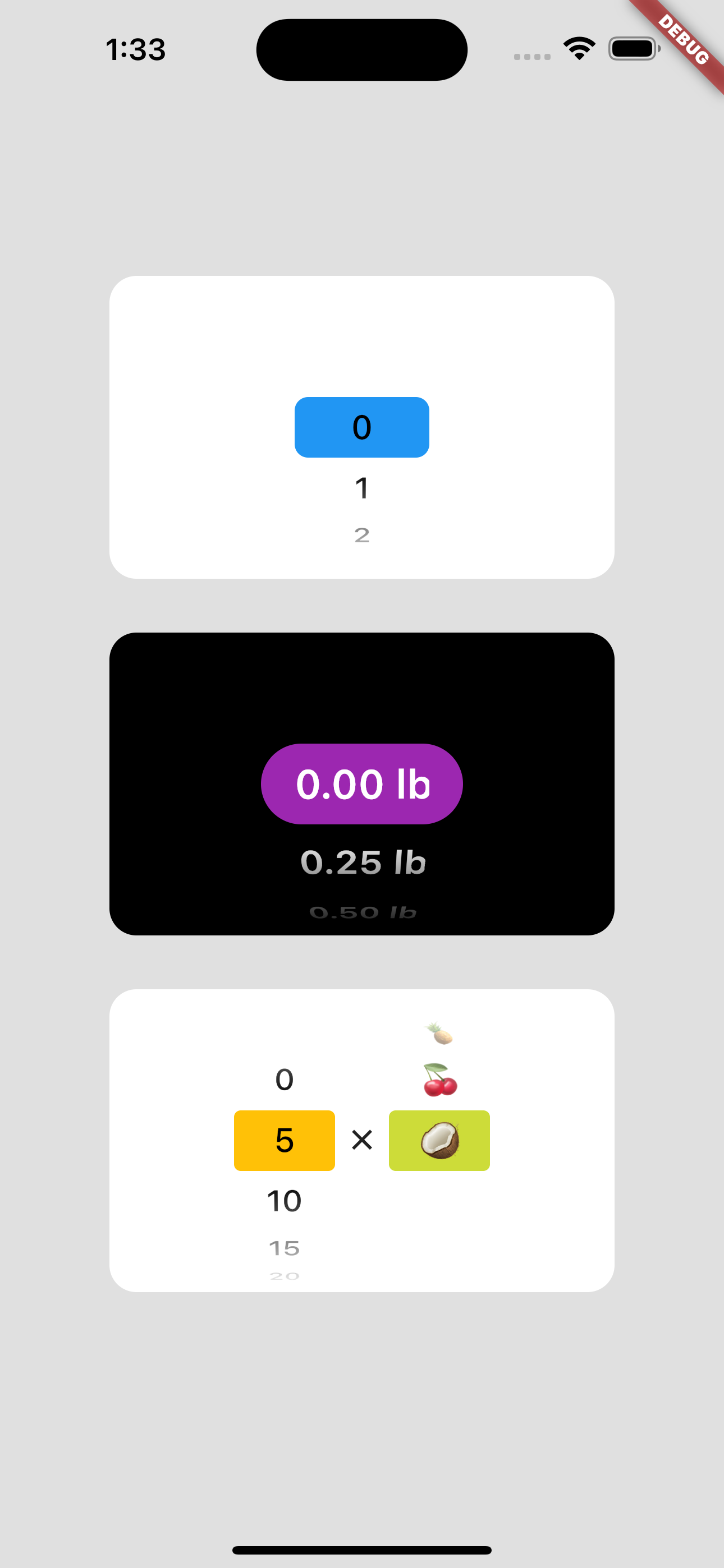
In the example below, we are converting the index to a double value to represent quarter lbs.
SizedBox(
  width: 200,
  height: 200,
  child: SelectorWheel(
    childCount: 10,
    convertIndexToValue: (int index) {
      // This is just to illustrate, that the index can be converted
      // to any value. In this case, we are converting the index to
      // a quarter of a pound.
      final quarter = index / 4;

      return SelectorWheelValue(
        // The label is what is displayed on the selector wheel
        label: '${quarter.toString()} lb',
        value: quarter,
        index: index,
      );
    },
    onValueChanged: (SelectorWheelValue<double> value) {
      // print the value that was selected
      print(value);
    },
  ),
)
The colors of the selector wheel can be customized by overriding the ThemeData in the following way:
// Overriding the colors of the selector wheel
Theme(
  data: ThemeData(
    textTheme: Theme.of(context).textTheme.copyWith(
      titleLarge: Theme.of(context).textTheme.titleLarge?.copyWith(
        fontSize: 24.0,
        fontWeight: FontWeight.w600,
      ),
    ),
    colorScheme: Theme.of(context).colorScheme.copyWith(
      surface: Colors.black,
      onSurface: Colors.white,
      secondaryContainer: Colors.amber,
    ),
  ),
  child: SizedBox(
    width: 200,
    height: 200,
    child: SelectorWheel(
      childCount: 10,
      highlightBorderRadius: 16.0,
      highlightHeight: 40.0,
      highlightWidth: 100.0,
      convertIndexToValue: (int index) {
        return SelectorWheelValue(
          label: index.toString(),
          value: index,
          index: index,
        );
      },
      onValueChanged: (value) {
        // print the value that was selected
        print(value);
      },
    ),
  ),
)
Notice, that we're also customizing the "highlighted" item's border radius, height, and width. To see all the customizable properties, check out the SelectorWheel class.
Contributing #
Contributions are welcome! If you find a bug or have a feature request, please open an issue on the GitHub repository.
License #
This package is licensed under the MIT License. For more details, please refer to the LICENSE file included in the repository.
