searchfield 0.8.9  searchfield: ^0.8.9 copied to clipboard
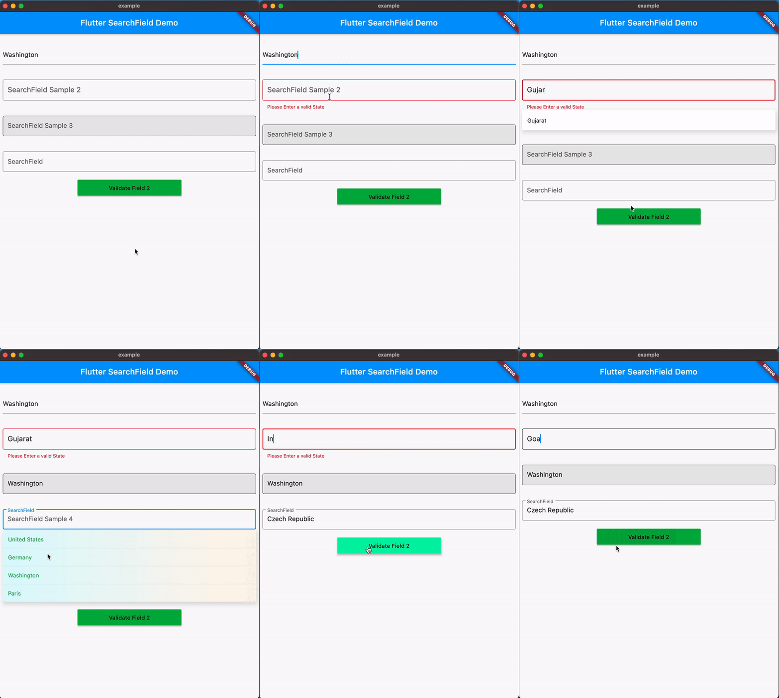
A highly customizable, simple and easy to use flutter Widget to add a searchfield to your Flutter Application. This Widget allows you to search and select from list of suggestions.
searchfield: ^0.8.9 #
A highly customizable simple and easy to use flutter searchfield widget. This Widget allows you to search and select a suggestion from list of suggestions.
Think of this widget like a dropdownButton field with an ability
- to Search 🔍.
- to position and define height of each Suggestion Item
- to show dynamic suggestions as an overlay above the widgets or in the widget tree.
- to define max number of items visible in the viewport 📱
- to filter out the suggestions with a custom logic.
- to visually customize the input and the suggestions
list of all the properties mentioned below
Getting Started #
Installation #
- Add the dependency
flutter pub add searchfield
- Import the package
import 'package:searchfield/searchfield.dart';
Use the Widget
Example1
SearchField<Country>(
  suggestions: countries
    .map(
    (e) => SearchFieldListItem<Country>(
      e.name,
      item: e,
      // Use child to show Custom Widgets in the suggestions
      // defaults to Text widget
      child: Padding(
        padding: const EdgeInsets.all(8.0),
        child: Row(
          children: [
            CircleAvatar(
              backgroundImage: NetworkImage(e.flag),
            ),
            SizedBox(
              width: 10,
            ),
            Text(e.name),
          ],
        ),
      ),
  ),
  ).toList(),
),
Example2 (Validation)
Form(
  key: _formKey,
  child: SearchField(
    suggestions: _statesOfIndia
        .map((e) => SearchFieldListItem(e))
        .toList(),
    suggestionState: Suggestion.expand,
    textInputAction: TextInputAction.next,
    hint: 'SearchField Example 2',
    searchStyle: TextStyle(
      fontSize: 18,
      color: Colors.black.withOpacity(0.8),
    ),
    validator: (x) {
      if (!_statesOfIndia.contains(x) || x!.isEmpty) {
        return 'Please Enter a valid State';
      }
      return null;
    },
    searchInputDecoration: InputDecoration(
      focusedBorder: OutlineInputBorder(
        borderSide: BorderSide(
          color: Colors.black.withOpacity(0.8),
        ),
      ),
      border: OutlineInputBorder(
        borderSide: BorderSide(color: Colors.red),
      ),
    ),
    maxSuggestionsInViewPort: 6,
    itemHeight: 50,
    onTap: (x) {},
  ))
 SearchField(
    onSearchTextChanged: (query) {
      final filter = suggestions
          .where((element) =>
              element.toLowerCase().contains(query.toLowerCase()))
          .toList();
      return filter
          .map((e) => SearchFieldListItem<String>(e,
              child: Padding(
                padding: const EdgeInsets.symmetric(vertical: 4.0),
                child: Text(e,
                    style: TextStyle(fontSize: 24, color: Colors.red)),
              )))
          .toList();
    },
    key: const Key('searchfield'),
    hint: 'Search by country name',
    itemHeight: 50,
    searchInputDecoration:
        InputDecoration(hintStyle: TextStyle(color: Colors.red)),
    suggestionsDecoration: SuggestionDecoration(
        padding: const EdgeInsets.all(4),
        border: Border.all(color: Colors.red),
        borderRadius: BorderRadius.all(Radius.circular(10))),
    suggestions: suggestions
        .map((e) => SearchFieldListItem<String>(e,
            child: Padding(
              padding: const EdgeInsets.symmetric(vertical: 4.0),
              child: Text(e,
                  style: TextStyle(fontSize: 24, color: Colors.red)),
            )))
        .toList(),
    focusNode: focus,
    suggestionState: Suggestion.expand,
    onSuggestionTap: (SearchFieldListItem<String> x) {
      focus.unfocus();
    },
  ),
));

Customize the suggestions the way you want #
Suggestions can be passed as a widget using the child property of SearchFieldListItem
SearchField(
  suggestions: _statesOfIndia
     .map((e) => SearchFieldListItem(e,
        child: Align(
          alignment: Alignment.centerRight,
          child: Padding(
             padding: const EdgeInsets.symmetric(horizontal:16.0),
               child: Text(e,
                 style: TextStyle(color: Colors.red),
               ),
             ),
          ))).toList(),
    ...
    ...
)


Support for Overlays #
- With v0.5.0 Searchfield now adds support for Overlays(default) which shows the suggestions floating on top of the Ui.
- The position of suggestions is dynamic based on the space available for the suggestions to expand within the viewport.


Properties #
autoCorrect: Defines whether to enable autoCorrect defaults totrueautofocus: Defines whether to enable autofocus defaults tofalsecontroller: TextEditing Controller to interact with the searchfield.comparatorproperty to filter out the suggestions with a custom logic (Comparator is deprecated UseonSearchTextChangedinstead).emptyWidget: Custom Widget to show when search returns empty Results (defaults toSizedBox.shrink)enabled: Defines whether to enable the searchfield defaults totruefocusNode: FocusNode to interact with the searchfield.hint: hint for the search Input.readOnly: Defines whether to enable the searchfield defaults tofalseinitialValue: The initial value to be set in searchfield when its rendered, if not specified it will be empty.inputType: Keyboard Type for SearchFieldinputFormatters: Input Formatter for SearchFielditemHeight: height of each suggestion Item, (defaults to 35.0).marginColor: Color for the margin between the suggestions.maxSuggestionsInViewPort: The max number of suggestions that can be shown in a viewport.offset: suggestion List offset from the searchfield, The top left corner of the searchfield is the origin (0,0).onOutSideTap: callback when the user taps outside the searchfield.onSaved: An optional method to call with the final value when the form is saved via FormState.save.onSearchTextChanged: callback when the searchfield text changes, it returns the current text in the searchfield.onSuggestionTap: callback when a sugestion is tapped it also returns the tapped value.onSubmit: callback when the searchfield is submitted, it returns the current text in the searchfield.scrollbarDecoration: decoration for the scrollbar.suggestions(required) : List of SearchFieldListItem to search from. eachSearchFieldListItemin the list requires a unique searchKey, which is used to search the list and an optional Widget, Custom Object to display custom widget and to associate a object with the suggestion list.suggestionState: enum to hide/show the suggestion on focusing the searchfield defaults toSuggestionState.expand.searchStyle: textStyle for the search Input.searchInputDecoration: decoration for the search Input (e.g to update HintStyle) similar to built in textfield widget.suggestionsDecoration: decoration for suggestions List with ability to add box shadow background color and much more.suggestionDirection: direction of the suggestions list, defaults toSuggestionDirection.down.suggestionItemDecoration: decoration for suggestionItem with ability to add color and gradient in the background.SuggestionAction: enum to control focus of the searchfield on suggestion tap.suggestionStyle:SpecifiesTextStylefor suggestions when no child is provided.textInputAction: An action the user has requested the text input control to perform throgh the submit button on keyboard.textCapitalization: Configures how the platform keyboard will select an uppercase or lowercase keyboard on IOS and Android.
You can find all the code samples here #
Contributing #
You are welcome to contribute to this package, to contribute please read the contributing guidelines.