searchfield 0.5.1  searchfield: ^0.5.1 copied to clipboard
A highly customizable simple and easy to use flutter Widget to add a searchfield to your Flutter Application.This Widget allows you to search and select from list of suggestions.
searchfield: ^0.5.1 #
A highly customizable simple and easy to use flutter Widget to add a searchfield to your Flutter Application.This Widget allows you to search and select from list of suggestions.
Think of this widget like a dropdownButton field with an ability
- to Search 🔍.
- to define height of each Suggestion Item
- to show dynamic suggestions along the z axis or below the searchfield along the Y-axis.
- to define max number of items visible in the viewport 📱
- to completely customize the input searchfield like a normal textfield
- to customize the suggestions with colors and gradients
list of all the properties mentioned below
Getting Started #
Installation #
- Add the dependency
dependencies:
  searchfield: ^0.5.1
- Import the package
import 'package:searchfield/searchfield.dart';
Use the Widget
Example1
 SearchField(
    suggestions: [
    'United States',
    'America',
    'Washington',
    'India',
    'Paris',
    'Jakarta',
    'Australia',
    'Lorem Ipsum'
    ],
),

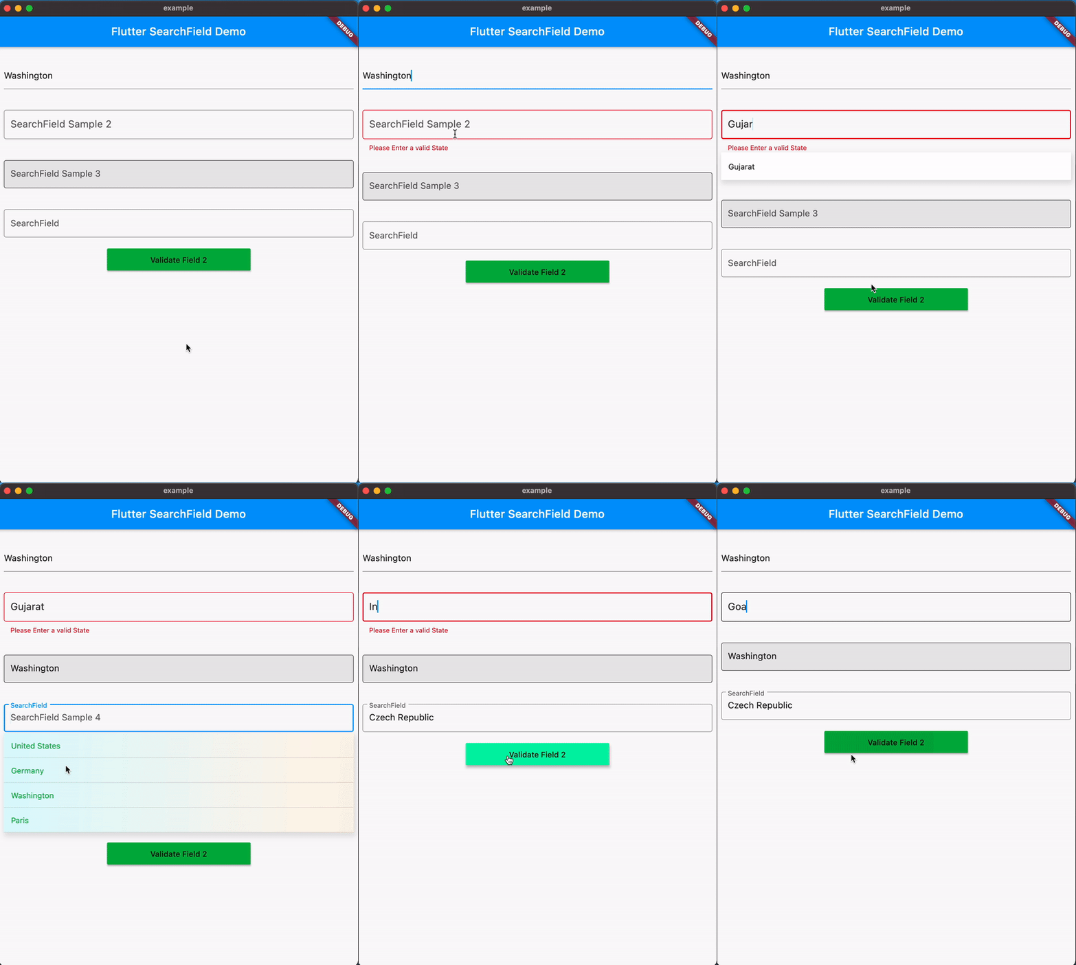
Example2 (Validation)
Form(
   key: _formKey,
   child: SearchField(
   suggestions: _statesOfIndia,
   hint: 'SearchField Sample 2',
   searchStyle: TextStyle(
                  fontSize: 18,
                  color: Colors.black.withOpacity(0.8),
               ),
   validator: (x) {
      if (!_statesOfIndia.contains(x) || x.isEmpty) {
            return 'Please Enter a valid State';
      }
      return null;
      },
   searchInputDecoration:
         InputDecoration(
            focusedBorder: OutlineInputBorder(
            borderSide: BorderSide(
            color: Colors.black.withOpacity(0.8),
         ),
   ),
   border: OutlineInputBorder(
   borderSide: BorderSide(color: Colors.red),
   ),
   ),
   maxSuggestionsInViewPort: 6,
   itemHeight: 50,
   onTap: (x) {
      print(x);
   },
 ),
),


Support for Overlays #
- With v0.5.0 Searchfield now supports Overlays which shows the suggestions floating on top of the Ui.
- The position of suggestions is dynamic based on the space available for the suggestions to expand within the viewport.
- Overlay is enabled by default, You can disable this floating suggestions by passing the property
hasOverlay=false. - However Theres also a known issue, when toggling
hasOverflowfrom false to true you should manually do a hot restart to make it work.

Properties #
controller: TextEditing Controller to interact with the searchfield.suggestions: list of Strings to search from.(Mandatory)initialValue: The initial value to be set in searchfield when its rendered, if not specified it will be empty.hasOverlay: shows floating suggestions on top of the Ui if disabled the suggestions will be shown along the searchInput. if not specified defaults totrue.onTap: callback when a sugestion is tapped it also returns the tapped value.hint: hint for the search Input.searchStyle: textStyle for the search Input.suggestionStyle: textStyle for the SuggestionItem.searchInputDecoration: decoration for the search Input similar to built in textfield widget.suggestionsDecoration: decoration for suggestions List with ability to add box shadow background color and much more.suggestionItemDecoration: decoration for suggestionItem with ability to add color and gradient in the background.itemHeight: height of each suggestion Item, (defaults to 35.0).marginColor: Color for the margin between the suggestions.maxSuggestionsInViewPort: The max number of suggestions that can be shown in a viewport.
Contributing #
You are welcome to contribute to this package,contribution doesnt necessarily mean sending a pull request it could be
- pointing out bugs/issues
- requesting a new feature
- improving the documentation
If you feel generous and confident send a PR but make sure theres an open issue if not feel free to create one before you send a PR. This helps Identify the problem and helps everyone to stay aligned with the issue :)