searchable_listview 1.7.2  searchable_listview: ^1.7.2 copied to clipboard
A new easy way to filter listview with simple implementation with possibilty to customize search field and empty widget
Searchable ListView #

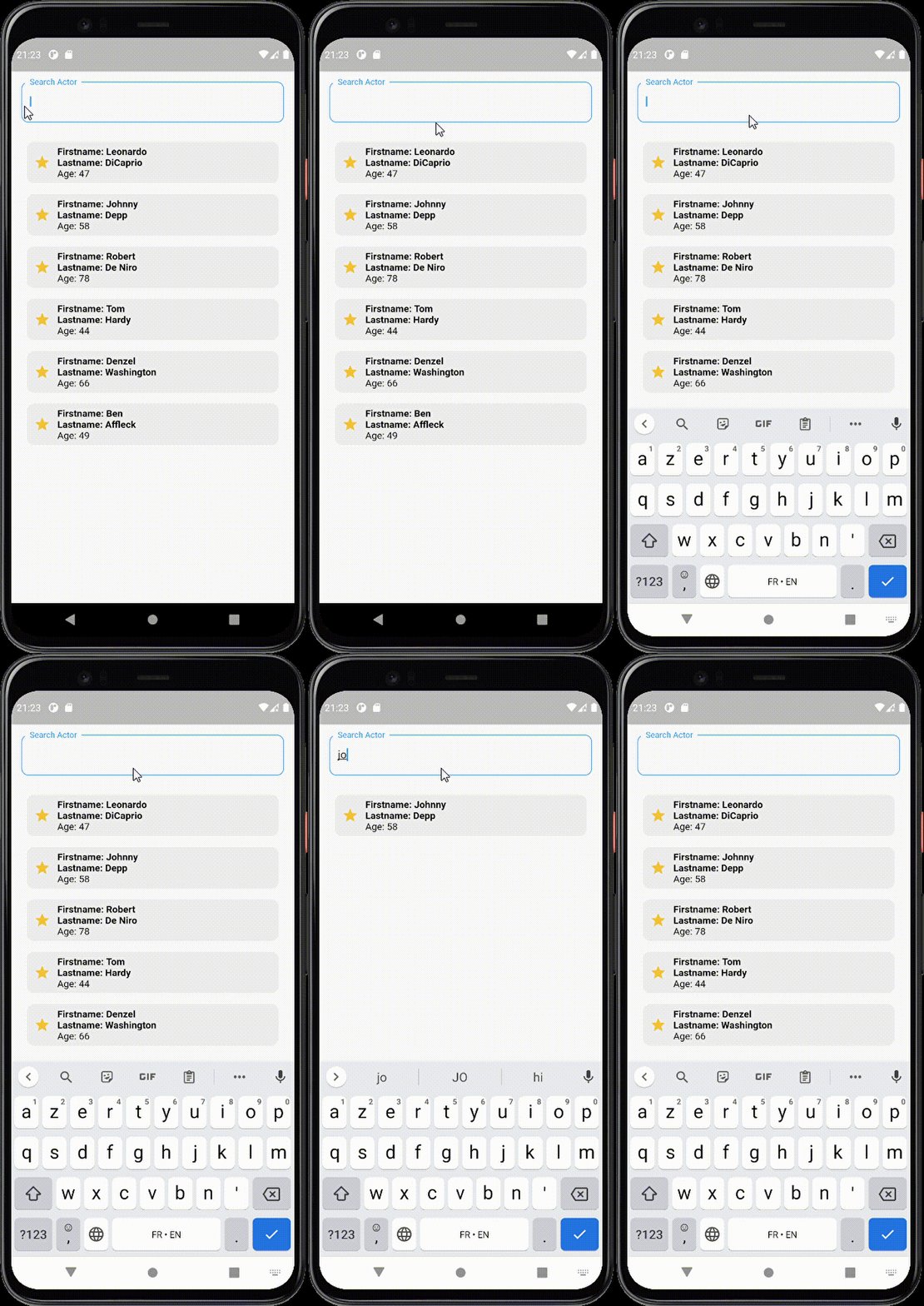
An easy way to filter lists
Features #
- Filter list view easily
- Support pagination
- Pull to refresh list
- Sliver scroll animation effect
- Display custom widget when list is empty
- Customize search text field
- Change keyboard input type and keyboard submit button
- Add focus on search text field
- Add on item pressed callback
- Customize search text style
- Clear icon button in search to easily clear text
- Customizable scroll direction
- Searchable list with seperator builder
- Customizable text field position
Getting Started #
In order to add searchable listview package to your project add this line to your pubspec.yaml file
dependencies:
	searchable_listview:  1.7.2
Attributes #
/// Initial list of all elements that will be displayed.
  late List<T> initialList;

  /// Callback to filter the list based on the given search value.
  ///
  /// Invoked on changing the text field search if ```searchType == SEARCH_TYPE.onEdit```
  /// or invoked when submiting the text field if ```searchType == SEARCH_TYPE.onSubmit```.
  ///
  /// You should return a list of filtered elements.
  final List<T> Function(String) filter;

  /// Builder function that generates the ListView items
  /// based on the given element.
  final Widget Function(T) builder;

  /// The widget to be displayed when the filter returns an empty list.
  ///
  /// Defaults to `const SizedBox.shrink()`.
  final Widget emptyWidget;

  /// Text editing controller applied on the search field.
  ///
  /// Defaults to null.
  late TextEditingController? searchTextController;

  /// The keyboard action key
  ///
  /// Defaults to [TextInputAction.done].
  final TextInputAction keyboardAction;

  /// The text field input decoration
  ///
  /// Defaults to null.
  final InputDecoration? inputDecoration;

  /// The style for the input text field
  ///
  /// Defaults to null.
  final TextStyle? style;

  /// The keyboard text input type
  ///
  /// Defaults to [TextInputType.text]
  final TextInputType textInputType;

  /// Callback function invoked when submiting the search text field
  final Function(String?)? onSubmitSearch;

  /// The search type on submiting text field or when changing the text field value
  ///SEARCH_TYPE.onEdit,
  ///SEARCH_TYPE.onSubmit
  /// Defaults to [SEARCH_TYPE.onEdit].
  final SEARCH_TYPE searchType;

  /// Indicate whether the text field input should be obscured or not.
  /// Defaults to `false`.
  final bool obscureText;

  /// Indicate if the search text field is enabled or not.
  /// Defaults to `true`.
  final bool searchFieldEnabled;

  /// The focus node applied on the search text field
  final FocusNode? focusNode;

  /// Function invoked when pressing on item
  /// Defaults to null
  final void Function<T>(T)? onItemSelected;

  /// Indicate whether the clear icon will be displayed or not
  /// by default it's true, to display the clear icon the inputDecoration should not contains suffix icon
  /// otherwise the initial suffix icon will be displayed
  final bool displayClearIcon;

  /// The color applied on the suffix icon (if `displayClearIcon = true`).
  /// Defaults to [Colors.grey].
  final Color defaultSuffixIconColor;

  ///An async callback invoked when dragging down the list
  ///if onRefresh is nullable the drag to refresh is not applied
  late Future<void> Function()? onRefresh;

  ///Builder callback required  when using [seperated] constructor
  ///return the Widget that will seperate all the elements inside the list
  late Widget Function(BuildContext, int)? seperatorBuilder;

  ///The scroll direction of the list
  ///by default [Axis.vertical]
  final Axis scrollDirection;


  ///The position of the text field (bottom or top)
  ///by default the textfield is displayed on top
  final SearchTextPosition searchTextPosition;

  ///Callback function invoked each time the listview
  ///reached the bottom
  ///used to create pagination in listview
  final Future<dynamic> Function()? onPaginate;
Migration: #
- If you are using the 1.5.3 version or older and you are using
sliverScrollEffectparameter, for 1.6.0 version and above this parameter is replaced with a constructorSearchableList.sliver
Implementation #
Default constructor #
SearchableList<Object>
Used to create simple listview with search field (with other attributes to customize your own listview)
Seperator constructor #
SearchableList.seperated
Used to create listview with divider seperation (with other attributes to customize your own listview)
Sliver effect constructor #
SearchableList.sliver
Used to create a listview with sliver scrolling effect (with other attributes to customize your own listview)
Simple implementation #
SearchableList<Actor>(
  initialList: actors,
  builder: (Actor user) => UserItem(user: user),
  filter: (value) => actors.where((element) => element.name.toLowerCase().contains(value),).toList(),
  emptyWidget:  const EmptyView(),
  inputDecoration: InputDecoration(
    labelText: "Search Actor",
	fillColor: Colors.white,
	focusedBorder: OutlineInputBorder(
	  borderSide: const BorderSide(
	    color: Colors.blue,
		width: 1.0,
	  ),
	  borderRadius: BorderRadius.circular(10.0),
	),
  ),
),

Sliver scroll example #
SearchableList<Actor>.sliver(
  initialList: actors,
  builder: (Actor user) => UserItem(user: user),
  filter: (value) => actors.where((element) => element.name.toLowerCase().contains(value),).toList(),
  emptyWidget:  const EmptyView(),
  inputDecoration: InputDecoration(
    labelText: "Search Actor",
	fillColor: Colors.white,
	focusedBorder: OutlineInputBorder(
	  borderSide: const BorderSide(
	    color: Colors.blue,
		width: 1.0,
	  ),
	  borderRadius: BorderRadius.circular(10.0),
	),
  ),
),
Contribution #
Of course the project is open source, and you can contribute to it repository link
- If you found a bug, open an issue.
- If you have a feature request, open an issue.
- If you want to contribute, submit a pull request.