rotary_navbar 1.0.5  rotary_navbar: ^1.0.5 copied to clipboard
A customizable navigation bar with a curved design for Flutter applications.Which also rotates
CustomNavBar #

A sleek, customizable navigation bar with a curved design for Flutter applications.
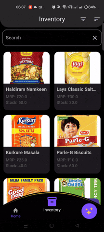
Features #
- 🌊 Elegant curved design with customizable arc radius
- 🎨 Fully customizable colors for background, selected, and unselected items
- 📐 Adjustable height and item spacing
- 🚀 Smooth animations when switching between items
- 🧩 Easy to integrate and customize
Installation #
Add this to your package's pubspec.yaml file:
dependencies:
  rotary_navbar: ^1.0.3
Then run:
$ flutter pub get
Usage #
Import the package in your Dart file:
import 'package:rotary_navbar/rotary_navbar.dart';
Implement the RotaryNavBar in your widget tree:
Scaffold(
  body: YourPageContent(),
  bottomNavigationBar: RotaryNavBar(
    items: [
      NavBarItem(icon: Icons.home, label: 'Home'),
      NavBarItem(icon: Icons.search, label: 'Search'),
      NavBarItem(icon: Icons.person, label: 'Profile'),
      NavBarItem(icon: Icons.settings, label: 'Settings'),
    ],
    onItemSelected: (index) {
      // Handle item selection
    },
  ),
)
Customization #
The RotaryNavBar widget offers various customization options:
| Parameter | Type | Default | Description |
|---|---|---|---|
items |
List<NavBarItem> |
Required | List of navigation items |
backgroundColor |
Color |
Colors.black |
Background color of the navbar |
selectedItemColor |
Color |
Color(0xFF7C4DFF) |
Color of the selected item |
unselectedItemColor |
Color |
Colors.grey |
Color of unselected items |
arcRadius |
double |
95.0 |
Radius of the curved arc |
height |
double |
96.0 |
Height of the navigation bar |
itemSpacing |
double |
0.35 |
Spacing between items (as a fraction of screen width) |
onItemSelected |
ValueChanged<int> |
null |
Callback function when an item is selected |
Example #
Here's a more detailed example of how to use RotaryNavBar:
import 'package:flutter/material.dart';
import 'package:custom_nav_bar/custom_nav_bar.dart';

class MyHomePage extends StatefulWidget {
  @override
  _MyHomePageState createState() => _MyHomePageState();
}

class _MyHomePageState extends State<MyHomePage> {
  int _selectedIndex = 0;

  final List<Widget> _pages = [
    Center(child: Text('Home Page')),
    Center(child: Text('Search Page')),
    Center(child: Text('Profile Page')),
    Center(child: Text('Settings Page')),
  ];

  @override
  Widget build(BuildContext context) {
    return Scaffold(
      appBar: AppBar(title: Text('RotaryNavBar Demo')),
      body: _pages[_selectedIndex],
      bottomNavigationBar: RotaryNavBar(
        items: [
          NavBarItem(icon: Icons.home, label: 'Home'),
          NavBarItem(icon: Icons.search, label: 'Search'),
          NavBarItem(icon: Icons.person, label: 'Profile'),
          NavBarItem(icon: Icons.settings, label: 'Settings'),
        ],
        backgroundColor: Colors.black,
        selectedItemColor: Colors.blue,
        unselectedItemColor: Colors.grey,
        arcRadius: 95,
        height: 96,
        itemSpacing: 0.35,
        onItemSelected: (index) {
          setState(() {
            _selectedIndex = index;
          });
        },
      ),
    );
  }
}
For a complete example, please check the example folder in the package repository.
Contributing #
Contributions are welcome! If you find a bug or want a feature, please open an issue.
License #
This project is licensed under the MIT License - see the LICENSE file for details.
Metadata
Publisher
unverified uploader
Weekly Downloads
Metadata
A customizable navigation bar with a curved design for Flutter applications.Which also rotates
Documentation
License
 MIT (license)