responsive_s 1.1.0  responsive_s: ^1.1.0 copied to clipboard
Responsive pachage that control size and font as you want to make responsive.
Responsive_s #
Build any app with your optional responsive for width ,height and font size.
Responsive give many optional parameters to control responsive way:
- fromPhysicalDimension means the length and all value will be calculated from device width and height.
- fromRealDimension means the length and all value will be calculated from real width and height depending on device orientation.
- Now,you can initial value for any device or for all device through "forUnInitialDevices" parameter.
- The package automatically detect screen type;
Usage #
@override
Widget build(BuildContext context) {
  Responsive _responsive = new Responsive(context);
  List<Widget> _circularAvatar = List<Widget>.generate(
      3,
          (index) =>
          CircleAvatar(
            radius: _responsive.responsiveValue(
                forUnInitialDevices: 5,
                forDesktopScreen: 10,
                forPortraitMobileScreen: 5),
          ));

  Container _container = Container(
      color: Colors.red,
      //responsive value can be used as responsive font size.
      child: Text(_responsive.screenType.toString(), style: TextStyle(
          fontSize: _responsive.responsiveValue(forUnInitialDevices: 5)
      ),),
      width: _responsive.responsiveWidth(forUnInitialDevices: 80),
      height: _responsive.responsiveHeight(forUnInitialDevices: 60));
  Widget _mobile = Column(
    mainAxisSize: MainAxisSize.max,
    children: [
      Row(
        mainAxisAlignment: MainAxisAlignment.spaceEvenly,
        mainAxisSize: MainAxisSize.max,
        children: _circularAvatar,
      ),
      _container
    ],
  );
  Widget _desktop = Row(
    mainAxisSize: MainAxisSize.max,
    children: [
      Column(
        mainAxisSize: MainAxisSize.max,
        mainAxisAlignment: MainAxisAlignment.spaceEvenly,
        children: _circularAvatar,
      ),
      SizedBox(width: _responsive.responsiveWidth(forUnInitialDevices: 2),),
      _container
    ],
  );
  return Scaffold(
      appBar: AppBar(),
      body: _responsive.responsiveWidget(
          forUnInitialDevices: _desktop,
          forPortraitMobileScreen: _mobile,
          forPortraitTabletScreen: _mobile)
  );
}
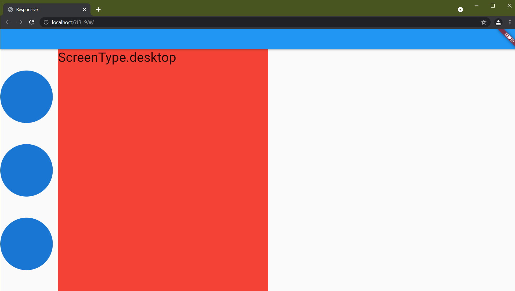
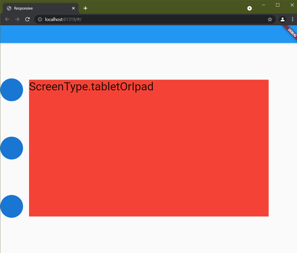
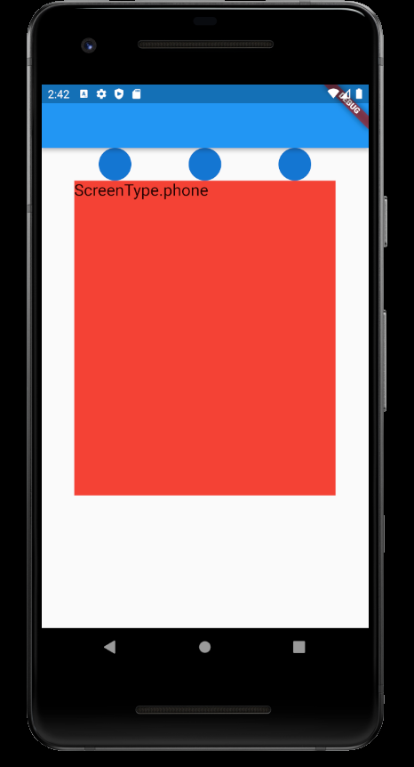
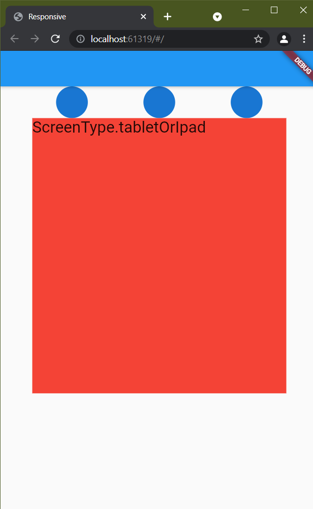
Result:


Overview: #
Until now,this package offer many responsive function depending on device:
- you can now initial different length and value depending on device to make your app responsive.
- Responsive value is created to use it as responsive value for font size , radius or any another value.
- Responsive function and responsive widget return function and widget depending on screen.
