responsive_grid 2.4.0  responsive_grid: ^2.4.0 copied to clipboard
Responsive Grid Layout and List for Flutter
responsive_grid #
Responsive Grid Layout and List for Flutter
Responsive Grid Layout #
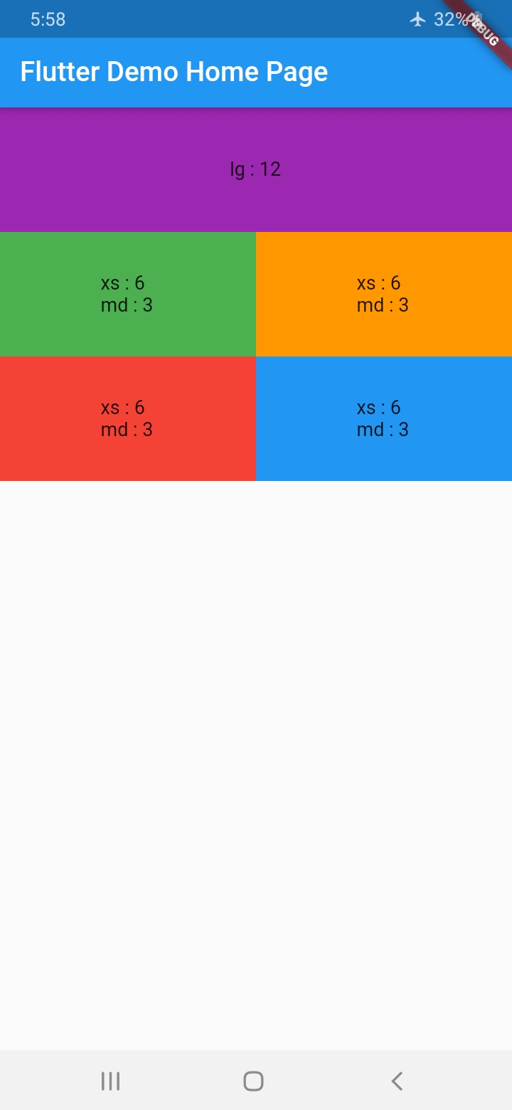
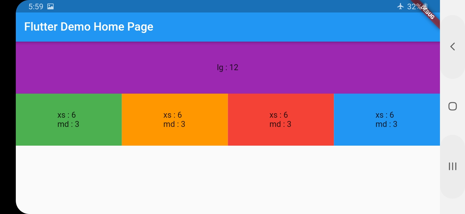
With ResponsiveGridRow and ResponsiveGridCol you can get the same behavior of bootstrap Grid System
Give every col the width it shall occupy at every size category assuming the total width is 12
        ResponsiveGridRow(
          children: [
            ResponsiveGridCol(
              lg: 12,
              child: Container(
                height: 100,
                alignment: Alignment(0, 0),
                color: Colors.purple,
                child: Text("lg : 12"),
              ),
            ),
            ResponsiveGridCol(
              xs: 6,
              md: 3,
              child: Container(
                height: 100,
                alignment: Alignment(0, 0),
                color: Colors.green,
                child: Text("xs : 6 \r\nmd : 3"),
              ),
            ),
            ResponsiveGridCol(
              xs: 6,
              md: 3,
              child: Container(
                height: 100,
                alignment: Alignment(0, 0),
                color: Colors.orange,
                child: Text("xs : 6 \r\nmd : 3"),
              ),
            ),
            ResponsiveGridCol(
              xs: 6,
              md: 3,
              child: Container(
                height: 100,
                alignment: Alignment(0, 0),
                color: Colors.red,
                child: Text("xs : 6 \r\nmd : 3"),
              ),
            ),
            ResponsiveGridCol(
              xs: 6,
              md: 3,
              child: Container(
                height: 100,
                alignment: Alignment(0, 0),
                color: Colors.blue,
                child: Text("xs : 6 \r\nmd : 3"),
              ),
            ),
          ],
        )
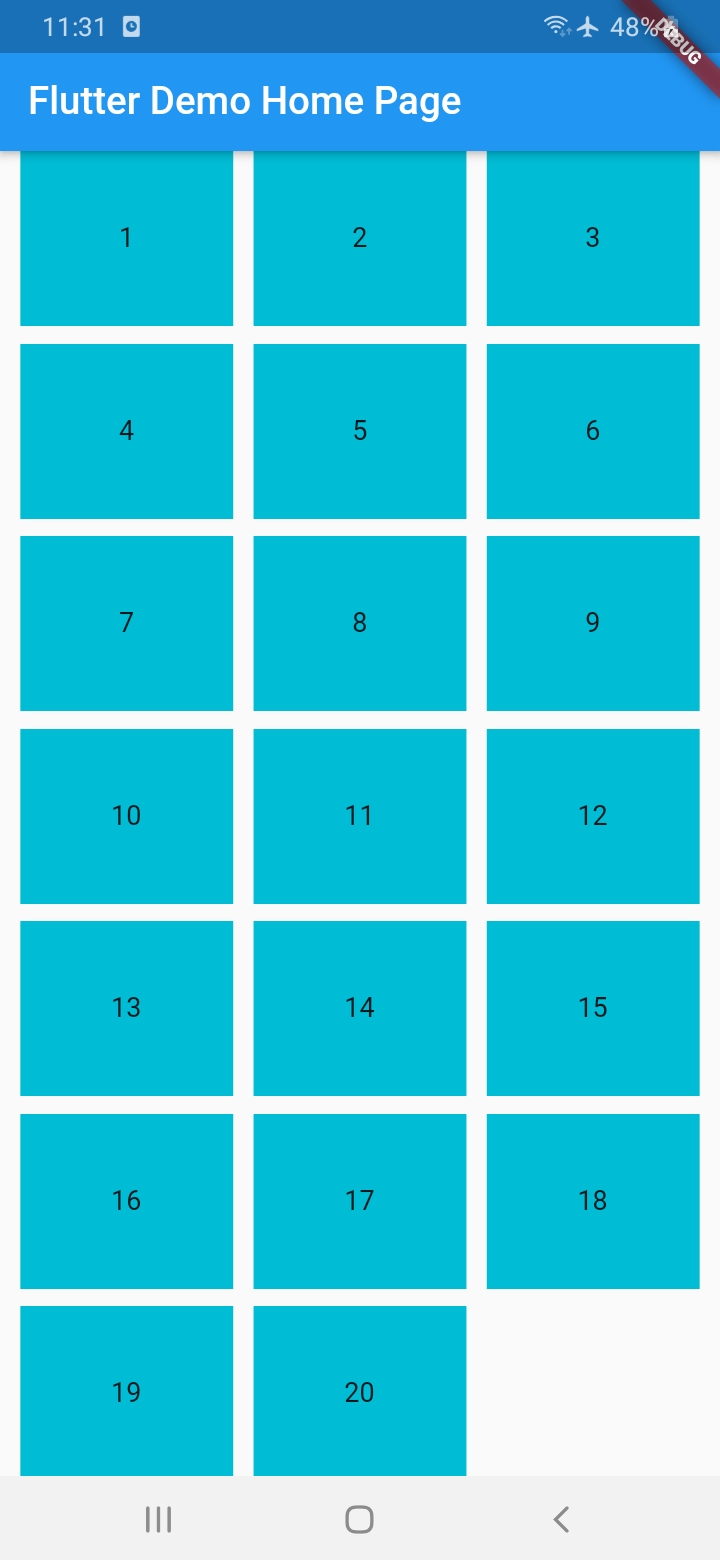
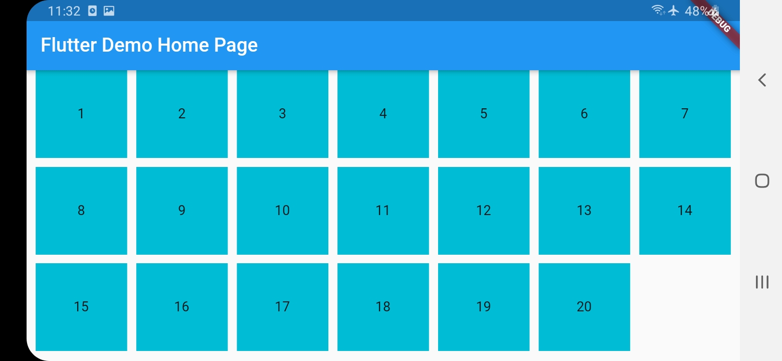
Responsive Grid List #
ResponsiveGridList works differently in that you only specify a desired width for the items and spacing, and it will decide how many items shall fit in a line, and the width of the item and spacing will change (only small change) to fill the entire width
    ResponsiveGridList(
        desiredItemWidth: 100,
        minSpacing: 10,
        children: [
          1,
          2,
          3,
          4,
          5,
          6,
          7,
          8,
          9,
          10,
          11,
          12,
          13,
          14,
          15,
          16,
          17,
          18,
          19,
          20
        ].map((i) {
          return Container(
            height: 100,
            alignment: Alignment(0, 0),
            color: Colors.cyan,
            child: Text(i.toString()),
          );
        }).toList()
    )
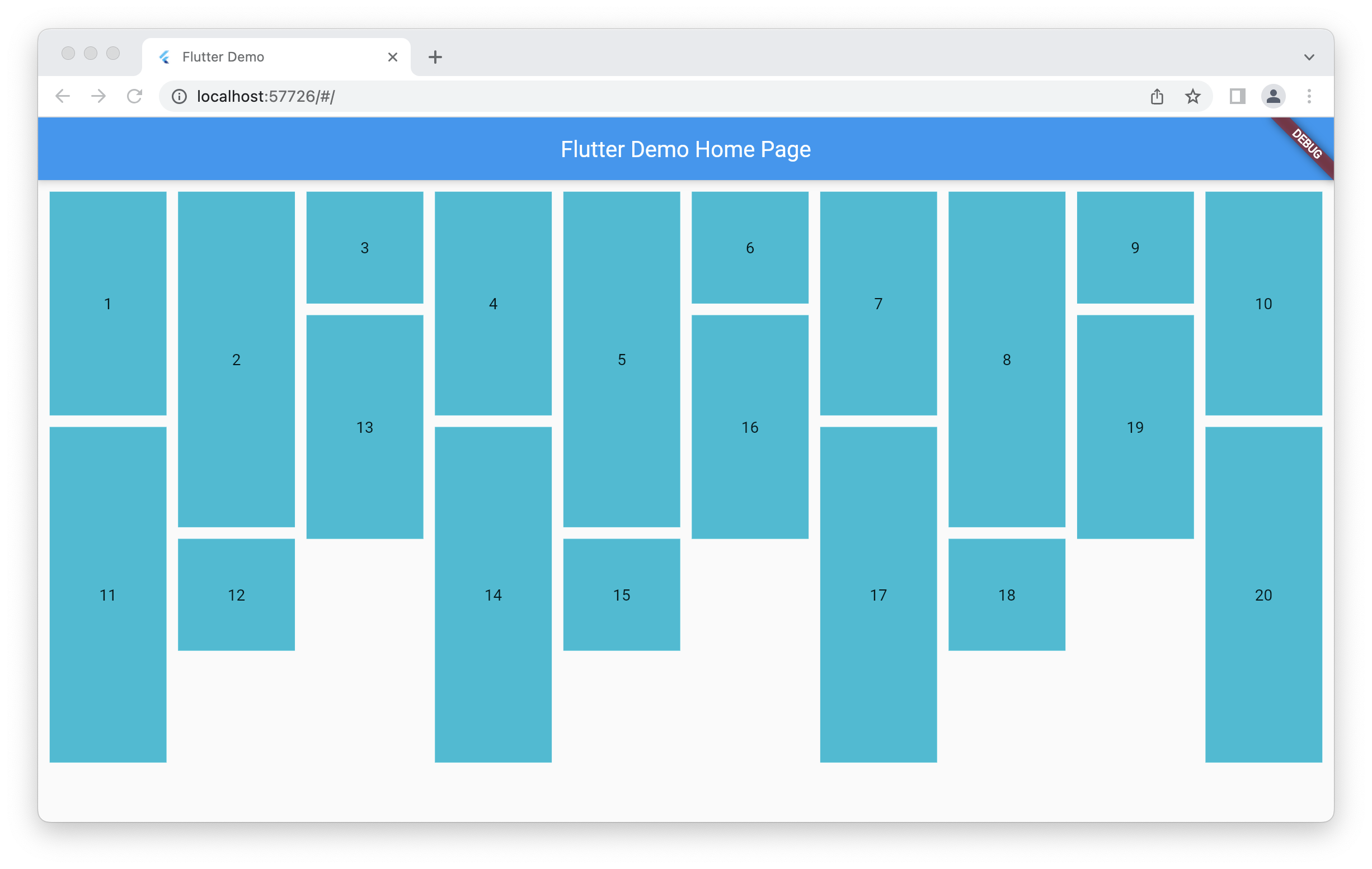
Responsive Staggered Grid List #
The same as the ResponsiveGridList, but arranges items in columns inside one big row, so every item has independent height
Utilities #
ResponsiveWidget , ResponsiveBuilder and responsiveValue()
provide a custom responsive Widget, Builder or a single value, for every size tier
ResponsiveLocalWidget and ResponsiveLocalBuilder
provide a responsive Widget or Builder for its own width, not the viewport's, they are just wrappers on top of flutter LayoutBuilder
Override breakpoints #
Add before attach App widget
ResponsiveGridBreakpoints.value = ResponsiveGridBreakpoints(
  xs: 600,
  sm: 905,
  md: 1240,
  lg: 1440,
);
Metadata
Publisher
unverified uploader
Metadata
Responsive Grid Layout and List for Flutter
Repository (GitHub)
View/report issues
License
 unknown (LICENSE)