radial_charts 0.2.2  radial_charts: ^0.2.2 copied to clipboard
Flutter widgets for radial rating charts and rounded donut charts with customizable legends, emoji support, and smooth animations.
 Radial Charts #
A collection of customizable radial chart widgets for Flutter — RadialRatingChart and RoundedDonutChart. Display ratings and data across multiple categories with variable radius segments, smooth Bezier-curved donut charts, customizable legends, and emoji support.
Features #
✨ Variable Radius Segments - Each category's segment radius represents its rating value
🍩 Rounded Donut Chart - Donut chart with smooth, rounded segment edges using Bezier curves
🎨 Highly Customizable - Colors, grid levels, opacity, borders, center text, and more
📦 Predefined Categories - Life balance, skills, product features templates with emojis
📊 Unified Legend System - Shared legend architecture with three styles (circle, rectangle, roundedRectangle)
😀 Emoji Support - Add emojis to categories and display them in legends
🚀 Zero Dependencies - Pure Flutter implementation using CustomPainter
⚡ Performance Optimized - Efficient rendering with smooth animations
Demo #

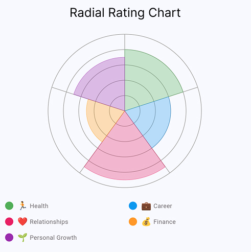
Radial Rating Chart Interactive rating chart with customizable categories, legends, and emoji support |

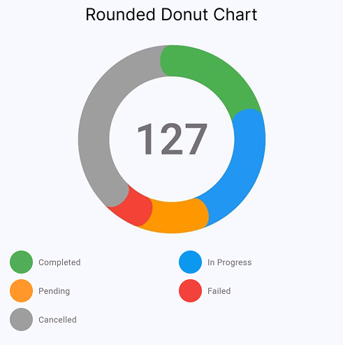
Rounded Donut Chart Smooth rounded edges with Bezier curves, center text, and flexible legend styles |
💡 Want to explore all settings interactively? Run the example app — it includes sliders, color pickers, and live preview for every chart parameter.
Installation #
Add this to your package's pubspec.yaml file:
dependencies:
  radial_charts: ^0.2.2
Then run:
flutter pub get
Usage #
Basic Example #
import 'package:flutter/material.dart';
import 'package:radial_charts/radial_charts.dart';

RadialRatingChart(
  data: [
    CategoryData(
      category: ChartCategory(
        id: 'health',
        name: 'Health',
        color: Colors.green,
        emoji: '🏃',
      ),
      rating: 8,
    ),
    CategoryData(
      category: ChartCategory(
        id: 'career',
        name: 'Career',
        color: Colors.blue,
        emoji: '💼',
      ),
      rating: 6,
    ),
    CategoryData(
      category: ChartCategory(
        id: 'relationships',
        name: 'Relationships',
        color: Colors.pink,
        emoji: '❤️',
      ),
      rating: 9,
    ),
  ],
  config: ChartConfig(size: 300),
  showLegend: true,
)
With Custom Configuration #
RadialRatingChart(
  data: yourCategoryData,
  config: ChartConfig(
    size: 320,
    maxRating: 10,
    minRating: 1,
    gridLevels: 10,
    gridColor: Colors.grey.withOpacity(0.3),
    segmentOpacity: 0.7,
    showSegmentBorders: true,
  ),
  showLegend: true,
  legendColumns: 2,
)
Using Predefined Categories #
The package includes predefined category sets for common use cases:
// Life Balance
RadialRatingChart(
  data: DefaultCategories.lifeBalance
      .map((cat) => CategoryData(category: cat, rating: 7))
      .toList(),
)

// Skills Assessment
RadialRatingChart(
  data: DefaultCategories.skills
      .map((cat) => CategoryData(category: cat, rating: 8))
      .toList(),
)

// Product Features
RadialRatingChart(
  data: DefaultCategories.productFeatures
      .map((cat) => CategoryData(category: cat, rating: 6))
      .toList(),
)
Rounded Donut Chart #
The RoundedDonutChart widget displays data as a donut chart with smooth, rounded edges between segments.
Key Features #
- Smooth Bezier Curve Transitions - Elegant rounded edges between segments instead of sharp corners
- Configurable Center Text - Display totals or custom text in the center with automatic calculation
- Three Legend Styles - Choose between circle, rectangle, or roundedRectangle indicators
- Empty State Visualization - Graceful display when no data is available
- Single Segment Support - Smart handling of charts with just one segment
- Emoji Support - Add emojis to segment labels for visual clarity
Basic Example #
import 'package:flutter/material.dart';
import 'package:radial_charts/radial_charts.dart';

RoundedDonutChart(
  data: [
    DonutSegmentData(
      id: 'completed',
      value: 45,
      color: Colors.green,
      label: 'Completed',
    ),
    DonutSegmentData(
      id: 'pending',
      value: 30,
      color: Colors.orange,
      label: 'Pending',
    ),
    DonutSegmentData(
      id: 'failed',
      value: 25,
      color: Colors.red,
      label: 'Failed',
    ),
  ],
  showCenterText: true,
  centerTextBuilder: (total) => '${total.toInt()}',
  showLegend: true,
  legendStyle: LegendStyle.roundedRectangle,
  showCountInLegend: true,
)
With Custom Configuration #
RoundedDonutChart(
  data: yourSegmentData,
  config: DonutChartConfig(
    size: 270,
    outerRadius: 135,
    innerRadius: 100,
    startAngle: -math.pi / 2,
    sortSegmentsById: true,
  ),
  // Center text options
  centerText: '100',  // Or use centerTextBuilder for dynamic text
  centerTextStyle: TextStyle(
    fontSize: 72,
    fontWeight: FontWeight.w600,
    color: Colors.grey,
  ),
  showCenterText: true,
  // Legend options
  showLegend: true,
  legendStyle: LegendStyle.roundedRectangle, // or circle, rectangle
  legendColumns: 2,
  legendIndicatorSize: Size(33, 28),
  showCountInLegend: true,
)
Legend Styles #
The RoundedDonutChart supports three legend styles:
LegendStyle.circle- Circular indicators (similar to RadialRatingChart)LegendStyle.rectangle- Square indicators with sharp cornersLegendStyle.roundedRectangle- Rounded rectangle indicators with optional count badges (default)
API Reference #
RadialRatingChart #
Main widget for displaying the chart.
| Property | Type | Default | Description |
|---|---|---|---|
data |
List<CategoryData> |
required | List of category data to display |
config |
ChartConfig? |
ChartConfig() |
Configuration for chart appearance |
showLegend |
bool |
false |
Whether to show legend |
showRatingInLegend |
bool |
false |
Show rating values inside legend indicators |
legendColumns |
int |
2 |
Number of columns in legend |
legendSpacing |
double |
8.0 |
Spacing between legend items |
legendIndicatorSize |
double |
16.0 |
Size of color indicator |
legendTextStyle |
TextStyle? |
null |
Text style for legend labels |
legendRatingStyle |
TextStyle? |
null |
Text style for rating values in legend |
ChartCategory #
Represents a category in the chart.
| Property | Type | Required | Description |
|---|---|---|---|
id |
String |
✅ | Unique identifier |
name |
String |
✅ | Display name |
color |
Color |
✅ | Segment color |
emoji |
String? |
❌ | Optional emoji/icon |
description |
String? |
❌ | Optional description |
CategoryData #
Combines a category with its rating value.
| Property | Type | Description |
|---|---|---|
category |
ChartCategory |
The category being rated |
rating |
double |
Rating value (typically 1-10) |
ChartConfig #
Configuration for chart appearance.
| Property | Type | Default | Description |
|---|---|---|---|
size |
double |
280.0 |
Chart size (width & height) |
maxRating |
int |
10 |
Maximum rating value |
minRating |
int |
0 |
Minimum rating value |
gridLevels |
int |
10 |
Number of concentric circles |
gridColor |
Color |
Color(0x4D000000) |
Grid line color |
gridStrokeWidth |
double |
1.0 |
Grid line width |
segmentOpacity |
double |
0.7 |
Segment opacity (0.0-1.0) |
showSegmentBorders |
bool |
true |
Show segment borders |
segmentBorderColor |
Color? |
null |
Border color (auto if null) |
segmentBorderWidth |
double |
0.5 |
Border width |
startAngle |
double |
-π/2 |
Start angle in radians |
sortCategoriesById |
bool |
true |
Sort categories by ID |
RoundedDonutChart #
Main widget for displaying the rounded donut chart.
| Property | Type | Default | Description |
|---|---|---|---|
data |
List<DonutSegmentData> |
required | List of segment data to display |
config |
DonutChartConfig? |
DonutChartConfig() |
Configuration for chart appearance |
centerText |
String? |
null |
Static text to display in center |
centerTextBuilder |
String Function(double)? |
null |
Function to generate center text from total |
centerTextStyle |
TextStyle? |
default style | Text style for center text |
showCenterText |
bool |
true |
Whether to show center text |
showLegend |
bool |
false |
Whether to show legend |
legendStyle |
LegendStyle |
roundedRectangle |
Visual style of legend indicators |
legendColumns |
int |
2 |
Number of columns in legend |
legendIndicatorSize |
Size |
Size(33, 28) |
Size of legend color indicators |
showCountInLegend |
bool |
true |
Show count values in indicators |
legendSpacing |
double |
8.0 |
Spacing between legend items |
legendTextStyle |
TextStyle? |
null |
Text style for legend labels |
legendCountStyle |
TextStyle? |
null |
Text style for legend counts |
DonutSegmentData #
Represents a segment (slice) in the donut chart.
| Property | Type | Required | Description |
|---|---|---|---|
id |
String |
✅ | Unique identifier |
value |
double |
✅ | Numerical value (segment size) |
color |
Color |
✅ | Segment color |
label |
String |
✅ | Display label |
description |
String? |
❌ | Optional description |
metadata |
Map<String, dynamic>? |
❌ | Optional metadata |
DonutChartConfig #
Configuration for donut chart appearance.
| Property | Type | Default | Description |
|---|---|---|---|
size |
double |
270.0 |
Chart size (width & height) |
outerRadius |
double |
135.0 |
Outer radius of donut ring |
innerRadius |
double |
100.0 |
Inner radius (creates center hole) |
startAngle |
double |
-π/2 |
Start angle in radians |
sortSegmentsById |
bool |
true |
Sort segments by ID |
emptyStateColor |
Color |
Color(0x4DBCB5C0) |
Background color for empty state |
emptyStateBorderColor |
Color |
Color(0xFFE0E0E0) |
Border color for empty state |
emptyStateBorderWidth |
double |
2.0 |
Border width for empty state |
LegendStyle #
Enum defining legend indicator styles.
circle- Circular indicatorsrectangle- Rectangular indicators with sharp cornersroundedRectangle- Rectangular indicators with rounded corners
Examples #
Check out the example folder for complete examples including:
- Life Balance Assessment
- Skills Proficiency Chart
- Product Features Rating
- Custom Data Visualization
Run the example:
cd example
flutter run
Use Cases #
📊 Life Balance Wheels - Track satisfaction across life areas
💼 Skills Assessment - Visualize competency levels
⭐ Product Reviews - Display multi-dimensional ratings
📈 Performance Metrics - Show KPIs across categories
🎯 Goal Tracking - Monitor progress in different areas
📝 Survey Results - Present multi-category survey data
How It Works #
Radial Rating Chart #
A variation of a pie chart where each segment represents a category and the radius varies based on the rating value. Higher ratings extend further from the center, and a concentric grid helps with reading values. This makes it ideal for comparing multiple ratings at a glance.
Rounded Donut Chart #
A donut chart where each segment's arc length is proportional to its value. Segments have smooth, rounded edges achieved through cubic Bezier curves. The center area can display a total or custom text. Well-suited for showing proportional breakdowns — task status, budget allocation, or composition data.
Contributing #
Contributions are welcome! Please feel free to submit a Pull Request.
License #
This project is licensed under the MIT License - see the LICENSE file for details.
Author #
Created by hzfty
Support & Feedback #
If you find this package useful, please give it a ⭐ on GitHub!
- Bugs & Features: GitHub Issues
- Telegram: @dosavelyev
- Email: hzftyone@gmail.com
Changelog #
See CHANGELOG.md for version history.


