quick_button 0.0.1  quick_button: ^0.0.1 copied to clipboard
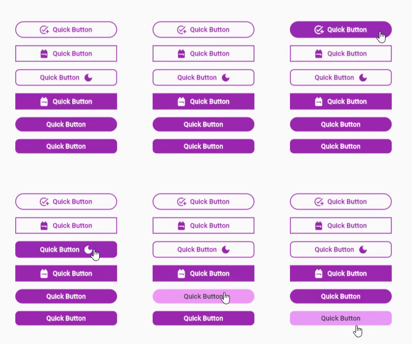
A package that provides multiple customizable buttons for quick use.
Quick Button #
A package that provides multiple customizable buttons for quick use.

Usage #
QuickButton behaves similarly to the TextButton widget but with more customizable features in one place.
- Basic Usage:
     QuickButton(
                labelText: 'Quick Button',
                onPressed: () {},
              ),
- Advanced Usage:
     QuickButton(
                labelText: 'Quick Button',
                labelColor: Colors.white,
                labelSize: 13.0,
                labelWeight: FontWeight.bold,
                labelSpacing: 0.3,
                borderRadius: 8.0,
                buttonSize: 200.0,
                backgroundColor: Colors.purple,
                labelHoverIn: const Color.fromARGB(255, 63, 63, 63),
                labelHoverOut: Colors.white,
                backgroundHoverIn: const Color.fromARGB(112, 226, 33, 243),
                backgroundHoverOut: Colors.purple,
                onPressed: () {},
              ),
Properties #
| Property | Description |
|---|---|
| labelColor | Text that defines the button. |
| labelColor | Initial color of font color of labelText. |
| LabelSize | Font size of labelText. |
| LabelWeight | Font weight of labelText. |
| labelSpacing | Letter spacing of labelText. |
| prefixIcon | Icon placed before the labelText. |
| suffixIcon | Icon placed after the labelText. |
| iconSize | Icon size of prefixIcon & suffixIcon. |
| buttonSize | Width of the button. |
| borderRadius | Rounds the corners of the button’s outer border edge to preferred size. |
| borderColor | Color of button’s border edge. |
| borderSize | Button’s border edge size. |
| backgroundColor | Background color of button. |
| labelHoverIn | Changes the color of labelText when the mouse hovers the button. |
| labelHoverOut | Changes the color of labelText when the mouse hovers outside the button. |
| backgroundHoverIn | Changes the color of backgroundColor when the mouse hovers the button. |
| backgroundHoverOut | Changes the color of backgroundColor when the mouse hovers outside the button. |
| onPressed | A callback is called when the button is tapped. |


