programming_blocks 0.0.1  programming_blocks: ^0.0.1 copied to clipboard
 nairda.com.mx
With this package you can implement your programming environment with graphic blocks with pure dart in flutter.
PorgrammingBlocks allows us to define a customized programming environment with graphical blocks without having to worry about how drag and drop works, or how to manage the blocks in the creation panel. We only need to define our list of sections and within each section the list of blocks that will contain.
Installation #
Add to pubspec.yaml:
dependencies:
    programming_blocks: ^0.0.1
Simple example #
import 'package:flutter/material.dart';
import 'package:programming_blocks/programming_blocks.dart';

class ProgrammingPage extends StatelessWidget {
  const ProgrammingPage({Key? key}) : super(key: key);

  @override
  Widget build(BuildContext context) {
    return Scaffold(
      body: SafeArea(
        child: ProgrammingBlocks(
          sections: [
            FollowSection(),
            LogicSection(),
            NumbersSection(),
          ],
        ),
      ),
    );
  }
}
Complex example #
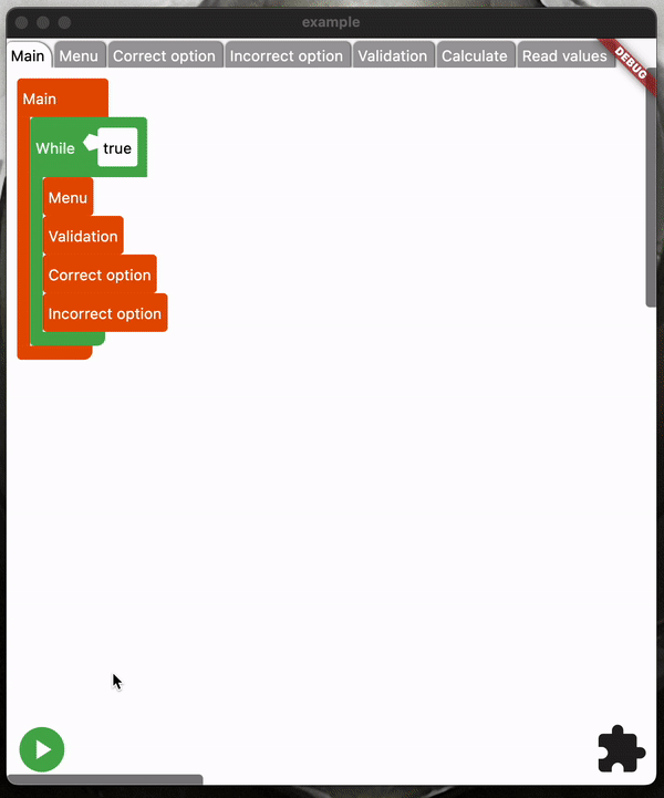
You can find the code of this animation on example folder, Online demo #
How to use #
The only attribute required to work is the section list, all others are settings and widget event listeners:
- Color? backgroundCanvasColor: Background color of the drawing canvas.
- Curve? creationPanelAnimationCurve: Animation curve for opening and closing the creation panel.
- Duration? creationPanelAnimationDuration: Duration of the creation panel opening and closing animation.
- Color? creationPanelBackgroundColor: Background color of the creation panel.
- double? creationPanelHeight: Height of the creation panel.
- Widget Function()? creationPanelOpenCloseBuilder: Widget builder for the creation panel open/close button.
- Widget Function(BuildContext context, CreationSectionData creationSectionData,bool selected)? creationSectionButtonBuilder: Widget builder for the buttons of each section in the creation panel.
- double defaultFuntionSize =2000: Default size of the functions.
- Duration? doubleTapAnimDuration: Duration of the double tap animation on the blocks.
- Duration dragDelay=100: Delay in dragging the blocks.
- bool drawMainScope=true: Whether to draw the main scope.
- bool enableFunctions=true: If the functions should be enabled.
- Color? foregroundCanvasColor: Color of the foreground of the drawing canvas.
- Color? functionsSectionColor: Color of the functions section in the creation panel.
- Widget Function(BuildContext context, String tabName, bool selected)? functionTabsBuilder: Widget builder for function tabs.
- String mainFunctionName = 'Main': Name of the main function.
- Function( RunningState runningState, )? onChangeRunningState: Callback function to change the running state.
- Function(ProgrammingBlocksProjectModel projectModel)? onProjectChange: Callback function to change the project model.
- double? opacityScrollBars: Opacity of the scroll bars.
- ProgrammingBlocksProjectModel? projectModel: Project model.
- double? radiusScrollBars: Radius of the scroll bars.
- Widget Function(Color? enterBlockColor)? runBuilder: Widget builder for the run button.
- Color? scrollBarsColor: Color of the scroll bars.
- double? scrollBarsWeight: Width of the scroll bars.
- List[] sections: List of sections <CreationSectionData> in the creation panel.
- Widget Function()? stopBuilder: Widget builder for the stop button.
- Widget Function(bool onBlockEnter)? trashBuilder: Widget builder for the trash can icon.
CreationSectionData #
The Section Data class contains information about the name and color of the section.
Sections #
SimpleSection #
The SimpleSection class represents a simple section in element creation. This class has the following arguments:
- Widget Function(CreationSectionData)? addInstanceButtonBuilder: A widget builder that is responsible for building a button to add a new instance of the element. It is optional and can be null.
- CreationSectionData creationSectionData: An object of type CreationSectionData that contains the creation section data.
- Lis [] blocktypes: – A list of <BlockType> objects that define the types of blocks that can be added to the section.
DividedSection #
The DividedSection class represents a divided section in element creation. This class has the following arguments:
- CreationSectionData creationSectionData: An object of type CreationSectionData that contains the creation section data.
- List [] subSections: A map containing the <CreationSectionData> of the split section, where the key is the name of the subsection and the value is an object of type CreationSection.
TypedSection #
The TypedSection class represents a section of typed elements on element creation. This class has the following arguments:
- Widget Function(BuildContext, CreationSectionData)? addInstanceButtonBuilder: - A widget builder that is responsible for building a button to add a new instance of the element. It is optional and can be null.
- CreationSectionData creationSectionData: An object of type CreationSectionData that contains the creation section data.
- BlockType instancesblockType: An object of type BlockType that defines the block type of the instances of the element.
- List [] instancesFunctionsBlockTypes: A list of <BlockType> that defines the block types of functions that can be added to instances of the element.
- String typeName: A String that represents the name of the type of elements that are being created in the section.
Necessary methods #
- Future<ConfigurationBlockModel?>(BuildContext context) addInstance: This method must return a new ConfigurationBlockModel by the method that the developer decides.
- void (BuildContext context, ConfigurationBlockController controller)onEditInstance: This method must contain the interface that the user decides to edit/delete instances.
BlockType #
Arguments #
- CreationSectionData sectionData: An object of type CreationSectionData that contains the creation section data.
- ProgrammingBlockShape shape: This would define the shape and interaction of the block.
- String name: Name with which this type of block will be distinguished from the others.
Necessary methods #
-
Widget(ProgrammingBlockController? blockController) nameBuilder: Constructs and returns a widget that represents the name of the block. The blockController parameter is optional and is used to control the behavior of the block.
-
Widget(ProgrammingBlockController? blockController) panelBuilder: Constructs and returns a widget that represents the panel of the block. The blockController parameter is optional and is used to control the behavior of the block.
-
Future: Execute the programming block. The executionController parameter is optional and is used to control the execution of the block.
-
Future: Read the data from the programming block. The readBlockController parameter is optional and is used to control reading data from the block.
-
ProgrammingBlockModel? blockModel: Returns a programming block model based on the shape of the block.
Metadata
Documentation
Publisher
Weekly Downloads
Metadata
With this package you can implement your programming environment with graphic blocks with pure dart in flutter.
Homepage
Repository (GitHub)
View/report issues
License
 MIT (license)
Dependencies
async, audioplayers, collection, equatable, flutter, zoom_widget