pop_overlay 2.0.0  pop_overlay: ^2.0.0 copied to clipboard
A feature-rich package for displaying customizable pop-ups from any given widget. Featuring animated, draggable overlays, with optional background blur effects...
pop_overlay #
A feature-rich Flutter package for displaying customizable pop-up notifications, alerts, and overlay UI elements. Featuring: animated, draggable, overlays/popups, and optional background blur.
Demo #
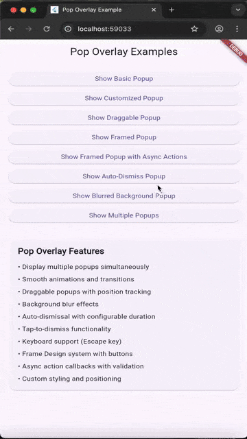
Features #
- ✨ Multiple Overlays: Display multiple popups simultaneously with automatic stacking and priority management
- 🎨 Customizable Animations: Smooth entrance and exit animations with full animation control
- 🌫️ Background Blur Effects: Optional blur overlay with configurable intensity
- 🎯 Tap-to-Dismiss: Background tap dismissal with configurable behavior
- 🖱️ Draggable Popups: Make popups draggable with position tracking using state management
- 📋 Framed Design: Pre-built UI Frame system for consistent popup styling
- ⌨️ Keyboard Support: Escape key listener for keyboard-based dismissal
- ⚡ Performance Optimized: Efficient rendering with smart animation controls
- 🎛️ Full Customization: Control colors, sizes, animations, and more
- 📱 Responsive: Adapts to different screen sizes and orientations
Installation #
Add this to your package's pubspec.yaml file:
dependencies:
  pop_overlay: ^2.0.0
Then run:
flutter pub get
Usage #
✅ No setup required (auto-installs) #
pop_overlay now self-installs its activator into the root overlay. You do not need to wrap your widget tree anymore.
Migration note:
PopOverlay.addPop(...)now accepts an optionalBuildContextfor deterministic root-overlay resolution.
Basic Pop-up #
import 'package:pop_overlay/pop_overlay.dart';

// Create and show a simple popup
PopOverlay.addPop(
  PopOverlayContent(
    id: 'my_popup',
    widget: Container(
      padding: const EdgeInsets.all(16),
      child: const Text('Hello, Pop Overlay!'),
    ),
  ),
);

// Remove the popup
PopOverlay.removePop('my_popup');
Pop-up with Customization #
PopOverlay.addPop(
  PopOverlayContent(
    id: 'custom_popup',
    widget: MyCustomWidget(),
    shouldDismissOnBackgroundTap: true,
    dismissBarrierColor: Colors.black.withValues(alpha: 0.5),
    shouldAnimatePopup: true,
  ),
);
Draggable Pop-up #
PopOverlay.addPop(
  PopOverlayContent(
    id: 'draggable_popup',
    widget: MyContentWidget(),
    isDraggeable: true,
  ),
);
Pop-up with Framed Design #
final template = FrameDesign(
  title: 'Settings',
  showCloseButton: true,
  titlePrefixIcon: Icons.settings,
  onSuccess: () => PopOverlay.removePop('settings_popup'),
);

PopOverlay.addPop(
  PopOverlayContent(
    id: 'settings_popup',
    widget: MySettingsWidget(),
    frameDesign: template,
    isDraggeable: true,
  ),
);
API Reference #
PopOverlay #
Main static class for managing popups.
addPop(PopOverlayContent content, {BuildContext? context})- Add a popup (optionally providing a context for deterministic overlay resolution)removePop(String id)- Remove a popup by IDdismissPop(String id)- Dismiss a popup respecting its settingsremoveMultiplePops(List<String> ids)- Remove multiple overlays at onceclearAll()- Clear all active popups
PopOverlayContent #
Configuration class for individual popups.
Parameters (selected):
id(String) - Unique identifier for the popupwidget(Widget) - Content widget to displayisDraggeable(bool) - Enable drag functionality (default: true)frameDesign(FrameDesign?) - Optional Frame design templateshouldDismissOnBackgroundTap(bool) - Allow dismissal by tapping outside (default: true)dismissBarrierColor(Color?) - Background overlay colorshouldAnimatePopup(bool) - Enable animations (default: true)duration(Duration?) - Auto-dismiss after a duration
FrameDesign #
Pre-built Frame template for consistent popup UI.
Parameters:
title(String?) - Popup titleshowCloseButton(bool) - Show close button (default: true)titlePrefixIcon(IconData?) - Icon before titleonSuccess(VoidCallback?) - Success button callback
Advanced Features #
The gif above demonstrates:
- Multiple stacked popups
- Smooth animations
- Draggable functionality
- Design template styling
Performance Optimizations #
The package includes several performance optimizations:
- Smart Animation Control: Animations are disabled during drag operations for smooth performance
- Efficient State Management: Custom drag state controller prevents unnecessary rebuilds
- Lazy Rendering: Overlays are only rendered when needed
- Minimal Dependencies: Lightweight package with carefully selected dependencies
Dependencies #
flutter_animate: Advanced animation effectss_future_button: Button with async supportstates_rebuilder_extended: State managements_widgets: Utility widgetssizer: Responsive sizing
See pubspec.yaml for the complete list.
Examples #
Complete working examples are available in the example/ directory:
- Basic pop-up notification
- Draggable popup with Frame Design template
- Multiple popups with priorities
- Customized animations and styling
Run the example:
cd example
flutter run
License #
This project is licensed under the MIT License - see the LICENSE file for details.
Support #
If you encounter any issues or have feature requests, please file an issue on the GitHub repository.
Made with ❤️ by SoundSliced Ltd
Metadata
Publisher
unverified uploader
Weekly Downloads
Metadata
A feature-rich package for displaying customizable pop-ups from any given widget. Featuring animated, draggable overlays, with optional background blur effects...
Repository (GitHub)
View/report issues
Documentation
License
 MIT (license)
Dependencies
flutter, flutter_animate, s_context_menu, s_disabled, s_future_button, s_ink_button, s_offstage, s_widgets, sizer, soundsliced_dart_extensions, soundsliced_tween_animation_builder, states_rebuilder_extended, ticker_free_circular_progress_indicator, universal_html