om_data_grid 0.0.14  om_data_grid: ^0.0.14 copied to clipboard
 omarx.net
A powerful, customizable, and high-performance data grid for Flutter apps, with support for advanced filtering, sorting, grouping, and charting.
om_data_grid #
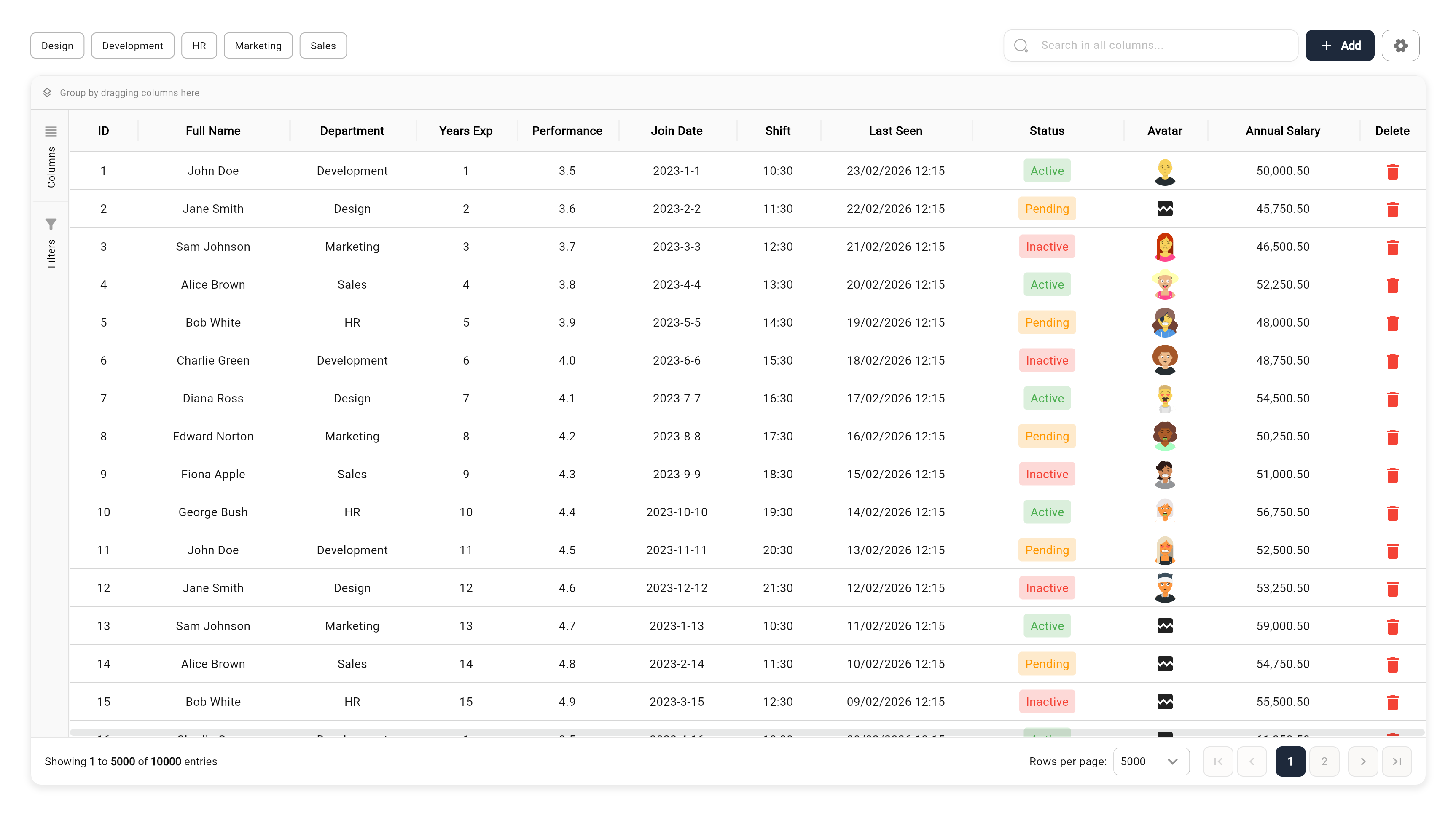
A high-performance, feature-rich, and fully customizable DataGrid for Flutter. Designed to handle large datasets with ease while providing enterprise-grade features like advanced filtering, multi-level grouping, and built-in visualization.

🌐 Live Demo #
Check out the interactive demo: Live Web Demo
📑 Table of Contents #
- 🚀 Key Features
- 🌐 Live Demo
- 🛠 Installation
- 📖 Quick Start
- 🧩 Advanced Usage
- 📊 Grid Features in Depth
- 🛠 API Reference
- 🤝 Contributing
- 📄 License
🚀 Key Features #
- ⚡ Enterprise-Grade Performance: Built with row and column virtualization to smoothly handle 100,000+ records.
- 🔍 Advanced Filtering System:
- Global search with substring highlighting.
- Quick filter bar for rapid data slicing.
- Advanced UI filtering per column (Contains, Equals, Starts With, Numeric ranges, etc.).
- 📊 Integrated Data Visualization: Built-in support for 15+ chart types including Column, Bar, Line, Area, Pie, Doughnut, and more (using Syncfusion).
- 📁 Grouping & Hierarchical Views:
- Drag and drop columns to group data dynamically.
- Multi-level grouping supports nested data exploration.
- 🔢 Aggregations & Summaries: Automatic calculations in footer rows (Sum, Average, Count, Min, Max, First, Last).
- 📝 Rich Content Support: Built-in editors for Dates, Checkboxes, Switches, Images, and Files (including Multi-Image/File support).
- 📍 Pinning & Reordering:
- Freeze columns/rows to the left, right, top, or bottom.
- Intuitive drag-and-drop for column and row reordering.
- 💾 Professional Exporting: Seamlessly export current or filtered views to Excel (.xlsx) and PDF.
🛠 Installation #
Add om_data_grid to your pubspec.yaml:
dependencies:
  om_data_grid: ^0.0.14
Then run:
flutter pub get
📖 Quick Start #
1. Simple Data Structure #
final List<Map<String, dynamic>> myData = [
  {"id": 1, "name": "John Doe", "role": "Developer", "salary": 75000},
  {"id": 2, "name": "Jane Smith", "role": "Designer", "salary": 82000},
];
2. Configure Your Columns #
final List<OmGridColumn> columns = [
  OmGridColumn(key: 'id', title: 'ID', width: 80, type: OmGridRowTypeEnum.number),
  OmGridColumn(key: 'name', title: 'Name', width: 150, type: OmGridRowTypeEnum.text),
  OmGridColumn(key: 'role', title: 'Role', width: 120, type: OmGridRowTypeEnum.comboBox),
  OmGridColumn(key: 'salary', title: 'Salary', width: 130, type: OmGridRowTypeEnum.double),
];
3. Initialize Controller & Widget #
final controller = OmDataGridController(
  data: myData,
  columnModels: columns.map((c) => OmGridColumnModel(column: c)).toList(),
  configuration: OmDataGridConfiguration(
    primaryColor: Colors.teal,
    allowPagination: true,
  ),
);

// In your build method
OmDataGrid(controller: controller)
🧩 Advanced Usage #
Column Types #
om_data_grid handles much more than just text:
OmGridRowTypeEnum.image: URL/Asset image display.OmGridRowTypeEnum.multiImage: Carousel for multiple images.OmGridRowTypeEnum.iosSwitch: Interactive boolean toggle.OmGridRowTypeEnum.date: Date picker integration with customizable formatting.OmGridRowTypeEnum.state: Conditional status indicators with icons.
Calculated Columns (Formulas) #
Create columns that perform live calculations:
OmGridColumn(
  key: 'total_comp',
  title: 'Total Comp',
  // Formula using other column keys
  formula: 'salary + bonus',
  type: OmGridRowTypeEnum.number,
)
Custom Aggregations #
Show summaries at the grid or group level:
OmGridColumn(
  key: 'salary',
  title: 'Salary',
  // Options: sum, avg, count, min, max, first, last
  aggregationType: OmAggregationType.avg,
)
Theming & UI #
The grid supports a powerful cascading theming system. You can set a few base colors, and the entire grid will automatically update its palette, while still allowing you to override any specific property.
Quick Styling (Base Theme)
Perfect for matching your app's brand and supporting Light/Dark modes with minimal code:
OmDataGridConfiguration(
  gridBackgroundColor: Colors.white,
  gridForegroundColor: Color(0xFF1E293B),
  gridBorderColor: Color(0xFFE2E8F0),
  primaryColor: Color(0xFF1E293B),
  gridFontFamily: 'Inter',
  // Non-color attributes
  rowHeight: 45.0,
  allowPagination: true,
)
Detailed Customization
Override any of the 50+ styling properties for granular control:
OmDataGridConfiguration(
  gridBackgroundColor: Colors.white,
  gridForegroundColor: Colors.black87,
  // Specific overrides
  headerBackgroundColor: Color(0xFF1A1A1A),
  headerForegroundColor: Colors.white,
  selectedRowColor: Colors.blue.withOpacity(0.1),
  rowHeight: 50.0,
  headerHeight: 60.0,
)
Context Menus #
Add custom actions to rows or columns:
OmGridColumn(
  key: 'name',
  title: 'Name',
  contextMenuOptions: [
    OmRowContextMenuItem(
      label: 'Send Email',
      icon: Icons.email,
      onTap: (row) => print('Emailing ${row['name']}'),
    ),
  ],
)
Side Panel Customization #
Add your own tools to the grid's side panel:
OmDataGridController(
  additionalSidePanelTabs: [
    OmGridSidePanelTab(
      id: 'custom_reports',
      icon: Icons.analytics,
      label: 'Reports',
      builder: (context, controller) => MyCustomReportWidget(controller: controller),
    ),
  ],
)
📊 Grid Features in Depth #
Data Visualization #
The grid isn't just a list; it's an analysis tool. Built-in "Visualize" actions allow users to instantly turn any filtered dataset into a dashboard of charts (Pie, Bar, Column, Area, etc.) with customizable axes and sorting.
Exporting & Sharing #
- Excel: Full support for
.xlsxexport, including calculated columns and current filtering state. - PDF: Cleanly formatted PDF reports of your data grid.
Editing & Input #
When isEditing is true, cells become interactive:
- Text/Number: Standard input.
- ComboBox: Single and multi-selection dropdowns.
- Switches: Instant boolean updates.
- Images/Files: Integrated
image_pickerandfile_pickersupport.
🛠 API Reference #
OmDataGrid Props #
| Property | Type | Description |
|---|---|---|
controller |
OmDataGridController |
Required. Manages data, state, and event handling. |
onRowTap |
Function(Map) |
Callback when a row is clicked. |
isEditing |
bool |
Toggles cell editability globally. |
onSelectionChanged |
Function(List<Map>) |
Triggered when row selection changes. |
OmGridColumn Configuration #
| Property | Type | Default | Description |
|---|---|---|---|
key |
String |
- | Unique key identifying the column in the data source. |
title |
String |
- | The title displayed in the column header. |
width |
double? |
null |
Initial width of the column. |
textAlign |
TextAlign? |
TextAlign.center |
Alignment of the text within the cell. |
resizable |
bool |
true |
Whether the column width can be adjusted by the user. |
allowFiltering |
bool |
true |
Enables filtering for this column. |
allowSorting |
bool |
true |
Enables sorting for this column. |
type |
OmGridRowTypeEnum |
OmGridRowTypeEnum.text |
The type of data in the column (e.g., text, number, date, image). |
comboBoxSettings |
OmGridComboBoxSettings? |
null |
Configuration for comboBox column types. |
numberType |
String? |
null |
Specific number formatting type. |
showInChart |
bool |
true |
Whether this column represents data in charts. |
canBeXAxis |
bool |
true |
Whether this column can be used as the X-axis in charts. |
canBeYAxis |
bool |
true |
Whether this column can be used as the Y-axis in charts. |
formula |
String? |
null |
Formula for calculated columns (e.g., "price * quantity"). |
decimalSeparator |
String? |
null |
Character used as decimal separator. |
thousandsSeparator |
String? |
null |
Character used as thousands separator. |
decimalDigits |
int? |
null |
Number of decimal places to display. |
customDateFormat |
String? |
null |
Custom format string for date columns. |
imageBorderRadius |
double? |
null |
Border radius for image cells. |
multiSelect |
bool? |
null |
Enables multi-selection for relevant types. |
displayKey |
String? |
null |
Key to display in the cell (for object-based values). |
valueKey |
String? |
null |
Key for the underlying value (for object-based values). |
readonlyInView |
bool? |
null |
If true, the column cannot be edited in the grid view. |
onDelete |
Future<void> Function(dynamic)? |
null |
Callback triggered when a specialized item (like a file) is deleted. |
stateConfig |
Map<dynamic, OmStateConfig>? |
null |
Configuration for state-based styling (background/text colors based on value). |
contextMenuOptions |
List<OmRowContextMenuItem>? |
null |
Custom context menu options for this column. |
showPlaceholderWhileScrolling |
bool |
true |
Shows a placeholder for performance optimization during scrolling. |
OmDataGridConfiguration #
Defines the global appearance and behavior of the DataGrid.
| Property | Type | Default | Description |
|---|---|---|---|
headerBackgroundColor |
Color |
Color(0xFFE7E7E7) |
Background color of the header row. |
headerForegroundColor |
Color |
Color(0xFF131313) |
Text color of the header row. |
rowBackgroundColor |
Color |
Colors.transparent |
Background color of data rows. |
rowForegroundColor |
Color |
Color(0xFF131313) |
Text color of data rows. |
selectedRowColor |
Color |
Color(0x14398FD4) |
Background color of selected rows. |
rowHoverColor |
Color |
Color(0x0A000000) |
Background color when hovering over a row. |
selectedRowForegroundColor |
Color |
Color(0xFF131313) |
Text color of selected rows. |
headerBorderColor |
Color |
Color(0xFFE5E5E5) |
Color of the header borders. |
headerBorderWidth |
double |
0.5 |
Width of the header borders. |
rowBorderColor |
Color |
Color(0xFFE5E5E5) |
Color of the row borders. |
rowBorderWidth |
double |
0.5 |
Width of the row borders. |
headerBorderVisibility |
OmGridBorderVisibility |
both |
Visibility of header borders. |
rowBorderVisibility |
OmGridBorderVisibility |
both |
Visibility of row borders. |
headerTextStyle |
TextStyle? |
null |
Custom text style for the header. |
rowTextStyle |
TextStyle? |
null |
Custom text style for rows. |
selectedRowTextStyle |
TextStyle? |
null |
Custom text style for selected rows. |
resizeHandleColor |
Color |
Colors.transparent |
Color of the column resize handle. |
resizeHandleWidth |
double |
4 |
Width of the resize handle area. |
paginationBackgroundColor |
Color |
Color(0xFFFFFFFF) |
Background color of the pagination footer. |
paginationSelectedBackgroundColor |
Color |
Color(0xFF398FD4) |
Background color of selected page button. |
paginationSelectedForegroundColor |
Color |
Color(0xFFFFFFFF) |
Text color of selected page button. |
paginationUnselectedBackgroundColor |
Color |
Color(0xFFFAF9F7) |
Background color of unselected page buttons. |
paginationUnselectedForegroundColor |
Color |
Color(0xFFABABAB) |
Text color of unselected page buttons. |
paginationTextColor |
Color |
Color(0xFF131313) |
Text color of pagination info. |
gridBackgroundColor |
Color |
Color(0xFFFFFFFF) |
Background color of the entire grid area. |
gridBorderColor |
Color |
Color(0xFFE5E5E5) |
Color of the outer grid border. |
filterIconColor |
Color |
Color(0xFF131313) |
Color of the filter icon in headers. |
sortIconColor |
Color |
Color(0xFF131313) |
Color of the sort icon in headers. |
filterPopupBackgroundColor |
Color |
Color(0xFFFFFFFF) |
Background color of the filter popup. |
keyboardHideButtonBackgroundColor |
Color |
Color(0xFF131313) |
Background color of keyboard hide button. |
keyboardHideButtonForegroundColor |
Color |
Color(0xFFFFFFFF) |
Icon color of keyboard hide button. |
primaryColor |
Color |
Color(0xFF398FD4) |
Primary accent color (focus, selection). |
errorColor |
Color |
Color(0xFFF44242) |
Color used for error states. |
inputFillColor |
Color |
Colors.white |
Fill color for input fields. |
inputBorderColor |
Color |
Color(0xFFB5B5B5) |
Border color for input fields. |
inputFocusBorderColor |
Color |
Color(0xFF398FD4) |
Focused border color for inputs. |
secondaryTextColor |
Color |
Color(0xFF929292) |
Secondary text color. |
primaryForegroundColor |
Color |
Colors.white |
Foreground color on primary background. |
minColumnWidth |
double |
120 |
Minimum width for columns. |
rowHeight |
double |
40.0 |
Height of each data row. |
headerHeight |
double |
50.0 |
Height of the header row. |
cacheExtent |
double |
250.0 |
Cache extent for scrolling performance. |
columnWidthMode |
OmColumnWidthMode |
fill |
Strategy for calculating column widths. |
allowPagination |
bool |
true |
Enables pagination footer. |
rowsPerPage |
int |
250 |
Default number of rows per page. |
paginationMode |
OmPaginationMode |
pages |
Style of pagination (pages vs simple). |
allowSorting |
bool |
true |
Globally enables sorting. |
allowColumnReordering |
bool |
true |
Allows dragging to reorder columns. |
allowRowReordering |
bool |
false |
Allows dragging to reorder rows. |
selectionMode |
OmSelectionMode |
none |
Row selection mode. |
rowsPerPageOptions |
List<int>? |
null |
Options for rows per page dropdown. |
quickFilters |
List<OmQuickFilterConfig>? |
null |
Configuration for quick filter buttons. |
showSettingsButton |
bool |
true |
Shows settings button in toolbar. |
showClearFiltersButton |
bool |
true |
Shows clear filters button. |
showAddButton |
bool |
false |
Shows 'Add' button in toolbar. |
addButtonText |
String? |
'Add' |
Text for the add button. |
addButtonIcon |
Widget |
Icon(Icons.add...) |
Icon for the add button. |
addButtonBackgroundColor |
Color? |
null |
Background color of add button. |
addButtonForegroundColor |
Color? |
null |
Text/Icon color of add button. |
addButtonBorderColor |
Color? |
null |
Border color of add button. |
addButtonFontSize |
double? |
null |
Font size of add button text. |
addButtonFontWeight |
FontWeight? |
null |
Font weight of add button text. |
addButtonPadding |
EdgeInsetsGeometry? |
vertical: 8 |
Padding for add button. |
addButtonBorderRadius |
BorderRadiusDirectional? |
circular(8) |
Border radius of add button. |
showFilterOnHover |
bool |
true |
Shows filter icon only on hover. |
showSortOnHover |
bool |
true |
Shows sort icon only on hover. |
enableGrouping |
bool |
false |
Enables grouping features. |
allowGrouping |
bool |
true |
Allows user to group by columns. |
showGroupingPanel |
bool |
false |
Shows the drop target for grouping. |
groupPanelBackgroundColor |
Color? |
null |
Background color of group panel. |
groupPanelBorderColor |
Color? |
null |
Border color of group panel. |
groupPanelBorderWidth |
double? |
null |
Border width of group panel. |
groupPanelHeight |
double? |
null |
Height of group panel. |
groupPanelTextStyle |
TextStyle? |
null |
Text style in group panel. |
groupPanelIconColor |
Color? |
null |
Icon color in group panel. |
groupPanelClearIconColor |
Color? |
null |
Clear icon color in group panel. |
groupPanelItemBackgroundColor |
Color? |
null |
Background of grouped items. |
groupPanelItemBorderColor |
Color? |
null |
Border color of grouped items. |
groupPanelItemTextStyle |
TextStyle? |
null |
Text style of grouped items. |
columnSearchBorderColor |
Color? |
0xFFE0E0E0 |
Border color of column search box. |
columnSearchIconColor |
Color? |
0xFF9E9E9E |
Icon color of column search box. |
dragFeedbackOutsideBackgroundColor |
Color? |
0xFFF44336 |
Drag feedback background (invalid). |
dragFeedbackInsideBackgroundColor |
Color? |
0xFFFFFFFF |
Drag feedback background (valid). |
dragFeedbackOutsideBorderColor |
Color? |
0xFFF44336 |
Drag feedback border (invalid). |
dragFeedbackInsideBorderColor |
Color? |
0xFFE0E0E0 |
Drag feedback border (valid). |
dragFeedbackOutsideTextColor |
Color? |
0xFFFFFFFF |
Drag feedback text (invalid). |
dragFeedbackInsideTextColor |
Color? |
0xFF000000 |
Drag feedback text (valid). |
dragFeedbackIconColor |
Color? |
0xFFFFFFFF |
Drag feedback icon color. |
dragFeedbackShadowColor |
Color? |
0x1A000000 |
Drag feedback shadow. |
columnDragIndicatorColor |
Color? |
0xFF9E9E9E |
Color of placement indicator. |
columnFunctionIconColor |
Color? |
0xFF2196F3 |
Color of function icons. |
bottomPanelSectionBorderColor |
Color? |
0xFFE0E0E0 |
Border color in bottom panel. |
bottomPanelDragTargetColor |
Color? |
null |
Color of drag target in bottom panel. |
bottomPanelDragTargetInactiveColor |
Color? |
0xFFEEEEEE |
Inactive drag target color. |
bottomPanelIconColor |
Color? |
0xFFBDBDBD |
Icon color in bottom panel. |
menuBackgroundColor |
Color? |
0xFFFFFFFF |
Background color of menus. |
menuSurfaceTintColor |
Color? |
0xFFFFFFFF |
Surface tint of menus. |
menuTextColor |
Color? |
0xFF9E9E9E |
Text color in menus. |
dialogBackgroundColor |
Color? |
0xFFFFFFFF |
Background of dialogs. |
dialogSurfaceTintColor |
Color? |
0xFFFFFFFF |
Surface tint of dialogs. |
dialogTextColor |
Color? |
0xFF757575 |
Text color in dialogs. |
contextMenuItems |
List<...>? |
null |
Custom context menu items. |
useDefaultContextMenuItems |
bool |
true |
Whether to include default menu items. |
showCopyMenuItem |
bool |
true |
Show 'Copy' in context menu. |
showCopyHeaderMenuItem |
bool |
true |
Show 'Copy Header' in context menu. |
showEquationMenuItem |
bool |
true |
Show 'Equation' in context menu. |
showSortMenuItem |
bool |
true |
Show 'Sort' in context menu. |
showFilterBySelectionMenuItem |
bool |
true |
Show 'Filter by Selection'. |
showChartsMenuItem |
bool |
true |
Show 'Visualize' in context menu. |
sidePanelConfiguration |
OmSidePanelConfiguration |
const... |
Side panel configuration. |
showColumnsTab |
bool |
true |
Show 'Columns' tab in side panel. |
showFiltersTab |
bool |
true |
Show 'Filters' tab in side panel. |
showQuickSearch |
bool |
false |
Show quick search toolbar. |
showGlobalSearch |
bool |
false |
Show global search toolbar. |
frozenColumnCount |
int |
0 |
Number of columns frozen on the left. |
footerFrozenColumnCount |
int |
0 |
Number of columns frozen on the right. |
frozenRowCount |
int |
0 |
Number of rows frozen at the top. |
footerFrozenRowCount |
int |
0 |
Number of rows frozen at the bottom. |
showPlaceholderWhileScrolling |
bool |
true |
Optimizes scrolling performance. |
shrinkWrapRows |
bool |
false |
Shrink wrap vertical sizing. |
shrinkWrapColumns |
bool |
false |
Shrink wrap horizontal sizing. |
frozenPaneElevation |
double |
0.0 |
Elevation shadow for frozen panes. |
frozenPaneBorderSide |
BorderSide? |
Color(0xFFE5E5E5) |
Border for frozen panes. |
frozenPaneScrollMode |
OmFrozenPaneScrollMode |
sticky |
Scroll behavior (sticky vs fixed). |
filterTabItemBackgroundColor |
Color? |
0xFFFFFFFF |
Background of filter items. |
filterTabItemBorderColor |
Color? |
0xFFEEEEEE |
Border of filter items. |
filterTabItemParamsColor |
Color? |
0xDD000000 |
Text color of filter params. |
filterTabItemIconColor |
Color? |
0xFF757575 |
Icon color of filter items. |
chartPopupBackgroundColor |
Color? |
0xFFFFFFFF |
Background of chart popup. |
chartPopupBorderColor |
Color? |
0xFFBDBDBD |
Border of chart popup. |
chartPopupLoadingBackgroundColor |
Color? |
0xFF000000 |
Loading background for charts. |
chartPopupLoadingTextColor |
Color? |
0xFF000000 |
Loading text color for charts. |
chartPopupResizeHandleColor |
Color? |
0xFF9E9E9E |
Resize handle for chart popup. |
mobileSettingsBackgroundColor |
Color? |
0xFFFFFFFF |
Background for mobile settings. |
mobileSettingsHeaderColor |
Color? |
null |
Header color for mobile settings. |
mobileSettingsIconColor |
Color? |
null |
Icon color for mobile settings. |
chartTitleColor |
Color? |
0xFFFFFFFF |
Title color in charts. |
chartIconColor |
Color? |
0xFFFFFFFF |
Icon color in charts. |
fullScreenButtonColor |
Color? |
0xFFFFFFFF |
Fullscreen button color. |
closeButtonColor |
Color? |
0xFFFFFFFF |
Close button color. |
chartSettingsSidebarBackgroundColor |
Color? |
null |
Chart settings sidebar background. |
contextMenuIconColor |
Color? |
0xFF616161 |
Icon color in context menu. |
contextMenuTextColor |
Color? |
0xDD000000 |
Text color in context menu. |
contextMenuDestructiveColor |
Color? |
0xFFF44336 |
Color for destructive actions. |
contextMenuSectionHeaderColor |
Color? |
null |
Section header color in menu. |
contextMenuItemIconBackgroundColor |
Color? |
null |
Background for menu item icons. |
contextMenuSortIconColor |
Color? |
null |
Specific icon color for sort. |
contextMenuPinIconColor |
Color? |
null |
Specific icon color for pin. |
contextMenuGroupIconColor |
Color? |
null |
Specific icon color for group. |
contextMenuAggregationIconColor |
Color? |
null |
Specific icon color for aggregation. |
contextMenuLayoutIconColor |
Color? |
null |
Specific icon color for layout. |
(Note: OmDataGridConfiguration contains many more color and style properties for fine-grained customization of menus, dialogs, and inputs not listed above.)
OmSidePanelConfiguration #
Controls the look and feel of the expandable side panel.
| Property | Type | Default | Description |
|---|---|---|---|
backgroundColor |
Color? |
Color(0xFFF9F9F9) |
Background color of the side panel. |
activeTabColor |
Color? |
Colors.white |
Background color of the active tab. |
inactiveTabColor |
Color? |
Colors.transparent |
Background color of inactive tabs. |
activeIconColor |
Color? |
Colors.black |
Icon color for the active tab. |
inactiveIconColor |
Color? |
Colors.grey |
Icon color for inactive tabs. |
collapsedWidth |
double |
45.0 |
Width of the panel when collapsed. |
expandedWidth |
double |
250.0 |
Width of the panel when expanded. |
animationDuration |
Duration |
200ms |
Duration of the expand/collapse animation. |
🤝 Contributing #
Contributions are welcome! Please feel free to submit a Pull Request or open an issue on GitHub.
📄 License #
This project is licensed under the MIT License - see the LICENSE file for details.
Metadata
Publisher
Weekly Downloads
Metadata
A powerful, customizable, and high-performance data grid for Flutter apps, with support for advanced filtering, sorting, grouping, and charting.
Repository (GitHub)
View/report issues
License
 unknown (license)
Dependencies
expressions, file_selector, flutter, http, iconsax_flutter, image_picker, intl, path_provider, syncfusion_flutter_charts, syncfusion_flutter_datepicker, syncfusion_flutter_pdf, syncfusion_flutter_xlsio, url_launcher, web