neumorphic 0.0.2  neumorphic: ^0.0.2 copied to clipboard
Neumorphic UI. Implementation of Neumorphism user interface consisting of sets of principles and widgets for the Flutter framework
neumorphic #
Neumorphic Ui for flutter

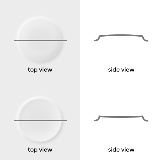
Includes two states:
NeumorphicStatus.convex (first) &
NeumorphicStatus.concave (second)
Api #
Now implemented some widgets:
- Neumorphic
- NeumorphicButton
- NeumorphicSwitch
Neumorphic #
It is container like a Material merged with Container, but implement Neumorphism
Neumorphic(
  // State of Neumorphic (may be concave & convex)
  status: NeumorphicStatus.concave,

  // Elevation relative to parent. Main constituent of Neumorphism
  bevel: 10,

  // Specified decorations, like `BoxDecoration` but only limited
  decoration: NeumorphicDecoration(
    borderRadius: BorderRadius.circular(8)
  ),

  // Other arguments such as margin, padding etc. (Like `Container`)
  child: Text('Container')
)
NeumorphicButton #
Button automatically when pressed toggle the status of NeumorphicStatus from concave to convex and back
NeumorphicButton(
  onPressed: () {
    print('Pressed !');
  },
  child: Text('Button'),
);
NeumorphicSwitch #
Remade CupertinoSlidingSegmentedControl
NeumorphicSwitch<int>(
  onValueChanged: (val) {
    setState(() {
      switchValue = val;
    });
  },
  groupValue: switchValue,
  children: {
    0: Padding(
      padding: EdgeInsets.symmetric(vertical: 24, horizontal: 8),
      child: Text('First'),
    ),
    1: Padding(
      padding: EdgeInsets.symmetric(vertical: 24, horizontal: 8),
      child: Text('Second'),
    ),
  },
);
Getting Started #
This project is a starting point for a Flutter plug-in package, a specialized package that includes platform-specific implementation code for Android and/or iOS.
For help getting started with Flutter, view our online documentation, which offers tutorials, samples, guidance on mobile development, and a full API reference.