nav_bar 0.0.4  nav_bar: ^0.0.4 copied to clipboard
A highly customizable, futuristic bottom navigation bar with particle effects and liquid animations.
🚀 Nav Bar #
A premium Flutter navigation bar with 13 stunning hand-crafted styles, physics-based animations, haptic feedback, and deep customization — built to make your app feel alive.

📱 Demo #
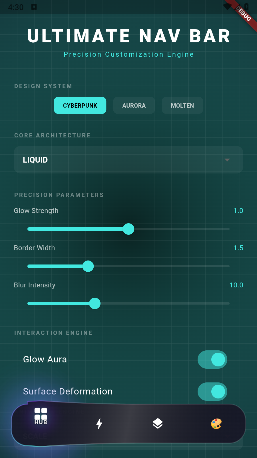
Click the image above to watch the interactive demo video! 🎬
✨ Why Nav Bar? #
Most navigation bars are boring. Nav Bar gives you 13 unique, premium styles — each with its own personality, physics, and visual language. Every tap feels intentional. Every transition feels alive.
- 🎨 13 Hand-Crafted Styles — Not templates. Each one is a unique visual experience.
- ⚡ Physics-Based Animations — Elastic curves, spring momentum, and composite jitter.
- 📳 Haptic Feedback — Every tap has tactile weight and impact.
- 🖼️ Custom Icons & Labels — Use
IconData, images, emojis, or anyWidget. - 🎭 3 Built-In Themes — Cyberpunk, Aurora, Molten — or build your own.
- 🎯 Deep Customization — Override any color, toggle any effect, tune any parameter.
- 🔔 Notification Badges — With customizable counts.
- 🚀 Production Ready — Optimized 60fps rendering with clamped calculations.
📦 Installation #
dependencies:
  nav_bar: ^0.0.1
flutter pub get
🏁 Quick Start #
import 'package:nav_bar/nav_bar.dart';

FuturisticNavBar(
  selectedIndex: _currentIndex,
  onItemSelected: (index) => setState(() => _currentIndex = index),
  style: NavBarStyle.liquid,
  theme: const FuturisticTheme.cyberpunk(),
  items: [
    NavBarItem(icon: Icons.home, label: 'Home'),
    NavBarItem(icon: Icons.search, label: 'Search'),
    NavBarItem(
      icon: Icons.notifications,
      label: 'Alerts',
      hasNotification: true,
      notificationCount: 3,
    ),
    NavBarItem(icon: Icons.person, label: 'Profile'),
  ],
)
That's it. Drop it into any Scaffold and you're running.
🎨 The 13 Styles #
Every style is a completely different visual experience. Pick the one that matches your app's soul.
🌊 Liquid #
Organic. Alive. Flowing. A gooey, metallic deformation effect — the bar morphs and stretches like liquid mercury responding to your touch. The active item creates a magnetic pull that warps the surface.
FuturisticNavBar(style: NavBarStyle.liquid, ...)
🪶 Floating #
Detached. Elegant. Weightless. Individual items float as frosted glass pods with sophisticated hover physics. Each pod lifts and settles with natural spring behavior — like pebbles on water.
FuturisticNavBar(style: NavBarStyle.floating, ...)
🖤 Obsidian #
Stealth. Precision. Matte Black. A technical matte-black design with micro-grid patterns and glassmorphism. A sharp beam of light cuts through on selection — like opening a vault door in a dark room.
FuturisticNavBar(style: NavBarStyle.obsidian, ...)
⚛️ Quantum #
Energy. Echoes. Magnetic Fields. High-tech quantum energy echoes ripple outward from the selected item. Ghost trails and magnetic physics create an otherworldly sense of power beneath each icon.
FuturisticNavBar(style: NavBarStyle.quantum, ...)
💎 Prism #
Light. Refraction. Rainbow. Crystalline light dispersion splits the active icon into chromatic RGB ghosts — like light passing through a crystal prism. The effect creates a sense of dimensional depth.
FuturisticNavBar(style: NavBarStyle.prism, ...)
🌈 Hologram #
Iridescent. Glitchy. Futuristic. A shimmering holographic light-field with scanlines and color shifts. The active item flickers with glitch effects — like a malfunctioning holographic display from the future.
FuturisticNavBar(style: NavBarStyle.hologram, ...)
⏱️ Chronos #
Mechanical. Precise. Ticking. Precision clockwork movement with watch-like ticks and markers. The selection indicator moves like the second hand of a Swiss timepiece — deliberate, exact, satisfying.
FuturisticNavBar(style: NavBarStyle.chronos, ...)
🧠 Synapse #
Neural. Connected. Alive. Neural data flows between icon nodes through connecting filaments. When you tap, pulses of light travel along neural pathways — like watching thoughts fire across a brain.
FuturisticNavBar(style: NavBarStyle.synapse, ...)
🏛️ Monolith #
Minimal. Architectural. Bold. Inspired by brutalist architecture — deep light-slit shadows and imposing geometric forms. The active state reveals a glowing slit, like light escaping from within a massive stone structure.
FuturisticNavBar(style: NavBarStyle.monolith, ...)
🕳️ Singularity #
Gravity. Event Horizon. Dark. A black-hole gravitational effect — space-time bends around the selected item. Nearby elements distort and stretch as if being pulled toward an event horizon. Pure power.
FuturisticNavBar(style: NavBarStyle.singularity, ...)
🖌️ Sumi #
Ink. Organic. Zen. Japanese Sumi-e ink wash with organic bleed effects. The active state blooms like ink dropped onto wet paper — calming, artistic, and completely unique in the Flutter ecosystem.
FuturisticNavBar(style: NavBarStyle.sumi, ...)
🌌 Cosmos #
Space. Stars. Infinite. A deep space journey with parallax starfields and nebula clouds. The selected item becomes a supernova — radiating light across a field of distant stars. For apps that dream big.
FuturisticNavBar(style: NavBarStyle.cosmos, ...)
⚙️ Kinetic #
Mechanical. Tiles. Waves. A grid of mechanical tiles that react with wave propagation physics. Tapping an item sends a ripple through the tile grid — like dropping a stone into a grid of interconnected gears.
FuturisticNavBar(style: NavBarStyle.kinetic, ...)
🎭 Themes #
Three built-in color themes, or create your own from scratch.
Cyberpunk 🔵 #
Neon cyan and electric purple on deep dark backgrounds. The default hacker aesthetic.
theme: const FuturisticTheme.cyberpunk()
Aurora 🟢 #
Soft sky blue, warm pink, and golden accents — inspired by the Northern Lights.
theme: const FuturisticTheme.aurora()
Molten 🔴 #
Fiery red and golden yellow — like looking into the heart of a volcano.
theme: const FuturisticTheme.molten()
Custom Theme 🎨 #
Build your own theme from scratch:
theme: FuturisticTheme(
  name: 'My Theme',
  accentColor: Colors.tealAccent,
  baseColor: Color(0xFF1A1A2E),
  backgroundColor: Color(0xFF0F0F1A),
  particleColor: Colors.white70,
  glowGradient: LinearGradient(
    colors: [Colors.tealAccent, Colors.purpleAccent, Colors.blueAccent],
  ),
)
⚡ Icon Animations #
Choose how your icons react when selected:
| Animation | Effect | Best For |
|---|---|---|
IconAnimationType.scale |
Smooth scale up | Clean, professional apps |
IconAnimationType.rotate |
360° spin | Playful, dynamic apps |
IconAnimationType.slide |
Slides upward | Elegant transitions |
IconAnimationType.fade |
Fades in/out | Minimalist designs |
IconAnimationType.flip |
3D card flip | Bold, eye-catching UIs |
IconAnimationType.bounce |
Elastic jump | Fun, energetic apps |
IconAnimationType.magnetic |
Glowing pulse with attraction | Sci-fi, gaming apps |
FuturisticNavBar(
  iconAnimationType: IconAnimationType.bounce,
  ...
)
🖼️ Custom Icons & Labels #
Go beyond IconData — use any Widget as an icon or label.
Emoji Icons #
NavBarItem(
  customIcon: Text('🎮', style: TextStyle(fontSize: 28)),
  label: 'Games',
)
Image Icons #
NavBarItem(
  customIcon: Image.asset('assets/logo.png', width: 28, height: 28),
  label: 'Brand',
)
Custom Styled Labels #
NavBarItem(
  icon: Icons.star,
  customLabel: Row(
    mainAxisSize: MainAxisSize.min,
    children: [
      Text('VIP', style: TextStyle(color: Colors.amber, fontWeight: FontWeight.bold)),
      SizedBox(width: 4),
      Icon(Icons.verified, size: 12, color: Colors.amber),
    ],
  ),
)
Fully Custom #
NavBarItem(
  customIcon: ShaderMask(
    shaderCallback: (rect) => LinearGradient(
      colors: [Colors.cyan, Colors.purple],
    ).createShader(rect),
    child: Icon(Icons.diamond, size: 28, color: Colors.white),
  ),
  customLabel: Text('Premium', style: TextStyle(color: Colors.amber)),
)
🎯 Deep Customization #
Override any color or toggle any visual effect per-style using customColors and effectToggles:
FuturisticNavBar(
  theme: const FuturisticTheme.cyberpunk().copyWith(
    customColors: {
      'backgroundColor': Colors.black,
      'impactColor': Colors.cyanAccent,
      'tileActiveColor': Colors.purpleAccent,
      'gridColor': Colors.white24,
    },
    effectToggles: {
      'showImpact': true,
      'showGrid': false,
      'showGlow': true,
    },
  ),
  glowStrength: 1.5,        // Glow intensity (0.0 - 2.0)
  borderWidth: 2.0,         // Border thickness
  blurSigma: 12.0,          // Background blur radius
  enableMotionBlur: true,    // Enable motion blur effects
  ...
)
🔔 Notification Badges #
Built-in support for notification indicators with counts:
NavBarItem(
  icon: Icons.notifications,
  label: 'Alerts',
  hasNotification: true,       // Shows a dot badge
  notificationCount: 99,      // Shows count badge
)
📋 Full API Reference #
FuturisticNavBar #
| Parameter | Type | Default | Description |
|---|---|---|---|
selectedIndex |
int |
required | Currently active tab index |
onItemSelected |
Function(int) |
required | Callback when a tab is tapped |
items |
List<NavBarItem> |
required | List of navigation items |
theme |
FuturisticTheme |
cyberpunk() |
Color theme |
style |
NavBarStyle |
liquid |
Visual style |
iconAnimationType |
IconAnimationType |
scale |
How icons animate on selection |
showGlow |
bool |
true |
Enable background glow effect |
showLiquid |
bool |
true |
Enable liquid effects |
iconSize |
double |
24.0 |
Size of icons |
barElevation |
double |
0.0 |
Elevation shadow |
barBackgroundColor |
Color? |
null |
Override theme background |
animationDuration |
Duration |
600ms |
Animation speed |
textStyle |
TextStyle? |
null |
Custom label text style |
glowStrength |
double |
1.0 |
Glow intensity (0.0 - 2.0) |
borderWidth |
double |
1.5 |
Border thickness |
blurSigma |
double |
10.0 |
Background blur radius |
enableMotionBlur |
bool |
false |
Enable motion blur effects |
NavBarItem #
| Parameter | Type | Default | Description |
|---|---|---|---|
icon |
IconData? |
null |
Traditional icon (required if no customIcon) |
customIcon |
Widget? |
null |
Any widget as icon (takes priority) |
label |
String? |
null |
Traditional text label |
customLabel |
Widget? |
null |
Any widget as label (takes priority) |
hasNotification |
bool |
false |
Show notification badge |
notificationCount |
int |
0 |
Notification count |
FuturisticTheme #
| Parameter | Type | Description |
|---|---|---|
name |
String |
Theme name |
glowGradient |
LinearGradient |
Gradient for glow effects |
accentColor |
Color |
Primary accent color |
baseColor |
Color |
Base dark color |
particleColor |
Color |
Particle effect color |
backgroundColor |
Color |
Background color |
customColors |
Map<String, Color> |
Override any internal color |
effectToggles |
Map<String, bool> |
Toggle any visual effect |
📚 Example App #
Check out the full example app for a complete interactive demo with:
- Style switcher (all 13 styles)
- Theme picker (Cyberpunk, Aurora, Molten)
- Icon animation selector
- Real-time parameter tuning (glow, blur, border)
- Custom icon/label demonstrations
🤝 Contributing #
Contributions, issues, and feature requests are welcome!
- Fork the repo
- Create your feature branch (
git checkout -b feature/amazing-feature) - Commit your changes (
git commit -m 'Add amazing feature') - Push to the branch (
git push origin feature/amazing-feature) - Open a Pull Request
📄 License #
MIT License — see LICENSE for details.
💬 Support #
- 🐛 Issues: GitHub Issues
- ⭐ Star this repo if you find it useful!
- 📢 Share with other Flutter developers!
Made with ❤️ for the Flutter community
Metadata
Publisher
unverified uploader
Weekly Downloads
Metadata
A highly customizable, futuristic bottom navigation bar with particle effects and liquid animations.
Repository (GitHub)
View/report issues
License
 unknown (license)