multi_thumb_range_slider 1.3.1+1  multi_thumb_range_slider: ^1.3.1+1 copied to clipboard
 greenhopper.at
A customizable Flutter widget that provides a multi-thumb slider with draggable thumbs for defining ranges, breakpoints, or multiple selection points.
Multi Thumb Range Slider #
A customizable Flutter widget that provides a multi-thumb slider with draggable thumbs for defining ranges, breakpoints, or multiple selection points.
🚀 Live Example #
Try the interactive example app: Live Demo
The live demo showcases all the features of the multi-thumb slider with interactive examples you can test in your browser.
Features #
- Multiple Thumbs: Set multiple values on a single slider track with intuitive drag-and-drop interaction
- Generic Type Support: Full support for
int,double,enum, and other comparable types - Customizable Appearance: Extensive styling options for colors, sizes, and visual elements
- Responsive Design: Adapts to different screen sizes and orientations with smooth animations
- Tickmarks & Labels: Configurable tickmarks with positioning options (above, below, on-track)
- Segment Display: Built-in segment visualization with multiple content types
- Custom Formatting: Flexible value formatting for currency, percentages, weights, and more
- Segment Editing: Add and remove segments dynamically with visual buttons
Getting Started #
Installation #
Add this to your package's pubspec.yaml file:
dependencies:
  multi_thumb_range_slider: ^1.3.0
Quick Start Examples #
Minimal Setup #
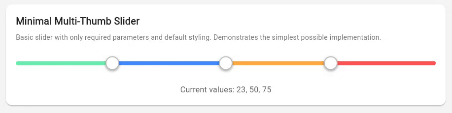
CustomMultiThumbSlider.withInt(
  values: [20, 80],
  onChanged: (values) => print('Values: $values'),
)
With Visual Enhancements #
CustomMultiThumbSlider.withInt(
  values: [25, 75],
  showTickmarks: true,
  showTooltip: true,
  showSegments: true,
  onChanged: (values) => print('Range: ${values[0]} - ${values[1]}'),
)
Interactive Editing Mode #
CustomMultiThumbSlider.withInt(
  values: [30, 70],
  showSegments: true,
  enableSegmentEdit: true,
  enableDescriptionEdit: true,
  onSegmentAdd: (index) => handleSegmentAdd(index),
  onSegmentRemove: (index) => handleSegmentRemove(index),
  onChanged: (values) => setState(() => _values = values),
)
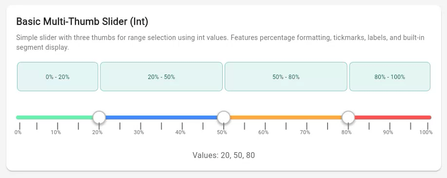
Basic Usage #
Basic Integer Slider with Built-in Features
import 'package:flutter/material.dart';
import 'package:multi_thumb_range_slider/multi_thumb_range_slider.dart';

class BasicExampleWidget extends StatefulWidget {
  @override
  State<BasicExampleWidget> createState() => _BasicExampleWidgetState();
}

class _BasicExampleWidgetState extends State<BasicExampleWidget> {
  List<int> _values = [20, 50, 80];

  @override
  Widget build(BuildContext context) {
    return CustomMultiThumbSlider.withInt(
      values: _values,
      min: 0,
      max: 100,
      // Visual enhancements
      showTickmarks: true,
      tickmarkInterval: 5,
      showTickmarkLabels: true,
      tickmarkLabelInterval: 10,
      showTooltip: true,
      valueFormatter: (value) => '$value%',
      // Built-in segment display
      showSegments: true,
      segmentContentType: SegmentContentType.fromToRange,
      onChanged: (newValues) {
        setState(() {
          _values = newValues;
        });
      },
    );
  }
}
Double Precision Slider with Decimal Formatting
[🎬 Animated example placeholder - GIF will be added here]
class DoubleExampleWidget extends StatefulWidget {
  @override
  State<DoubleExampleWidget> createState() => _DoubleExampleWidgetState();
}

class _DoubleExampleWidgetState extends State<DoubleExampleWidget> {
  List<double> _values = [15.5, 42.3, 78.9];

  @override
  Widget build(BuildContext context) {
    return CustomMultiThumbSlider<double>(
      values: _values,
      min: 0.0,
      max: 100.0,
      showTooltip: true,
      valueFormatter: (value) => value.toStringAsFixed(1),
      // Show segment widths with decimal precision
      showSegments: true,
      segmentContentType: SegmentContentType.width,
      onChanged: (newValues) {
        setState(() {
          _values = newValues;
        });
      },
    );
  }
}
Enum Slider with Educational Dan Rank System

enum DanRank {
  firstDan, secondDan, thirdDan, fourthDan, fifthDan,
  sixthDan, seventhDan, eighthDan, ninthDan, tenthDan
}

extension DanRankExtension on DanRank {
  String get displayName {
    switch (this) {
      case DanRank.firstDan: return '1st Dan';
      case DanRank.secondDan: return '2nd Dan';
      // ... more cases
      default: return '${index + 1}th Dan';
    }
  }
}

class DanRankExampleWidget extends StatefulWidget {
  @override
  State<DanRankExampleWidget> createState() => _DanRankExampleWidgetState();
}

class _DanRankExampleWidgetState extends State<DanRankExampleWidget> {
  List<DanRank> _values = [DanRank.fifthDan, DanRank.eighthDan];

  @override
  Widget build(BuildContext context) {
    return CustomMultiThumbSlider.withEnum<DanRank>(
      values: _values,
      min: DanRank.firstDan,
      max: DanRank.tenthDan,
      allPossibleValues: DanRank.values,
      showTickmarks: true,
      showTickmarkLabels: true,
      tickmarkLabelInterval: 1,
      showTooltip: true,
      valueFormatter: (value) => value.displayName,
      onChanged: (newValues) {
        setState(() {
          _values = newValues;
        });
      },
    );
  }
}
Advanced Examples #
Price Range Selector #
[🎬 Animated example placeholder - GIF will be added here]
Applications with currency formatting and range categorization:
class PriceRangeExampleWidget extends StatefulWidget {
  @override
  State<PriceRangeExampleWidget> createState() => _PriceRangeExampleWidgetState();
}

class _PriceRangeExampleWidgetState extends State<PriceRangeExampleWidget> {
  List<int> _values = [50, 150, 300];

  @override
  Widget build(BuildContext context) {
    return CustomMultiThumbSlider.withInt(
      values: _values,
      min: 0,
      max: 500,
      showTooltip: true,
      valueFormatter: (value) => '\$$value',
      // E-commerce styled segments
      showSegments: true,
      segmentContentType: SegmentContentType.toRange,
      segmentCardBackgroundColor: Colors.green.shade50,
      segmentCardBorderColor: Colors.green.shade200,
      segmentTextColor: Colors.green.shade800,
      onChanged: (newValues) {
        setState(() {
          _values = newValues;
        });
      },
    );
  }
}
Weight Class Selector for Sports Applications #
[🎬 Animated example placeholder - GIF will be added here]
Weight class ranges:
class WeightClassExampleWidget extends StatefulWidget {
  @override
  State<WeightClassExampleWidget> createState() => _WeightClassExampleWidgetState();
}

class _WeightClassExampleWidgetState extends State<WeightClassExampleWidget> {
  List<int> _values = [60, 70, 80, 90];

  @override
  Widget build(BuildContext context) {
    return CustomMultiThumbSlider.withInt(
      values: _values,
      min: 50,
      max: 100,
      height: 60,
      thumbRadius: 18,
      showTooltip: true,
      valueFormatter: (value) => '${value}kg',
      onChanged: (newValues) {
        setState(() {
          _values = newValues;
        });
      },
    );
  }
}
Interactive Segment Editing #
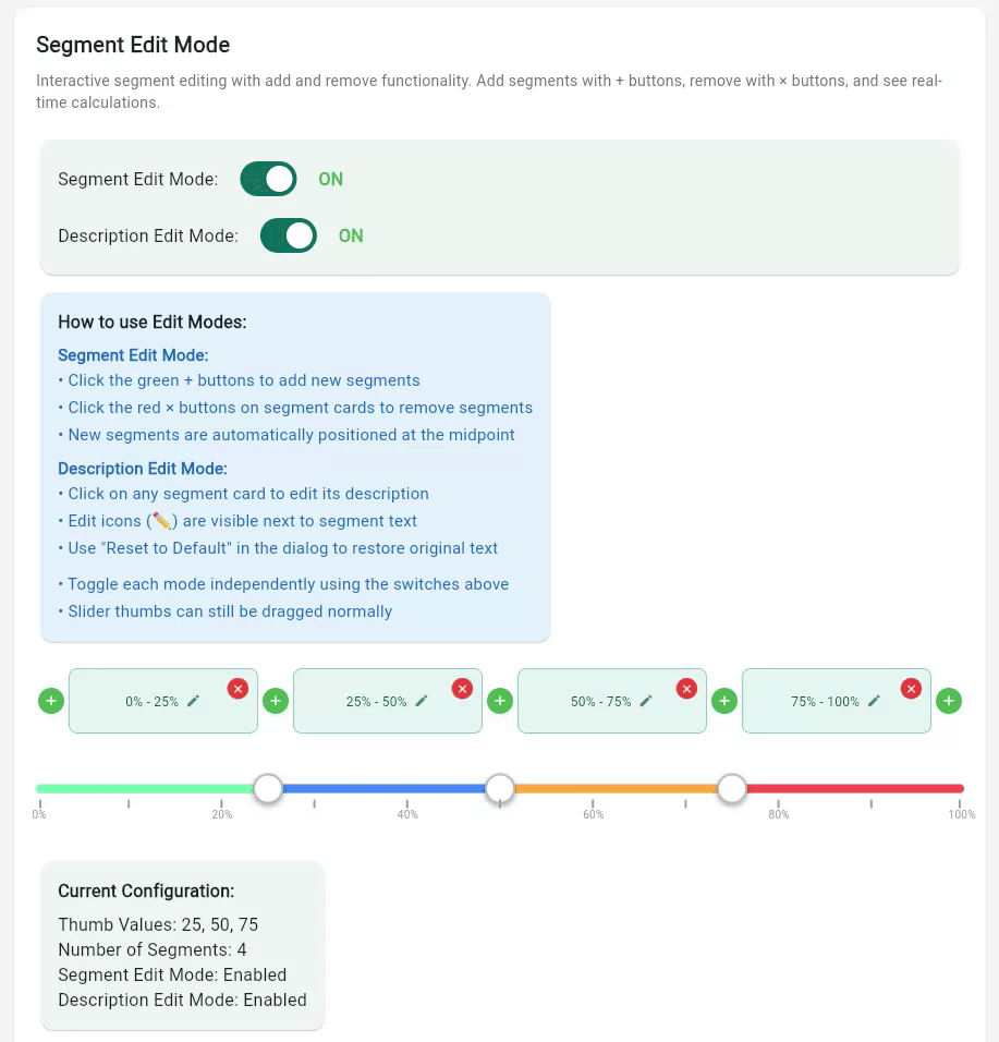
Advanced segment editing capabilities with add/remove functionality:
class SegmentEditExampleWidget extends StatefulWidget {
  @override
  State<SegmentEditExampleWidget> createState() => _SegmentEditExampleWidgetState();
}

class _SegmentEditExampleWidgetState extends State<SegmentEditExampleWidget> {
  List<int> _values = [25, 50, 75];
  bool _editModeEnabled = true;
  bool _descriptionEditEnabled = true;

  @override
  Widget build(BuildContext context) {
    return CustomMultiThumbSlider.withInt(
      values: _values,
      min: 0,
      max: 100,
      // Enable segment display and editing
      showSegments: true,
      segmentContentType: SegmentContentType.fromToRange,
      enableSegmentEdit: _editModeEnabled,
      enableDescriptionEdit: _descriptionEditEnabled,
      // Optional editing callbacks
      onSegmentAdd: (segmentIndex) {
        // Handle adding new segment
        final newValues = calculateNewValues(segmentIndex);
        setState(() => _values = newValues);
      },
      onSegmentRemove: (segmentIndex) {
        // Handle removing segment
        final newValues = calculateRemovedValues(segmentIndex);
        setState(() => _values = newValues);
      },
      onDescriptionChanged: (segmentIndex, description) {
        // Handle custom description changes
        print('Segment $segmentIndex: $description');
      },
      onChanged: (newValues) {
        setState(() {
          _values = newValues;
        });
      },
    );
  }
}
Tickmark & Visual Features #
Tickmark Positioning Options #
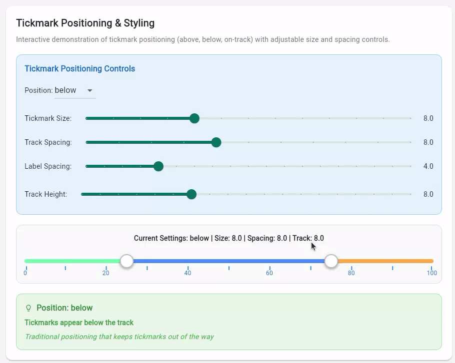
Configure tickmarks to appear above, below, or on the track itself:
class TickmarkPositioningExample extends StatefulWidget {
  @override
  State<TickmarkPositioningExample> createState() => _TickmarkPositioningExampleState();
}

class _TickmarkPositioningExampleState extends State<TickmarkPositioningExample> {
  List<int> _values = [25, 75];
  TickmarkPosition _position = TickmarkPosition.below;

  @override
  Widget build(BuildContext context) {
    return CustomMultiThumbSlider<int>(
      values: _values,
      min: 0,
      max: 100,
      // Tickmark configuration
      showTickmarks: true,
      tickmarkInterval: 10,
      tickmarkSize: 8.0,
      tickmarkPosition: _position,     // above, below, or onTrack
      tickmarkSpacing: 8.0,           // Distance from track
      // Label configuration
      showTickmarkLabels: true,
      tickmarkLabelInterval: 20,
      labelSpacing: 4.0,              // Distance from tickmarks
      onChanged: (newValues) => setState(() => _values = newValues),
    );
  }
}
Tooltip Configuration #
Interactive tooltips with custom formatting:
CustomMultiThumbSlider.withInt(
  values: [20, 50, 80],
  showTooltip: true,
  tooltipColor: Colors.blue.shade700,
  tooltipTextColor: Colors.white,
  tooltipTextSize: 14.0,
  valueFormatter: (value) => '$value%',    // Custom formatting
  onChanged: (newValues) => setState(() => _values = newValues),
)
Custom Styling and Color Schemes #
Extensive styling options for different themes:
CustomMultiThumbSlider.withInt(
  values: [30, 60, 90],
  min: 0,
  max: 100,
  // Track styling
  height: 50,
  trackHeight: 8.0,
  trackColor: Colors.grey[300]!,
  // Thumb styling
  thumbColor: Colors.blue[600]!,
  thumbRadius: 16,
  // Range colors (cycles if more ranges than colors)
  rangeColors: [
    Colors.green.shade200,
    Colors.blue.shade200,
    Colors.purple.shade200,
    Colors.red.shade200,
  ],
  onChanged: (newValues) => setState(() => _values = newValues),
)
Segment Display & Editing Features #
The multi-thumb range slider includes segment visualization and editing capabilities for interactive application use cases.
Segment Display Options #
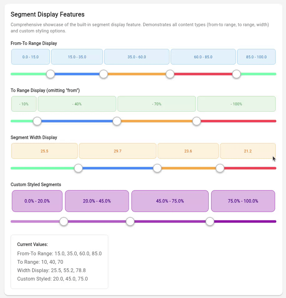
The segment display supports three different content types:
// 1. From-To Range Display (shows "0-20", "20-50", "50-100")
CustomMultiThumbSlider.withInt(
  values: [20, 50, 80],
  showSegments: true,
  segmentContentType: SegmentContentType.fromToRange,
  onChanged: (newValues) => setState(() => _values = newValues),
)

// 2. To Range Display (shows "-20", "-50", "-100")
CustomMultiThumbSlider.withInt(
  values: [20, 50, 80],
  showSegments: true,
  segmentContentType: SegmentContentType.toRange,
  onChanged: (newValues) => setState(() => _values = newValues),
)

// 3. Width Display (shows calculated segment widths "20", "30", "20")
CustomMultiThumbSlider.withInt(
  values: [20, 50, 80],
  showSegments: true,
  segmentContentType: SegmentContentType.width,
  onChanged: (newValues) => setState(() => _values = newValues),
)
Segment Editing Capabilities #
Enable dynamic segment editing with visual add/remove buttons:
CustomMultiThumbSlider.withInt(
  values: [25, 50, 75],
  showSegments: true,
  enableSegmentEdit: true,              // Enable add/remove buttons
  enableDescriptionEdit: true,          // Enable description editing
  onSegmentAdd: (index) {
    // Add new segment at specified position
  },
  onSegmentRemove: (index) {
    // Remove segment at specified position
  },
  onDescriptionChanged: (index, description) {
    // Handle custom description changes
  },
  onChanged: (newValues) => setState(() => _values = newValues),
)
Custom Segment Styling #
Customize the appearance of segment cards with extensive styling options:
CustomMultiThumbSlider.withInt(
  values: [20, 50, 80],
  showSegments: true,
  segmentContentType: SegmentContentType.fromToRange,
  // Segment styling
  segmentHeight: 70,
  segmentCardPadding: 12,
  segmentCardMargin: 4,
  segmentCardBorderRadius: 12,
  segmentCardBackgroundColor: Colors.purple.shade100,
  segmentCardBorderColor: Colors.purple.shade400,
  segmentTextColor: Colors.purple.shade900,
  segmentTextSize: 14,
  segmentTextWeight: FontWeight.bold,
  showSegmentBorders: true,
  showSegmentBackgrounds: true,
  valueFormatter: (value) => '${value}%',
  onChanged: (newValues) => setState(() => _values = newValues),
)
Value Formatting & Localization #
Built-in formatters for common use cases with custom formatting support:
// Percentage formatting
CustomMultiThumbSlider.withInt(
  values: [20, 50, 80],
  valueFormatter: (value) => '$value%',
  onChanged: (newValues) => setState(() => _values = newValues),
)

// Currency formatting
CustomMultiThumbSlider.withInt(
  values: [50, 150, 300],
  valueFormatter: (value) => '\$$value',
  onChanged: (newValues) => setState(() => _values = newValues),
)

// Weight formatting
CustomMultiThumbSlider.withInt(
  values: [60, 80, 100],
  valueFormatter: (value) => '${value}kg',
  onChanged: (newValues) => setState(() => _values = newValues),
)

// Decimal precision formatting
CustomMultiThumbSlider<double>(
  values: [15.5, 42.3, 78.9],
  valueFormatter: (value) => value.toStringAsFixed(1),
  onChanged: (newValues) => setState(() => _values = newValues),
)
Read-Only Mode #
CustomMultiThumbSlider.withInt(
  values: [25, 50, 75],
  min: 0,
  max: 100,
  readOnly: true,           // Disables all interaction
  showSegments: true,       // Can still show segment information
  showTickmarks: true,      // Visual elements remain functional
  onChanged: (values) {},   // Callback not called in read-only mode
)
API Reference #
CustomMultiThumbSlider #
The main widget providing multi-thumb slider functionality with support for generic value types, extensive visual customization, and interactive features.
Constructors
Generic Constructor
const CustomMultiThumbSlider<T>({
  Key? key,
  required List<T> values,
  required ValueChanged<List<T>> onChanged,
  required T min,
  required T max,

  // Basic Layout
  double height = 45.0,
  double trackHeight = 8.0,
  bool readOnly = false,

  // Colors & Styling
  Color trackColor = const Color(0xFFE0E0E0),
  List<Color> rangeColors = defaultRangeColors,
  Color thumbColor = Colors.white,
  double thumbRadius = 14.0,

  // Value Formatting
  String Function(T)? valueFormatter,
  List<T>? allPossibleValues, // Required for enum types

  // Tickmarks & Labels
  bool showTickmarks = false,
  int? tickmarkInterval,
  double tickmarkSize = 6.0,
  Color tickmarkColor = Colors.grey,
  TickmarkPosition tickmarkPosition = TickmarkPosition.below,
  double tickmarkSpacing = 6.0,
  bool showTickmarkLabels = false,
  int? tickmarkLabelInterval,
  double tickmarkLabelSize = 12.0,
  Color tickmarkLabelColor = Colors.black87,
  double labelSpacing = 4.0,

  // Tooltips
  bool showTooltip = false,
  Color tooltipColor = Colors.black87,
  Color tooltipTextColor = Colors.white,
  double tooltipTextSize = 12.0,

  // Segment Display
  bool showSegments = false,
  SegmentContentType segmentContentType = SegmentContentType.fromToRange,
  double segmentHeight = 60.0,
  double segmentCardPadding = 8.0,
  double segmentCardMargin = 2.0,
  double segmentCardBorderRadius = 8.0,
  Color segmentCardBackgroundColor = const Color(0xFFF5F5F5),
  Color segmentCardBorderColor = const Color(0xFFE0E0E0),
  Color segmentTextColor = const Color(0xFF424242),
  double segmentTextSize = 12.0,
  FontWeight segmentTextWeight = FontWeight.normal,
  bool showSegmentBorders = true,
  bool showSegmentBackgrounds = true,

  // Segment Editing
  bool enableSegmentEdit = false,
  bool enableDescriptionEdit = false,
  Color segmentAddButtonColor = Colors.green,
  Color segmentRemoveButtonColor = Colors.red,
  double segmentButtonSize = 20.0,
  Function(int)? onSegmentAdd,
  Function(int)? onSegmentRemove,
  Function(int, String?)? onDescriptionChanged,
})
Int Convenience Constructor
const CustomMultiThumbSlider.withInt({
  // Same parameters as generic constructor but with int defaults
  int min = 0,
  int max = 100,
  // ... all other parameters
})
Enum Convenience Constructor
const CustomMultiThumbSlider.withEnum<T extends Enum>({
  required List<T> allPossibleValues,
  // ... all other parameters
})
Key Parameters
| Category | Parameter | Description |
|---|---|---|
| Core | values |
List of current thumb values |
min / max |
Value range boundaries | |
onChanged |
Callback for value changes | |
readOnly |
Disable interaction for display-only mode | |
| Visual | showTickmarks |
Enable tickmark display |
showTooltip |
Enable interactive tooltips | |
showSegments |
Enable segment visualization | |
valueFormatter |
Custom value formatting function | |
| Interaction | enableSegmentEdit |
Enable add/remove segment buttons |
enableDescriptionEdit |
Enable segment description editing | |
onSegmentAdd / onSegmentRemove |
Segment editing callbacks | |
onDescriptionChanged |
Description change callback |
Enums
enum SegmentContentType { fromToRange, toRange, width }
enum TickmarkPosition { above, below, onTrack }
Type Support & Behavior #
| Type | Usage | Behavior |
|---|---|---|
int |
Most common use case | Values automatically rounded to nearest integer |
double |
Precise measurements | Full decimal precision maintained |
enum |
Categorical selection | Discrete values with custom display names |
| Custom | Any comparable type | Must implement comparison operators |
Type-Specific Features #
- All types: Tooltips, segments, tickmarks, formatting
- Int/Double: Automatic interval calculation for tickmarks
- Enums: Requires
allPossibleValuesparameter for proper spacing - Custom types: Must provide custom
valueFormatterfor display
Customization Options #
Visual Theming #
- Colors: Track, thumb, range, and segment colors
- Sizing: Height, radius, padding, and spacing controls
- Typography: Font sizes, weights, and colors for labels
- Borders: Border radius, width, and styling options
Layout Control #
- Positioning: Tickmarks above, below, or on track
- Spacing: Configurable gaps between elements
- Responsive: Automatic adaptation to screen sizes
- Overflow: Smart handling of limited space
Interaction Design #
- Touch Targets: Optimized thumb sizes for mobile
- Visual Feedback: Hover states and selection indicators
- Accessibility: Screen reader and keyboard navigation support
- Animation: Smooth transitions and state changes
Contributing #
Contributions are welcome! Please feel free to submit a Pull Request. For major changes, please open an issue first to discuss what you would like to change.
License #
This project is licensed under the MIT License - see the LICENSE file for details.
Support #
If you encounter any issues or have questions, please:
- Check the existing issues
- Create a new issue with a detailed description
- Include your Flutter version and device information
Changelog #
1.3.0 #
- Custom Segment Descriptions: Interactive editing of segment descriptions
- Tap-to-edit functionality with popup dialogs
- Reset to default button for easy restoration
- Visual indicators for customized segments
onDescriptionChangedcallback for monitoring changes
- Segment Data Access: New
getSegmentsWithDescriptions()method- Returns complete segment information including custom descriptions
SliderSegment<T>andSegmentDescriptiondata models- Full type safety and generic support
- Enhanced UX: Improved segment editing experience with better visual feedback
1.2.0 #
- New Segment Display Feature: Built-in segment visualization above the slider
- Three content types: from-to range, to range, and width display
- Extensive styling customization options
- Integration with value formatters
- Works with numeric types (int, double)
- Enhanced Examples: New examples showcasing segment display features
- Improved Documentation: Comprehensive examples and API documentation
1.1.0 #
- Added generic type support for
int,double,enum, and other types - Changed default type from
doubletoint - Added convenience constructor
CustomMultiThumbSlider.int()with default min/max values - Improved type safety and flexibility
1.0.0 #
- Initial release
- Multi-thumb slider with draggable interface
- Customizable appearance and styling
- Range constraint enforcement
- Responsive design support
Metadata
Documentation
Publisher
Weekly Downloads
Metadata
A customizable Flutter widget that provides a multi-thumb slider with draggable thumbs for defining ranges, breakpoints, or multiple selection points.
Repository (GitHub)
View/report issues
Topics
License
 unknown (license)
Dependencies
cupertino_icons, flutter, logger