morphable_shape 1.2.1  morphable_shape: ^1.2.1 copied to clipboard
 wenkaifan.com
A Flutter package for creating various shapes that are responsive and can morph betweem each other.
morphable_shape #
A Flutter package for creating various shapes that are responsive and can morph between each other.
Notice: Please always try to use the latest version of this package (which has null safety enabled). All future development will happen there.
Getting Started #
First, you need to create a Shape instance. The responsive feature means that
you can have a single shape instance that adapts to different sizes without you calculating the desired dimensions. For example, the following
code will give you a rectangle with a 60 px circular radius at the top left corner and a (60 px, 10%) elliptical corner at the bottom right corner.
(for more information of how to use the Length class, see length_unit).
Shape rectangle=RectangleShape(
borderRadius: DynamicBorderRadius.only(
topLeft: DynamicRadius.circular(10.toPXLength),
bottomRight: DynamicRadius.elliptical(60.0.toPXLength, 10.0.toPercentLength))
);
You can use the shape to create a shapeBorder that gets used by the Material widget or the ClipPath widget which perform the shape clipping.
var border=MorphableShapeBorder(
shape: rectangle,
);

var widget=Material(
shape: shapeBorder,
clipBehavior: Clip.antiAlias,
child: Container()
);
You can run the example app to create a local shape editing tool to see the various shapes supported by this package (also hosted online at https://fluttershape.com/).
Supported Shapes #
Currently supported shapes are:
RectangleShape #
The most powerful and commonly used one should be the RectangleShape class. It allows to you configure each corner of the rectangle individually or at once.
It also automatically scales all sides so that they don’t overlap (just like what CSS does). The RectangleShape supports four different corner styles:
enum CornerStyle{
  rounded,
  concave,
  straight,
  cutout,
}
You can configure the corner styles like this:
var cornerStyles=RectangleCornerStyles.all(CornerStyle.rounded);
cornerStyles=RectangleCornerStyles.only(
topLeft: CornerStyle.rounded,
bottomRight: CornerStyle.concave
);
You can also specify the border with, color (or gradient) using the DynamicBorderSide class:
var border=DynamicBorderSide(
width: 10.toPXWidth,
gradient: LinearGradient(colors:[Colors.red, Colors.green]),
);
Now you get a fully fledged rectangle:
Shape rectangle=RectangleShape(
borderRadius:
        const DynamicBorderRadius.all(DynamicRadius.circular(Length(100))),
cornerStyles: cornerStyles,
border: border,
);
You can make a triangle, a diamond, a trapezoid, or even an arrow shape by just using the RectangleShape class and providing the right corner style and radius.

RoundedRectangleShape #
If you use the RoundedRectangleShape class, then the four border sides can be further configured individually. The four border sides can be styled independently or at once:
var borders=RectangleBorders.all(DynamicBorderSide.none);
borders=RectangleBorders.symmetric(
horizontal: DynamicBorderSide(
width: 10.toPercentWidth,
color: Colors.blue,
));
borders=RectangleBorders.only(
top: DynamicBorderSide(
width: 10.toPXWidth,
gradient: LinearGradient(colors:[Colors.red, Colors.green]),
));
Then you have:
Shape shape=RoundedRectangleShape({
    borderRadius: DynamicBorderRadius.all(DynamicRadius.circular(Length(100))),
    borders: borders,
  });
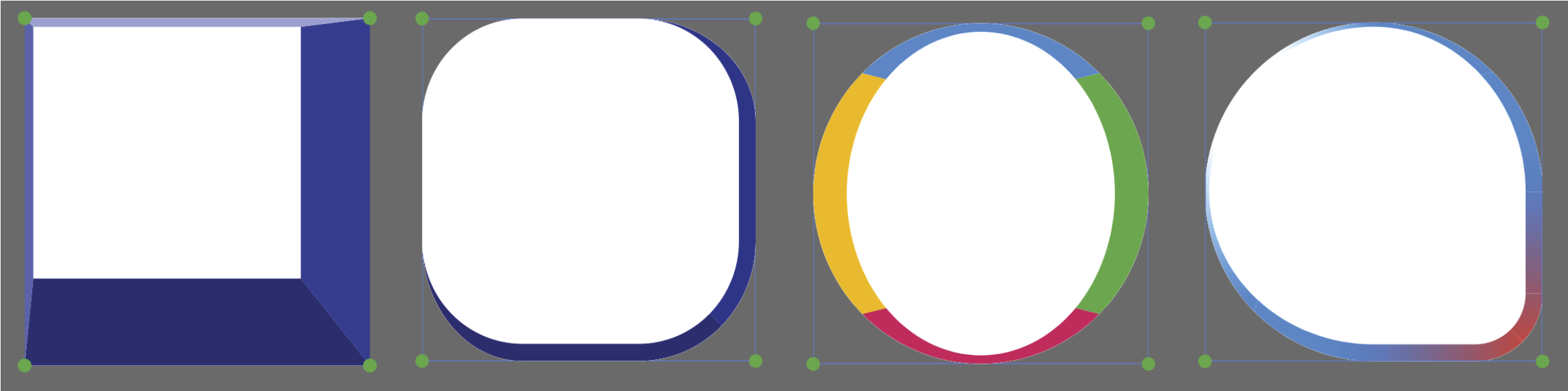
Below are some border designs using this class. This class is very similar to what CSS offers and is an extension to the BoxBorder and RoundedRectangleBorder class that Flutter offers.
CircleShape #
CircleShape allows you to choose the start angle and sweep angle:
CircleShape(
startAngle: 0,
sweepAngle: 2*pi,
)

PolygonShape #
PolygonShape supports changing the number of sides as well as corner radius and corner style:
PolygonShape(
sides:6,
cornerRadius: 10.toPercentLength,
cornerStyle: CornerStyle.rounded
)

StarShape #
The StarShape allows you to change the number of corners, the inset, the border radius, the border style, the inset radius, and the inset style.
StarShape(
corners: 5,
inset: 50.toPercentLength,
cornerRadius: 0.toPXLength,
cornerStyle: CornerStyle.rounded,
insetRadius: 0.toPXLength,
insetStyle: CornerStyle.rounded
)

Shape Morphing #
Every shape in this package can be gracefully morphed into one another, including the border(s). Hence the name of this package. To morph between two shapes you first need to create a ShapeBorderTween:
MorphableShapeBorder startBorder = MorphableShapeBorder(shape: startShape);
MorphableShapeBorder endBorder = MorphableShapeBorder(shape: endShape);

MorphableShapeBorderTween shapeBorderTween =
        MorphableShapeBorderTween(begin: startBorder, end: endBorder);
Then you can get the intermediate shapes at progress t by calling:
Shape intermediate=shapeBorderTween.lerp(t);
For an explanation and demonstration of the morphing algorithm, take a look at this Medium post.
Below are some showcases of the shape morphing process. Most shapes can be morphed in a natural and pixel-perfect fashion.


There are three morph methods to choose when you create your tween.
MorphableShapeBorderTween shapeBorderTween =
        MorphableShapeBorderTween(begin: startBorder, end: endBorder,
        method: MorphMethod.auto);
The MorphMethod.weighted tries to use as little control
points as possible to do the morphing and takes into account the length of each side of a shape. The MorphMethod.unweighted uses more points
but do not use the length information. The MorphMethod.auto will choose either
one of the aformentioned methods based on some geometric criteria to make the morphing
process to look more natural. The auto method generally works well, but you can
try other ones if the morphing looks weird.
Shape Serialization #
Every shape in this package supports serialization. If you have designed some shape you like, just call toJson() on it. Then you can reuse it by writting.
Shape shape=RoundedRectangleShape();
String jsonStr=json.encode(shape.toJson());
Shape shapeDecoded=parseShape(json.decode(jsonStr));
Shadowed Shape #
You can use the ShadowedShape widget to add shadow to your widget.
class ShadowedShape extends StatelessWidget {
  final ShapeBorder? shape;
  final List<ShapeShadow>? shadows;
  final Widget? child;
  }
The ShapeShadow is very similar to the BoxShadow class but supports Gradient filling:
const ShapeShadow({
    Color color = const Color(0xFF000000),
    Offset offset = Offset.zero,
    double blurRadius = 0.0,
    this.spreadRadius = 0.0,
    this.gradient,
  })
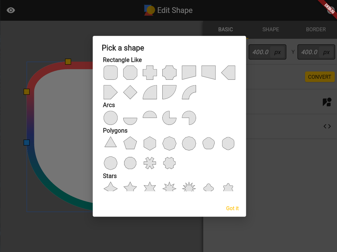
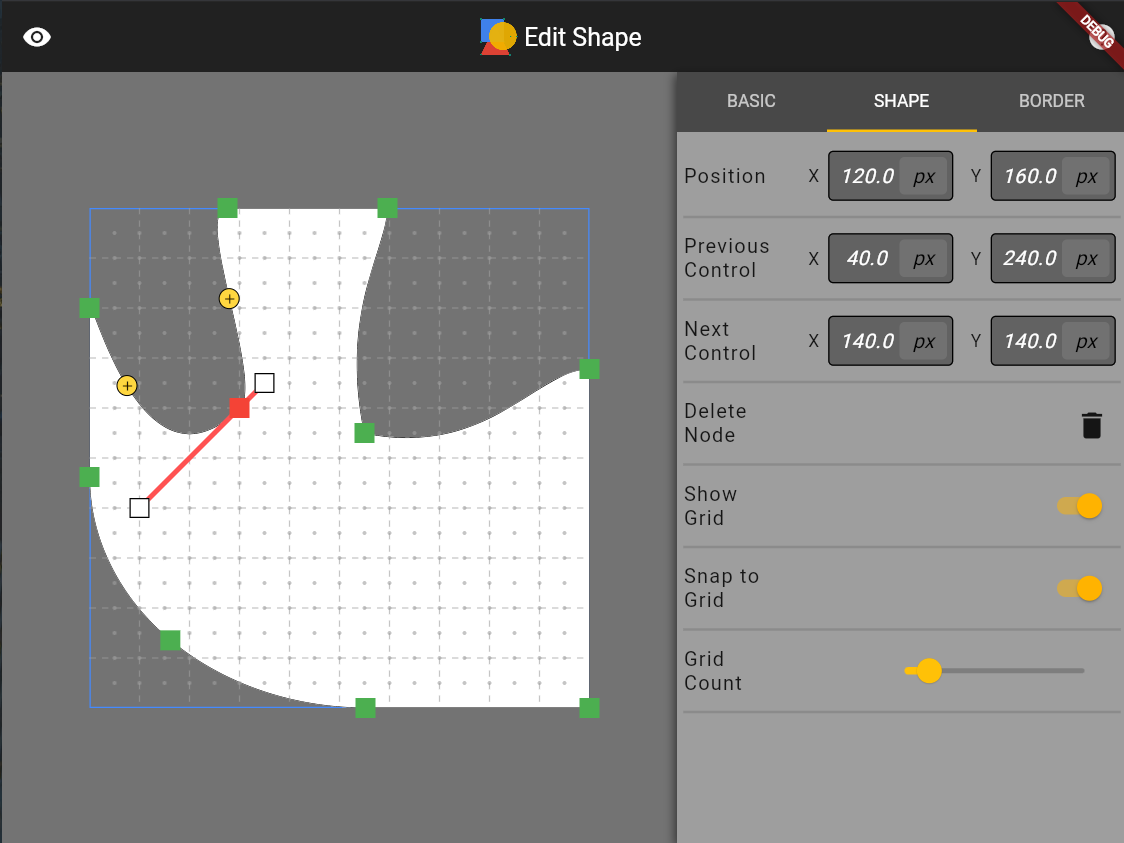
A Shape Editing Tool #
As I mentioned before, the example app in this package is a shape editing tool for you to quickly design the shape you want and generate the corresponding code. Below are some screenshots of the interfaces of this tool. I put about equal amount of effort into developing this tool compared to developing this package so I strongly recommend you to check it out. You can either build it locally or visit: https://fluttershape.com/.


Metadata
Publisher
Metadata
A Flutter package for creating various shapes that are responsive and can morph betweem each other.
Repository (GitHub)
View/report issues
License
 unknown (LICENSE)
Dependencies
dimension, flutter, flutter_class_parser