modular_customizable_dropdown 1.0.0  modular_customizable_dropdown: ^1.0.0 copied to clipboard
A modular and customizable dropdown that can be attached to ANY widget.
Modular and Customizable Dropdown #
A modular dropdown package that is compatible with any widget.
This dropdown is not tied to any widget in particular and can be attached to whatever widgets you can think of.
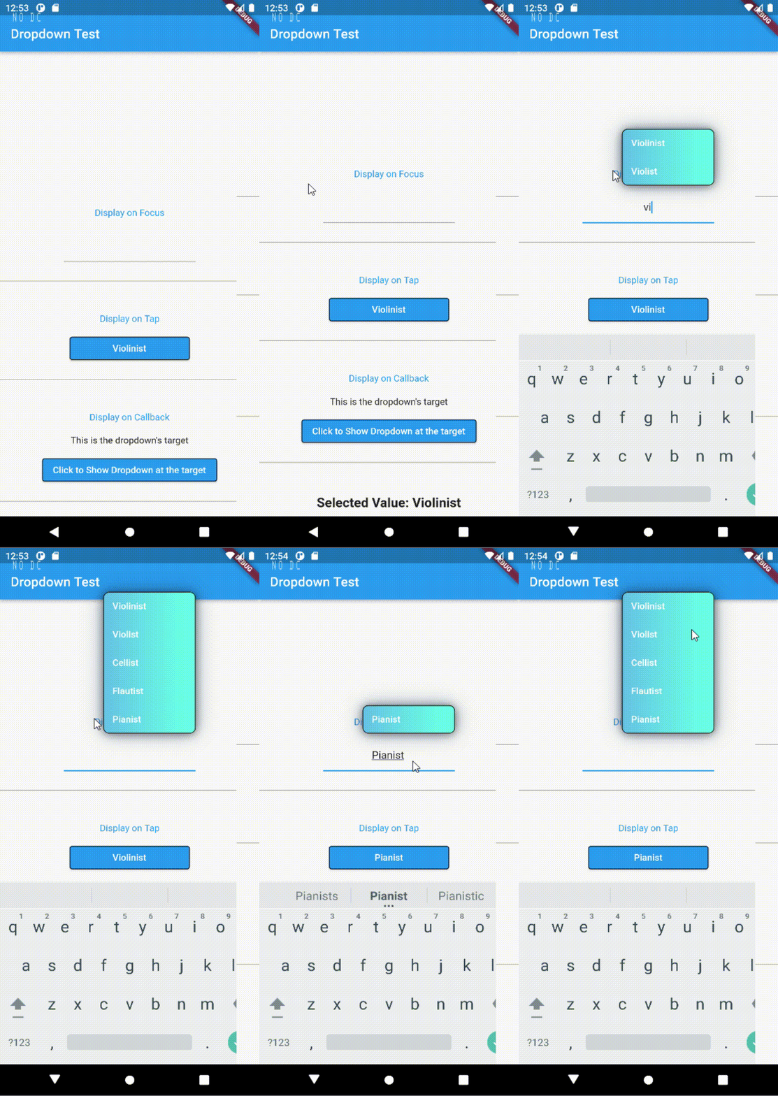
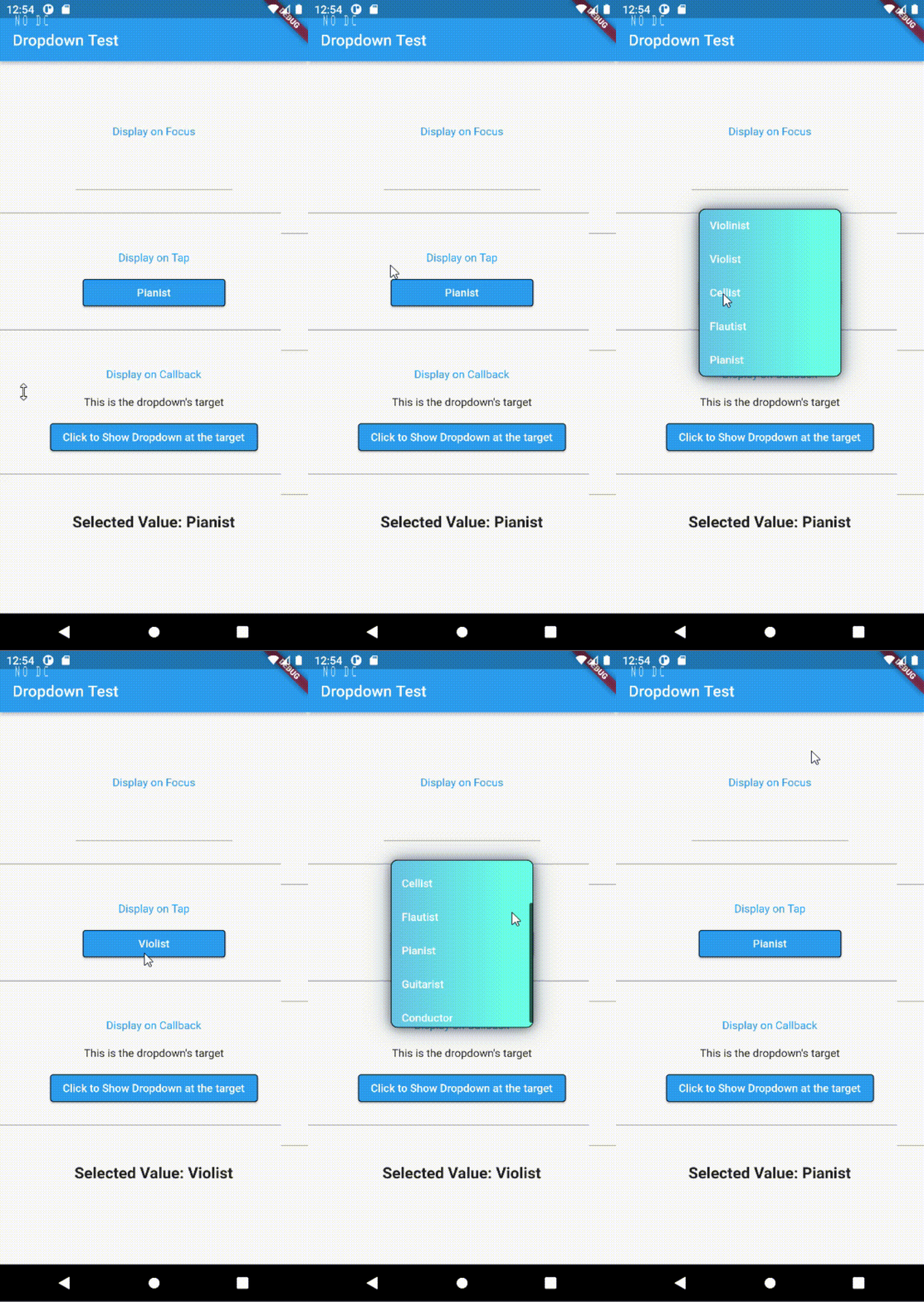
(Please excuse the ugly color palette, I just wanna show you that it's possible to do gradients...)
TL;DR #
Wrap whatever widget you want the dropdown to attach to with the dropdown.
By default, the dropdown will appear directly below the target widget's position.
ModularCustomizableDropdown.displayOnTap(
    target: const SizedBox(width: 100, child: Text("I'm the target widget")),
    onValueSelect: (String _selectedVal) => debugPrint(_selectedVal),
    allDropdownValues: values,
)
That's it! These lines are all you need to get the dropdown working. Once the target widget is tapped, the dropdown will appear right below your target widget.
Read further for further details on customizing the dropdown.
For a thorough example, see the main.dart file in the example folder or clone this package's repo and run the file.
Customizing the dropdown #
The appearance of the dropdown can be configured with the DropdownStyle class. This dropdown is very customizable, below is a short example of what it can do.
For a more complete explanation, please see here.
ModularCustomizableDropdown.displayOnTap(
    //...other params
    style: const DropdownStyle(
        //This will scale the width of the dropdown to be 1.2 of the target's width.
        dropdownWidth: DropdownWidth(scale: 1.2),
        //The height of the dropdown will fit exactly 4 rows of items.
        dropdownMaxHeight: DropdownMaxHeight(byRows: 4),
        //The dropdown will be positioned above the target with its left side aligned with the target's.
        dropdownAlignment: DropdownAlignment.topLeft,
        //Pretty self-explanatory
        defaultItemColor: LinearGradient(colors: [
            Colors.white, Colors.blue
        ]),
        onTapItemColor: LinearGradient(colors: [
            Colors.black, Colors.black
        ]),
        //The time it takes for the dropdown to expand. 0 for no animation.
        //Because the alignment is topLeft, the dropdown will expand upward, beginning from the top of the target. See below for more explanation.
        transitionInDuration: Duration(milliseconds: 160),
        //...other params
    ),
    //...other params
)
Features Summary #
-
Comes with three factory constructors, with which you will be able to trigger the dropdown when: a tap happens, the target widget is focused, or a callback is called.
-
Use DropdownAlignment to align it however you wish. This should cover many common use cases already. It's very similar to Flutter's alignment, take a look here.
Note: Your width needs to be different from the target for the horizontal alignment to take effect (duh).
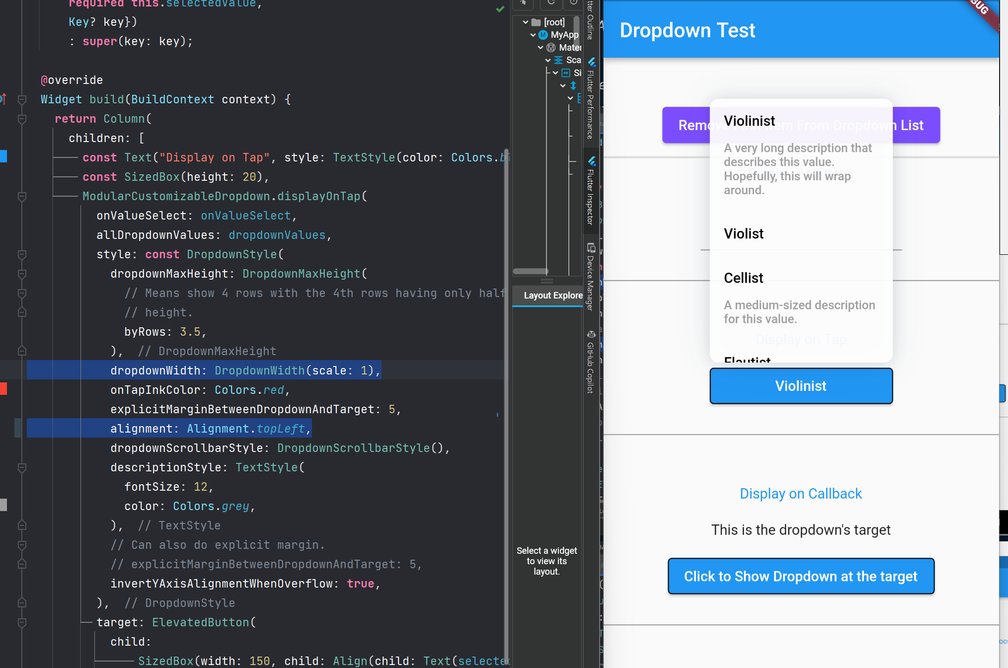
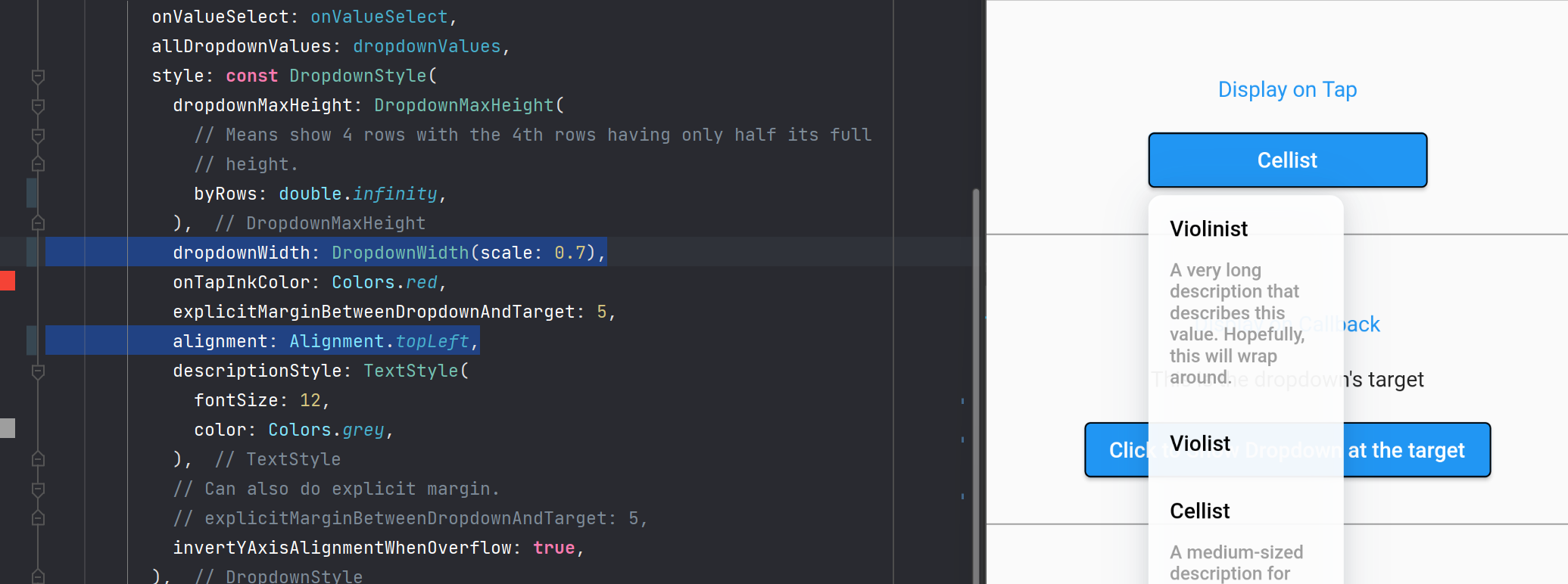
- The expand animation adjusts automatically to the provided DropdownAlignment. For example if the target is above the dropdown, the dropdown will expand from top, and vice versa. If DropdownAlignment == DropdownAlignment.center, the dropdown will expands in both vertical direction.
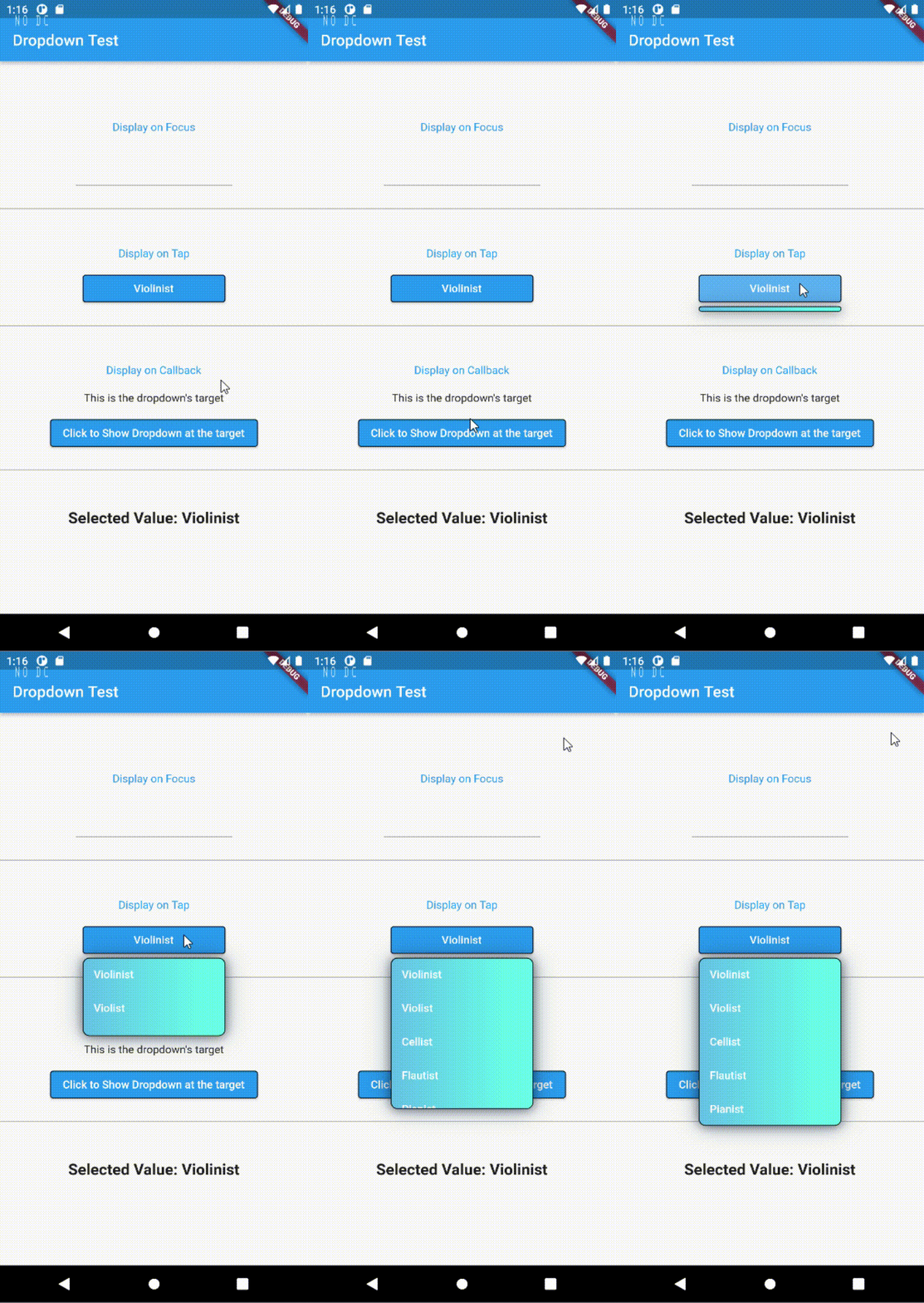
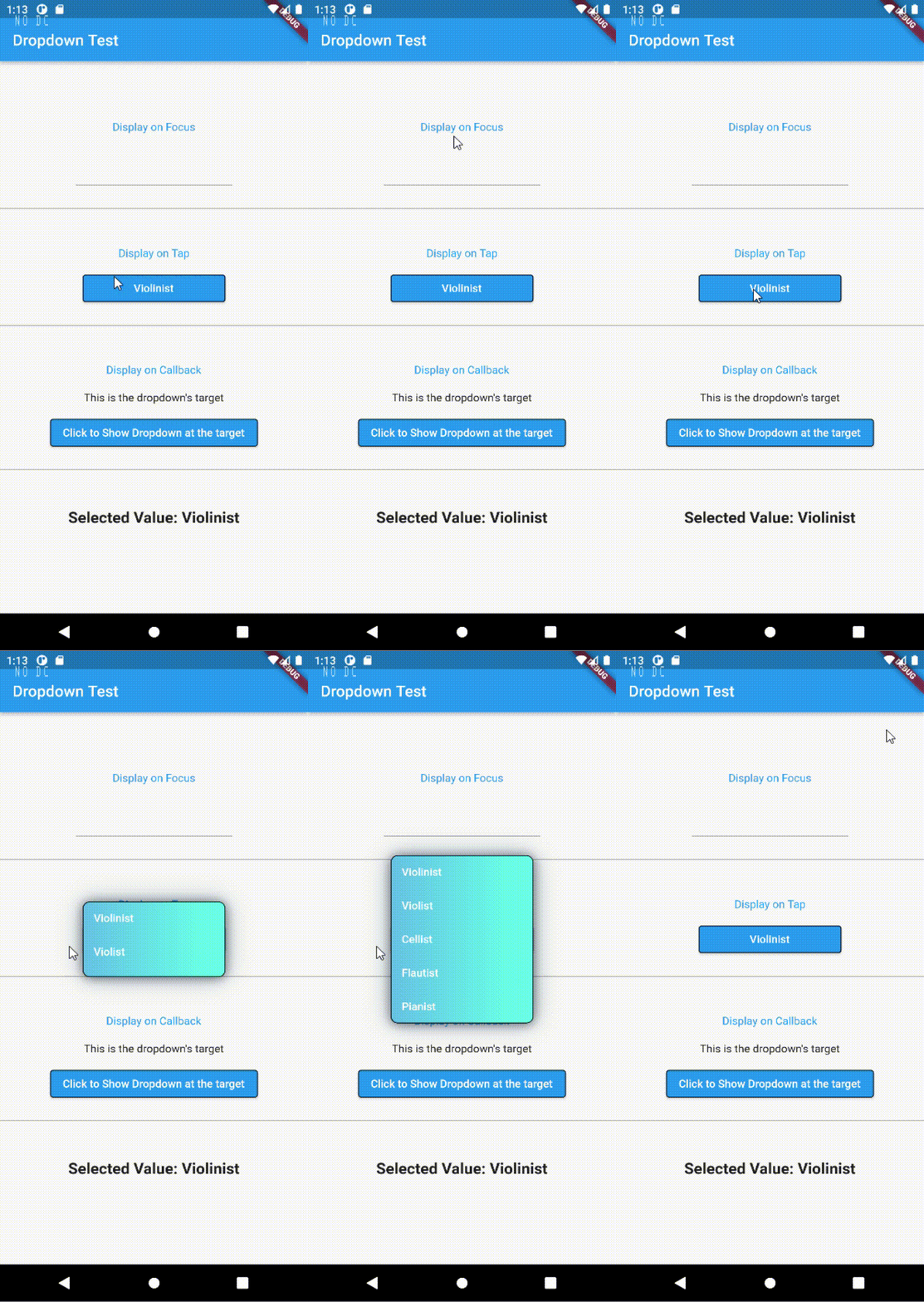
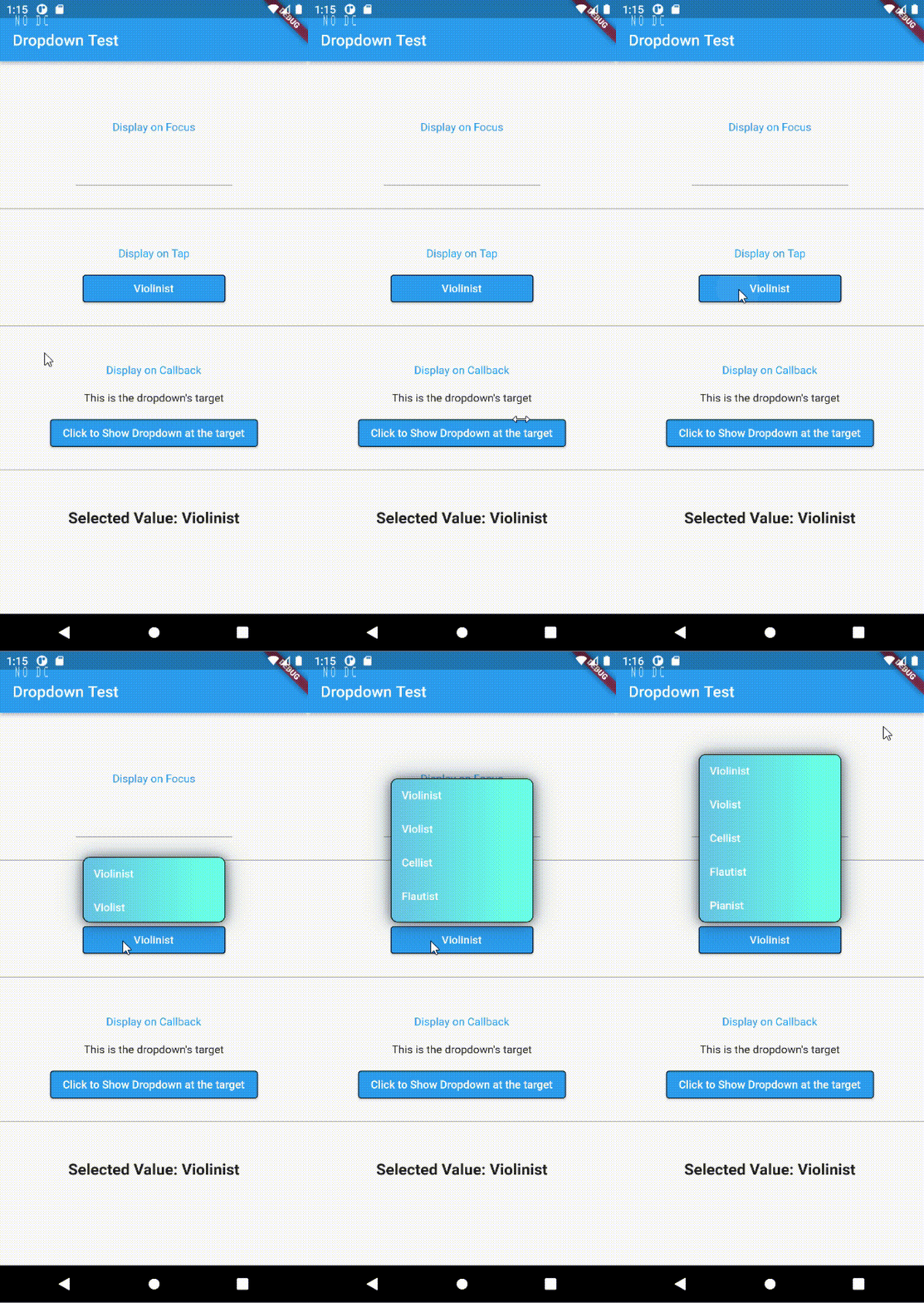
On the y axis value in the DropdownAlignment class affects the origin of the transition. You can play around by providing the dropdown values without using const properties like DropdownValue(-1, 0.7).
- Max Height can be described using pixels or the number of rows to be visible before scrolling.
Behaviors #
- By default, the dropdown sizes itself to its parent. If the parent is very small, the dropdown will also be very small.
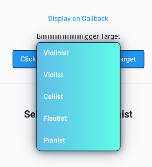
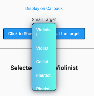
So naturally, if you wrap your small widget with a larger SizedBox, the dropdown would size itself to the SizedBox. However, there is even an easier way, you can, as we have gone over already in the example above, use the DropdownWidth class.
class DropdownWidth {
  /// Will scale its width relative to the parent widget.
  ///
  /// This is the default behavior.
  final double scale;

  /// Will size itself according to the provided pixels.
  ///
  /// The scale property will be ignored if this is provided.
  final double? byPixels;

  const DropdownWidth({this.scale = 1, this.byPixels});
}
- By default, the dropdown is set to wrap to the opposite side of the target widget when it finds that it will overflow the screen when expanded.
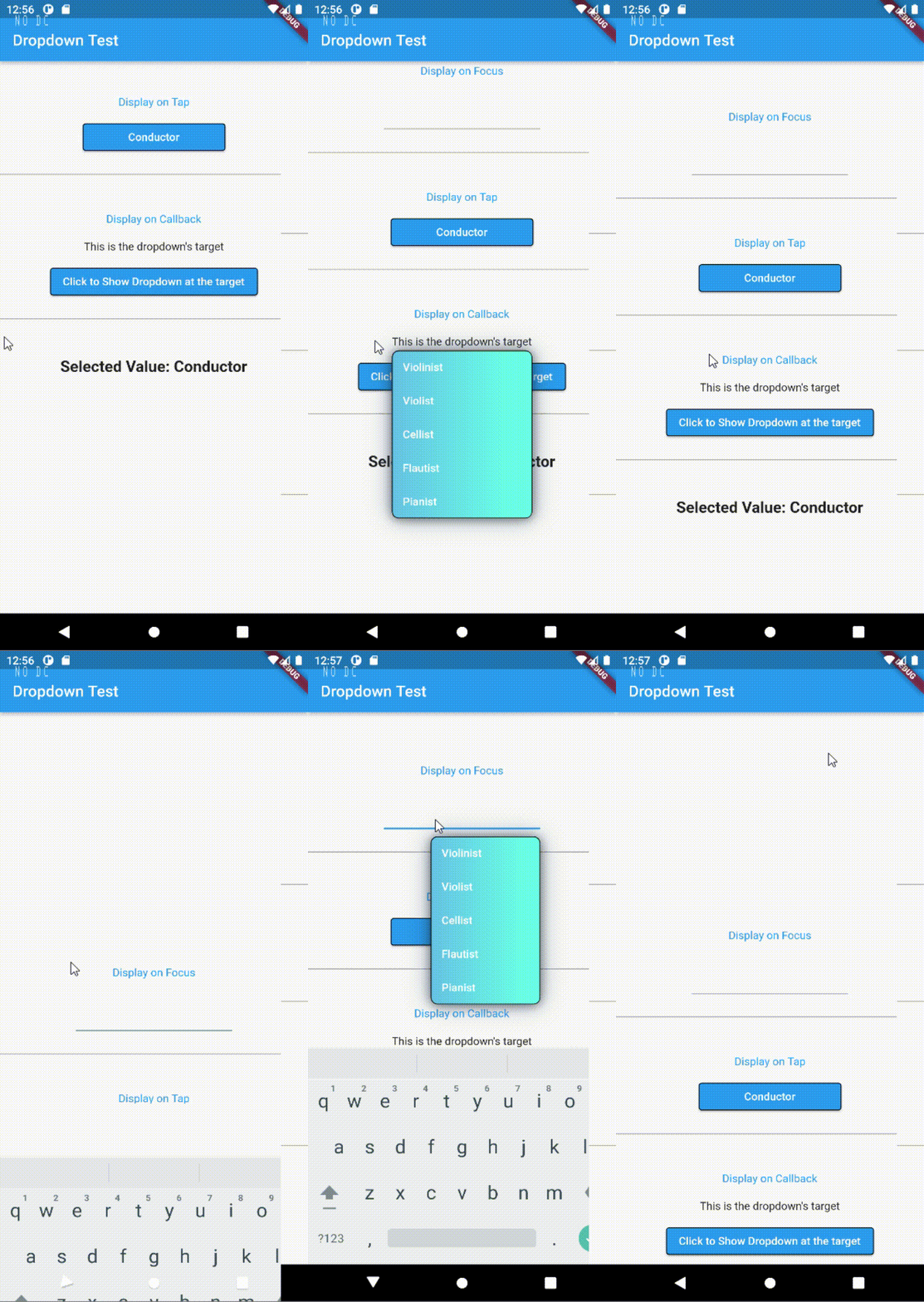
-
The target widget is basically the child of the dropdown whose build method gets called everytime a value is tapped, so all optimization best practices apply. See this link for more details.
-
DropdownAlignment's x and y properties can be more than 1 and less than -1. This would be like relative top/bottom margin.