liquid_glass_nav 1.0.1  liquid_glass_nav: ^1.0.1 copied to clipboard
A beautiful, highly customizable bottom navigation bar with liquid glass (glassmorphism) effect. Features smooth animations, haptic feedback, badges, and accessibility support.
Liquid Glass Nav 🌊✨ #
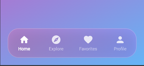
A beautiful, highly customizable bottom navigation bar with liquid glass (glassmorphism) effect for Flutter. Create stunning iOS-style navigation bars with smooth animations, haptic feedback, badges, and much more!
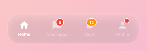
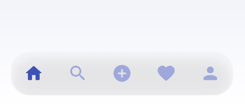
📸 Preview #


Features ✨ #
- 🎨 Stunning Glassmorphism Effect - Beautiful frosted glass appearance with customizable blur
- 🎯 Fully Customizable - Colors, icons, labels, sizes, gradients, and more
- 📱 iOS-Style Design - Rounded corners and smooth animations
- ⚡ High Performance - Optimized with BackdropFilter
- 🔄 Multiple Animation Types - Scale, Slide, Rotate, and Fade transitions
- 📳 Haptic Feedback - Built-in haptic feedback support (Light, Medium, Heavy, Selection)
- 🔔 Badge Support - Show notification badges with custom text and colors
- ♿ Accessibility Features - Semantic labels, tooltips, and screen reader support
- 🎭 Flexible Styling - Support for gradients, shadows, borders, and custom colors
- 📐 Responsive Design - Adapts to different screen sizes
- 🌈 Gradient Support - Optional gradient backgrounds
Installation 📦 #
Add this to your package's pubspec.yaml file:
dependencies:
  liquid_glass_nav: ^1.0.0
Then run:
flutter pub get
Quick Start 🚀 #
import 'package:flutter/material.dart';
import 'package:liquid_glass_nav/liquid_glass_nav.dart';

class MyHomePage extends StatefulWidget {
  @override
  _MyHomePageState createState() => _MyHomePageState();
}

class _MyHomePageState extends State<MyHomePage> {
  int _currentIndex = 0;

  final List<LiquidGlassNavItem> _items = [
    LiquidGlassNavItem(
      icon: Icons.home,
      label: 'Home',
      tooltip: 'Home Screen',
    ),
    LiquidGlassNavItem(
      icon: Icons.search,
      label: 'Search',
      tooltip: 'Search Screen',
    ),
    LiquidGlassNavItem(
      icon: Icons.favorite,
      label: 'Favorites',
      tooltip: 'Favorites Screen',
    ),
    LiquidGlassNavItem(
      icon: Icons.person,
      label: 'Profile',
      tooltip: 'Profile Screen',
    ),
  ];

  @override
  Widget build(BuildContext context) {
    return Scaffold(
      body: Stack(
        children: [
          // Your page content here
          Container(
            decoration: BoxDecoration(
              gradient: LinearGradient(
                begin: Alignment.topCenter,
                end: Alignment.bottomCenter,
                colors: [Colors.blue.shade300, Colors.purple.shade300],
              ),
            ),
          ),

          // Navigation bar at the bottom
          Positioned(
            left: 16,
            right: 16,
            bottom: 20,
            child: LiquidGlassBottomNav(
              items: _items,
              currentIndex: _currentIndex,
              onTap: (index) {
                setState(() {
                  _currentIndex = index;
                });
              },
            ),
          ),
        ],
      ),
    );
  }
}
Advanced Usage 🎨 #
With Animation Types #
LiquidGlassBottomNav(
  items: _items,
  currentIndex: _currentIndex,
  onTap: (index) => setState(() => _currentIndex = index),
  animationType: NavAnimationType.rotateScale, // Try: scale, slideUp, rotateScale, fade
  animationDuration: Duration(milliseconds: 300),
  animationCurve: Curves.easeInOut,
)
With Badges #
final items = [
  LiquidGlassNavItem(
    icon: Icons.home,
    label: 'Home',
  ),
  LiquidGlassNavItem(
    icon: Icons.message,
    label: 'Messages',
    showBadge: true,
    badgeText: '5',
    badgeColor: Colors.red,
    badgeTextColor: Colors.white,
  ),
  LiquidGlassNavItem(
    icon: Icons.notifications,
    label: 'Alerts',
    showBadge: true, // Shows dot badge without text
  ),
];
With Haptic Feedback #
LiquidGlassBottomNav(
  items: _items,
  currentIndex: _currentIndex,
  onTap: (index) => setState(() => _currentIndex = index),
  enableHapticFeedback: true,
  hapticFeedbackType: HapticFeedbackType.medium, // light, medium, heavy, selection
)
With Custom Styling #
LiquidGlassBottomNav(
  items: _items,
  currentIndex: _currentIndex,
  onTap: (index) => setState(() => _currentIndex = index),
  backgroundColor: Colors.white.withOpacity(0.2),
  selectedItemColor: Colors.blue,
  unselectedItemColor: Colors.grey,
  blurIntensity: 15.0,
  height: 70.0,
  borderRadius: BorderRadius.circular(30),
  gradient: LinearGradient(
    colors: [
      Colors.white.withOpacity(0.3),
      Colors.white.withOpacity(0.1),
    ],
  ),
)
With Ripple Effect #
LiquidGlassBottomNav(
  items: _items,
  currentIndex: _currentIndex,
  onTap: (index) => setState(() => _currentIndex = index),
  enableRipple: true,
  rippleColor: Colors.blue.withOpacity(0.3),
)
Complete Example 📱 #
Check out the example folder for complete working examples including:
- Basic navigation
- Badge examples
- Different animation types
- Gradient backgrounds
- Custom styling
- Haptic feedback
- Accessibility features
Best Practices 💡 #
- Position the nav bar: Use Stack widget to overlay the navigation bar at the bottom
- Background: Works best with colorful or gradient backgrounds for the glass effect
- Contrast: Ensure good contrast between selected/unselected items
- Item count: Recommended 3-5 items for optimal UX
- Accessibility: Always provide semanticLabel and tooltip for better accessibility
- Haptic feedback: Use appropriate haptic feedback type for your app's feel
- Badges: Use badges sparingly for important notifications
Platform Support 🎯 #
| Platform | Support |
|---|---|
| Android | ✅ |
| iOS | ✅ |
| Web | ✅ |
| macOS | ✅ |
| Windows | ✅ |
| Linux | ✅ |
Contributing 🤝 #
Contributions are welcome! Please feel free to submit a Pull Request.
License 📄 #
This project is licensed under the MIT License - see the LICENSE file for details.
Author ✍️ #
Created by Om Prakash Yadav
Support ⭐ #
If you like this package, please give it a ⭐ on GitHub!
Made with Flutter 💙


