introduction_story 0.1.0  introduction_story: ^0.1.0 copied to clipboard
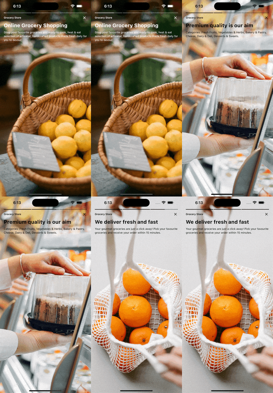
A social media story inspired screen to be used for introductions, whether to give users some information about your app (onboarding) or introduce new feature!
introduction_story #
Social media story inspired screen which can be used as onboarding to attract first-time users or introduction (for example new feature).

Getting started #
In your pubspec.yaml and below the dependencies add introduction_story.
dependencies:
  introduction_story: ^0.1.0
Usage #
- Inside your dart file add the imports below:
import 'package:flutter/material.dart';
import 'package:introduction_story/introduction_story.dart';
- Declare how should the introduction should look like in the form of
IntroductionStoryScreen, then push the screen by the help of the Navigator.
Navigator.push(
      context,
      MaterialPageRoute(
        builder: (_) {
          return IntroductionStoryScreen(
            stories: [
              Story(
                imagePath: 'assets/image_1.png',
                featureName: 'Here you can write the story name',
                title: 'Here you can write the title',
                description: 'Here you can write the description',
              ),
              Story(
                imagePath: 'assets/image_2.png',
                featureName: 'Here you can write the story name',
                title: 'Here you can write the title',
                description: 'Here you can write the description',
              ),
            ],
          );
        },
      ),
    );
Documentation #
Story Class #
| Dart attribute | Datatype | Description | Default Value |
|---|---|---|---|
| name | String | Name of the story. | Empty String |
| title | String | Title of the story. | Empty String |
| description | String | Description of the story. | Empty String |
| imagePath | String | Story background image path. | Null |
| decoration | StoryDecoration | Represents story customizations such as foregroundColor, text styles. | StoryDecoration() |
StoryDecoration Class #
| Dart attribute | Datatype | Description | Default Value |
|---|---|---|---|
| lightMode | bool | Specify the story brightness mode (light/dark), applied on status bar icons (only iOS), and all the foreground component colors (title, description, progress bar). | True |
| foregroundColor | Color | Set the foreground widgets color. | Null |
| backgroundColor | Color | Story background color. | Null |
| titleTextStyle | TextStyle | Set the title text style. | Null |
| descriptionTextStyle | TextStyle | Set the description text style. | Null |
| nameTextStyle | TextStyle | Set the name text style. | Null |


