flutter_theme_changer_erfan 0.0.5+0  flutter_theme_changer_erfan: ^0.0.5+0 copied to clipboard
A Flutter package that allows you to change your app's theme color dynamically with 4 beautiful widgets.
Flutter Dynamic Theme Changer #
A Flutter package that allows you to easily change your app's theme color dynamically at runtime using Riverpod.
It provides both a full theme changer wrapper and four beautiful theme widgets!
☕ Support #
If you find this package helpful, consider supporting my work:
✨ Features #
- 🎨 Dynamic primary color theme switching with Material 3 ColorScheme
- 🧩 Five ready-to-use theme widgets:
ThemeColorPickerWidget: An expandable color picker that can be placed anywhere (Great for floating).ThemeDialogButton: A convenient button that shows colors in a dialog. which is great for all common use cases.CustomColorPickerDialog: A static utility to show a theme picker from any custom widget or UI element.ThemeModeToggle: A simple toggle for switching between light and dark mode.DarkLightModeCustomToggle: An advanced toggle for custom light/dark mode color schemes.
- 🌈 Allow users to pick from customizable color palettes
- 🚀 Built with Flutter Riverpod 2.0 (StateNotifier based)
- 🎯 Simple API and easy integration
- ✍️ Fully customizable if needed
- ✅ Compatible with Flutter 3.24 and Material 3
- 🔄 Optimized performance with background processing
- 💾 Persistent theme preferences across app restarts
- 🧵 Off-main-thread theme generation for smooth UI
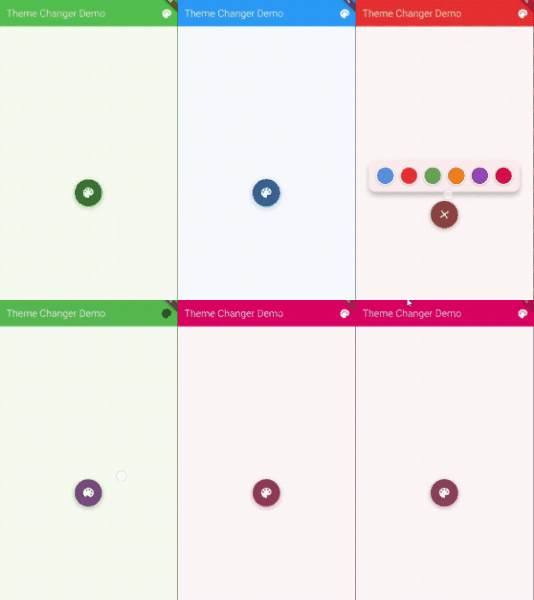
🎥 Theme Color Picker Demo #

Above: Animated demo of ThemeColorPickerWidget.
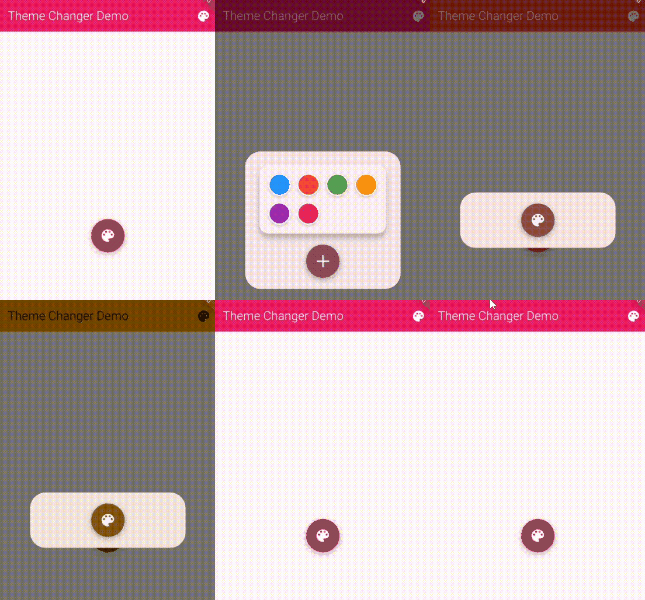
🎥 Theme Dialog Button Demo #

Above: Animated demo of ThemeDialogButton widget.
Getting started #
Add this to your package's pubspec.yaml file:
dependencies:
  flutter_theme_changer_erfan: ^0.0.5+0
Then run flutter pub get to install the package.
Or run flutter pub add flutter_theme_changer_erfan in your terminal.
🛠️ How to Use #
Basic Setup #
Wrap your app with ThemeChanger and specify a default color:
void main() {
  runApp(
    const ProviderScope(
      child: ThemeChanger(
        title: 'My App',
        defaultColor: Colors.purple, // Specify your default theme color this is required!
        scaffoldColor: Colors.white, // Optional scaffold background color
        child: HomeScreen(),
      ),
    ),
  );
}
Using ThemeDialogButton #
Add the dialog button to your AppBar for a clean theme selection experience:
AppBar(
  title: const Text('My App'),
  actions: [
    // Add the theme dialog button to your AppBar
    ThemeDialogButton(
      availableColors: [
        Colors.blue,
        Colors.red,
        Colors.green,
        Colors.orange,
        Colors.purple,
      ],
    ),
  ],
)
Using ThemeColorPickerWidget #
Place the color picker widget anywhere in your app for a floating theme selection experience:
// For ThemeColorPickerWidget
ThemeColorPickerWidget(
  availableColors: [
    Colors.teal,
    Colors.indigo,
    Colors.deepOrange,
    Colors.cyan,
    Colors.lime,
    Colors.amber,
  ],
)

// For ThemeDialogButton (coming soon)
🎨 Custom Theme Picker Integration #
In addition to the built-in widgets, you can now trigger the theme color picker from any custom UI element using the CustomColorPickerDialog:
Basic Button Example #
ElevatedButton(
  onPressed: () => CustomColorPickerDialog.showColorPickerDialog(context),
  child: Text('Change Theme'),
)
Icon Button Example #
IconButton(
  icon: Icon(Icons.palette),
  onPressed: () => CustomColorPickerDialog.showColorPickerDialog(
    context,
    availableColors: [
      Colors.purple,
      Colors.orange,
      Colors.teal,
      Colors.pink,
      Colors.indigo,
    ],
  ),
  tooltip: 'Change Theme',
)
Custom Widget Example #
GestureDetector(
  onTap: () => CustomColorPickerDialog.showColorPickerDialog(context),
  child: Container(
    padding: EdgeInsets.all(12),
    decoration: BoxDecoration(
      color: Theme.of(context).colorScheme.primary,
      borderRadius: BorderRadius.circular(8),
    ),
    child: Row(
      mainAxisSize: MainAxisSize.min,
      children: [
        Icon(
          Icons.format_paint,
          color: Theme.of(context).colorScheme.onPrimary,
        ),
        SizedBox(width: 8),
        Text(
          'Custom Theme Selector',
          style: TextStyle(
            color: Theme.of(context).colorScheme.onPrimary,
          ),
        ),
      ],
    ),
  ),
)
Toggle Switch Example #
bool _toggleValue = false;

Switch(
  value: _toggleValue,
  onChanged: (value) {
    setState(() {
      _toggleValue = value;
    });
    if (value) {
      CustomColorPickerDialog.showColorPickerDialog(
        context,
        availableColors: [
          Colors.purple,
          Colors.orange,
          Colors.teal,
          Colors.pink,
          Colors.indigo,
        ],
      );
    }
  },
)
From Event Handlers #
void onUserPreferenceChanged() {
  CustomColorPickerDialog.showColorPickerDialog(context);
}
This gives you complete flexibility to integrate theme changing functionality with your own UI components and interaction patterns.
Using ThemeModeToggle #
Add a simple light/dark mode toggle to your app:
void main() {
  runApp(
    const ProviderScope(
      child: ThemeChanger(
        title: 'My App',
        defaultColor: Colors.purple,
        child: HomeScreen(),
      ),
    ),
  );
}

// In your UI:
AppBar(
  title: const Text('My App'),
  actions: [
    // Add the theme mode toggle to your AppBar
    const ThemeModeToggle(
      showIcon: true,
      showText: true,
      compact: false,
    ),
  ],
)
Using DarkLightModeCustomToggle #
For advanced theming with custom color palettes for light and dark modes:
void main() {
  runApp(
    const ProviderScope(
      child: MyApp(),
    ),
  );
}

class MyApp extends ConsumerStatefulWidget {
  const MyApp({super.key});

  @override
  ConsumerState<MyApp> createState() => _MyAppState();
}

class _MyAppState extends ConsumerState<MyApp> {
  @override
  void initState() {
    super.initState();
    _initializeTheme();
  }

  void _initializeTheme() {
    // Define custom colors for light and dark modes
    final lightModeColors = {
      'background': Colors.white,
      'card': Colors.blue.shade50,
      'primary': Colors.blue.shade600,
      'text': Colors.black87,
    };

    final darkModeColors = {
      'background': Colors.grey.shade900,
      'card': Colors.grey.shade800,
      'primary': Colors.blue.shade400,
      'text': Colors.white,
    };

    // Initialize custom theme colors
    CustomThemeColorPalette.initialize(
      ref,
      lightModeColors: lightModeColors,
      darkModeColors: darkModeColors,
      isDarkMode: false, // Default to light mode
      syncWithAppTheme: true,
    );
  }

  @override
  Widget build(BuildContext context) {
    return ThemeChanger(
      title: 'Custom Theme Demo',
      defaultColor: Colors.blue.shade600,
      child: HomeScreen(),
    );
  }
}

// In your UI:
AppBar(
  title: const Text('My App'),
  actions: [
    // Add the custom theme toggle to your AppBar
    Padding(
      padding: const EdgeInsets.all(8.0),
      child: DarkLightModeCustomToggle(
        lightModeColors: {
          'background': Colors.white,
          'card': Colors.blue.shade50,
          'primary': Colors.blue.shade600,
          'text': Colors.black87,
        },
        darkModeColors: {
          'background': Colors.grey.shade900,
          'card': Colors.grey.shade800,
          'primary': Colors.blue.shade400,
          'text': Colors.white,
        },
        syncWithAppTheme: true,
        defaultDarkMode: false,
      ),
    ),
  ],
)
How DarkLightModeCustomToggle Works
The DarkLightModeCustomToggle provides a powerful way to implement custom color palettes for both light and dark modes:
-
Named Color Palettes: Define your own color maps with semantic keys like 'background', 'text', 'card', etc.
-
Separate Light/Dark Palettes: Create distinct color sets for light and dark modes that automatically switch when toggled.
-
App Theme Synchronization: When
syncWithAppThemeis set totrue, the toggle will also update the app's main theme. -
Accessing Colors: You can access your custom colors anywhere in your app using:
// Create a color palette reference final colorPalette = CustomThemeColorPalette(ref); // Use it to get colors by name Container( color: colorPalette.getColor('background'), child: Text( 'Hello World', style: TextStyle(color: colorPalette.getColor('text')), ), ) -
Default Mode: Set
defaultDarkModetotrueto start your app in dark mode with the dark palette. -
Custom Icon Colors: Customize the toggle's appearance with
lightModeIconColoranddarkModeIconColor.
This approach gives you complete control over your app's color scheme while maintaining the simplicity of a single toggle for your users.
📦 What's Inside #
| Widget/File | Purpose |
|---|---|
ThemeChanger |
Wraps your app with dynamic theming |
ThemeColorPickerWidget |
Expandable color picker that shows in-place |
ThemeDialogButton |
AppBar button that shows colors in a dialog |
CustomColorPickerDialog |
Static utility to show a theme picker from any widget |
ThemeModeToggle |
Simple toggle for switching between light and dark mode |
DarkLightModeCustomToggle |
Advanced toggle for custom light/dark mode color schemes |
ThemeNotifier + themeProvider |
Riverpod logic for managing theme color |
📲 Example #
A full working example is available inside the /example folder.
To run the example locally:
flutter run --target=example/lib/main.dart
You'll see a floating color button — tap it, pick a color, and the app's theme changes instantly!
✅ All tests passed,including integration tests #
✅ All tests passed, including integration tests #

🙌 Contributing #
Contributions are welcome! Feel free to open issues or submit pull requests if you'd like to help!
🔥 Author #
Erfan Alizada. Developed with ❤️ using Flutter and Riverpod.
Additional information #
- For more examples, check out the example directory
- Report bugs on the issue tracker
- Contribute to the package on GitHub
📄 License #
This project is licensed under the GNU General Public License v3.0. See the LICENSE file for more details.
🔍 Performance Considerations #
This package is optimized for performance with:
- Background processing for theme generation using isolates
- Efficient state management with Riverpod
- Minimal rebuilds when changing themes
- Immediate UI feedback with optimized theme generation
For apps concerned with performance, you can monitor theme changes:
void main() {
  WidgetsFlutterBinding.ensureInitialized();

  // Add performance monitoring
  final observer = PerformanceObserver();
  WidgetsBinding.instance.addObserver(observer);

  runApp(const ProviderScope(child: MyApp()));
}
📱 Material 3 Support #
This package fully supports Material 3, which is the default in Flutter 3.24+. Key features include:
- Uses
ColorScheme.fromSeedfor harmonious color generation - Properly handles Material 3 theme properties
- Supports the new Material 3 color system
- Adapts to both light and dark themes
The theme picker widgets automatically adapt to your app's Material version and provide a consistent experience.
🔄 Theme Persistence #
Themes are automatically saved to SharedPreferences and restored when the app restarts:
- User theme preferences persist across app sessions
- Fast loading with optimized storage
- Fallback to default theme when no saved preference exists
🧵 Advanced Usage #
Custom Theme Generation #
You can customize how themes are generated by extending the ThemeNotifier:
class CustomThemeNotifier extends ThemeNotifier {
  @override
  Future<void> updateThemeOffMainThread(Color primaryColor) async {
    // Your custom theme generation logic
    super.updateThemeOffMainThread(primaryColor);
  }
}

// Register your custom provider
final customThemeProvider = StateNotifierProvider<CustomThemeNotifier, ThemeData>((ref) {
  return CustomThemeNotifier();
});
Performance Monitoring #
The package includes built-in performance logging that you can use to monitor theme generation times:
import 'dart:developer' as developer;

void main() {
  // Enable detailed logging
  developer.log('Theme generation performance monitoring enabled', name: 'performance');

  runApp(const ProviderScope(child: MyApp()));
}
📊 Technical Details #
- Uses isolates for off-main-thread theme generation
- Implements optimized color calculations
- Leverages Flutter's Material 3 design system
- Provides immediate visual feedback while processing complex themes
🔄 Widget Compatibility Guide #
Here's a guide on which widgets can be combined and which should be used separately:
Compatible Combinations #
✅ ThemeColorPickerWidget + ThemeDialogButton
- These can work well together as they both use the same theme provider. You might use the dialog in the AppBar and the picker widget elsewhere in your UI.
✅ ThemeColorPickerWidget + ThemeModeToggle
- These work well together as they control different aspects: one changes the color palette, the other toggles between light/dark mode.
✅ ThemeDialogButton + ThemeModeToggle
- Similar to above, these control different aspects of theming and can be used together.
✅ CustomColorPickerDialog + ThemeModeToggle
- The dialog can be triggered from custom UI while the toggle handles light/dark mode.
Incompatible Combinations #
❌ ThemeModeToggle + DarkLightModeCustomToggle
- Both control light/dark mode switching but in different ways. Using both will cause conflicts.
❌ DarkLightModeCustomToggle + Any color picker widget
- The custom toggle implements its own color palette system that may conflict with the standard color pickers.
Recommended Setups #
-
Basic Theme Control:
ThemeDialogButtonin the AppBarThemeModeTogglein the AppBar or settings screen
-
Advanced Theme Control:
ThemeColorPickerWidgetas a floating widgetThemeDialogButtonin the AppBarThemeModeTogglein the AppBar or settings screen
-
Custom Theme Control:
CustomColorPickerDialogtriggered from custom UI elementsThemeModeTogglefor light/dark switching
-
Fully Custom Theme System:
DarkLightModeCustomTogglealone, with custom color palettes for both modes
