flutter_deck 0.3.0  flutter_deck: ^0.3.0 copied to clipboard
 kazlauskas.dev
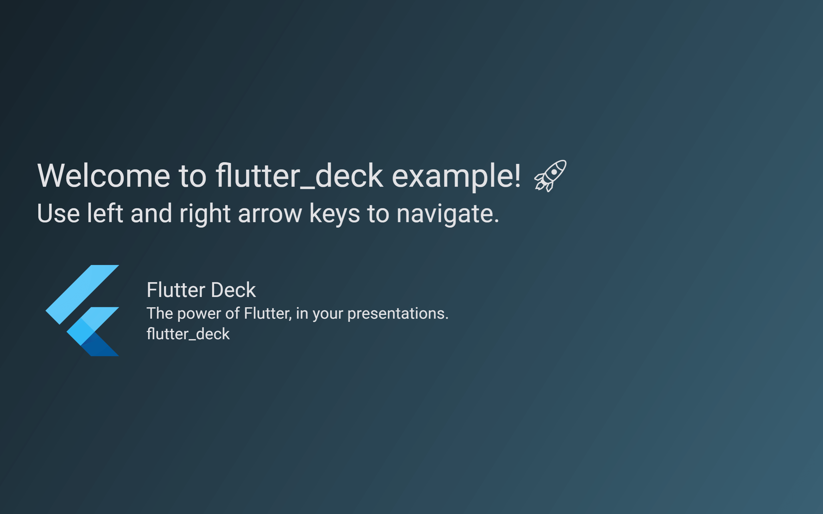
A lightweight, customizable, and easy-to-use framework to create presentations in Flutter.
flutter_deck #
Features 🪄 #
- 💙 Slide deck is built as any other Flutter app.
- 🧭 Navigator 2.0 support - each slide is rendered as an individual page with a deep link to it.
- 🐾 Steps - each slide can have multiple steps that can be navigated through.
- ⚙️ Define a global configuration once and override it per slide if needed.
- 🚀 Predictable API to access the slide deck state and its methods from anywhere in the app.
- 📦 Out of the box slide templates, widgets, transitions and controls.
- 🎨 Light and dark theme support.
Installation 💻 #
❗ In order to start using flutter_deck you must have the Flutter SDK installed on your machine.
Add flutter_deck to your pubspec.yaml:
dependencies:
  flutter_deck:
Install it:
flutter packages get
Hello World flutter_deck! 🧑💻 #
Use FlutterDeckApp as your slide deck's root widget and pass a list of FlutterDeckSlide widgets to it:
void main() {
  runApp(const FlutterDeckExample());
}

class FlutterDeckExample extends StatelessWidget {
  const FlutterDeckExample({super.key});

  @override
  Widget build(BuildContext context) {
    // This is an entry point for the Flutter Deck app.
    return FlutterDeckApp(
      configuration: const FlutterDeckConfiguration(...),
      slides: [
        <...>
      ],
    );
  }
}
Also, you can define a global configuration for your slide deck:
FlutterDeckApp(
  configuration: const FlutterDeckConfiguration(
    background: FlutterDeckBackgroundConfiguration(
      light: FlutterDeckBackground.solid(Color(0xFFB5FFFC)),
      dark: FlutterDeckBackground.solid(Color(0xFF16222A)),
    ),
    controls: FlutterDeckControlsConfiguration(
      nextKey: LogicalKeyboardKey.arrowRight,
      previousKey: LogicalKeyboardKey.arrowLeft,
      openDrawerKey: LogicalKeyboardKey.period,
    ),
    footer: FlutterDeckFooterConfiguration(
      showSlideNumbers: true,
      showSocialHandle: true,
    ),
    showProgress: false,
    transition: FlutterDeckTransition.fade(),
  ),
  <...>
);
Use any colors you like:
FlutterDeckApp(
  lightTheme: ThemeData.light(),
  darkTheme: ThemeData.dark(),
  themeMode: ThemeMode.system,
  <...>
);
And do not forget to introduce yourself!
FlutterDeckApp(
  speakerInfo: const FlutterDeckSpeakerInfo(
    name: 'John Doe',
    description: 'CEO of flutter_deck',
    socialHandle: '@john_doe',
    imagePath: 'assets/me.png',
  ),
  <...>
);
Slides #
The are multiple ways to create a slide:
- Using one of the predefined slide templates.
- Implementing a custom slide template.
- Implementing a custom slide.
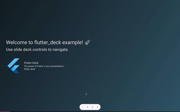
FlutterDeckTitleSlide #
This class is used to create the title slide in a slide deck. It is responsible for rendering the default header and footer of the slide deck, and placing the title and subtitle of the slide in the correct places. Also, if the FlutterDeckSpeakerInfo is set for the slide deck, it will render the speaker info below the title and subtitle.
class TitleSlide extends FlutterDeckTitleSlide {
  const TitleSlide({super.key})
      : super(
          configuration: const FlutterDeckSlideConfiguration(
            route: '/title-slide',
            footer: FlutterDeckFooterConfiguration(showFooter: false),
          ),
        );

  @override
  String get title => 'Here goes the title of the slide';

  @override
  String? get subtitle => 'Here goes the subtitle of the slide (optional)';
}
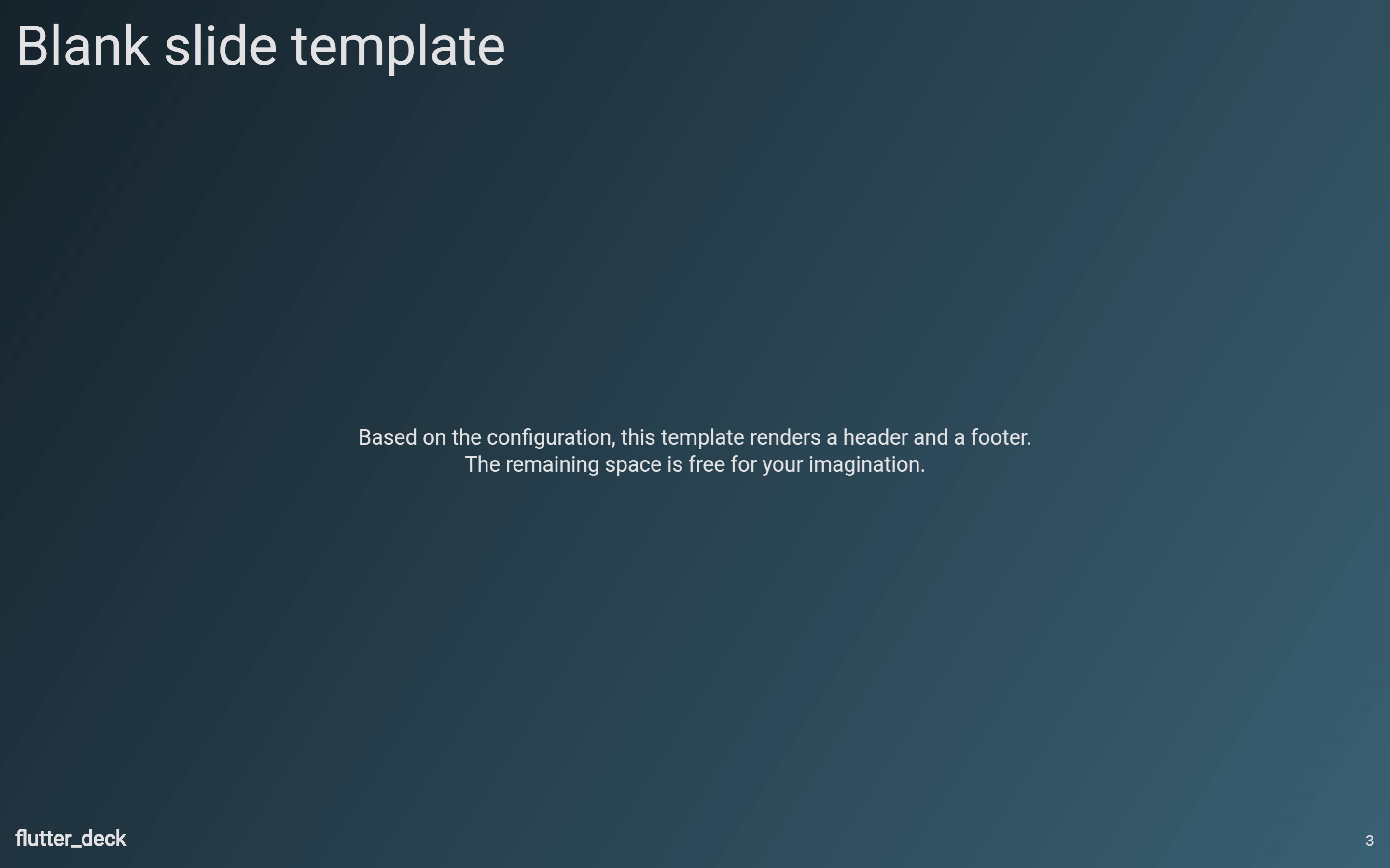
FlutterDeckBlankSlide #
This class is used to create a blank slide in a slide deck. It is responsible for rendering the default header and footer of the slide deck, and placing the content of the slide in the correct place.
class BlankSlide extends FlutterDeckBlankSlide {
  const BlankSlide({super.key})
      : super(
          configuration: const FlutterDeckSlideConfiguration(
            route: '/blank-slide',
            header: FlutterDeckHeaderConfiguration(title: 'Blank slide template'),
          ),
        );

  @override
  Widget body(BuildContext context) {
    return Text('Here goes the content of the slide');
  }
}
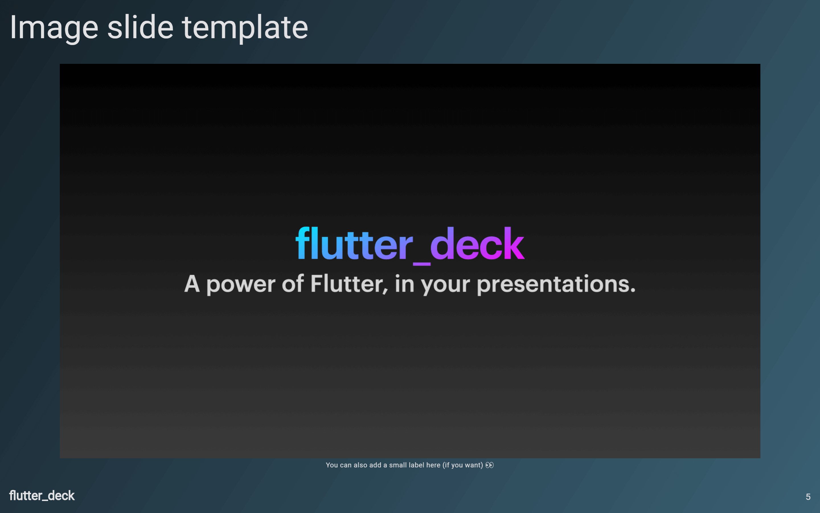
FlutterDeckImageSlide #
This class is used to create a slide that only contains an image. It is responsible for rendering the default header and footer of the slide deck, and placing the image in the correct place.
class ImageSlide extends FlutterDeckImageSlide {
  const ImageSlide({super.key})
      : super(
          configuration: const FlutterDeckSlideConfiguration(
            route: '/image-slide',
            header: FlutterDeckHeaderConfiguration(title: 'Image slide template'),
          ),
        );

  @override
  Image get image => Image.asset('assets/image.png');

  @override
  String? get label => 'Here goes the label of the image (optional)';
}
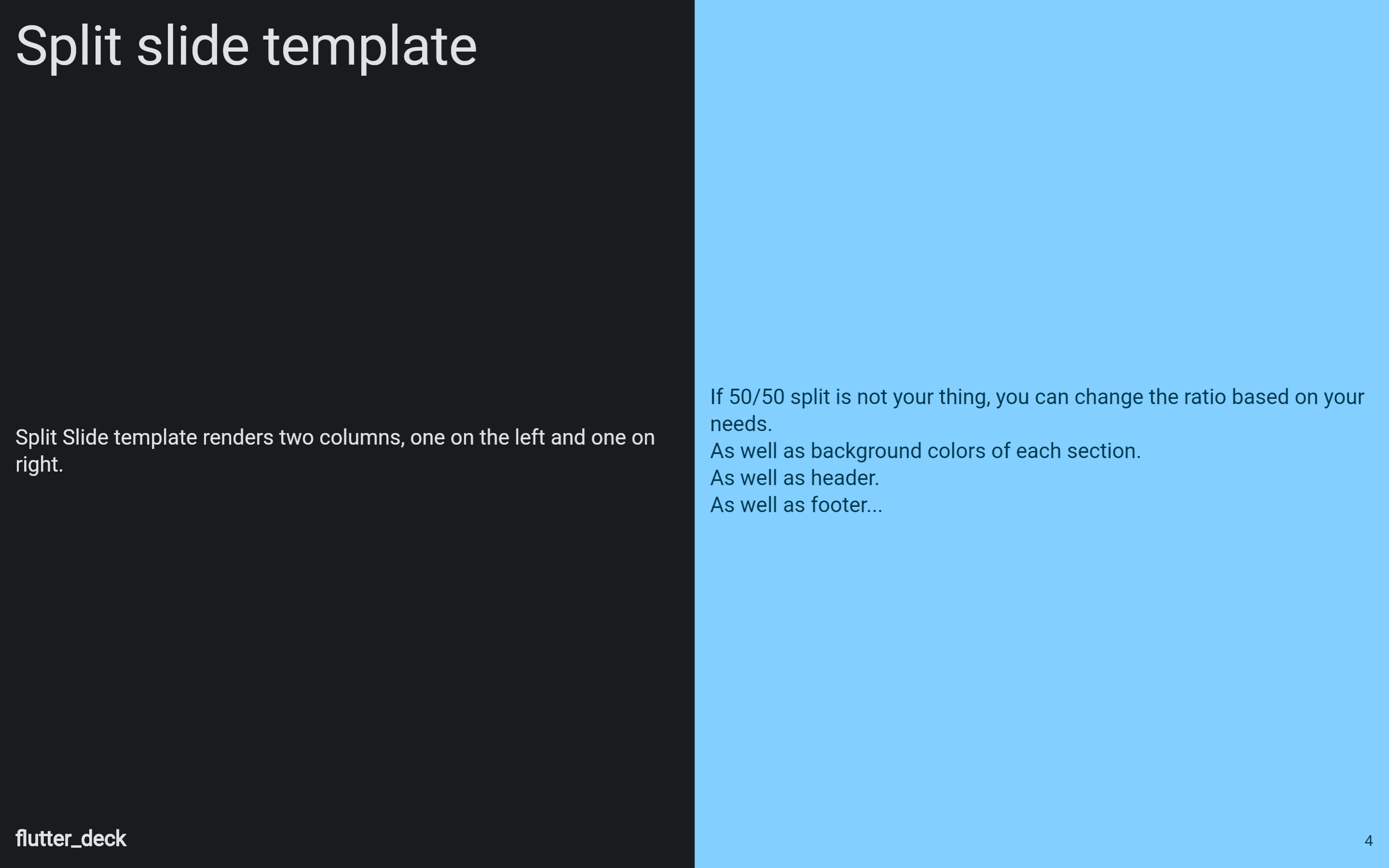
FlutterDeckSplitSlide #
This class is used to create a slide that contains two columns. It is responsible for rendering the default header and footer of the slide deck, and placing the left and right section content in the correct places.
class SplitSlide extends FlutterDeckSplitSlide {
  const SplitSlide({super.key})
      : super(
          configuration: const FlutterDeckSlideConfiguration(
            route: '/split-slide',
            header: FlutterDeckHeaderConfiguration(title: 'Split slide template'),
          ),
        );

  @override
  Widget left(BuildContext context) {
    return Text('Here goes the LEFT section content of the slide');
  }

  @override
  Widget right(BuildContext context) {
    return Text('Here goes the RIGHT section content of the slide');
  }
}
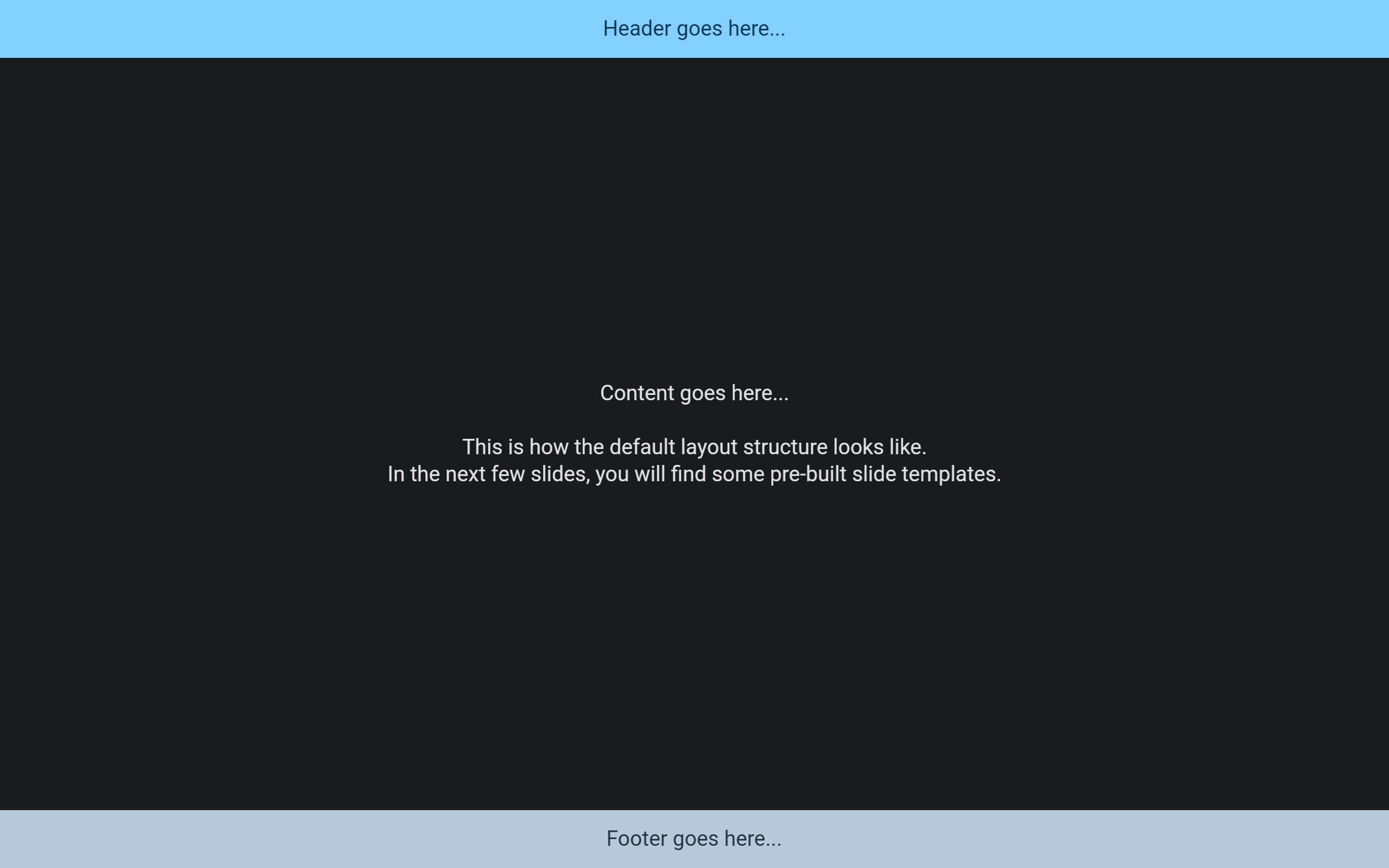
Creating a custom template #
To create a custom slide template, you need to extend the FlutterDeckSlideBase class and override its methods. This class is used to create a slide with a standard layout. It is responsible for placing the header, footer, and content of the slide in the correct places. Also, it is responsible for displaying the background of the slide.
class LayoutStructureSlide extends FlutterDeckSlideBase {
  const LayoutStructureSlide({super.key})
      : super(
          configuration: const FlutterDeckSlideConfiguration(
            route: '/layout-structure',
          ),
        );

  @override
  FlutterDeckBackground background(BuildContext context) {
    return FlutterDeckBackground.solid(
      Theme.of(context).colorScheme.background,
    );
  }

  @override
  Widget? content(BuildContext context) {
    return const ColoredBox(
      color: Colors.red,
      child: Text('Content goes here...'),
    );
  }

  @override
  Widget? footer(BuildContext context) {
    return ColoredBox(
      color: Theme.of(context).colorScheme.secondary,
      child: const Text('Footer goes here...'),
    );
  }

  @override
  Widget? header(BuildContext context) {
    return ColoredBox(
      color: Theme.of(context).colorScheme.primary,
      child: const Text('Header goes here...'),
    );
  }
}
Creating a custom slide #
Finally, you can always create a custom slide by extending the FlutterDeckSlide class and overriding the slide method. This class is responsible for wrapping the slide in a [Scaffold] and displaying the navigation drawer for the slide deck.
class CustomSlide extends FlutterDeckSlide {
  const CustomSlide({super.key})
      : super(
          configuration: const FlutterDeckSlideConfiguration(
            route: '/custom-slide',
          ),
        );

  @override
  Widget slide(BuildContext context) {
    return const Text('Here goes your custom slide content...');
  }
}
Slide visibility #
By default, all slides are visible and available in the slide deck. However, you can hide a slide by setting the hidden property to true for the slide configuration:
class HiddenSlide extends FlutterDeckBlankSlide {
  const HiddenSlide({super.key})
      : super(
          configuration: const FlutterDeckSlideConfiguration(
            route: '/hidden',
            hidden: true, // Sets the slide to be hidden
          ),
        );

  @override
  Widget body(BuildContext context) {
    return Center(
      child: Text(
        "This slide is hidden. Oh, but you can't see it...",
        style: Theme.of(context).textTheme.titleLarge,
      ),
    );
  }
}
Widgets #
FlutterDeckBulletList #
A widget that renders a list of bullet points. Bullet point items are rendered as a row with a bullet point and the text. The bullet point is rendered as a dot by default, but can be customized by providing a bulletPointWidget. The text is rendered as an AutoSizeText widget and is automatically resized to fit the available space.
If useSteps is true for the slide configuration, the bullet points will be rendered one by one as the user steps through the slide.
class FlutterDeckBulletListDemoSlide extends FlutterDeckSplitSlide {
  const FlutterDeckBulletListDemoSlide({super.key})
      : super(
          configuration: const FlutterDeckSlideConfiguration(
            route: '/bullet-list-demo',
            steps: 3, // Define the number of steps for the slide
            header: FlutterDeckHeaderConfiguration(title: 'FlutterDeckBulletList demo'),
          ),
        );

  @override
  Widget left(BuildContext context) {
    return FlutterDeckBulletList(
      useSteps: true, // Enable steps for the bullet list
      items: const [
        'This is a step',
        'This is another step',
        'This is a third step',
      ],
    );
  }

  @override
  Widget right(BuildContext context) {
    return Text('FlutterDeckBulletList is awesome!');
  }
}
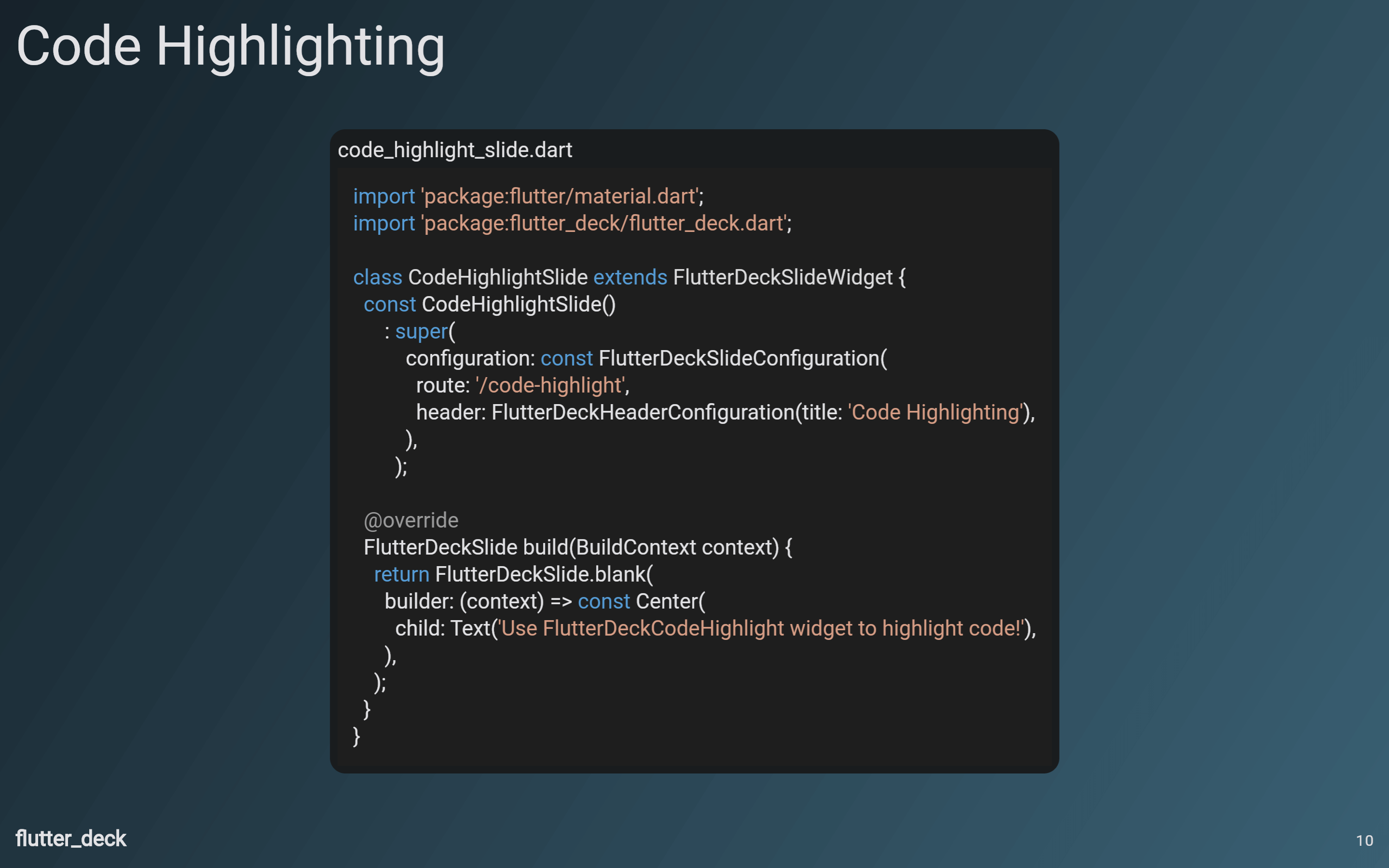
FlutterDeckCodeHighlight #
Provides a widget that gives you customizable syntax highlighting for many languages.
class CodeHighlightSlide extends FlutterDeckBlankSlide {
  const CodeHighlightSlide({super.key})
      : super(
          configuration: const FlutterDeckSlideConfiguration(
            route: '/code-highlight',
            header: FlutterDeckHeaderConfiguration(title: 'Code Highlighting'),
          ),
        );

  @override
  Widget body(BuildContext context) {
    return Center(
      child: FlutterDeckCodeHighlight(
        code: '''
import 'package:flutter_deck/flutter_deck.dart';

class CodeHighlightSlide extends FlutterDeckBlankSlide {
  const CodeHighlightSlide({super.key})
      : super(
          configuration: const FlutterDeckSlideConfiguration(
            route: '/code-highlight',
            header: FlutterDeckHeaderConfiguration(title: 'Code Highlighting'),
          ),
        );

  @override
  Widget body(BuildContext context) {
    return const Center(
      child: Text('Use FlutterDeckCodeHighlight widget to highlight code!'),
    );
  }
}''',
        fileName: 'code_highlight_slide.dart',
        language: 'dart',
        textStyle: Theme.of(context).textTheme.titleLarge,
      ),
    );
  }
}
Accessing slide deck state from the code #
By using the FlutterDeck extensions, you can access the slide deck state and its methods from anywhere in the app:
@override
Widget build(BuildContext context) {
  // Retrieve the FlutterDeck instance from the context.
  final flutterDeck = context.flutterDeck;

  // Retrieve the FlutterDeckRouter instance for this slide deck.
  final router = flutterDeck.router;
  // Retrieve the current slide configuration.
  final configuration = flutterDeck.configuration;
  // Retrieve the global slide deck configuration.
  final globalConfiguration = flutterDeck.globalConfiguration;
  // Retrieve the speaker info.
  final speakerInfo = flutterDeck.speakerInfo;

  // Go to the next slide.
  flutterDeck.next();
  // Go to the previous slide.
  flutterDeck.previous();

  // Retrieve the current slide number.
  final slideNumber = flutterDeck.slideNumber;
  // Go to the first slide.
  flutterDeck.goToSlide(1);

  // Retrieve the current step number.
  final stepNumber = flutterDeck.stepNumber;
  // Go to the first step.
  flutterDeck.goToStep(1);

  <...>
}
Transitions #
This package comes with a few predefined transitions that can be used for your slides:
FlutterDeckTransition.none(default)FlutterDeckTransition.fadeFlutterDeckTransition.scaleFlutterDeckTransition.slideFlutterDeckTransition.rotationFlutterDeckTransition.custom
You can specify a transition for the whole slide deck:
FlutterDeckApp(
  configuration: const FlutterDeckConfiguration(
    transition: FlutterDeckTransition.fade(),
  ),
  <...>
);
Or you can specify a transition for a specific slide:
class TransitionsSlide extends FlutterDeckSplitSlide {
  const TransitionsSlide({super.key})
      : super(
          configuration: const FlutterDeckSlideConfiguration(
            route: '/transitions',
            transition: FlutterDeckTransition.rotation(), // Specify the transition for the slide
          ),
        );

  <...>
}
FlutterDeckTransition.custom accepts a FlutterDeckTransitionBuilder that can be extended to create a custom transition:
class VerticalTransitionBuilder extends FlutterDeckTransitionBuilder {
  const VerticalTransitionBuilder();

  @override
  Widget build(
    BuildContext context,
    Animation<double> animation,
    Animation<double> secondaryAnimation,
    Widget child,
  ) {
    return SlideTransition(
      position: animation.drive(
        Tween<Offset>(
          begin: const Offset(0, 1),
          end: Offset.zero,
        ).chain(CurveTween(curve: Curves.easeIn)),
      ),
      child: child,
    );
  }
}

class CustomTransitionSlide extends FlutterDeckBlankSlide {
  const CustomTransitionSlide({super.key})
      : super(
          configuration: const FlutterDeckSlideConfiguration(
            route: '/custom-transition',
            transition: FlutterDeckTransition.custom(
              transitionBuilder: VerticalTransitionBuilder(),
            ),
          ),
        );

  <...>
}
Steps #
Steps is a feature that allows you to navigate through a slide, well, step by step. You can access the current step from any widget. This way, you can reveal or hide content, run animations, etc.
To enable steps for a slide, you need to set the steps property for the slide configuration:
class StepsDemoSlide extends FlutterDeckBlankSlide {
  const StepsDemoSlide({super.key})
      : super(
          configuration: const FlutterDeckSlideConfiguration(
            route: '/steps-demo',
            steps: 2,
          ),
        );

  <...>
}
To trigger a rebuild of the widget when the step changes, you can use the FlutterDeckSlideStepsBuilder widget:
@override
Widget body(BuildContext context) {
  return FlutterDeckSlideStepsBuilder(
    builder: (context, stepNumber) => stepNumber == 1
        ? const Text('This is the first step.')
        : const Text('This is the second step.'),
  );
}
Or you can use the FlutterDeckSlideStepsListener to trigger side effects when the step changes:
@override
Widget body(BuildContext context) {
  return FlutterDeckSlideStepsListener(
    listener: (context, stepNumber) {
      print('Current step: $stepNumber');
    },
    child: const Text('Steps demo slide'),
  );
}
Navigation drawer #
Every slide deck comes with a navigation drawer that can be used to navigate through the slide deck. The navigation drawer is automatically generated based on the slide deck configuration. From the drawer, you can change the current theme mode, or go to a specific slide.
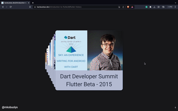
Presentations built with flutter_deck 🚀 #
| Title | Author |
|---|---|
| Let me introduce you to Flutter | Mangirdas Kazlauskas |
| Control your Flutter application on the fly with Firebase Remote Config | Mangirdas Kazlauskas |
Metadata
Publisher
Weekly Downloads
Metadata
A lightweight, customizable, and easy-to-use framework to create presentations in Flutter.
Repository (GitHub)
View/report issues
Topics
Funding
Consider supporting this project:
github.com
License
 unknown (license)
Dependencies
auto_size_text, flutter, flutter_highlight, go_router