flutter_deck 0.12.1  flutter_deck: ^0.12.1 copied to clipboard
A lightweight, customizable, and easy-to-use framework to create presentations in Flutter.
flutter_deck #
Demo: https://mkobuolys.github.io/flutter_deck/
Features 🪄 #
- 💙 Slide deck is built as any other Flutter app.
- 🧭 Navigator 2.0 support - each slide is rendered as an individual page with a deep link to it.
- 🐾 Steps - each slide can have multiple steps that can be navigated through.
- ⚙️ Define a global configuration once and override it per slide if needed.
- 🚀 Predictable API to access the slide deck state and its methods from anywhere in the app.
- 📦 Out of the box slide templates, widgets, transitions and controls.
- 🎨 Custom theming and light/dark mode support.
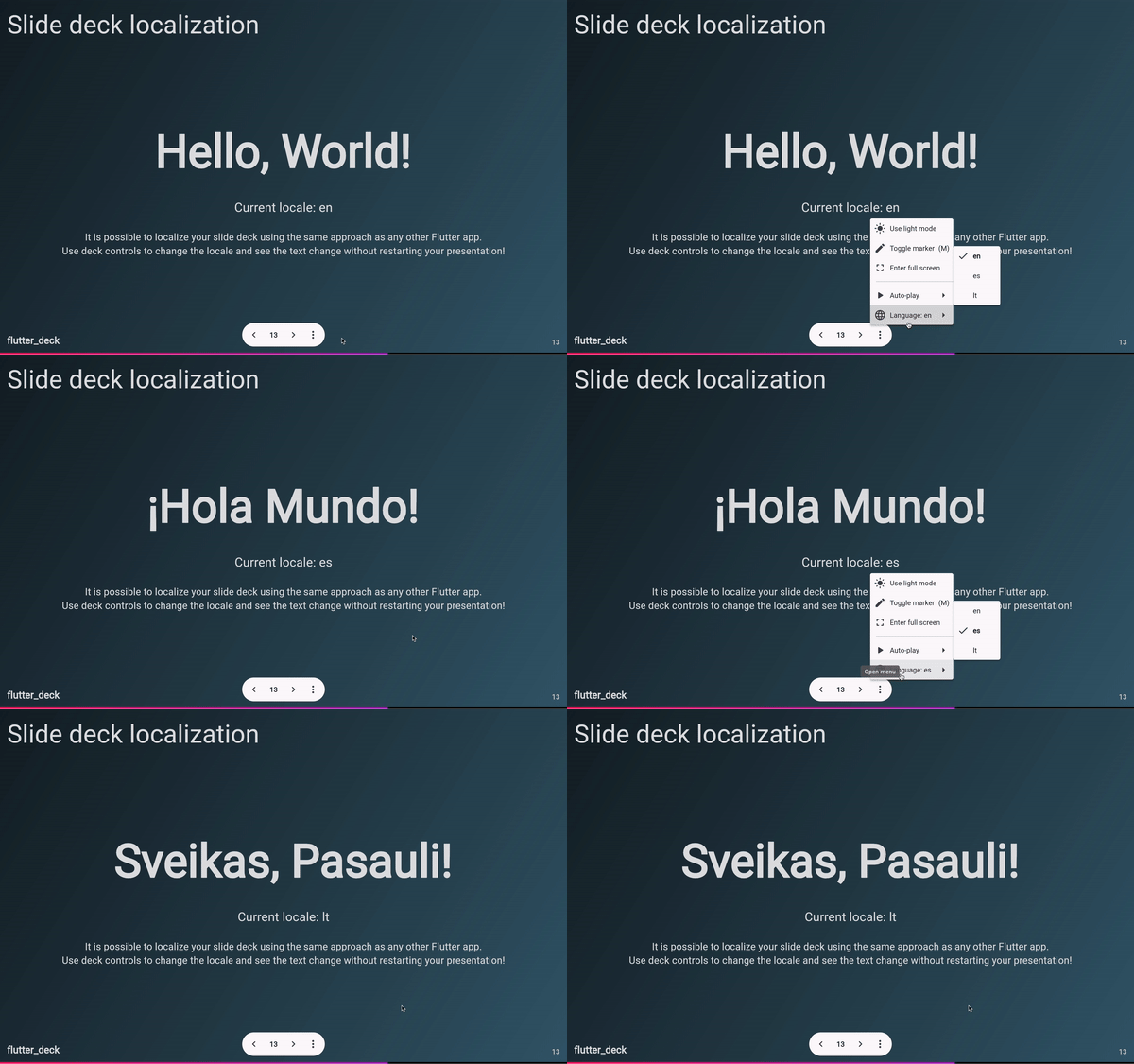
- 🌍 Built-in localization support.
Table of contents #
- 💻 Installation
- 👨💻 Hello flutter_deck!
- 📃 Slide templates
- 🪄 Generating slides
- 🎨 Theming
- 🙈 Slide visibility
- 🧱 Widgets
- 📦 Accessing slide deck state from the code
- 🔀 Transitions
- 🐾 Steps
- 🌍 Localization
- 🎮 Controls
- 🚀 Presentations built with flutter_deck
💻 Installation #
❗ In order to start using flutter_deck you must have the Flutter SDK installed on your machine.
Add flutter_deck to your pubspec.yaml:
dependencies:
  flutter_deck:
Install it:
flutter packages get
🧑💻 Hello flutter_deck! #
Use FlutterDeckApp as your slide deck's root widget and pass a list of FlutterDeckSlideWidget widgets to it:
void main() {
  runApp(const FlutterDeckExample());
}

class FlutterDeckExample extends StatelessWidget {
  const FlutterDeckExample({super.key});

  @override
  Widget build(BuildContext context) {
    // This is an entry point for the Flutter Deck app.
    return FlutterDeckApp(
      configuration: const FlutterDeckConfiguration(...),
      slides: [
        <...>
      ],
    );
  }
}
Also, you can define a global configuration for your slide deck:
FlutterDeckApp(
  configuration: FlutterDeckConfiguration(
    background: const FlutterDeckBackgroundConfiguration(
      light: FlutterDeckBackground.solid(Color(0xFFB5FFFC)),
      dark: FlutterDeckBackground.solid(Color(0xFF16222A)),
    ),
    controls: const FlutterDeckControlsConfiguration(
      presenterToolbarVisible: true,
      shortcuts: FlutterDeckShortcutsConfiguration(
        enabled: true,
        nextSlide: SingleActivator(LogicalKeyboardKey.arrowRight),
        previousSlide: SingleActivator(LogicalKeyboardKey.arrowLeft),
        toggleMarker: SingleActivator(
          LogicalKeyboardKey.keyM,
          control: true,
          meta: true,
        ),
        toggleNavigationDrawer: SingleActivator(
          LogicalKeyboardKey.period,
          control: true,
          meta: true,
        ),
      ),
    ),
    footer: const FlutterDeckFooterConfiguration(
      showSlideNumbers: true,
      widget: FlutterLogo(),
    ),
    header: const FlutterDeckHeaderConfiguration(
      showHeader: false,
    ),
    marker: const FlutterDeckMarkerConfiguration(
      color: Colors.cyan,
      strokeWidth: 8.0,
    ),
    progressIndicator: const FlutterDeckProgressIndicator.gradient(
      gradient: LinearGradient(
        begin: Alignment.topLeft,
        end: Alignment.bottomRight,
        colors: [Colors.pink, Colors.purple],
      ),
      backgroundColor: Colors.black,
    ),
    slideSize: FlutterDeckSlideSize.fromAspectRatio(
      aspectRatio: const FlutterDeckAspectRatio.ratio16x10(),
      resolution: const FlutterDeckResolution.fromWidth(1440),
    ),
    transition: const FlutterDeckTransition.fade(),
  ),
  <...>
);
Use any colors you like:
FlutterDeckApp(
  lightTheme: FlutterDeckThemeData.light(),
  darkTheme: FlutterDeckThemeData.dark(),
  themeMode: ThemeMode.system,
  <...>
);
And do not forget to introduce yourself!
FlutterDeckApp(
  speakerInfo: const FlutterDeckSpeakerInfo(
    name: 'John Doe',
    description: 'CEO of flutter_deck',
    socialHandle: '@john_doe',
    imagePath: 'assets/me.png',
  ),
  <...>
);
📃 Slide templates #
To create a slide, extend the FlutterDeckSlideWidget class and override the build method that returns a FlutterDeckSlide widget. FlutterDeckSlide supports a few predefined slide templates that help you to create a slide faster.
// Extend the FlutterDeckSlideWidget class...
class NewSlide extends FlutterDeckSlideWidget {
  const NewSlide()
      : super(
          configuration: const FlutterDeckSlideConfiguration(
            route: '/new-slide',
            title: 'New slide',
          ),
        );

  // ...override the build method...
  @override
  FlutterDeckSlide build(BuildContext context) {
    // ...and create a new FlutterDeckSlide instance.
  }
}
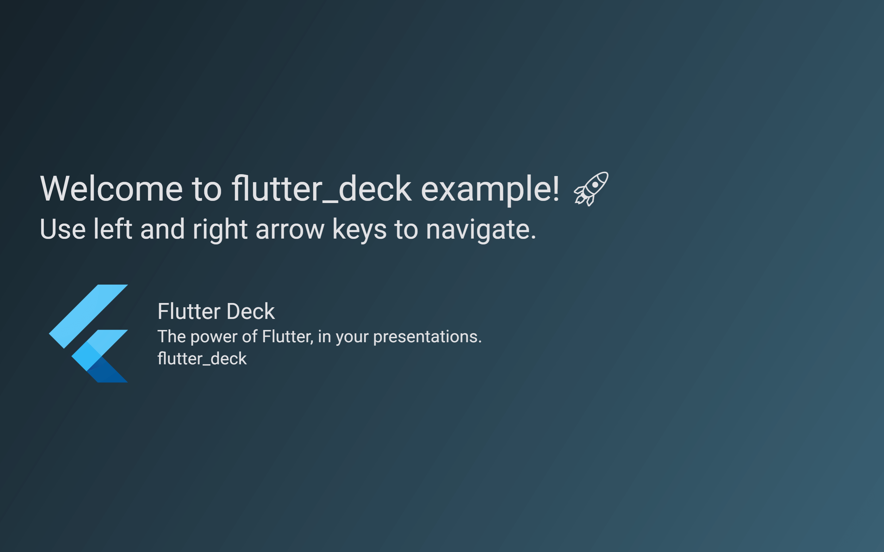
Title slide #
To create a title slide, use the FlutterDeckSlide.title constructor. It is responsible for rendering the default header and footer of the slide deck, and placing the title and subtitle in the correct places. Also, if the FlutterDeckSpeakerInfo is set, it will render the speaker info below the title and subtitle.
class TitleSlide extends FlutterDeckSlideWidget {
  const TitleSlide()
      : super(
          configuration: const FlutterDeckSlideConfiguration(
            route: '/title-slide',
            title: 'Title slide',
            footer: FlutterDeckFooterConfiguration(showFooter: false),
          ),
        );

  @override
  FlutterDeckSlide build(BuildContext context) {
    return FlutterDeckSlide.title(
      title: 'Here goes the title of the slide',
      subtitle: 'Here goes the subtitle of the slide (optional)',
    );
  }
}
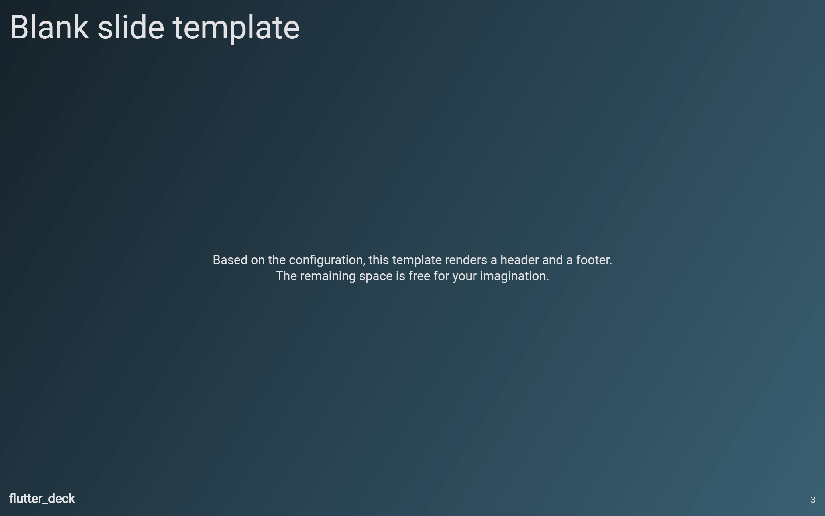
Blank slide #
To create a title slide, use the FlutterDeckSlide.blank constructor. It is responsible for rendering the default header and footer of the slide deck, and rendering the content of the slide using the provided builder.
class BlankSlide extends FlutterDeckSlideWidget {
  const BlankSlide()
      : super(
          configuration: const FlutterDeckSlideConfiguration(
            route: '/blank-slide',
            header: FlutterDeckHeaderConfiguration(
              title: 'Blank slide template',
            ),
          ),
        );

  @override
  FlutterDeckSlide build(BuildContext context) {
    return FlutterDeckSlide.blank(
      builder: (context) => const Text('Here goes the content of the slide'),
    );
  }
}
Big fact slide #
To create a big fact slide, use the FlutterDeckSlide.bigFact constructor. It is responsible for rendering the title (fact) with the description (subtitle) below it.
class BigFactSlide extends FlutterDeckSlideWidget {
  const BigFactSlide()
      : super(
          configuration: const FlutterDeckSlideConfiguration(
            route: '/big-fact',
            header: FlutterDeckHeaderConfiguration(
              title: 'Big fact slide template',
            ),
          ),
        );

  @override
  FlutterDeckSlide build(BuildContext context) {
    return FlutterDeckSlide.bigFact(
      title: '100%',
      subtitle: 'The test coverage value that flutter_deck will probably never achieve',
      theme: FlutterDeckTheme.of(context).copyWith(
        bigFactSlideTheme: const FlutterDeckBigFactSlideThemeData(
          titleTextStyle: TextStyle(color: Colors.amber),
        ),
      ),
    );
  }
}
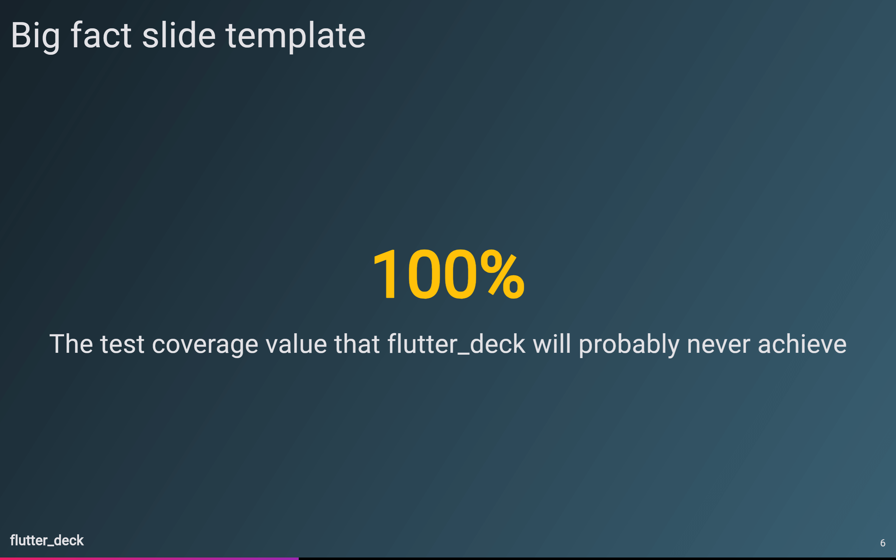
Image slide #
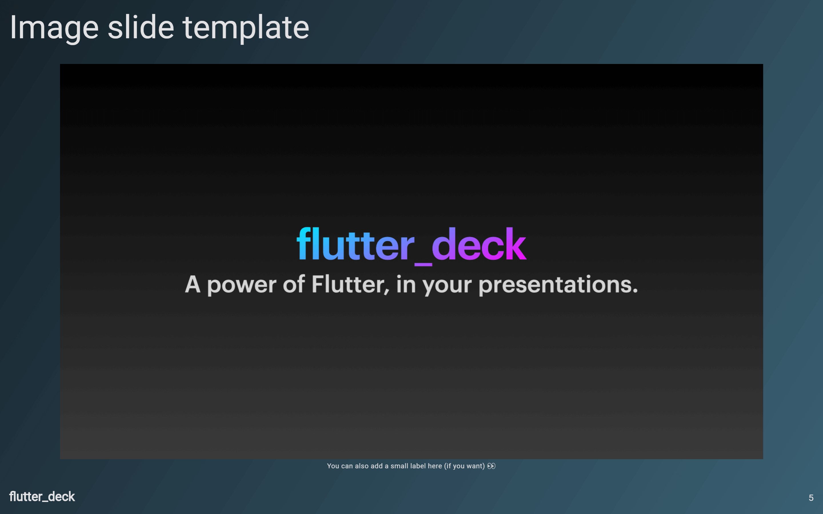
To create an image slide, use the FlutterDeckSlide.image constructor. It is responsible for rendering the default header and footer of the slide deck, and rendering the image using the provided imageBuilder.
class ImageSlide extends FlutterDeckSlideWidget {
  const ImageSlide()
      : super(
          configuration: const FlutterDeckSlideConfiguration(
            route: '/image-slide',
            header: FlutterDeckHeaderConfiguration(
              title: 'Image slide template',
            ),
          ),
        );

  @override
  FlutterDeckSlide build(BuildContext context) {
    return FlutterDeckSlide.image(
      imageBuilder: (context) => Image.asset('assets/image.png'),
      label: 'Here goes the label of the image (optional)',
    );
  }
}
Quote slide #
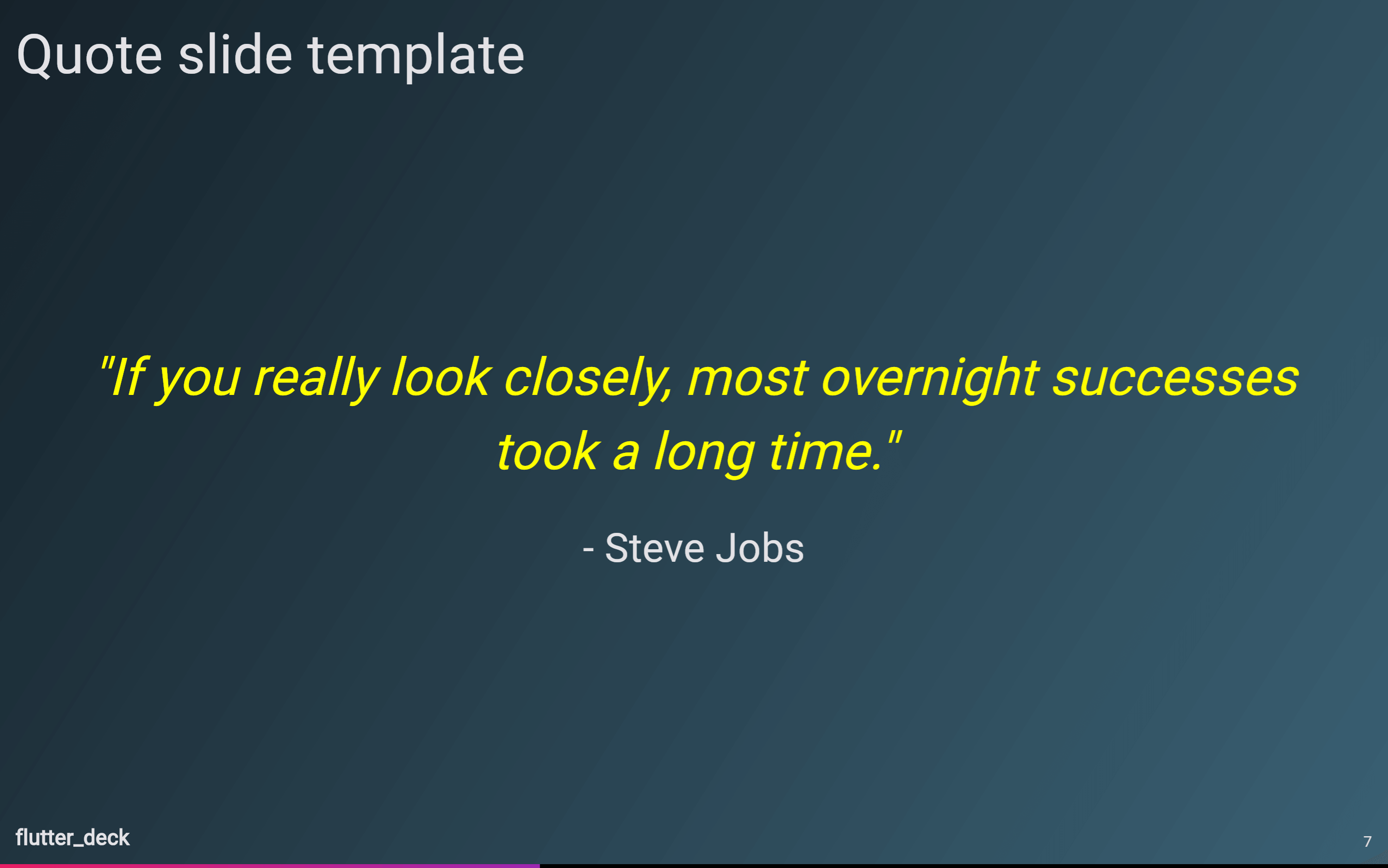
To create a quote slide, use the FlutterDeckSlide.quote constructor. It is responsible for rendering the quote and attribution below it.
class QuoteSlide extends FlutterDeckSlideWidget {
  const QuoteSlide()
      : super(
          configuration: const FlutterDeckSlideConfiguration(
            route: '/quote',
            header: FlutterDeckHeaderConfiguration(
              title: 'Quote slide template',
            ),
          ),
        );

  @override
  FlutterDeckSlide build(BuildContext context) {
    return FlutterDeckSlide.quote(
      quote: '"If you really look closely, most overnight successes took a long time."',
      attribution: '- Steve Jobs',
      theme: FlutterDeckTheme.of(context).copyWith(
        quoteSlideTheme: const FlutterDeckQuoteSlideThemeData(
          quoteTextStyle: TextStyle(color: Colors.yellowAccent),
        ),
      ),
    );
  }
}
Split slide #
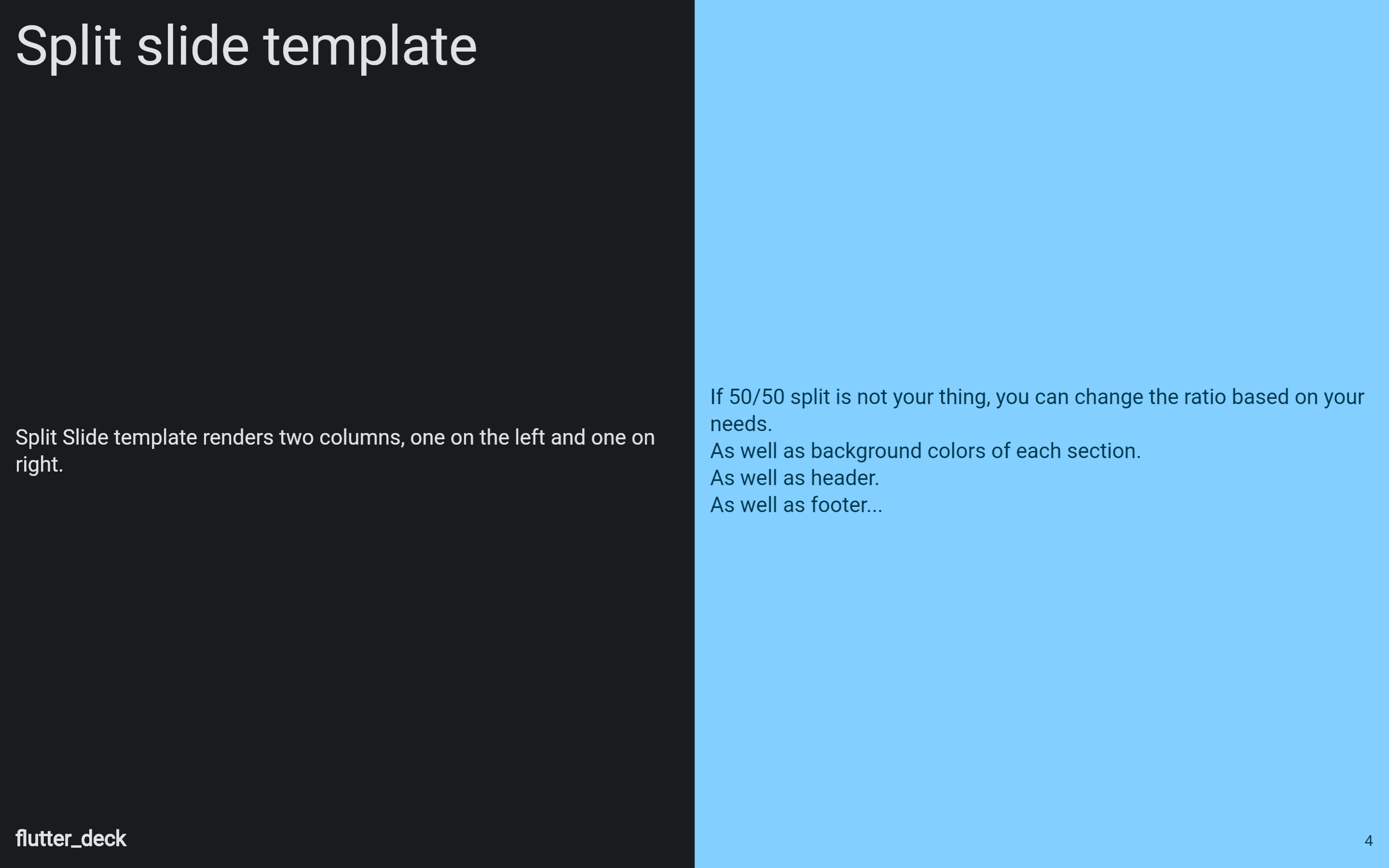
To create a split slide, use the FlutterDeckSlide.split constructor. It is responsible for rendering the default header and footer of the slide deck, and use the leftBuilder and rightBuilder to create the content of the left and right columns. Make sure to use text styles from Theme or FlutterDeckTheme to apply the correct text styling for specific slide sections.
class SplitSlide extends FlutterDeckSlideWidget {
  const SplitSlide()
      : super(
          configuration: const FlutterDeckSlideConfiguration(
            route: '/split-slide',
            header: FlutterDeckHeaderConfiguration(
              title: 'Split slide template',
            ),
          ),
        );

  @override
  FlutterDeckSlide build(BuildContext context) {
    return FlutterDeckSlide.split(
      leftBuilder: (context) {
        return Text(
          'Here goes the LEFT section content of the slide',
          style: FlutterDeckTheme.of(context).textTheme.bodyMedium,
        );
      },
      rightBuilder: (context) {
        return Text(
          'Here goes the RIGHT section content of the slide',
          style: FlutterDeckTheme.of(context).textTheme.bodyMedium,
        );
      },
    );
  }
}
Template slide #
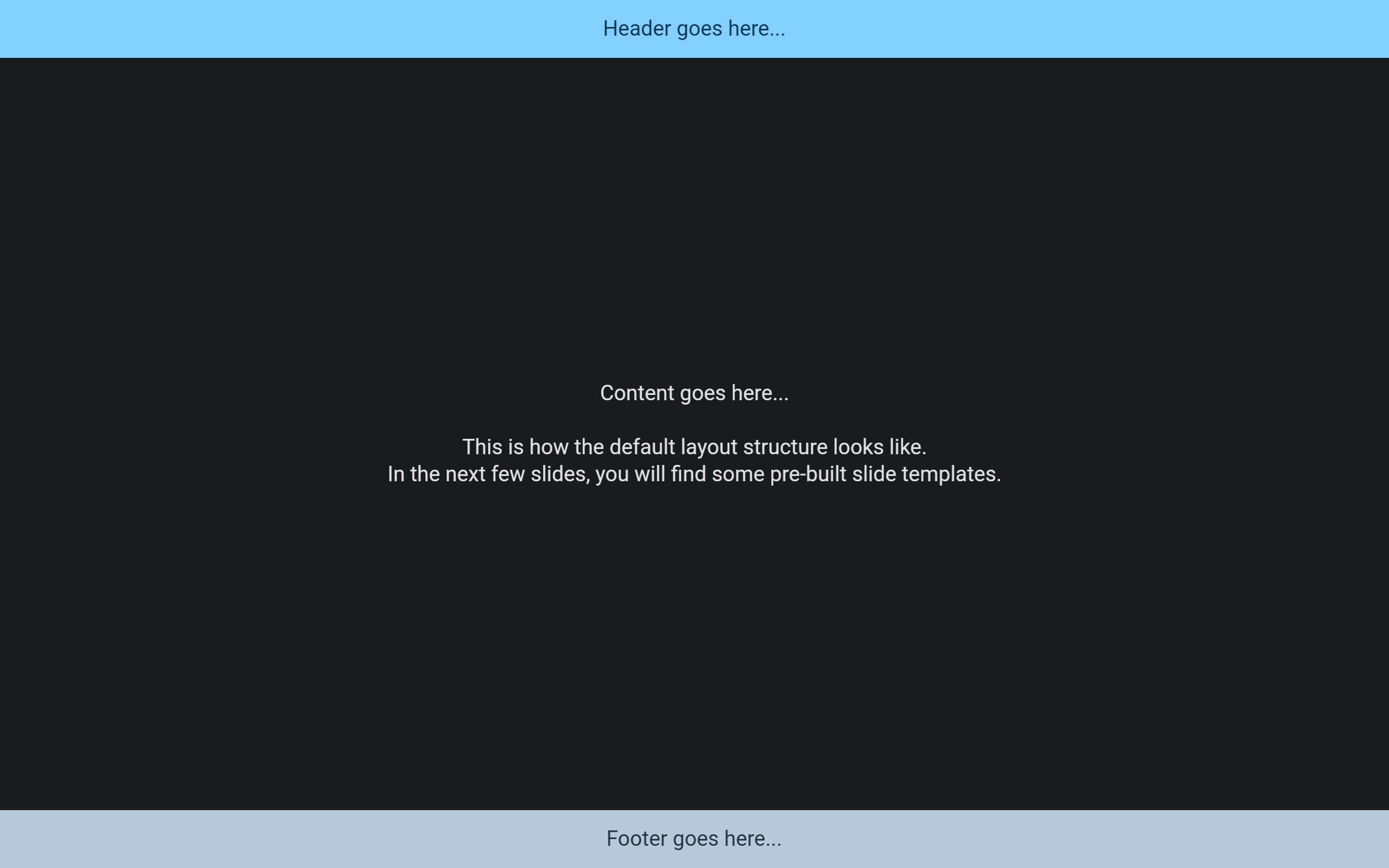
To create a custom template slide, use the FlutterDeckSlide.template constructor. It is responsible for placing the header, footer, and content of the slide in the correct places. Also, it is responsible for displaying the background of the slide.
class TemplateSlide extends FlutterDeckSlideWidget {
  const TemplateSlide()
      : super(
          configuration: const FlutterDeckSlideConfiguration(
            route: '/template-slide',
            title: 'Template slide',
          ),
        );

  @override
  FlutterDeckSlide build(BuildContext context) {
    return FlutterDeckSlide.template(
      backgroundBuilder: (context) => FlutterDeckBackground.solid(
        Theme.of(context).colorScheme.background,
      ),
      contentBuilder: (context) => const ColoredBox(
        color: Colors.red,
        child: Text('Content goes here...'),
      ),
      footerBuilder: (context) => ColoredBox(
        color: Theme.of(context).colorScheme.secondary,
        child: const Text('Footer goes here...'),
      ),
      headerBuilder: (context) => ColoredBox(
        color: Theme.of(context).colorScheme.primary,
        child: const Text('Header goes here...'),
      ),
    );
  }
}
Custom slide #
To create a custom slide (without any predefined template), use the FlutterDeckSlide.custom constructor and pass a custom builder to it.
class CustomSlide extends FlutterDeckSlideWidget {
  const CustomSlide()
      : super(
          configuration: const FlutterDeckSlideConfiguration(
            route: '/custom-slide',
            title: 'Custom slide',
          ),
        );

  @override
  FlutterDeckSlide build(BuildContext context) {
    return FlutterDeckSlide.custom(
      builder: (context) {
        return const Text('Here goes your custom slide content...');
      },
    );
  }
}
🪄 Generating slides #
This package comes with a mason template that can be used to generate a new slide for the slide deck.
Ensure you have the mason_cli installed:
dart pub global activate mason_cli
Install the flutter_deck_slide template:
# Install locally
mason add flutter_deck_slide

# Install globally
mason add -g flutter_deck_slide
Generate a new slide:
mason make flutter_deck_slide
🎨 Theming #
You can customize the theme of your slide deck by providing a FlutterDeckThemeData to the FlutterDeckApp widget:
return FlutterDeckApp(
  // You can define light...
  lightTheme: FlutterDeckThemeData.fromTheme(
    ThemeData.from(
      colorScheme: ColorScheme.fromSeed(
        seedColor: const Color(0xFFB5FFFC),
      ),
      useMaterial3: true,
    ),
  ),
  // ...and dark themes.
  darkTheme: FlutterDeckThemeData.fromTheme(
    ThemeData.from(
      colorScheme: ColorScheme.fromSeed(
        seedColor: const Color(0xFF16222A),
        brightness: Brightness.dark,
      ),
      useMaterial3: true,
    ),
  ),
);
It's also possible to override the theme for a specific slide. The provided theme data will be merged with the global theme. Meaning, only the properties you specify there are overridden:
class ThemingSlide extends FlutterDeckSlideWidget {
  const ThemingSlide()
      : super(
          configuration: const FlutterDeckSlideConfiguration(
            route: '/theming-slide',
            header: FlutterDeckHeaderConfiguration(title: 'Theming'),
          ),
        );

  @override
  FlutterDeckSlide build(BuildContext context) {
    return FlutterDeckSlide.split(
      theme: FlutterDeckTheme.of(context).copyWith(
        splitSlideTheme: const FlutterDeckSplitSlideThemeData(
          leftBackgroundColor: Colors.blue,
          leftColor: Colors.yellow,
          rightBackgroundColor: Colors.yellow,
          rightColor: Colors.blue,
        ),
      ),
      leftBuilder: (context) => <...>
      rightBuilder: (context) => <...>
    );
  }
}
Also, you can override the theme for a specific flutter deck widget that supports theming (e.g. header, footer, bullet list, code highlight, etc.). Simply, wrap the widget with a corresponding theme widget:
FlutterDeckSlide.template(
  // Wrap header with a theme widget to override the theme.
  headerBuilder: (context) => FlutterDeckHeaderTheme(
    data: FlutterDeckHeaderThemeData(
      color: Colors.red,
      textStyle: FlutterDeckTheme.of(context).textTheme.header,
    ),
    child: const FlutterDeckHeader(title: 'Header'),
  ),
  // Wrap footer with a theme widget to override the theme.
  footerBuilder: (context) => FlutterDeckFooterTheme(
    data: FlutterDeckFooterThemeData(
      socialHandleColor: Colors.blue,
      socialHandleTextStyle:
          FlutterDeckTheme.of(context).textTheme.bodyMedium,
    ),
    child: const FlutterDeckFooter(showSlideNumber: false),
  ),
  contentBuilder: (context) => Center(
    // Wrap code highlight with a theme widget to override the theme.
    child: FlutterDeckCodeHighlightTheme(
      data: FlutterDeckCodeHighlightThemeData(
        backgroundColor: Colors.green,
        textStyle: FlutterDeckTheme.of(context).textTheme.bodyLarge,
      ),
      child: const FlutterDeckCodeHighlight(code: '<...>'),
    ),
  ),
);
🙈 Slide visibility #
By default, all slides are visible and available in the slide deck. However, you can hide a slide by setting the hidden property to true for the slide configuration:
class HiddenSlide extends FlutterDeckSlideWidget {
  const HiddenSlide()
      : super(
          configuration: const FlutterDeckSlideConfiguration(
            route: '/hidden',
            hidden: true, // Sets the slide to be hidden
          ),
        );

  @override
  FlutterDeckSlide build(BuildContext context) {
    return FlutterDeckSlide.blank(
      builder: (context) => const Center(
        child: Text("This slide is hidden. Oh, but you can't see it..."),
      ),
    );
  }
}
🧱 Widgets #
This package comes with a few predefined widgets that could be used in your slide deck.
FlutterDeckBulletList #
A widget that renders a list of bullet points. Bullet point items are rendered as a row with a bullet point and the text. The bullet point is rendered as a dot by default, but can be customized by providing a bulletPointWidget. The text is rendered as an AutoSizeText widget and is automatically resized to fit the available space.
If useSteps is true for the slide configuration, the bullet points will be rendered one by one as the user steps through the slide.
class FlutterDeckBulletListDemoSlide extends FlutterDeckSlideWidget {
  const FlutterDeckBulletListDemoSlide()
      : super(
          configuration: const FlutterDeckSlideConfiguration(
            route: '/bullet-list-demo',
            title: 'Bullet list demo',
            steps: 3, // Define the number of steps for the slide
          ),
        );

  @override
  FlutterDeckSlide build(BuildContext context) {
    return FlutterDeckSlide.split(
      leftBuilder: (context) => FlutterDeckBulletList(
        useSteps: true, // Enable steps for the bullet list
        items: const [
          'This is a step',
          'This is another step',
          'This is a third step',
        ],
      ),
      rightBuilder: (context) => const Text('FlutterDeckBulletList demo'),
    );
  }
}
FlutterDeckCodeHighlight #
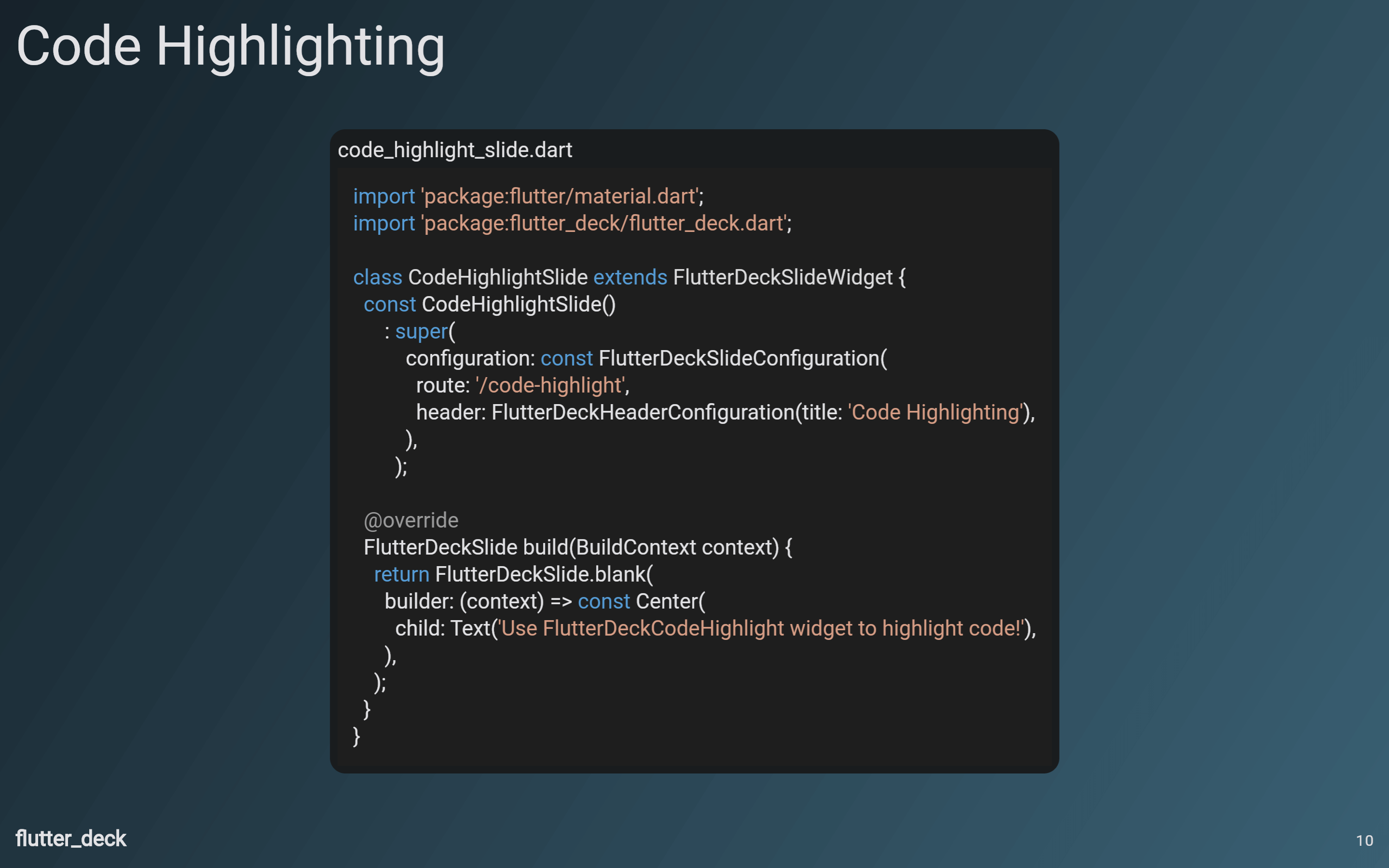
Provides a widget that gives you customizable syntax highlighting for many languages.
class CodeHighlightSlide extends FlutterDeckSlideWidget {
  const CodeHighlightSlide()
      : super(
          configuration: const FlutterDeckSlideConfiguration(
            route: '/code-highlight',
            header: FlutterDeckHeaderConfiguration(title: 'Code Highlighting'),
          ),
        );

  @override
  FlutterDeckSlide build(BuildContext context) {
    return FlutterDeckSlide.blank(
      builder: (context) => const Center(
        child: FlutterDeckCodeHighlight(
          code: '''
import 'package:flutter/material.dart';
import 'package:flutter_deck/flutter_deck.dart';

class CodeHighlightSlide extends FlutterDeckSlideWidget {
  const CodeHighlightSlide()
      : super(
          configuration: const FlutterDeckSlideConfiguration(
            route: '/code-highlight',
            header: FlutterDeckHeaderConfiguration(title: 'Code Highlighting'),
          ),
        );

  @override
  FlutterDeckSlide build(BuildContext context) {
    return FlutterDeckSlide.blank(
      builder: (context) => const Center(
        child: Text('Use FlutterDeckCodeHighlight widget to highlight code!'),
      ),
    );
  }
}''',
          fileName: 'code_highlight_slide.dart',
          language: 'dart',
        ),
      ),
    );
  }
}
📦 Accessing slide deck state from the code #
By using the FlutterDeck extensions, you can access the slide deck state and its methods from anywhere in the app:
@override
Widget build(BuildContext context) {
  // Retrieve the FlutterDeck instance from the context.
  // Or by using the extension method: context.flutterDeck
  final flutterDeck = FlutterDeck.of(context);

  // Retrieve the FlutterDeckRouter instance for this slide deck.
  final router = flutterDeck.router;
  // Retrieve the current slide configuration.
  final configuration = flutterDeck.configuration;
  // Retrieve the global slide deck configuration.
  final globalConfiguration = flutterDeck.globalConfiguration;
  // Retrieve the speaker info.
  final speakerInfo = flutterDeck.speakerInfo;

  // Go to the next slide.
  flutterDeck.next();
  // Go to the previous slide.
  flutterDeck.previous();

  // Retrieve the current slide number.
  final slideNumber = flutterDeck.slideNumber;
  // Go to the first slide.
  flutterDeck.goToSlide(1);

  // Retrieve the current step number.
  final stepNumber = flutterDeck.stepNumber;
  // Go to the first step.
  flutterDeck.goToStep(1);

  <...>
}
🔀 Transitions #
This package comes with a few predefined transitions that can be used for your slides:
FlutterDeckTransition.none(default)FlutterDeckTransition.fadeFlutterDeckTransition.scaleFlutterDeckTransition.slideFlutterDeckTransition.rotationFlutterDeckTransition.custom
You can specify a transition for the whole slide deck:
FlutterDeckApp(
  configuration: const FlutterDeckConfiguration(
    transition: FlutterDeckTransition.fade(),
  ),
  <...>
);
Or you can specify a transition for a specific slide:
class TransitionsSlide extends FlutterDeckSlideWidget {
  const TransitionsSlide()
      : super(
          configuration: const FlutterDeckSlideConfiguration(
            route: '/transitions',
            title: 'Transitions',
            transition: FlutterDeckTransition.rotation(), // Specify the transition for the slide
          ),
        );

  <...>
}
FlutterDeckTransition.custom accepts a FlutterDeckTransitionBuilder that can be extended to create a custom transition:
class VerticalTransitionBuilder extends FlutterDeckTransitionBuilder {
  const VerticalTransitionBuilder();

  @override
  Widget build(
    BuildContext context,
    Animation<double> animation,
    Animation<double> secondaryAnimation,
    Widget child,
  ) {
    return SlideTransition(
      position: animation.drive(
        Tween<Offset>(
          begin: const Offset(0, 1),
          end: Offset.zero,
        ).chain(CurveTween(curve: Curves.easeIn)),
      ),
      child: child,
    );
  }
}

class CustomTransitionSlide extends FlutterDeckSlideWidget {
  const CustomTransitionSlide()
      : super(
          configuration: const FlutterDeckSlideConfiguration(
            route: '/custom-transition',
            title: 'Custom transition',
            transition: FlutterDeckTransition.custom(
              transitionBuilder: VerticalTransitionBuilder(),
            ),
          ),
        );

  <...>
}
🐾 Steps #
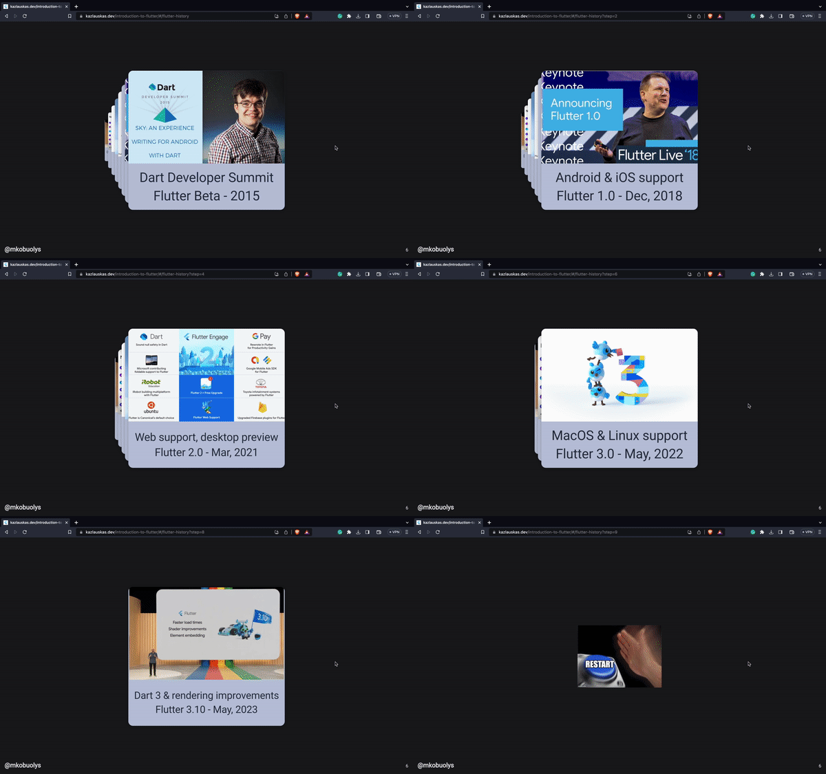
Steps is a feature that allows you to navigate through a slide, well, step by step. You can access the current step from any widget. This way, you can reveal or hide content, run animations, etc.
To enable steps for a slide, you need to set the steps property for the slide configuration:
class StepsDemoSlide extends FlutterDeckSlideWidget {
  const StepsDemoSlide()
      : super(
          configuration: const FlutterDeckSlideConfiguration(
            route: '/steps-demo',
            title: 'Steps demo',
            steps: 2,
          ),
        );

  <...>
}
To trigger a rebuild of the widget when the step changes, you can use the FlutterDeckSlideStepsBuilder widget:
@override
Widget build(BuildContext context) {
  return FlutterDeckSlideStepsBuilder(
    builder: (context, stepNumber) => stepNumber == 1
        ? const Text('This is the first step.')
        : const Text('This is the second step.'),
  );
}
Or you can use the FlutterDeckSlideStepsListener to trigger side effects when the step changes:
@override
Widget build(BuildContext context) {
  return FlutterDeckSlideStepsListener(
    listener: (context, stepNumber) {
      print('Current step: $stepNumber');
    },
    child: const Text('Steps demo slide'),
  );
}
🌍 Localization #
This package comes with a built-in localization support. You can change the locale of the slide deck at runtime (see controls). The updated locale will be applied to the whole slide deck.
To localize the slide deck, follow the instructions provided in the official Flutter documentation.
Then, provide AppLocalizations when creating the slide deck:
FlutterDeckApp(
  <...>
  locale: const Locale('en'), // The initial locale of the slide deck
  localizationsDelegates: AppLocalizations.localizationsDelegates,
  supportedLocales: AppLocalizations.supportedLocales,
);
🎮 Controls #
By default, every slide deck comes with a presenter toolbar that can be used to control the slide deck. Also, some of the controls can be accessed by using keyboard shortcuts.
To disable all the controls (e.g. you use your own UI to control the slide deck), set the controls property for the slide deck configuration to FlutterDeckControlsConfiguration.disabled():
FlutterDeckConfiguration(
  controls: FlutterDeckControlsConfiguration.disabled(),
  <...>
)
To disable the presenter toolbar, set the presenterToolbarVisible property to false:
FlutterDeckConfiguration(
  controls: const FlutterDeckControlsConfiguration(
    presenterToolbarVisible: false,
  ),
  <...>
)
To disable the keyboard shortcuts, set the shortcuts property to FlutterDeckShortcutsConfiguration(enabled: false):
FlutterDeckConfiguration(
  controls: const FlutterDeckControlsConfiguration(
    shortcuts: FlutterDeckShortcutsConfiguration(enabled: false),
  ),
  <...>
)
Navigation drawer #
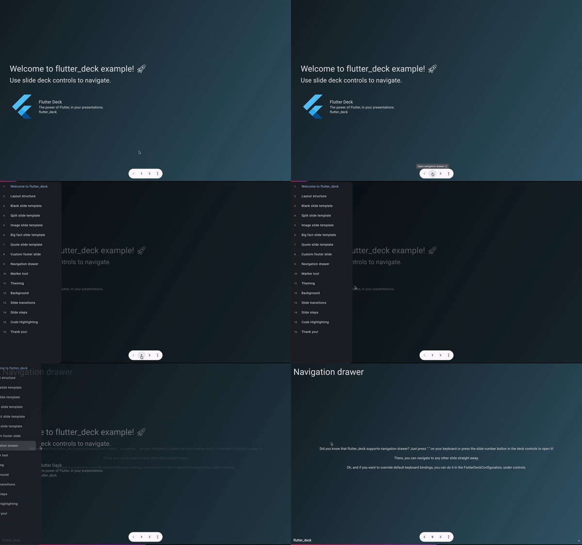
Every slide deck comes with a navigation drawer that can be used to navigate through the slide deck. The navigation drawer is automatically generated based on the slide deck configuration.
The navigation drawer item title is generated based on the following rules:
- The slide title is used if it is set in the slide configuration (
FlutterDeckSlideConfiguration.title). - If the slide title is not set, the header title is used if it is set in the slide header configuration (
FlutterDeckHeaderConfiguration.title). - The slide route is used otherwise.
Marker tool #
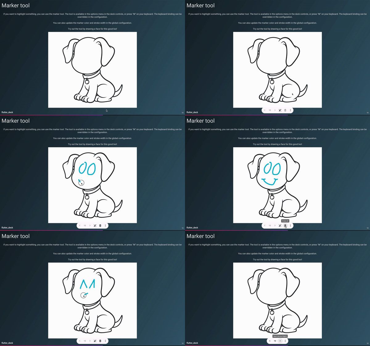
The marker tool allows you to draw on top of the slide. It can be used to highlight specific parts of the slide, or to draw anything you want. The tool is available in the presenter toolbar, or just press "M" on your keyboard (it's also possible to specify a custom key binding for the toggleMarker shortcut in FlutterDeckShortcutsConfiguration).
Auto-play #
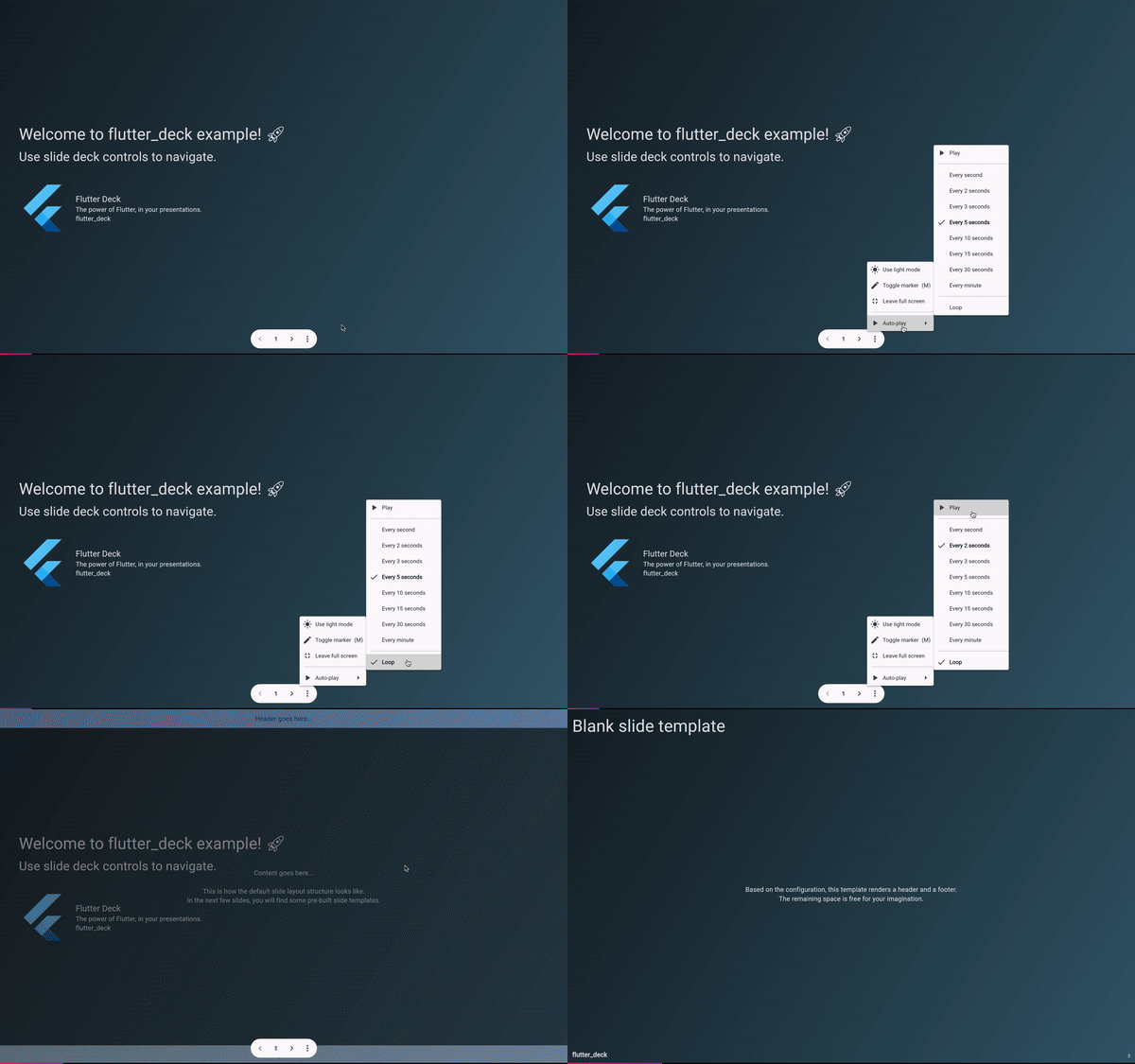
The auto-play feature allows you to automatically navigate through the slide deck. It can be used to create a presentation that runs on its own. The auto-play feature is available in the presenter toolbar.
Changing locale #
You can change the locale of the slide deck at runtime. The updated locale will be applied to the whole slide deck. The locale can be changed using the presenter toolbar.
