


fluent_ui 1.2.3  fluent_ui: ^1.2.3 copied to clipboard
 bdlukaa.dev
Implements Fluent Ui in flutter. Based on the official documentation
fluent_ui


Design beautiful native windows apps using Flutter
Unofficial implementation of Fluent UI for Flutter. It's written based on the official documentation
Content #
Motivation #
Since flutter has Windows support (currently in stable under an early release flag as of 11/03/2021), it's necessary to have support to its UI guidelines to build apps with fidelity, since it has support for Material and Cupertino. See this for more info on the offical fluent ui support
See also:
Roadmap #
Currently, we've only done the desktop part of the library, so you can import the library as one itself:
import 'package:fluent_ui/fluent_ui';
Note: this does not mean you can't use this library anywhere else. You can use it wherever you want
Futurely, once the desktop part of this library gets mature, web and mobile will also be supported. See also:
Also, futurely there will be a way to get the current device accent color. For more info, see accent color
[Inputs Preview] [Forms Preview]
Style #
You can use the Theme widget to, well... theme your widgets. You can style your widgets in two ways:
- Using the
FluentAppwidget
FluentApp(
  title: 'MyApp',
  style: Style(
    ...
  ),
)
- Using the
Themewidget
Theme(
  style: Style(
    ...
  ),
  child: ...,
),
Icons #

Inside your app, you use icons to represent an action, such as copying text or navigating to the settings page. This library includes an icon library with it, so you can just call Icons.[icon_name] in any Icon widget:
Icon(Icons.add)
To style icons, you can use IconStyle in the app Style or use the property style in the Icon widget. You can see the list of icons here
Colors #
This library also includes the Fluent UI colors with it, so you can just call Colors.[color_name]:
TextStyle(color: Colors.black)
Avaiable colors:
Colors.transparentColors.whiteColors.blackColors.greyColors.yellowColors.orangeColors.redColors.magentaColors.purpleColors.blueColors.tealColors.green
Accent color #
Common controls use an accent color to convey state information. By default, the accent color is Colors.blue. However, you can also customize your app's accent color to reflect your brand:
Style(
  accentColor: Colors.blue,
)
Brightness #
You can change the style brightness to change the color of your app.
Brightness.light
Brightness.dark
It defaults to the brightness of the device. (MediaQuery.of(context).brightness)
Typography #
To set a typography, you can use the Style class combined with the Typography class:
Style(
  typography: Typography(
    caption: TextStyle(
      fontSize: 12,
      color: Colors.black,
      fontWeight: FontWeight.normal,
    ),
  ),
)
Font #
You should use one font throughout your app's UI, and we recommend sticking with the default font for Windows apps, Segoe UI. It's designed to maintain optimal legibility across sizes and pixel densities and offers a clean, light, and open aesthetic that complements the content of the system.

Type ramp #
The Windows type ramp establishes crucial relationships between the type styles on a page, helping users read content easily.

Navigation #
The default flutter navigation is available when using the FluentApp widget, that means you can simply call Navigator.push and Navigator.pop to navigate between routes.
See navigate to a new screen and back
Navigation panel #
Navigation Panel will be rewritten in a near future, because it lacks so much implementations and fidelity. Here's what's done and what's left to do:
- ❌ Top navigation. On top navigation, the page transitions should default to Horizontal page transition
- ✅ Left navigation.
- ✅ Open display mode
- ✅ Compact display mode
- ❌ Minimal display mode. This also require a rework on the Scaffold widget
- ❌ Automatic display mode. The current display mod is very hacky and can be broken easily
- ❌ Selected indicators. Currently only one indicator is supported (sliding horizontally)
- ❌ Paen footer. Currently, only one tile can be in the bottom, but in the offical implementation, there can be multiple tiles
- ❌ Back button. There is no back button currently. This would also require to remove the default top bar and implement a custom one. We can use Material's
AppBaras reference
Usually, NavigationPanel is used in Scaffold's left property:
int _currentIndex = 0;

Scaffold(
  left: NavigationPanel(
    currentIndex: _currentIndex,
    menu: NavigationPanelMenuItem(...),
    items: [
      NavigationPanelSectionHeader(
        header: Text('Cool Navigation Panel Header'),
      ),
      NavigationPanelItem(
        icon: Icon(Icons.checkbox_checked),
        label: Text('Page 1'),
        onTapped: () => setState(() => _currentIndex = 0),
      ),
      NavigationPanelTileSeparator(),
      NavigationPanelItem(
        icon: Icon(Icons.text_align_center_filled),
        label: Text('Page 2'),
        onTapped: () => setState(() => _currentIndex = 1),
      ),
    ],
  ),
  body: ...,
)

Navigation body #
Usually used in Scaffold's body property. Example:
int _currentIndex = 0;

Scaffold(
  left: NavigationPanel(...),
  body: NavigationPanelBody(
    index: _currentIndex,
    transitionBuilder: (child, animation) {
      // Refer to page transitions to see more page transitions
      return DrillInPageTransition(
        child: child,
        animation: animation,
      );
    }
    children: [
      Page1(),
      Page2(),
    ],
  ),
),
Page transitions #
Page transitions navigate users between pages in an app, providing feedback as the relationship between pages. Page transitions help users understand if they are at the top of a navigation hierarchy, moving between sibling pages, or navigating deeper into the page hierarchy.
This library gives you the following implementations to navigate between your pages:
Entrance
Entrance is a combination of a slide up animation and a fade in animation for the incoming content. Use entrance when the user is taken to the top of a navigational stack, such as navigating between tabs or left-nav items.
The desired feeling is that the user has started over.
Avaiable with the widget EntrancePageTransition, it produces the following effect:

Drill In
Use drill when users navigate deeper into an app, such as displaying more information after selecting an item.
The desired feeling is that the user has gone deeper into the app.
Avaiable with the widget DrillInPageTransition, it produces the following effect:

Horizontal
It's avaiable with the widget HorizontalSlidePageTransition.
It's recommended to widely use these transitions when using the navigation panel.
Widgets: #
(1) = High priority
(2) = Medium priority
(3) = Low priority
NOTE: The code for all the images below can be found on the example folder
| Widget | Preview |
|---|---|
| Checkbox |  |
| RadioButton |  |
| Slider |  |
| ToggleButton | |
| ToggleSwitch |  |
| (3) DropDownButton | |
| SplitButton |  |
| RatingControl |  |
| Widget | Preview |
|---|---|
| TextBox |  |
| (3) Auto suggest box | |
| (2) ComboBox |
Button #
A button gives the user a way to trigger an immediate action. Learn more
Creating #
Button(
  text: Text('Cool button'),
  onPressed: () {
    print('button pressed'),
  }
)
To disable the button, set onPressed to null
Screenshots #


Checkbox #
A check box is used to select or deselect action items. It can be used for a single item or for a list of multiple items that a user can choose from. The control has three selection states: unselected, selected, and indeterminate. Use the indeterminate state when a collection of sub-choices have both unselected and selected states. Learn more
Creating #
To create a checkbox, use the widget Checkbox:
bool _checked = true;

Checkbox(
  checked: _checked,
  onChanged: (value) => setState(() => _checked = value),
)
Handling its states
| State | Property | Value |
|---|---|---|
| checked | checked | true |
| unchecked | checked | false |
| indeterminate | checked | null |
| enabled | onChanged | non-null |
| disabled | onChanged | null |
Screenshots #


TextBox #
The TextBox control lets a user type text into an app. It's typically used to capture a single line of text, but can be configured to capture multiple lines of text. The text displays on the screen in a simple, uniform, plaintext format. Learn more
You can use the forms screen in the example app for reference.
Creating #
You can use the widget TextBox to create text boxes:
TextBox(
  controller: ...,
  header: 'Notes',
  placeholder: 'Type your notes here',
),
Screenshots #


| Widget | Preview |
|---|---|
| (3) Flyouts | |
| (3) Teaching tip |
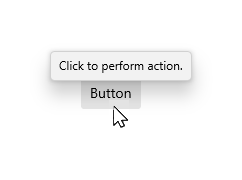
Tooltip #
A tooltip is a short description that is linked to another control or object. Tooltips help users understand unfamiliar objects that aren't described directly in the UI. They display automatically when the user moves focus to, presses and holds, or hovers the mouse pointer over a control. The tooltip disappears after a few seconds, or when the user moves the finger, pointer or keyboard/gamepad focus. Learn more
Creating #
To add a tooltip to a widget, wrap it in a Tooltip widget:
Tooltip(
  message: 'Tooltip message hehe',
  child: Button(
    text: Text('Button with tooltip'),
    onPressed: () {
      print('pressed button with tooltip');
    }
  ),
)
It's located above or below the child widget. You can specify the preffered location when both locations are available using the preferBelow property.
Screenshots #

Content Dialog #
Dialogs are modal UI overlays that provide contextual app information. They block interactions with the app window until being explicitly dismissed. They often request some kind of action from the user. Learn more
Creating #
You can create a Dialog with the widget ContentDialog:
ContentDialog(
  title: Text('No WiFi connection'),
  content: Text('Check your connection and try again'),
  actions: [
    Button(
      text: Text('Ok'),
      onPressed: () {
        Navigator.pop(context);
      }
    )
  ],
),
Display #
You can display the dialog as an overlay by calling the function showDialog:
showDialog(
  context: context,
  builder: (context) {
    return ContentDialog(...);
  },
);
Screenshots #


| Widget | Preview |
|---|---|
| (3) Pivot | |
| (3) TabView |
Pickers:
- (3) Date and time
- (3) Calendar date picker (Depends on ComboBox)
- (3) Calendar view
- (2) Date picker (Depends on ComboBox)
- (2) Time picker (Depends on ComboBox)
Others:
| Widget | Preview |
|---|---|
| (1) Progress indicators | |
| (3) Reveal Highlight | |
| (3) Reveal Focus | |
| (3) Badges | |
| (3) Sound | |
| (3) Contact card | |
| (3) Flip View | |
| (3) Tree View | |
| (3) Pull to refresh |
Acrylic #
Acrylic is a type of Brush that creates a translucent texture. You can apply acrylic to app surfaces to add depth and help establish a visual hierarchy.
Usage
You can easily use the Acrylic widget as a substitute for the Container, because it has all the necessary properties it has, but don't use it everywhere everytime:
| Do | Don't |
|---|---|
| Do use acrylic as the background material of non-primary app surfaces like navigation panes. | Don't put desktop acrylic on large background surfaces of your app - this breaks the mental model of acrylic being used primarily for transient surfaces. |
| Do extend acrylic to at least one edge of your app to provide a seamless experience by subtly blending with the app’s surroundings. | Don’t place in-app and background acrylics directly adjacent to avoid visual tension at the seams. |
| Don't place multiple acrylic panes with the same tint and opacity next to each other because this results in an undesirable visible seam. | |
| Don’t place accent-colored text over acrylic surfaces. |
Acrylic(
  padding: EdgeInsets.all(12), // Defaults to EdgeInsets.zero
  child: Button(
    text: Text('Mom it\'s me hehe <3'),
    onPressed: () {
      print('button inside acrylic pressed');
    }
  ),
  color: ...,
  width: ...,
  height: ...,
),
Widgets using Acrylic #
Currently, the following widgets use acrylic in its implementation:
- InfoBar
- Navigation Panel
Note #
This widget MAY BE unperformatic on old devices because it uses expensive widgets in its composition: ClipRect and BackdropFilter. It should not affect the most part of the devices
Screenshots #

InfoBar #
The InfoBar widget is for displaying app-wide status messages to users that are highly visible yet non-intrusive. There are built-in Severity levels to easily indicate the type of message shown as well as the option to include your own call to action or hyperlink button. Since the InfoBar is inline with other UI content the option is there for the control to always be visible or dismissed by the user.
Usage
You can easility create it using the InfoBar widget and theme it using InfoBarStyle. It has built-in support for both light and dark theme:
InfoBar(
  title: Text('Update available'),
  content: Text('Restart the app to apply the latest update.'), // optional
  severity: InfoBarSeverity.info, // optional. Default to InfoBarSeverity.info
),
Some screenshots


Equivalents with the material library #
The list of equivalents between this library and flutter/material.dart
| Material | Fluent |
|---|---|
| TextButton | Button |
| IconButton | IconButton |
| Checkbox | Checkbox |
| RadioButton | RadioButton |
| - | Rating Bar |
| - | SplitButton |
| - | ToggleButton |
| Switch | ToggleSwitch |
| TextField | TextBox |
| AlertDialog | ContentDialog |
| - | InfoBar |
| Tooltip | Tooltip |
| Drawer | NavigationPanel |
| Divider | Divider |
| VerticalDivider | Divider |
| Card | Acrylic |
Contribution #
Feel free to open an issue if you find an error or make pull requests.
All the widgets above with the mark of (3) will not be implemented soon, so you can create a pull request with the implementation for them :). You can also help to improve the documentation for all the widgets, and in this readme.
All type of contributions are welcome :)
Metadata
Publisher
Weekly Downloads
Metadata
Implements Fluent Ui in flutter. Based on the official documentation
Repository (GitHub)
View/report issues
License
 unknown (license)