flexi_productimage_slider 1.0.4  flexi_productimage_slider: ^1.0.4 copied to clipboard
 dharini.dev
An image slider to represent your products..:)
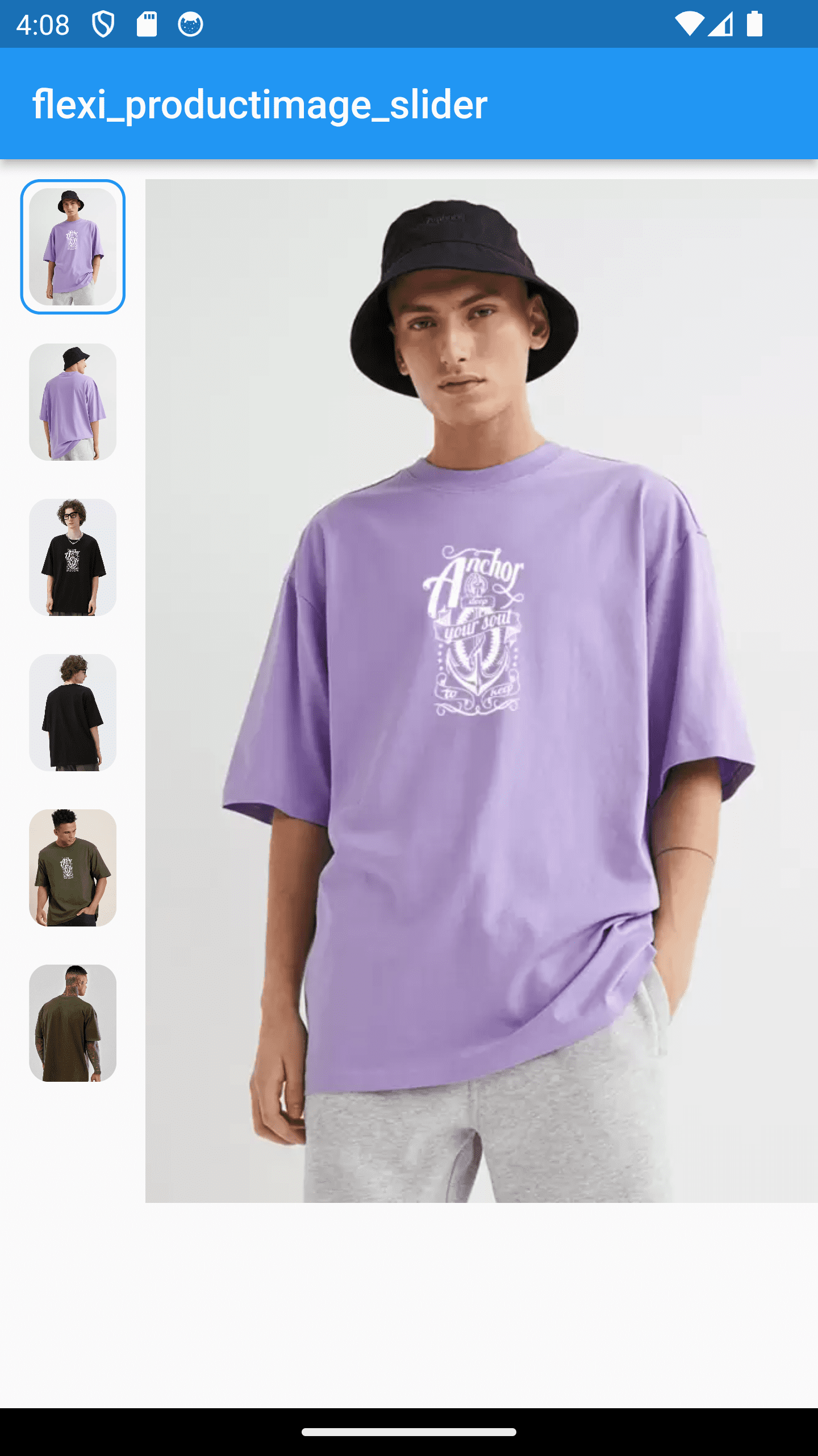
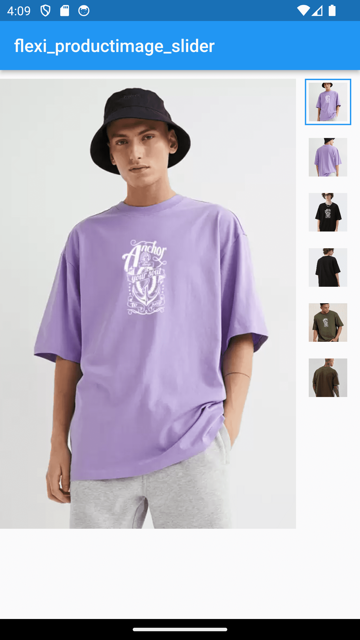
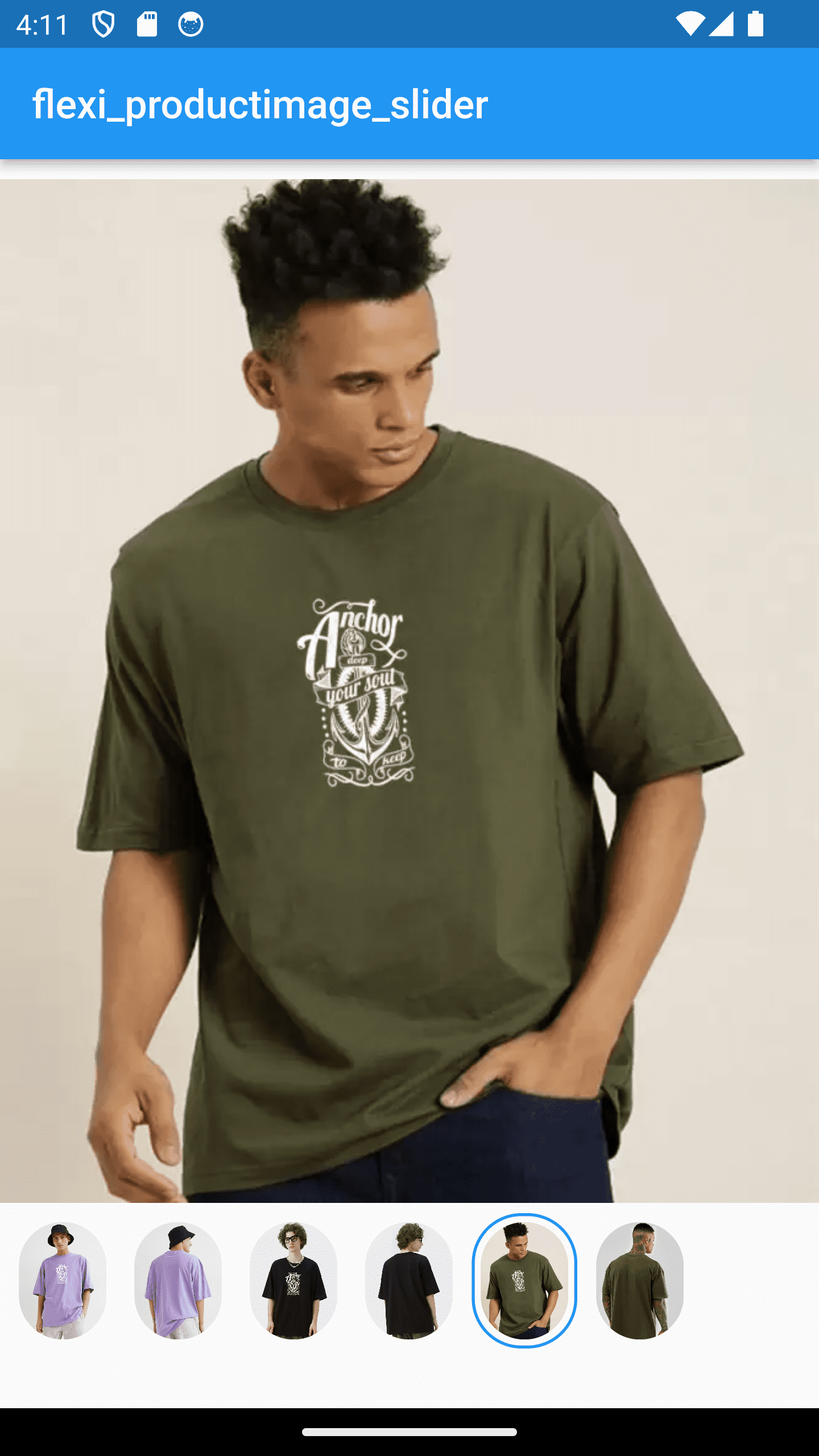
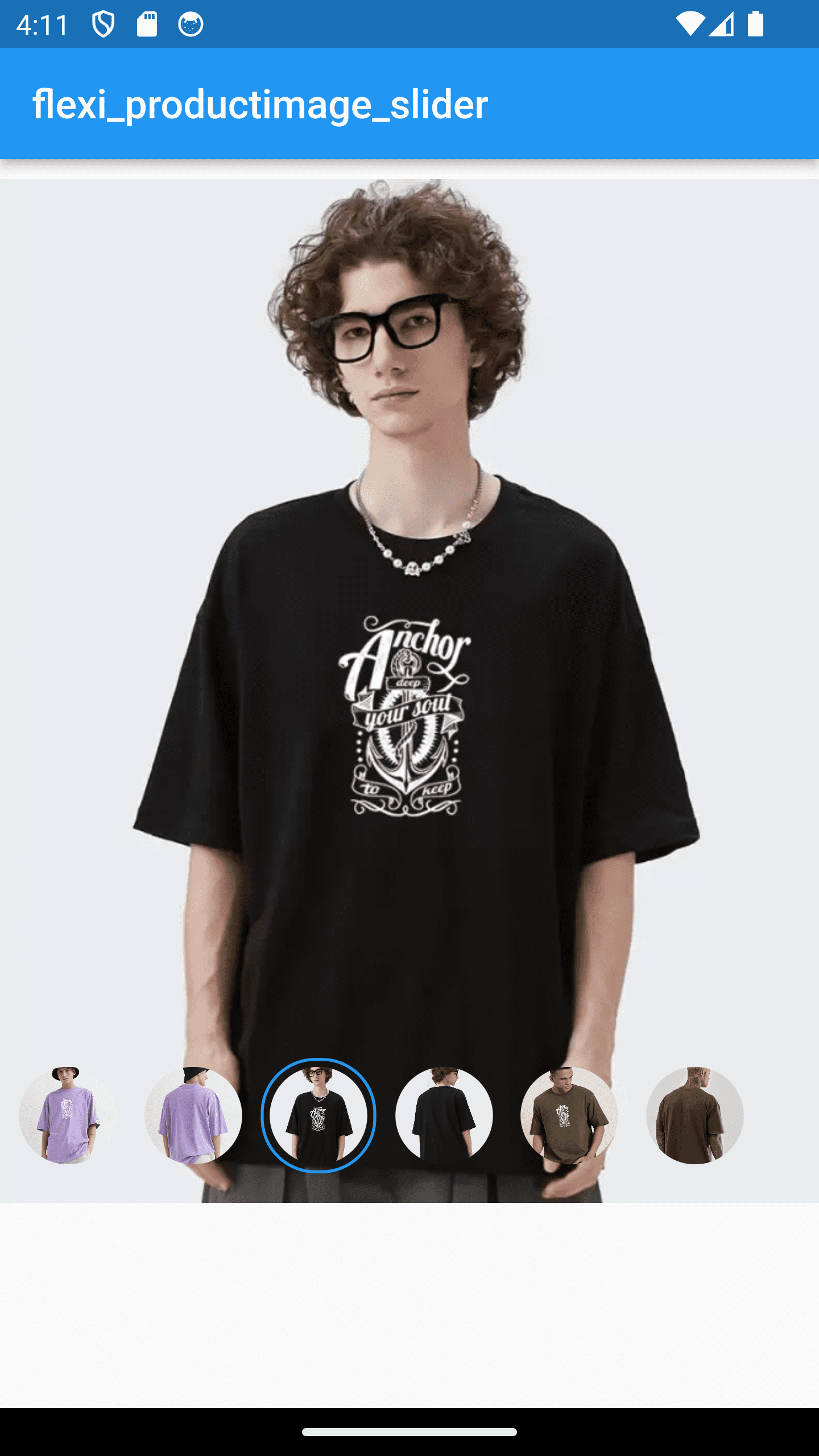
flexi_productimage_slider #
An image slider to represents your products..:)
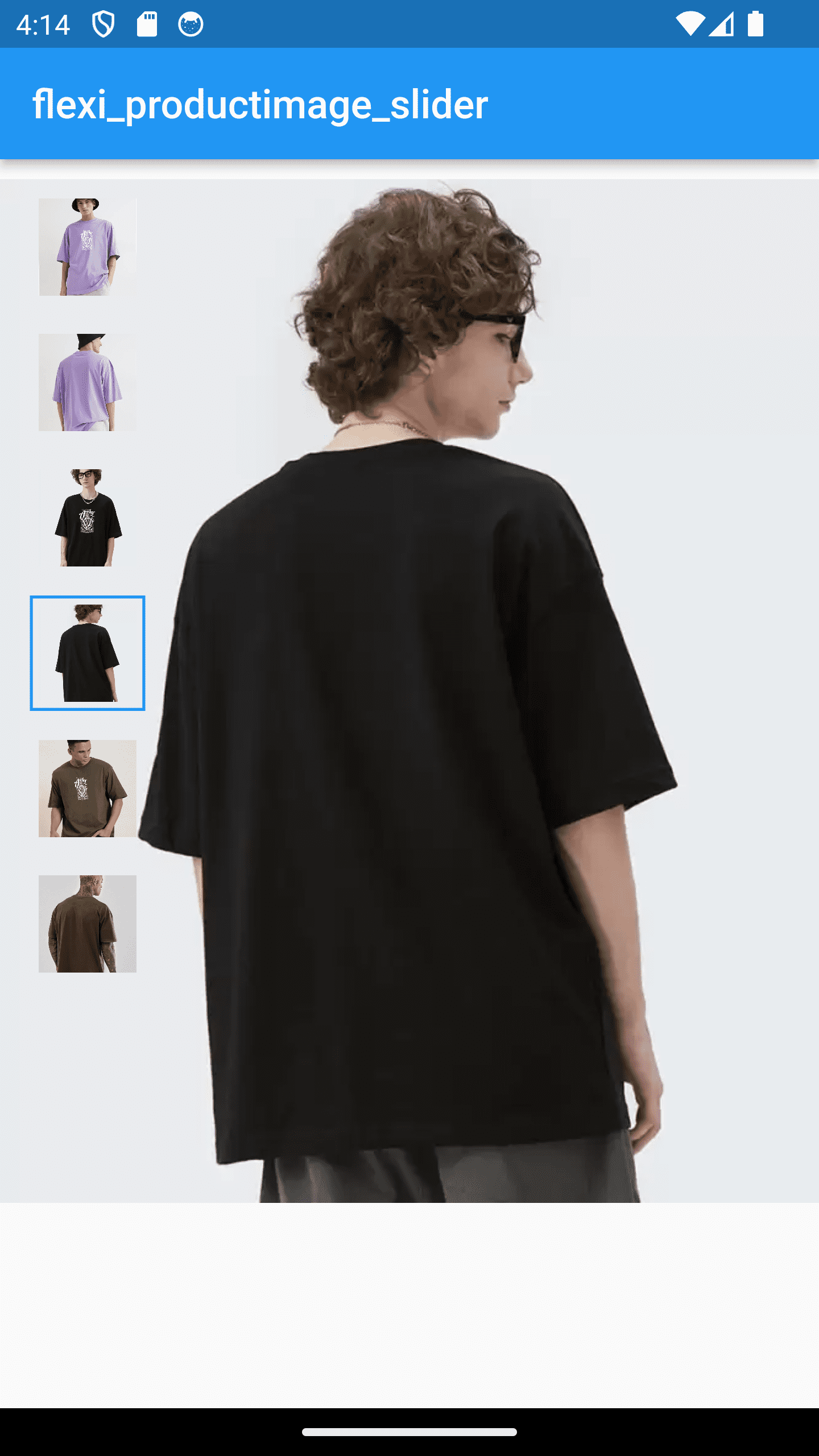
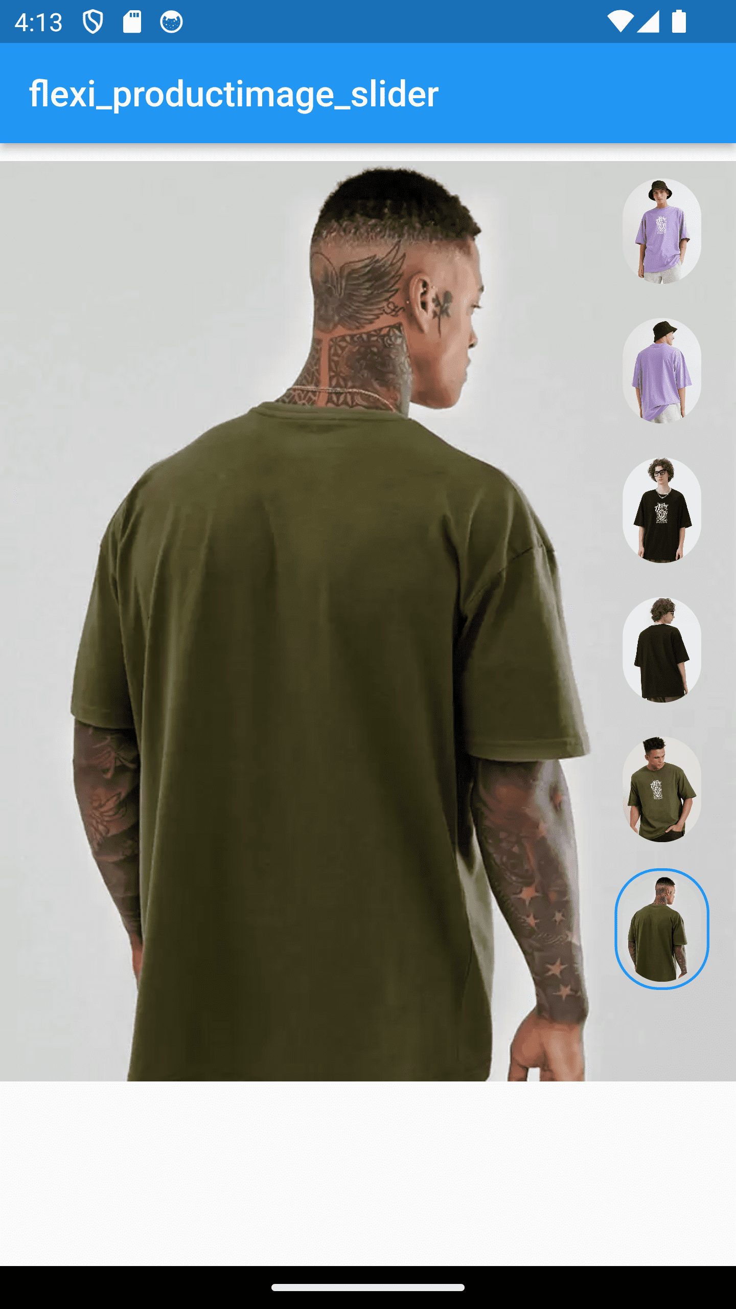
Features #
- set image slider with its rest of the thumbnails
- it provides 2 style and each contains square & circle thumbnail with 3 styles
|
|
|
|
|
|

|

|

|

|

|

|

|

|
Installation #
In your pubspec.yaml file within your Flutter Project:
dependencies:
  flexi_productimage_slider: <latest_version>
Usage #
aspectRatio : set this value as per your image ratio

boxFit : how your image should fit in box

thumbnailPosition : where you want present the rest of the images to end user

thumbnailShape : set thumbnail shapes - sqaure , circle , rectangle

thumbnailWidth: set thumbnail width

selectedThumbnailBorder: set thumbnail border

sliderStyle : Style1 : display thumbnails on the image (left , right , bottom)
              Style2 : display thumbnails next to image (left , right , bottom)
import 'package:flexi_productimage_slider/flexi_productimage_slider.dart';

            flexi_productimage_slider(
                        arrayImages: [
                        "https://i.ibb.co/bFx0p10/7.jpg",
                        "https://i.ibb.co/SPwd6rJ/8.jpg",
                        "https://i.ibb.co/GP2GFTG/6.jpg",
                        "https://i.ibb.co/s3JYgx1/5.jpg",
                        ],
                        aspectRatio: 16/9,
                        boxFit: BoxFit.cover,
                        thumbnailPosition: ThumbnailPosition.LEFT,
                        thumbnailShape: ThumbnailShape.Rectangle,
                        thumbnailWidth: 50,
                        selectedThumbnailBorder: Border.all(width: 1.5,color: Colors.teal),
                        sliderStyle: SliderStyle.Style2,
            ),
        ...
Additional information #
Images used for example is just for a demo purpose.
Metadata
21
likes
0
pub points
79%
popularity
Publisher
Metadata
An image slider to represent your products..:)
Repository (GitHub)
View/report issues
License
 unknown (LICENSE)
Dependencies
cached_network_image, flutter, gallery_zoom_slides