dialog_loader 0.0.3+3  dialog_loader: ^0.0.3+3 copied to clipboard
An easy way to create a loader, you can easily combine the loader with popular state management.
dialog_loader #
An easy way to create a loader, you can easily combine the loader with popular state management.
New Features 💥 #
- The barrierDismissible default set to false on loading and will be automatically set to true when the load is complete.
- Asset file / Image network support on the loader.
Installation #
Include dialog_loader in your pubspec.yaml file:
dependencies:
  flutter:
    sdk: flutter
  dialog_loader: version
Now in your Dart code, you can use:
import 'package:dialog_loader/dialog_loader.dart';
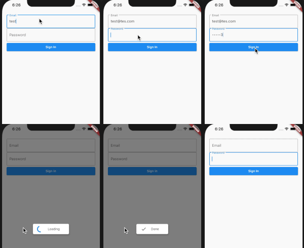
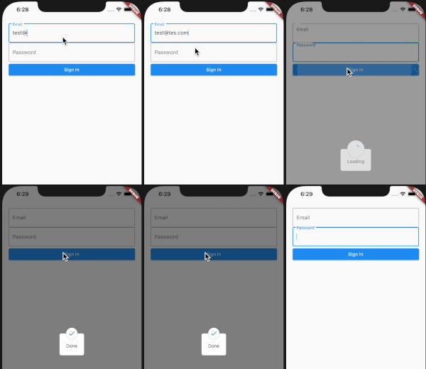
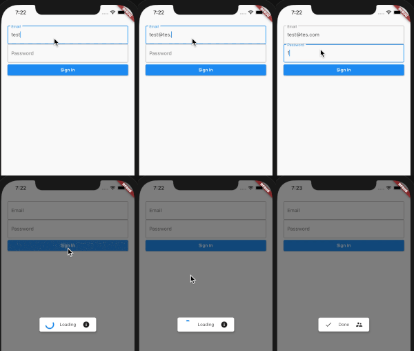
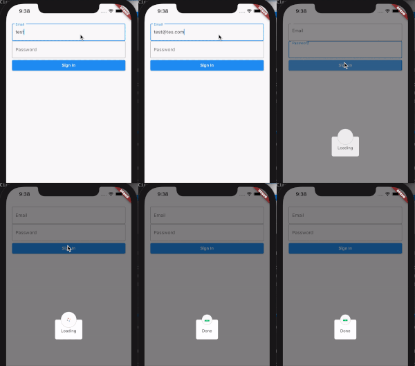
Preview #
| LoaderTheme.dialogDefault | LoaderTheme.dialogCircle |
|---|---|
 |
 |
| LoaderTheme.dialogDefault (left and right icon) | LoaderTheme.dialogCircle (Image network) |
|---|---|
 |
 |
with the dialog loader package, you can easily combine the loader with popular state management on handling state updating, like loading, error, and success state.
Usage #
You can review the example of usage from the Github repo.
Create a new instance, pass the context as parameter.
  @override
  Widget build(BuildContext context) {
    DialogLoader dialogLoader = DialogLoader(context: context);
Create the default option of the loader
_dialogLoader(context) async {
      dialogLoader.show(
        theme: LoaderTheme.dialogCircle,
        title: Text("Loading"),
        leftIcon: SizedBox(
          child: CircularProgressIndicator(),
          height: 25.0,
          width: 25.0,
        ),
      );
    }
You don't need to update state, just pass the value.
void _update() {
      _dialogLoader(context);
      Future.delayed(const Duration(seconds: 4), () {
        dialogLoader.update(
          title: Text("Done"),
          leftIcon: Icon(Icons.done),
          autoClose: false,
          barrierDismissible: true,
        );
      });
    }
Constructor #
| Name | Description | Required | Default |
|---|---|---|---|
| context | Buildcontext to render the dialog | True |
Properties #
| Name | Description | Required | Default |
|---|---|---|---|
| theme | Loader theme | False | LoaderTheme.dialogDefault, |
| title | Widget title | False | Container() |
| leftIcon | Widget on the left side of the loader, and at the top for dialogCircle theme | False | Container() |
| rightIcon | Widget on the right side of the loader | False | Container() |
| barrierColor | Barrier Color of the loader | False | Colors.black26 |
| borderRadius | Double value to indicate the dialog border radius | False | 5.0 |
| backgroundColor | Double value to indicate the dialog background color | False | Colors.white |
| elevation | Double value to indicate the elevation border | False | 5.0 |
| autoClose | Boolean value to indicate auto Close the loader when the processing is complete | False | true |
| barrierDismissible | Boolean value to indicate barrierDimisable on dialog | False | false |
Donate #
You like the package ? Buy me a coffee :)

