dialog_loader

An easy way to create a loader, you can easily combine the loader with popular state management.
New Features 💥
- The barrierDismissible default set to false on loading and will be automatically set to true when the load is complete.
- Asset file / Image network support on the loader.
Installation
Include dialog_loader in your pubspec.yaml file:
dependencies:
  flutter:
    sdk: flutter
  dialog_loader: version
Now in your Dart code, you can use:
import 'package:dialog_loader/dialog_loader.dart';
Preview
| LoaderTheme.dialogDefault | LoaderTheme.dialogCircle |
|---|---|
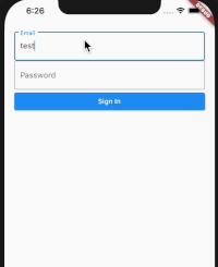 |
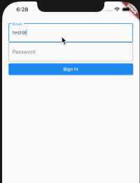 |
| LoaderTheme.dialogDefault (left and right icon) | LoaderTheme.dialogCircle (Image network) |
|---|---|
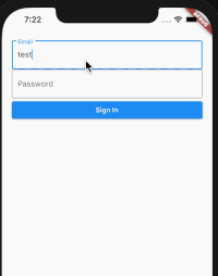 |
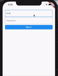 |
with the dialog loader package, you can easily combine the loader with popular state management on handling state updating, like loading, error, and success state.
Usage
You can review the example of usage from the Github repo.
Create a new instance, pass the context as parameter.
  @override
  Widget build(BuildContext context) {
    DialogLoader dialogLoader = DialogLoader(context: context);
Create the default option of the loader
_dialogLoader(context) async {
      dialogLoader.show(
        theme: LoaderTheme.dialogCircle,
        title: Text("Loading"),
        leftIcon: SizedBox(
          child: CircularProgressIndicator(),
          height: 25.0,
          width: 25.0,
        ),
      );
    }
You don't need to update state, just pass the value.
void _update() {
      _dialogLoader(context);
      Future.delayed(const Duration(seconds: 4), () {
        dialogLoader.update(
          title: Text("Done"),
          leftIcon: Icon(Icons.done),
          autoClose: false,
          barrierDismissible: true,
        );
      });
    }
Constructor
| Name | Description | Required | Default |
|---|---|---|---|
| context | Buildcontext to render the dialog | True |
Properties
| Name | Description | Required | Default |
|---|---|---|---|
| theme | Loader theme | False | LoaderTheme.dialogDefault, |
| title | Widget title | False | Container() |
| leftIcon | Widget on the left side of the loader, and at the top for dialogCircle theme | False | Container() |
| rightIcon | Widget on the right side of the loader | False | Container() |
| barrierColor | Barrier Color of the loader | False | Colors.black26 |
| borderRadius | Double value to indicate the dialog border radius | False | 5.0 |
| backgroundColor | Double value to indicate the dialog background color | False | Colors.white |
| elevation | Double value to indicate the elevation border | False | 5.0 |
| autoClose | Boolean value to indicate auto Close the loader when the processing is complete | False | true |
| barrierDismissible | Boolean value to indicate barrierDimisable on dialog | False | false |
Donate
You like the package ? Buy me a coffee :)