custom_calendar_viewer 0.1.9  custom_calendar_viewer: ^0.1.9 copied to clipboard
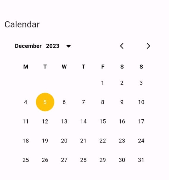
Amazing package help you to view your plans or important dates in calendar.
Custom Calendar Viewer #


- Amazing package help you to view your plans or important dates in calendar.
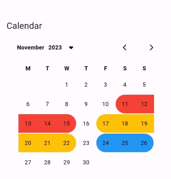
 |
 |
 |
|---|
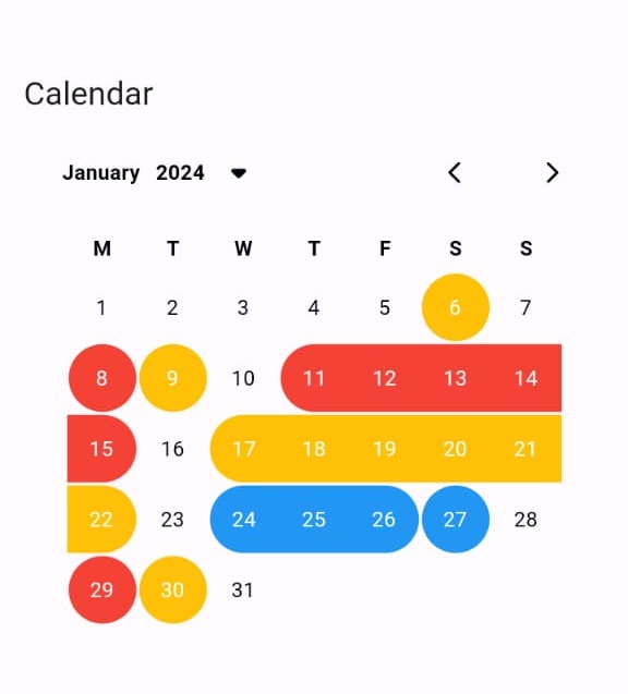
 |
 |
 |
 |
|---|
 |
 |
 |
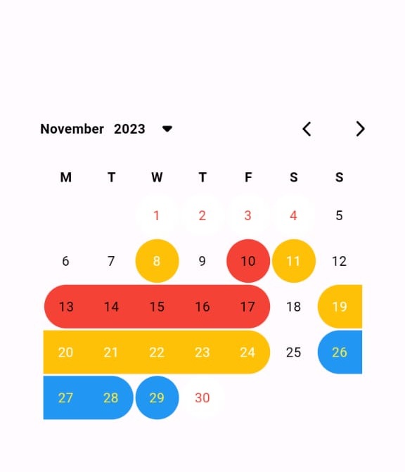 |
|---|
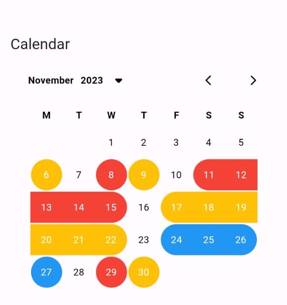 |
 |
 |
 |
|---|
 |
 |
 |
 |
|---|
Installation #
Add this to your pubspec.yaml:
dependencies:
  custom_calendar_viewer: ^Last Version
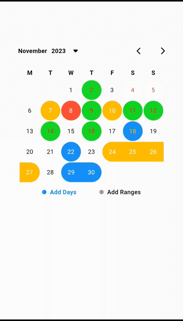
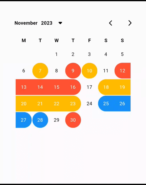
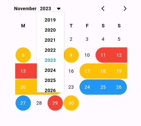
Features #
- Amazing package help you to view your plans or important dates in calendar.
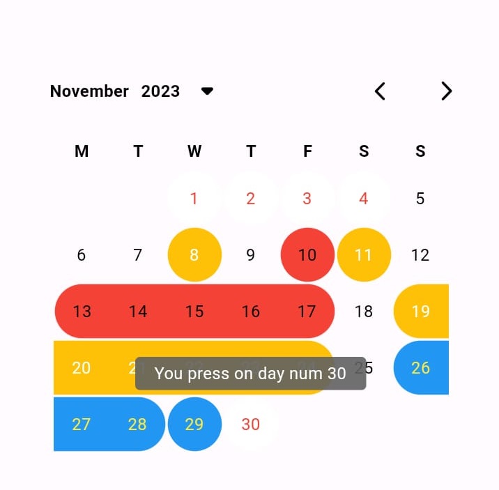
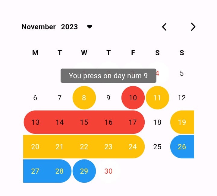
- You can add multi dates or multi ranges.
- you can handle the color for each date or you can use active color to give one color for all.
- you can use your own style for each text.
- The package have animation when you moving between months.
- With this package really you will be able to control your calendar view.
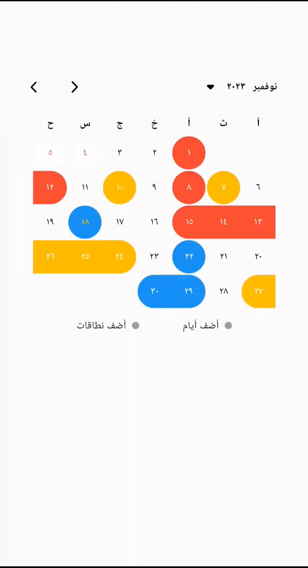
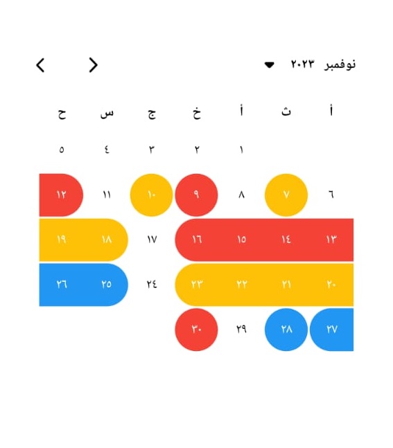
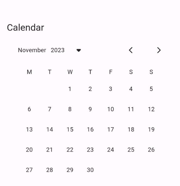
- The calendar work with 2 language Arabic and English.
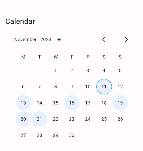
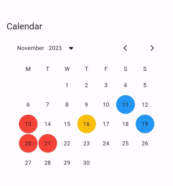
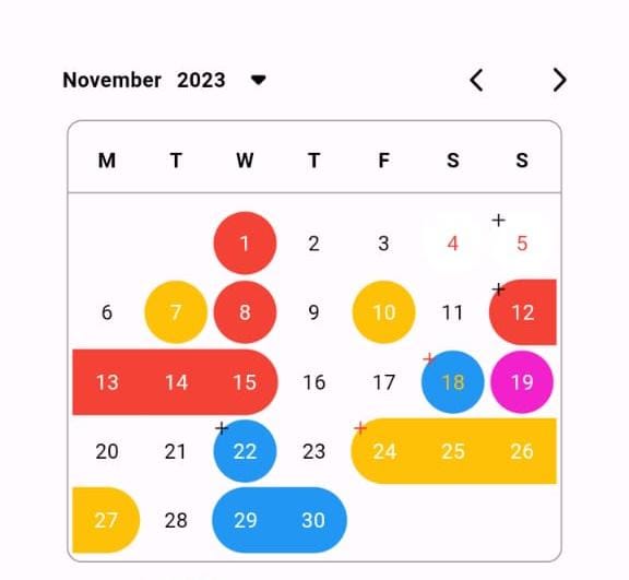
- You can handel the color for each active day (Text or Background).
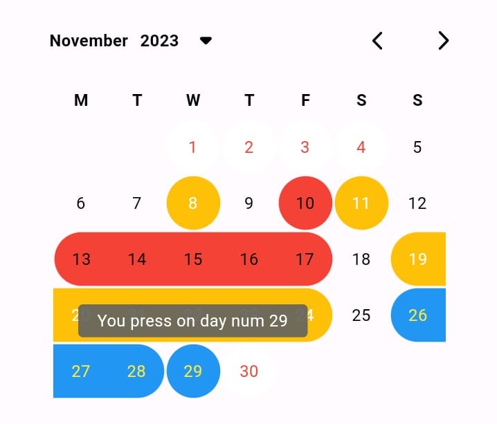
- You can use Tooltip to give more info about this day.
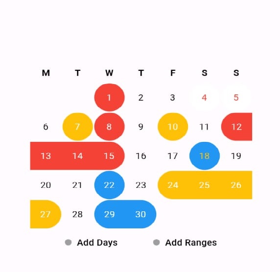
- Now you can add multiple dates or ranges when the application is started.
- You can handle the color for background or the text color when you add new ranges or dates.
- You can use CustomCalendarType to handle the type of calendar.
- CustomCalendarType.none this will make the user can't press on the calendar.
- CustomCalendarType.date this will make the user can add only one date.
- CustomCalendarType.range this will make the user to add only one range.
- CustomCalendarType.multiDates this will make the user can add multiple dates.
- CustomCalendarType.multiRanges this will make the user can add multiple ranges.
- CustomCalendarType.multiDatesAndRanges this will make the user can add multiple dates and ranges.
Getting started #
import 'package:custom_calendar_viewer/custom_calendar_viewer.dart';

void main() {

}

// Start use th package in your State Widget
What you can handle #
/// - Here you can add specific active days dates
/// - This  will take Date Model
/// - if you leave the color or text color null this will take the colors from active color for background and active day num style for text color
final List<Date>? dates;

/// - Here you can add specific active ranges dates
/// - This  will take RangeDate Model
/// - if you leave the color or text color null this will take the colors from active color for background and active day num style for text color
final List<RangeDate>? ranges;

/// - If you need to put specific color for each day name
/// - Make sure the list should have 7 colors when used
final List<String>? daysNameColors;

/// - This function will give you the date for the day that's tapped
final Function(DateTime date)? onDayTapped;

/// - This function will give you the updated lest for dates
final Function(List<Date>)? onDatesUpdated;

/// - This function will give you the updated lest for dates
final Function(List<RangeDate>)? onRangesUpdated;

/// - There's 6 types to handle your calendar
///   - CustomCalendarType.view this will make the user can't press on the calendar just for view
///   - CustomCalendarType.date this will make the user can add only one date
///   - CustomCalendarType.range this will make the user to add only one range
///   - CustomCalendarType.multiDates this will make the user can add multiple dates
///   - CustomCalendarType.multiRanges this will make the user can add multiple ranges
///   - CustomCalendarType.multiDatesAndRanges this will make the user can add multiple dates and ranges
final CustomCalendarType calendarType;

/// - There's 2 style to handle your calendar
///   - CustomCalendarStyle.withBorder this will add border around the calendar
///   - CustomCalendarStyle.normal this will show the calendar without border
final CustomCalendarStyle calendarStyle;

/// - Here you can control the active color
final Color activeColor;

/// - Here you can control the drop down arrow color
final Color dropArrowColor;

/// - Here you can control the moving arrow color
final Color movingArrowColor;

/// - You can use specific header background color for your calendar
final Color headerBackground;

/// - You can use specific days header background color for your calendar
final Color daysHeaderBackground;

/// - You can use specific days body background color for your calendar
final Color daysBodyBackground;

/// - Here you can customize you current day border or this will use default border
final Border? currentDayBorder;

/// - If you need to add border for all days expect the current day
final Border? dayBorder;

/// - You can control if you need to show the border for current day or not default is true
final bool showCurrentDayBorder;

/// - If this true the header will be shown
final bool showHeader;

/// - From here you can control the size for drop down arrow size
final double dropArrowSize;

/// - From here you can control the moving arrow size
final double movingArrowSize;

/// - you can control the radius for the active days
final double radius;

/// - From these you can handel the style for header text in the calendar
final TextStyle headerStyle;

/// - From these you can handel the style for day name text in the calendar
final TextStyle dayNameStyle;

/// - From these you can handel the style for day number text in the calendar
final TextStyle dayNumStyle;

/// - From these you can handel the style for active day number text in the calendar
final TextStyle activeDayNumStyle;

/// - From these you can handel the style for years text in the dropDown
final TextStyle dropDownYearsStyle;

/// - You can use 'ar' to show the calendar Arabic or 'en'(default) for English
final String local;

/// - This the duration for the calender when change the month
final Duration duration;

/// - This the duration for the years when open the years widget
final Duration yearDuration;

/// - The empty space that surrounds the header.
final EdgeInsets headerMargin;

/// - The empty space that surrounds the the days body.
final EdgeInsets daysMargin;

/// - The alignment for the icon default in Alignment.topLeft
/// - The icon widget this will shown with the day number
final Alignment iconAlignment;

/// - The space around the icon
/// - The icon widget this will shown with the day number
final EdgeInsets iconPadding;

/// - The color for the border around the calendar
final Color calendarBorderColor;

// - ToolTip Style

/// - The text to display in the tooltip. Only one of message.
final String toolTipMessage;

/// - The height of the tooltip's child.
/// - If the child is null, then this is the tooltip's intrinsic height.
final double? toolTipHeight;

/// - The amount of space by which to inset the tooltip's child.
/// - On mobile, defaults to 16.0 logical pixels horizontally and 4.0 vertically.
/// - On desktop, defaults to 8.0 logical pixels horizontally and 4.0 vertically.
final EdgeInsets? toolTipPadding;

/// - The empty space that surrounds the tooltip.
/// - Defines the tooltip's outer Container.margin. By default, a long tooltip will span the width of its window. If long enough, a tooltip might also span the window's height. This property allows one to define how much space the tooltip must be inset from the edges of their display window.
/// - If this property is null, then TooltipThemeData.margin is used. If TooltipThemeData.margin is also null, the default margin is 0.0 logical pixels on all sides.
final EdgeInsets? toolTipMargin;

/// - Whether the tooltip defaults to being displayed below the widget.
/// - Defaults to true. If there is insufficient space to display the tooltip in the preferred direction, the tooltip will be displayed in the opposite direction.
final bool toolTipPreferBelow;

/// - The TooltipTriggerMode that will show the tooltip.
/// - If this property is null, then TooltipThemeData.triggerMode is used. If TooltipThemeData.triggerMode is also null, the default mode is TooltipTriggerMode.longPress.
/// - This property does not affect mouse devices. Setting triggerMode to TooltipTriggerMode.manual will not prevent the tooltip from showing when the mouse cursor hovers over it.
final TooltipTriggerMode toolTipTriggerMode;

/// - Specifies the tooltip's shape and background color.
/// - The tooltip shape defaults to a rounded rectangle with a border radius of 4.0. Tooltips will also default to an opacity of 90% and with the color Colors.grey\700\ if ThemeData.brightness is Brightness.dark, and Colors.white if it is Brightness.light.
final Decoration? toolTipDecoration;

/// - The style to use for the message of the tooltip.
/// - If null, the message's TextStyle will be determined based on ThemeData.
/// - If ThemeData.brightness is set to Brightness.dark, TextTheme.bodyMedium of ThemeData.textTheme will be used with Colors.white. Otherwise, if ThemeData.brightness is set to Brightness.light, TextTheme.bodyMedium of ThemeData.textTheme will be used with Colors.black.
final TextStyle? toolTipTextStyle;

/// - How the message of the tooltip is aligned horizontally.
/// - If this property is null, then TooltipThemeData.textAlign is used. If TooltipThemeData.textAlign is also null, the default value is TextAlign.start.
final TextAlign? toolTipTextAlign;

/// - The length of time that a pointer must hover over a tooltip's widget before the tooltip will be shown.
/// - Defaults to 0 milliseconds (tooltips are shown immediately upon hover).
final Duration? toolTipWaitDuration;

/// - The length of time that the tooltip will be shown after a long press is released (if triggerMode is TooltipTriggerMode.longPress) or a tap is released (if triggerMode is TooltipTriggerMode.tap) or mouse pointer exits the widget.
/// - Defaults to 1.5 seconds for long press and tap released or 0.1 seconds for mouse pointer exits the widget.
final Duration? toolTipShowDuration;

/// - If this true the Tooltip will be active
final bool showTooltip;

// Add New Dates
/// - The color of the indicator when this not selected
final Color addDatesIndicatorColor;

/// - The color of the indicator when this selected
final Color addDatesIndicatorActiveColor;

/// - The Text style for the indicator text when this not selected
final TextStyle addDatesTextStyle;

/// - The Text style for the indicator text when this selected
final TextStyle addDatesActiveTextStyle;

/// - The empty space that surrounds the add dates widget.
final EdgeInsets addDatesMargin;
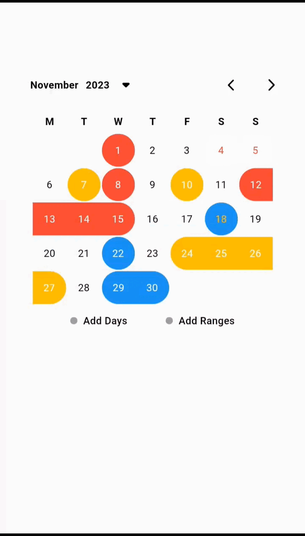
Usage #
For Full Example Go To Example Tap
    CustomCalendarViewer(
        dates: [
            Date(
                date: DateTime(2023, 11, 8),
                color: Colors.red,
            ),
            Date(
                date: DateTime(2023, 11, 10),
                color: Colors.amber,
            ),
            Date(
                date: DateTime(2023, 11, 7),
                color: Colors.amber,
            ),
            Date(
                date: DateTime(2023, 11, 1),
                color: Colors.red,
            ),
            Date(
                date: DateTime(2023, 11, 4),
                color: Colors.white,
                textColor: Colors.red,
            ),
            Date(
                date: DateTime(2023, 11, 5),
                color: Colors.white,
                textColor: Colors.red,
            ),
            Date(
                date: DateTime(2023, 11, 18),
                color: Colors.blue,
            ),
            Date(
              date: DateTime(2023, 11, 22),
            ),
        ],
        ranges: [
            RangeDate(
                start: DateTime(2023, 11, 12),
                end: DateTime(2023, 11, 15),
                color: Colors.red,
            ),
            RangeDate(
                start: DateTime(2023, 11, 24),
                end: DateTime(2023, 11, 27),
                color: Colors.amber,
            ),
            RangeDate(
                start: DateTime(2023, 11, 30),
                end: DateTime(2023, 11, 29),
            ),
        ],
        showCurrentDayBorder: false,
    ),
Additional information #
- Say to me in GitHub what you need to see in the package in the next update.
- Wait for more feature soon.
Author #
Metadata
17
likes
0
pub points
78%
popularity
Publisher
unverified uploader
Metadata
Amazing package help you to view your plans or important dates in calendar.
Repository (GitHub)
View/report issues
License
 unknown (LICENSE)
Dependencies
flutter, flutter_colorpicker, flutter_svg, intl