circular_progress_with_logo 1.0.0  circular_progress_with_logo: ^1.0.0 copied to clipboard
 goutam.info
A customizable circular progress indicator with animated logo/icon in the center. Perfect for loading states with branding. Supports 5 different animation styles.
Circular Progress With Logo #
A beautiful and highly customizable circular progress indicator for Flutter with an animated logo or icon in the center. Perfect for showing loading states while maintaining your app's branding and visual identity.
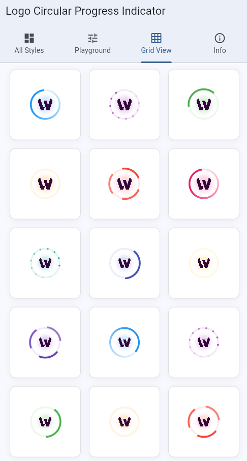
📸 Preview #
The package includes 5 stunning animation styles, all supporting a common logo in the center:
- Gradient - Smooth rotating gradient effect
- Dotted Circle - Animated dots forming a circle
- Dual Ring - Two counter-rotating arcs
- Wave - Pulsing waves radiating outward
- Spinning Arcs - Multiple arcs spinning together
✨ Features #
🎨 Multiple Animation Styles #
Choose from 5 different animation styles to match your app's design language. Each style provides smooth, performant animations that look great on all devices.
🖼️ Flexible Logo Options #
- Built-in Asset: Use the included icon.png asset
- Custom Assets: Provide your own image assets
- Custom Widgets: Use any Flutter widget (icons, images, etc.)
- Fallback: Automatic fallback to colored dot if no logo provided
⚙️ Highly Customizable #
- Adjustable size (from tiny 30px to large 150px+)
- Custom colors matching your brand
- Configurable stroke width
- Smooth pulse animation for center logo
- All parameters are optional with sensible defaults
📦 Multiple Components #
CustomLoader- Inline loader widget for any contextFullScreenLoader- Full-screen overlay with optional message
🚀 Production Ready #
- Lightweight and performant
- Zero external dependencies (Flutter only)
- Fully documented with examples
- Type-safe with full Dart null safety
- Works on iOS, Android, Web, Desktop
📥 Installation #
Add this to your package's pubspec.yaml file:
dependencies:
  circular_progress_with_logo: ^1.0.0
Then run:
flutter pub get
Or install it from the command line:
flutter pub add circular_progress_with_logo
🚀 Quick Start #
Import the package:
import 'package:circular_progress_with_logo/circular_progress_with_logo.dart';
Basic Usage #
// Simple loader with default gradient style and fallback dot
CustomLoader()

// With built-in icon from package
CustomLoader(
  size: 70,
  color: Colors.blue,
  logoAsset: 'packages/circular_progress_with_logo/assets/icon.png',
)
📚 Usage Examples #
1. Different Animation Styles #
All styles support the same customization options and logo placement:
// Gradient Style - Smooth rotating gradient
CustomLoader(
  size: 70,
  color: Colors.blue,
  style: LoaderStyle.gradient,
  logoAsset: 'packages/circular_progress_with_logo/assets/icon.png',
)

// Dotted Circle - Animated dots forming a circle
CustomLoader(
  size: 70,
  color: Colors.purple,
  style: LoaderStyle.dottedCircle,
  logoAsset: 'packages/circular_progress_with_logo/assets/icon.png',
)

// Dual Ring - Two counter-rotating arcs
CustomLoader(
  size: 70,
  color: Colors.green,
  style: LoaderStyle.dualRing,
  logoAsset: 'packages/circular_progress_with_logo/assets/icon.png',
)

// Wave - Pulsing waves radiating outward
CustomLoader(
  size: 70,
  color: Colors.orange,
  style: LoaderStyle.wave,
  logoAsset: 'packages/circular_progress_with_logo/assets/icon.png',
)

// Spinning Arcs - Multiple arcs spinning together
CustomLoader(
  size: 70,
  color: Colors.red,
  style: LoaderStyle.spinningArcs,
  logoAsset: 'packages/circular_progress_with_logo/assets/icon.png',
)
2. Using Your Own Logo Asset #
CustomLoader(
  size: 60,
  color: Colors.blue,
  style: LoaderStyle.gradient,
  logoAsset: 'assets/images/your_company_logo.png',
)
Don't forget to add your asset in your app's pubspec.yaml:
flutter:
  assets:
    - assets/images/your_company_logo.png
3. Using Custom Widget as Logo #
// With an icon
CustomLoader(
  size: 70,
  color: Colors.green,
  style: LoaderStyle.dualRing,
  logo: Icon(Icons.check_circle, color: Colors.green, size: 35),
)

// With Flutter logo
CustomLoader(
  size: 80,
  color: Colors.blue,
  style: LoaderStyle.wave,
  logo: FlutterLogo(size: 40),
)

// With any custom widget
CustomLoader(
  size: 90,
  color: Colors.purple,
  logo: Container(
    padding: EdgeInsets.all(8),
    decoration: BoxDecoration(
      color: Colors.white,
      shape: BoxShape.circle,
    ),
    child: Text('A', style: TextStyle(fontSize: 24, fontWeight: FontWeight.bold)),
  ),
)
4. Size Variations #
// Tiny - For inline use in buttons or cards
CustomLoader(size: 30, strokeWidth: 2.5)

// Small - For general inline use
CustomLoader(size: 40)

// Medium - Default size, ideal for most cases
CustomLoader(size: 70)

// Large - For splash screens or prominent loading
CustomLoader(size: 100, strokeWidth: 5.0)

// Extra Large - Maximum impact
CustomLoader(size: 150, strokeWidth: 6.0)
5. Custom Colors #
// Match your brand colors
CustomLoader(color: Color(0xFF6C63FF))

// Use theme colors
CustomLoader(color: Theme.of(context).primaryColor)

// Material colors
CustomLoader(color: Colors.deepPurple)
6. Full Screen Loader #
Perfect for blocking the UI during async operations:
// Show overlay with message
showDialog(
  context: context,
  barrierDismissible: false,
  builder: (context) => FullScreenLoader(
    message: 'Loading your data...',
    size: 80,
    style: LoaderStyle.gradient,
    logoAsset: 'packages/circular_progress_with_logo/assets/icon.png',
  ),
);

// Auto-dismiss after operation
void loadData() async {
  showDialog(
    context: context,
    barrierDismissible: false,
    builder: (context) => FullScreenLoader(
      message: 'Please wait...',
    ),
  );

  await Future.delayed(Duration(seconds: 2)); // Your async operation
  Navigator.pop(context); // Dismiss loader
}
7. In a ListView or Card #
Card(
  child: Padding(
    padding: EdgeInsets.all(16),
    child: Row(
      children: [
        CustomLoader(
          size: 40,
          color: Colors.blue,
          style: LoaderStyle.gradient,
        ),
        SizedBox(width: 16),
        Text('Loading...'),
      ],
    ),
  ),
)
8. Conditional Display #
class MyWidget extends StatelessWidget {
  final bool isLoading;
  final Widget child;

  @override
  Widget build(BuildContext context) {
    return isLoading
        ? Center(
            child: CustomLoader(
              size: 60,
              color: Colors.blue,
              logoAsset: 'packages/circular_progress_with_logo/assets/icon.png',
            ),
          )
        : child;
  }
}
With Custom Widget Logo #
CustomLoader(
  size: 60,
  color: Colors.green,
  logo: Icon(Icons.check, color: Colors.green, size: 30),
)
Full Screen Loader #
// Show loading overlay with gradient style
showDialog(
  context: context,
  barrierDismissible: false,
  builder: (context) => FullScreenLoader(
    message: 'Loading...',
    size: 80,
    style: LoaderStyle.gradient,
    logoAsset: 'packages/logo_circular_progress_indicator/assets/icon.png',
  ),
);
Parameters #
CustomLoader #
| Parameter | Type | Default | Description |
|---|---|---|---|
size |
double |
40 |
Diameter of the loader |
color |
Color? |
Theme.primaryColor |
Color of the progress indicator |
strokeWidth |
double |
3.5 |
Width of the circular stroke |
logoAsset |
String? |
null |
Path to asset image for center logo |
logo |
Widget? |
null |
Custom widget for center logo |
style |
LoaderStyle |
LoaderStyle.gradient |
Animation style |
LoaderStyle Enum #
LoaderStyle.gradient- Rotating gradient effectLoaderStyle.dottedCircle- Animated dots in a circleLoaderStyle.dualRing- Two counter-rotating arcsLoaderStyle.wave- Pulsing wave animationLoaderStyle.spinningArcs- Multiple spinning arcs
FullScreenLoader #
| Parameter | Type | Default | Description |
|---|---|---|---|
message |
String? |
null |
Optional loading message |
size |
double |
60 |
Size of the loader |
style |
LoaderStyle |
LoaderStyle.gradient |
Animation style |
logoAsset |
String? |
null |
Path to asset image for logo |
logo |
Widget? |
null |
Custom widget for logo |
🎯 Example #
Check out the comprehensive example app that showcases:
- All 5 animation styles
- Different sizes and configurations
- Interactive playground to customize in real-time
- Grid view of multiple loaders
- Full-screen overlay examples
- Code snippets for each use case
To run the example:
cd example
flutter pub get
flutter run
🤝 Contributing #
Contributions are welcome! If you have ideas for improvements or find bugs:
- Fork the repository
- Create your feature branch (
git checkout -b feature/amazing-feature) - Commit your changes (
git commit -m 'Add some amazing feature') - Push to the branch (
git push origin feature/amazing-feature) - Open a Pull Request
📄 License #
This project is licensed under the MIT License - see the LICENSE file for details.
🙏 Acknowledgments #
- Inspired by modern loading indicators across the web
- Built with ❤️ using Flutter
- Thanks to all contributors and users!
📧 Support #
- Issues: GitHub Issues
- Discussions: GitHub Discussions
- Email: For private inquiries
🌟 Show Your Support #
If you find this package helpful, please:
- ⭐ Star the repository on GitHub
- 👍 Like the package on pub.dev
- 📢 Share it with other Flutter developers
- 🐛 Report issues or suggest features
📊 Changelog #
See CHANGELOG.md for a list of changes in each version.
🔮 Roadmap #
Planned features for future releases:
- ❌ More animation styles
- ❌ Determinate progress support (0-100%)
- ❌ Customizable animation speed
- ❌ Color gradients with multiple stops
- ❌ Accessibility improvements
- ❌ Platform-specific optimizations
Metadata
Documentation
Publisher
Weekly Downloads
Metadata
A customizable circular progress indicator with animated logo/icon in the center. Perfect for loading states with branding. Supports 5 different animation styles.
Repository (GitHub)
View/report issues
License
 MIT (license)