circle_ui_navigator 1.0.1  circle_ui_navigator: ^1.0.1 copied to clipboard
A user-friendly customized widget whose goal is to display icons on a circle in a beatiful way.
A Flutter package for showing a circular navigation widget in a gorgeous, animated way. Highly customizable.
An inspiration is a design by Johny Vino.
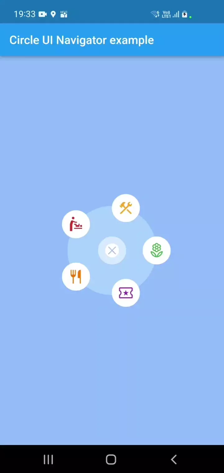
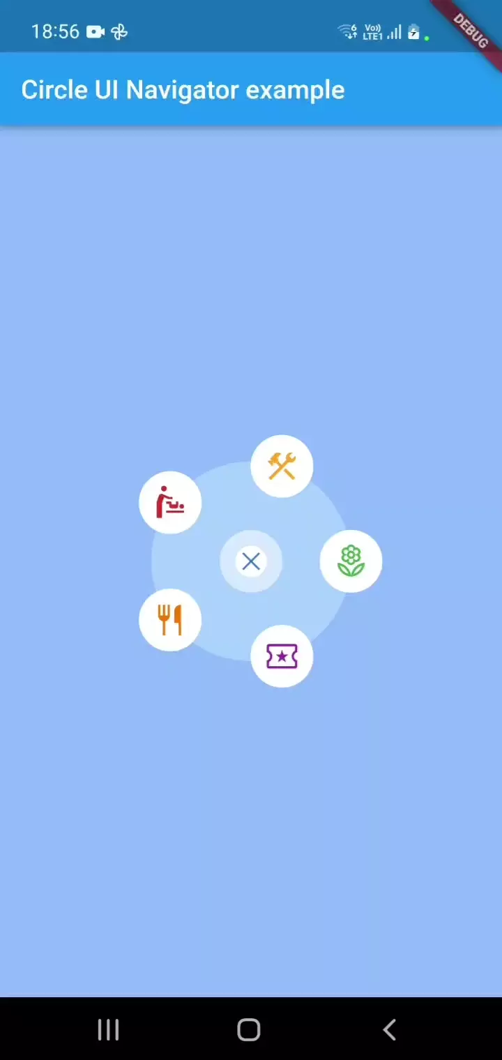
What does it look like? #
| Open | Close |
|---|---|
 |
 |
Installation #
- Add
circular_ui_navigator: 1.0.0to yourpubspec.yaml. - Run
flutter pub get
This package requires Dart SDK version 2.19.0 or above to function properly.
Please note that only SVG assets are supported for icons, as they are a highly compatible cross-platform solution. While this should be sufficient for most projects, please be aware that other icon types are not currently supported.
Usage #
To use the widget in your project, add the following import statement to the top of the file where you intend to use it:
import 'package:circle_ui_navigator/circle_ui_navigator.dart';
Then, use CircleNavigatorConfig in place of a widget.
You can customize all of the parameters shown below, and a few more.
// This code has to be inside a State of a StatefulWidget:
bool _isOpeningAnimation = true;
bool _isClosingAnimation = false;

@override
Widget build(BuildContext context) {
    return CircleNavigatorConfig(
        center: Point(200, 300), // of your choice and your responsibility to not draw a widget outside of the screen.
        animatedRippleColor: const Color(0xFF66A0FE).withOpacity(0.7),
        filledCircleColor: const Color(0xFFB4D8FF).withOpacity(0.7),
        isOpeningAnimation: _isOpeningAnimation,
        onOpenAnimationComplete: () {
            /**
              * You can add an optional reaction here if you like.
              */
            setState(() {
                _isOpeningAnimation = false;
            });
        },
        isClosingAnimation: _isClosingAnimation,
        onCloseAnimationComplete: () {
            /**
              * Add navigation call based on your navigation setup.
              */
            setState(() {
                _isClosingAnimation = false;
            });
        },
        iconSize: 48.0,
        actionIcons: [
            TappableIconData(
                assetPath: 'assets/images/local_florist.svg',
                color: Colors.green,
                tappedColor: Colors.grey,
                onTap: () {
                    /**
                      * Add navigation call based on your navigation setup.
                      */
                },
                outerBorderColor: Colors.white,
                outerBorderSize: 10,
                innerBorderColor: Colors.white,
            ),
            TappableIconData(
                assetPath: 'assets/images/local_activity.svg',
                color: Colors.purple,
                tappedColor: Colors.grey,
                onTap: () {
                    /**
                      * Add navigation call based on your navigation setup.
                      */
                },
                outerBorderColor: Colors.white,
                outerBorderSize: 10,
                innerBorderColor: Colors.white,
            ),
            TappableIconData(
                assetPath: 'assets/images/restaurant.svg',
                color: Colors.orange.shade700,
                tappedColor: Colors.grey,
                onTap: () {
                    /**
                      * Add navigation call based on your navigation setup.
                      */
                },
                outerBorderColor: Colors.white,
                outerBorderSize: 10,
                innerBorderColor: Colors.white,
            ),
            TappableIconData(
                assetPath: 'assets/images/baby_changing_station.svg',
                color: Colors.red.shade700,
                tappedColor: Colors.grey,
                onTap: () {
                    /**
                      * Add navigation call based on your navigation setup.
                      */
                },
                outerBorderColor: Colors.white,
                outerBorderSize: 10,
                innerBorderColor: Colors.white,
            ),
            TappableIconData(
                assetPath: 'assets/images/construction.svg',
                color: Colors.yellow.shade800,
                tappedColor: Colors.grey,
                onTap: () {
                    /**
                      * Add navigation call based on your navigation setup.
                      */
                },
                outerBorderColor: Colors.white,
                outerBorderSize: 10,
                innerBorderColor: Colors.white,
            ),
        ],
        closeIcon: TappableIconData(
            color: const Color(0xFF3678D0),
            assetPath: 'assets/images/close.svg',
            tappedColor: const Color(0xFF3678D0).withOpacity(0.5),
            onTap: () {
            setState(() {
                _isClosingAnimation = true;
            });
            },
            outerBorderColor: Colors.white54,
            outerBorderSize: 12,
            innerBorderColor: Colors.white,
        ),
        child: const CircleNavigator(),
    )
}
Refer to the example to learn how to place a widget in the center of the screen and explore the capabilities of CircleNavigatorConfig.
Additional information #
If you find a package relevant or have learned something from it, please do not hesitate to contact me or like it :) Also, please raise any issues you have here on GitHub
I have found two issues that may impact your use of the package:
- If the animationDuration and backgroundAnimationDuration parameters represent different time values, the onCloseAnimationComplete function is called twice. Usually, the first call causes the app to leave the screen, which is fine.
- Some users may want to turn off animations entirely. If it applies to you, please let me know so that I can improve the package.
Dependencies #
I tried to keep the project as minimalistic as possible. So its pubspec keeps only:
  equatable: ^2.0.5
  flutter_svg: ^2.0.2
