bottom_bars 1.0.0  bottom_bars: ^1.0.0 copied to clipboard
A new Flutter package to facilitate the use of personalized bottom bars.
BottomBars #
A new Flutter package to facilitate the use of personalized bottom bars. Package
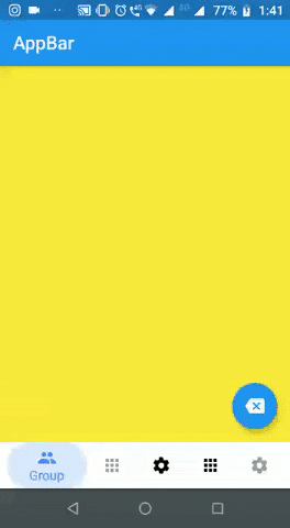
Preview #
Getting Started #
Add the plugin:
dependencies:
  ...
  bottom_bars: ^0.0.1
Import #
import 'package:bottom_bars/bottom_bars.dart';
Example Usage #
import 'package:flutter/material.dart';
import 'package:bottom_bars/bottom_bars.dart';

class TabsPage extends StatefulWidget {
  @override
  _TabsPageState createState() => _TabsPageState();
}

class _TabsPageState extends State<TabsPage> {
  @override
  Widget build(BuildContext context) {
    return BottomBars(
      type: 0,
      floatingActionButton: [
        FloatingActionButton(
          onPressed: () {},
          child: Icon(Icons.backspace),
        ),
        null,
        null,
        FloatingActionButton(
          onPressed: () {},
          child: Icon(Icons.backspace),
        ),
      ],
      appBar: [
        AppBar(
          title: Text("AppBar"),
        )
      ],
      tabs: <Widget>[
        Container(
          color: Colors.yellow,
        ),
        Container(
          color: Colors.red,
        ),
        Container(
          color: Colors.green,
        ),
        Container(
          color: Colors.red,
        ),
        Container(
          color: Colors.green,
        ),
      ],
      items: [
        BottomBarsItem(
            icon: Icon(Icons.group),
            title: Text("Group"),
            color: Colors.blueAccent),
        BottomBarsItem(
            icon: Icon(Icons.apps),
            title: Text("Home"),
            color: Colors.blueAccent,
            isEnabled: true),
        BottomBarsItem(
            icon: Icon(Icons.settings),
            title: Text("Settings"),
            color: Colors.blueAccent),
        BottomBarsItem(
            icon: Icon(Icons.apps),
            title: Text("Home"),
            color: Colors.blueAccent),
        BottomBarsItem(
            icon: Icon(Icons.settings),
            title: Text("Settings"),
            color: Colors.blueAccent,
            isEnabled: true),
      ],
    );
  }
}
Modifications #
BottomBars #
- @required tabs - Your pages that probably you'd use in PageView
- @required items - Your items (BottomBarsItem)
- appBar - Your appBar (it's a list because each tab has a appBar)
- floatingActionButton - Yout floatingActionButton (same idea of appBar)
- backgroundColor - bottomBar color
- iconSize - Icon's size
- colorItems - Color of each item
- type - Bottom Bar's type
- drag - If you can drag the screen
- cruve - Curver's type
BottomBarsItem #
- @required icon - Item's icon
- @required title - Item's title
- color - Item's color when is active
- isEnabled - Gets enabled when it is enabled
Metadata
3
likes
0
pub points
2%
popularity
Publisher
unverified uploader
Metadata
A new Flutter package to facilitate the use of personalized bottom bars.
Repository (GitHub)
View/report issues
License
 unknown (LICENSE)