adaptive_button 0.1.7  adaptive_button: ^0.1.7 copied to clipboard
AdaptiveButton is compatible with the platform, it disables the clicking feature of the button for your asynchronous operations and displays a widget on the button while waiting.
AdaptiveButton #
While AdaptiveButton is compatible with the platform, it disables the clicking feature of the button for your asynchronous operations and displays a widget on the button while waiting.
Getting Started #
Import the following package.
import 'package:adaptive_button/adaptive_button.dart';
| iOS | iOS |
|---|---|
 |
 |
| Android | Android |
|---|---|
 |
 |
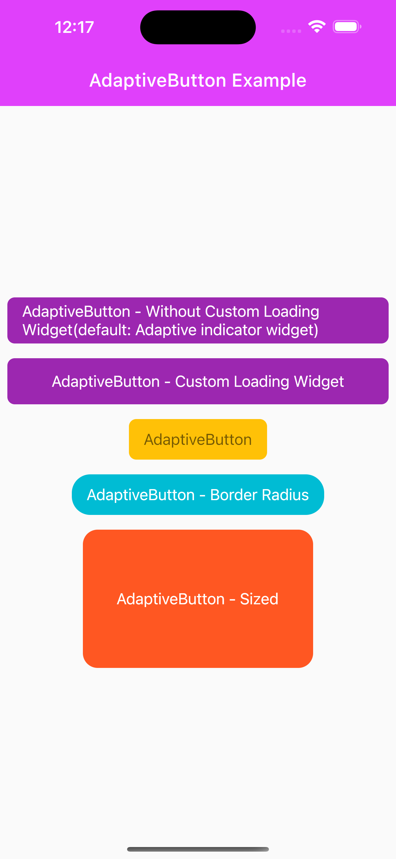
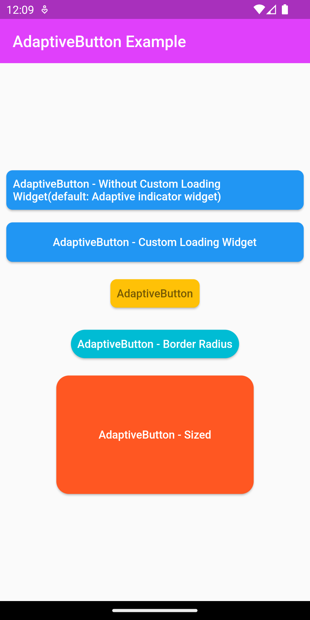
AdaptiveButton required options #
Required "Widget child" and Future<void> Function() onPressed
@override
Widget build(BuildContext context) {
  return Scaffold(
      body: Container(
        child: AdaptiveButton(
            child: Text("AdaptiveButton"),
            onPressed: () async {}
        ),
      ));
}
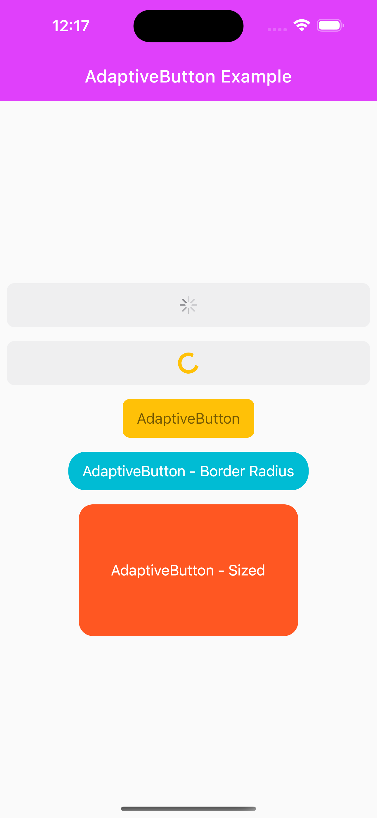
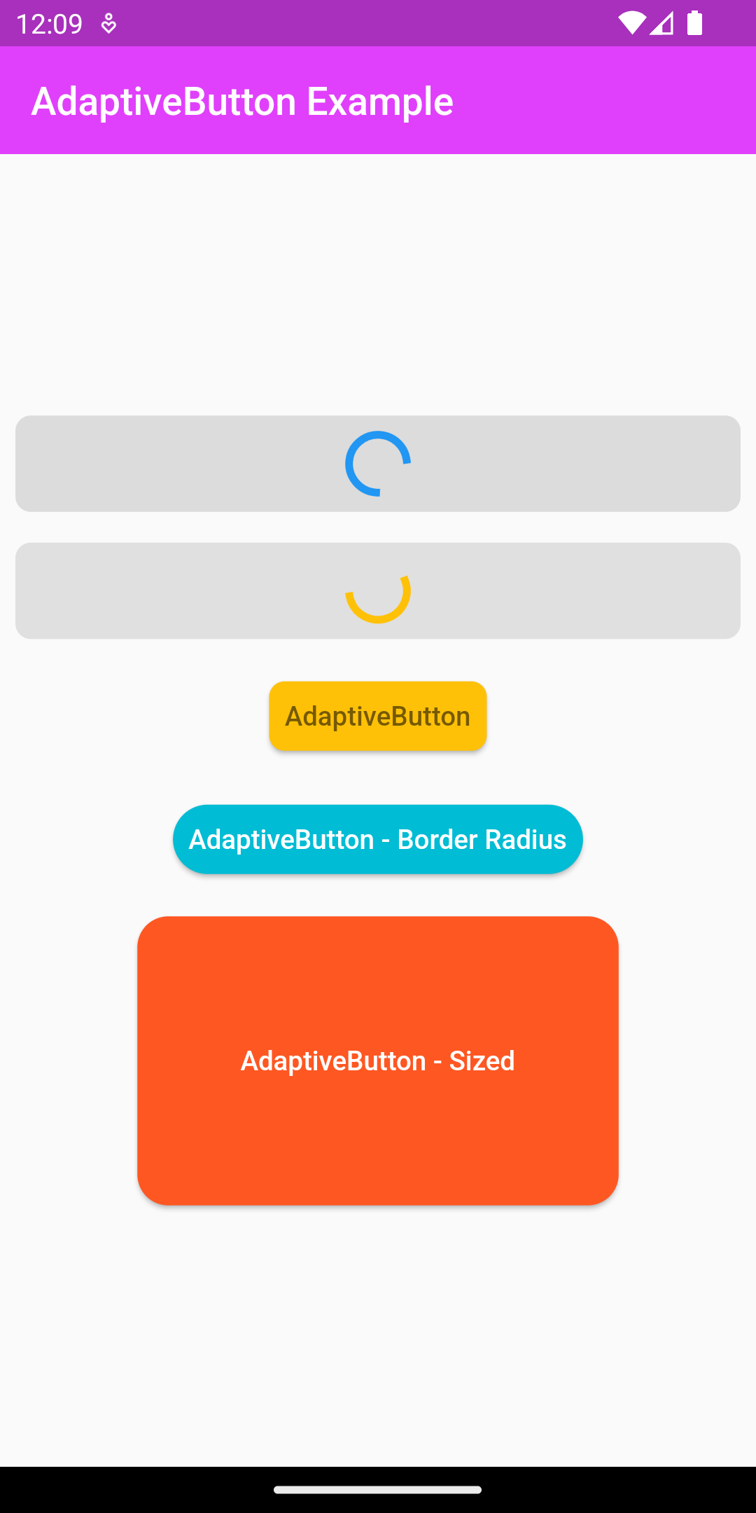
Without loading widget #
By default it uses indicator when the loadingWidget property is empty.
@override
Widget build(BuildContext context) {
  return Scaffold(
      body: Container(
        child: AdaptiveButton(
          height: 50,
          width: MediaQuery
              .of(context)
              .size
              .width,
          enabledLoading: true,
          child: const Text("AdaptiveButton - Without Loading Widget"),
          onPressed: () async {
            await Future.delayed(const Duration(seconds: 2));
            showDialog(
              context: context,
              builder: (context) {
                return const AlertDialog(
                  content: Text(
                      "Merhaba ben AdaptiveButton bulunduğum platforma göre şekillenirim:)"),
                );
              },
            );
          },
        ),
      ));
}
Use without asynchronous #
Use without async when the enableLoading property is empty.
@override
Widget build(BuildContext context) {
  return Scaffold(
      body: Container(
        child: AdaptiveButton(
          color: Colors.amber,
          child: const Text(
            "AdaptiveButton",
            style: TextStyle(color: Colors.black54),
          ),
          onPressed: () async {
            showDialog(
              context: context,
              builder: (context) {
                return const AlertDialog(
                  content: Text(
                      "Merhaba ben AdaptiveButton bulunduğum platforma göre şekillenirim:)"),
                );
              },
            );
            debugPrint("AdaptiveButton Test Message");
          },
        ),
      ));
}
#Sized property
You can customize the size of the AdaptiveButton using the width and height properties.
@override
Widget build(BuildContext context) {
  return Scaffold(
    body: AdaptiveButton(
      height: 50,
      width: MediaQuery
          .of(context)
          .size
          .width,
      enabledLoading: true,
      loadingWidget: const SizedBox(
          width: 20,
          height: 20,
          child: CircularProgressIndicator(
            color: Colors.amber,
          )),
      child: const Text("AdaptiveButton - Loading"),
      onPressed: () async {
        await Future.delayed(const Duration(seconds: 2));
        showDialog(
          context: context,
          builder: (context) {
            return const AlertDialog(
              content: Text(
                  "Merhaba ben AdaptiveButton bulunduğum platforma göre şekillenirim:)"),
            );
          },
        );
      },
    ),);
}
Features: #
AdaptiveButton:
double? width: Changes the width property of the buttondouble? height: Changes the height property of the button.Widget child: Determines the widget that will appear in the button. (required)Future<void> Function() onPressed: It is used for the action that will run when the button is clicked. (required)bool? enabledLoading: When set totrue, it displays a widget as a child of the button in asynchronous operations. It defaults tofalse.Widget? loadingWidget: Sets the widget to be displayed as the child of the button while the button is loading.Color? color: Sets the button's background color.BorderRadius? borderRadius: Allows the corners of the button to be ovalized. It defaults toBorderRadius.circular(8)
Metadata
Publisher
unverified uploader
Metadata
AdaptiveButton is compatible with the platform, it disables the clicking feature of the button for your asynchronous operations and displays a widget on the button while waiting.
Repository (GitHub)
View/report issues
License
 unknown (license)