action_sheet 1.0.3  action_sheet: ^1.0.3 copied to clipboard
A material bottom sheet with clickable actions as seen in Google Drive.
Action Sheet #
This package extends showModalBottomSheet() to provide a material bottom sheet with actions, replicating the one seen in Google Drive.
Preview #
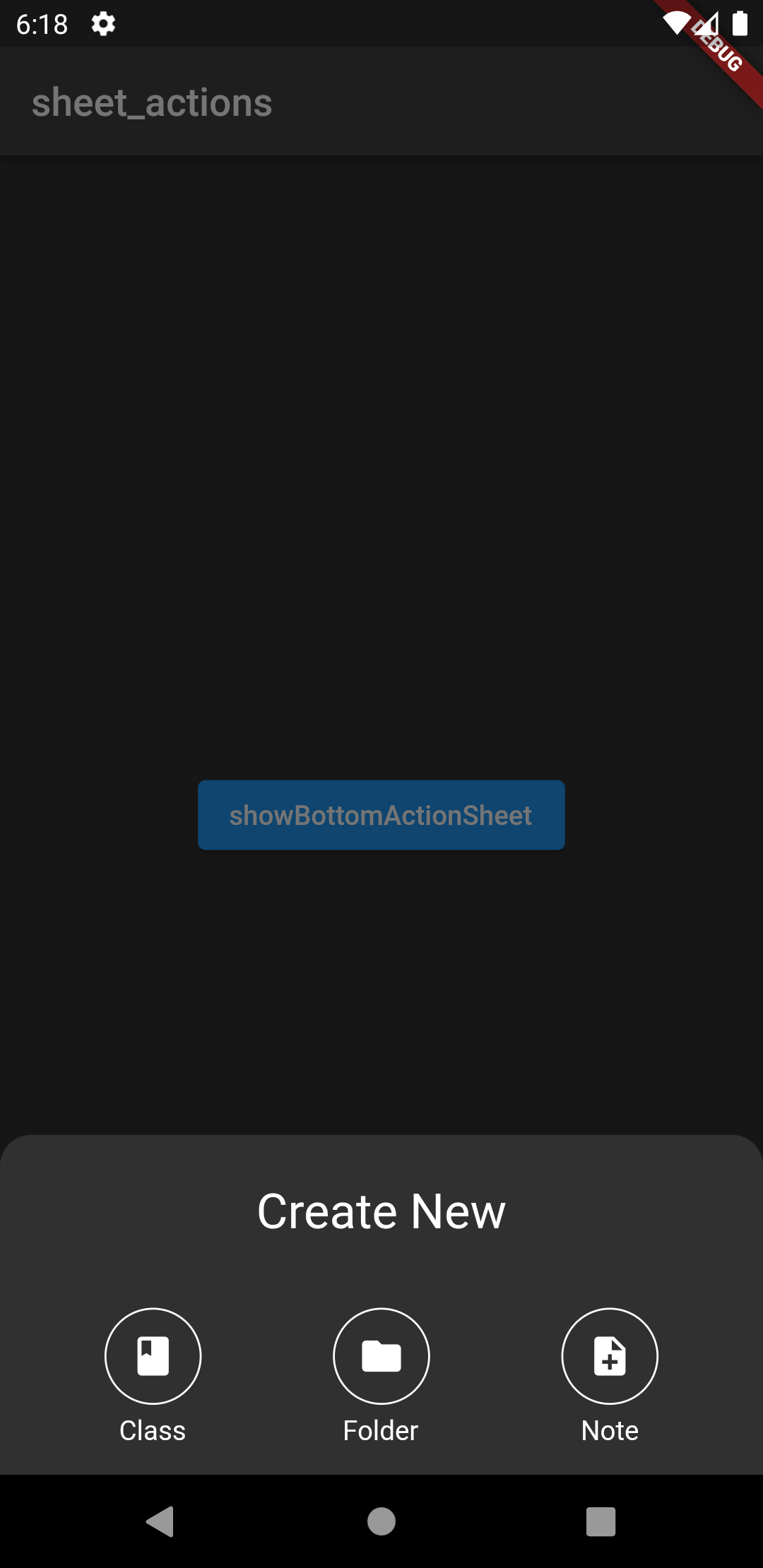
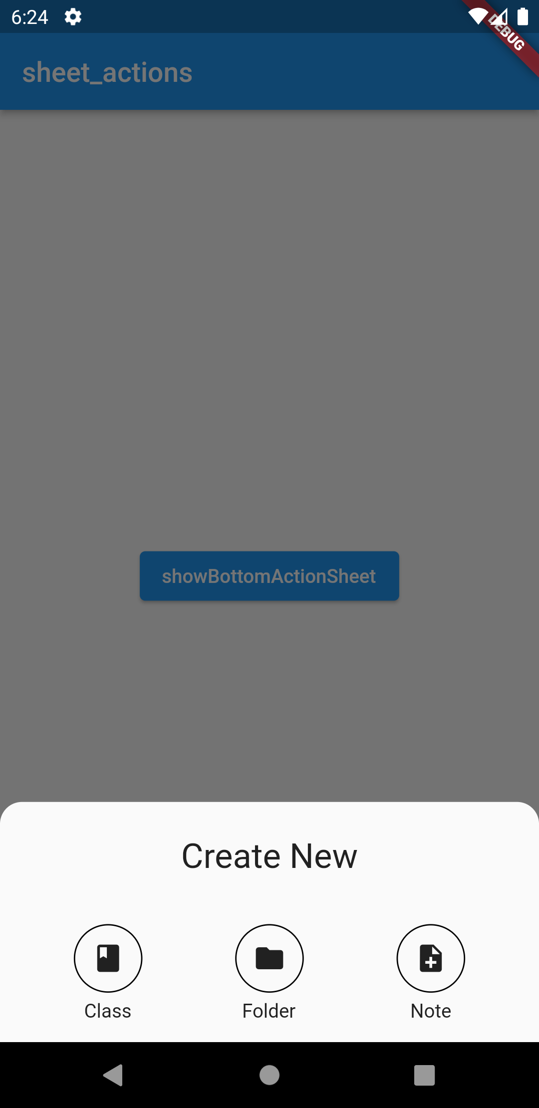
| Dark Theme | Light Theme |
|---|---|
 |
 |
Unless given backgroundColor and widgetBorderColour adjust according to the Brightness defined in the current theme.
The color of Icons or other widgets have to be adjusted manually.
Getting Started #
Add the package to your pubspec.yaml:
action_sheet: ^1.0.0
Import the package in your dart file:
import 'package:sheet_actions_test/action_sheet.dart';
Use showBottomActionSheet to return the bottom action sheet.
Basic Usage #
See Example.
Required Arguments:
- context: for building
- children: widgets to display as actions
- actions: function called on press
Widget build(BuildContext context) {
   return Center(
     child: ElevatedButton(
       child: Text("showBottomActionSheet"),
       onPressed: () {
         showBottomActionSheet(
           context: context,
           widgetPositioning: WidgetPositioning.mainAxis,
           children: [
             Icon(
               Icons.class_,
               color: Colors.white,
             ),
             Icon(
               Icons.folder,
               color: Colors.white,
             ),
             Icon(
               Icons.note_add,
               color: Colors.white,
             ),
           ],
           descriptions: [
             Text("Class"),
             Text("Folder"),
             Text("Note"),
           ],
           actions: [],
           titleText: Text(
             "Create New",
             style: TextStyle(fontSize: 25),
           ),
         );
       },
     ),
   );
 }
Parameters (Optional) #
descriptions:Text()beneath actionsdescriptionsPaddingtitleTexttitlePaddingwidgetPositioning:WidgetPostioning.leftBound: positions widgets in a grid from left to rightWidgetPositioning.mainAxis: positions widgets in a grid depending onmainAxisAlignment
widgetBorderRadius: radius for all borders around widgetswidgetBorderColormaxPerRow: maximum amount of widgets/actions in each row, unless given adjusts to number of widgets givenwidgetBorderSize: size of all borders surrounding the widgetswidgetSplashRadiuswidgetBorderWidthwidgetPaddingrowGap: gap between each row- `mainAxisAlignment
sheetPaddingconstraintsvisualDensitybackgroundColorelevationshape: defaults to a rectangle with rounded bordersclipBehaviour: clips everything outside of the specified shapebarrierColor: color of background when selectedisSrollControlleduseRootNavigatorisDimissibleenableDragrouteSettingstransitionAnimationController