zoomable_photo_gallery 1.0.2+1  zoomable_photo_gallery: ^1.0.2+1 copied to clipboard
This library is component of zoomable photo gellery
Zoomable Photo Gallery #
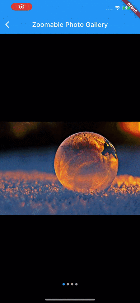
A Flutter package, It would help you make has zoomable photo gallery easy.
Getting Started #
To start using this package, add zoomable_photo_gallery dependency to your pubspec.yaml
dependencies:
  zoomable_photo_gallery: "<latest_release>"
Documentation #
ZoomablePhotoGallery #
This is so simple to use, it needs only images widget. you can use asset file(jpg,png) or network image or CachedNetworkImage what ever you want.
ZoomablePhotoGallery(
    imageList: List.generate(
        imageFile.length,
        (index) => imageFile[index],
    ),
),

--- or ---

ZoomablePhotoGallery(
    controller: controller,
    initIndex: 3,
    backColor: Colors.white,
    maxZoom: 5,
    minZoom: 0.5,
    location: IndicatorLocation.BOTTOM_CENTER,
    changePage: (int index) {
        setState(() {
        currentPageIndex = index;
        });
    },
    indicator: List.generate(
        imageUrl.length,
        (index) => Container(
        margin: const EdgeInsets.symmetric(horizontal: 3),
        width: 10,
        height: 10,
        decoration: BoxDecoration(
            color: index == currentPageIndex ? Colors.red : Colors.grey,
        ),
        ),
    ).toList(),
    imageList: List.generate(
        imageUrl.length,
        (index) => CachedNetworkImage(
                imageUrl: imageUrl[index],
                fadeInDuration: Duration.zero,
                fadeOutDuration: Duration.zero,
                progressIndicatorBuilder: (_, v, p) {
                return const Center(child: CircularProgressIndicator());
                },
            )
        ),
    ),
    onTap: () {
        Navigator.pop(context);
    },
| Parameters | Value | Required | Docs |
|---|---|---|---|
imageList |
List<Widget> |
YES | Required to image list widget |
initIndex |
int |
No | First view location of when would mounted this widget |
location |
IndicatorLocation |
No | indicator location enum option (ex : BOTTOM_CENTER , TOP_CENTER ...) |
controller |
ZoomablePhotoController |
No | You can controller paging in yourside. so you can make custom indicator |
backColor |
Color |
No | You can set the exterior color. |
height |
double |
No | It is height of photo gallery , default is display of device size |
maxZoom |
double |
No | This is the maximum zoom possible. default is 2.5 |
minZoom |
double |
No | This is the minimum zoom possible. default is 0.5 |
changePage |
Function(int) |
No | You can received current page when page changed |
indicator |
List<Widget> |
No | You can make custom indicator widget |
onTap |
Function() |
No | You can recived image tap event |
IndicatorLocation #
indicator location enum option
enum IndicatorLocation{
    BOTTOM_CENTER,
    BOTTOM_LEFT,
    BOTTOM_RIGHT,
    TOP_CENTER,
    TOP_LEFT,
    TOP_RIGHT,
}
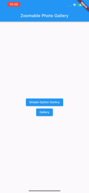
Screens #
Metadata
9
likes
60
points
10
downloads
Documentation
Publisher
unverified uploader
Weekly Downloads
Metadata
This library is component of zoomable photo gellery
Repository (GitHub)
View/report issues
License
 MIT (license)