x_containers 1.3.0  x_containers: ^1.3.0 copied to clipboard
A Flutter package offering more adaptive and easy-to-use container widgets.
XContainers #
A Flutter package offering more adaptive and easy-to-use container widgets.
I initially created the XContainer (formerly ShadowContainer) as a way to have a customizable container with a shadow.
Then I implemented the other XContainers to easily match and uniformize the style of the containers in my projects without repeating style code everywhere.
Features #
Add this to your Flutter app to:
- Have more container-type widgets at your disposal.
- Uniformize the style of the containers within your app.
- Easily manage that style via a shared theme object.
Getting started #
To get started, run the command:
$ flutter pub add x_containers
Then you'll be able to use:
import 'package:x_containers/x_containers.dart';
Usage #
This package gives you access to the following XContainers, as well as a xTheme singleton and a XLayout class.
All these are explained below.
| Name | Description |
|---|---|
| XContainers | |
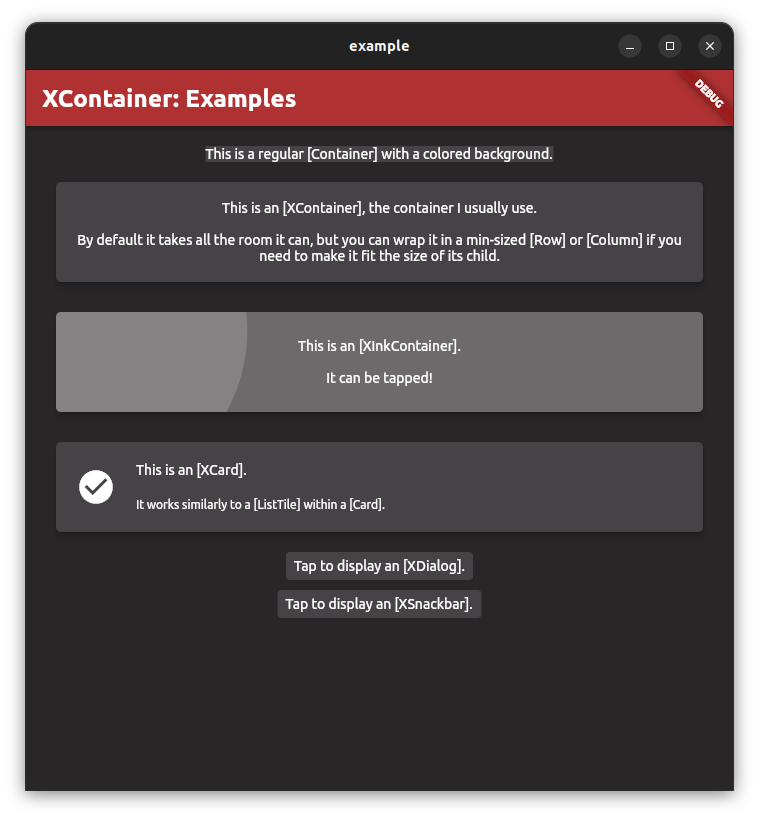
XContainer |
A container-type widget with a shadow and some more customization than a regular container. |
XButton |
A mix between a button and an XContainer. |
XCard |
A card-type widget meant to replace ListTiles inside Cards, it also fixes the issue of ListTile's leading and trailing properties not being leveled. |
XDialog |
A custom dialog object that can be displayed with its show method. |
XSnackbar |
A custom dialog object that can be displayed with its show method. |
| xTheme & XLayout | |
xTheme |
It allows you to customize the default properties shared by all the XContainers, and create app themes. |
XLayout |
It is a collection of constants used to uniformize the look of your app (for instance, it contains preset padding values or preset SizedBox). |
XContainers #
All the
XContainerare similar to their non-X counterparts but I tried to bring the most used properties to top-level (so you don't have to code aBoxDecorationevery time you want a shadow, for instance).// Instantiating a [XContainer]. XContainer( padding: EdgeInset.all(10), height: 100, enableShadow: true, child: Text("I have a shadow!"), ); // Instantiating a [XButton]. XButton( padding: EdgeInset.all(10), onTap: () => print("I've been tapped on!"), child: Text("Tap me!"), );
xTheme #
xThemeis a singleton class instance with two roles:
- Being the fallback theme for all XContainers so you can set it at the beginning of the app and not write a style object for each of your containers.
- Generating a
ThemeDatawithout having to set every single field during instantiation (specific fields now fallback to more generic ones, especially for colors).// Setting the [XContainer] theme. xTheme.set( margin: EdgeInsets.all(0), padding: XLayout.edgeInsetsAllS, ); // Instantiating a theme preset for dark mode. ThemeData darkMode = xTheme.getTheme( mode: ThemeMode.dark, primary: Color(0xFF464245), secondary: Color(0xFFAF3131), background: Color(0xFF282627), cardColor: Color(0xFF464245), containerColor: Color(0xFF686866), );
XLayout #
The
XLayoutclass exists because I tend to use 4 levels of padding (XS, S, M and L) in each of my projects and it's easier to just embed them all in a package rather than adding them to myglobals.dartin every project. They are embedded in a class so they don't conflict with others variables. Furthermore, they are all static so there is no need to instantiate the class.
Finally, if you can change a padding value, the other fields will match the new padding.// Large padding value. // Equivalent to [40]. XLayout.paddingL; // Large edge insets on all sides. // Equivalent to [EdgeInsets.all(paddingL)]. XLayout.edgeInsetsAllL; // Large circular border radius. // Equivalent to [BorderRadius.circular(paddingL)]. XLayout.brcL; // Large horizontal [SizedBox]. // Equivalent to [SizedBox(width: paddingL)]. XLayout.horizontalL; // Large vertical [SizedBox]. // Equivalent to [SizedBox(height: paddingL)]. XLayout.verticalL;
List of breaking changes #
1.3.0 #
- Deprecated [XInkContainer] due to unclear name. Use [XInkContainer] instead.
1.2.6 #
- Removed most parameters from
xTheme.getTheme. The reason for this change is that the goal of the function is to provide a custom theme from an easy set of parameters. The removed parameters were just overrides for the custom theme; and they can easily be set by running.copyWithon the generated theme.
1.2.3 #
- Replaced
densityanddensityRatioproperties byinternalHorizontalPaddingandinternalVerticalPaddinginxTheme,XListTileandXCard.
1.2.0 #
XSnackbardoesn't use thetitleStyleandcontentStyleproperties which are handled by the text theme.
1.1.0 #
- In
XSnackbar, the fieldmessageis renamed tocontentto match the naming of other classes. - In
XCard, the fieldsubtitleis renamed tocontentto match the naming of other classes.
Additional information #
This is my first package, feel free to check the github to add or ask any info you'd like, or give advice!
Metadata
Publisher
unverified uploader
Weekly Downloads
Metadata
A Flutter package offering more adaptive and easy-to-use container widgets.
Repository (GitHub)
View/report issues
Documentation
License
 GPL-3.0 (license)